• Members 533 posts
    Feb. 18, 2024, 3:31 p.m.

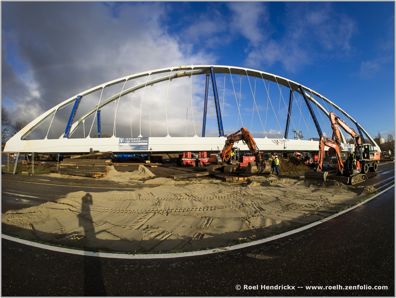
    I like the way the fish-eye has bent the foreground so that the white line mirrors the bridge's shape, and, even better, it makes an eye shape together with the bridge itself. This eye effectively surrounds the detail of interest in connection with the construction work. You have managed not only to illustrate the work going on, but also create an attractive piece of art.

    Pete

  • Members 533 posts
    Feb. 18, 2024, 3:36 p.m.

    I like the previous comments, especially Roel's pointing out the link between the medium and the subject!

    Pete

  • Members 533 posts
    Feb. 18, 2024, 4:09 p.m.

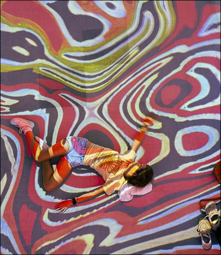
    Yes, Mike, I followed the link, and it looks like a fascinating project. Your photo interprets it very well. The prone body shows total immersion and the art projected over the person drives it home. It is disorientating too, as the curved lines and the posture of the subject, do not give any of the usual visual clues to sort out what is horizontal and what is vertical, and this disorientation means the viewer becomes immersed too. The seemingly ownerless shoes suggest that someone has become even more immersed and possibly been completely swallowed.
    There is another interesting point too. The installation is trying to educate people about native Australians' culture and play a role in equality. The image has done just that. We cannot tell the sex or the ethnicity of the person and it doesn't matter in this photo, as it shouldn't in life.

    Pete

  • Members 533 posts
    Feb. 18, 2024, 4:30 p.m.

    This is a true abstract, as there is nothing to give any clues as to what the subject is, and that is a real strength. We are left to ponder the aesthetics as shown, and the colours, patterns and washes of colour are very pleasing, and then it is up to us to let our imagination wander and find our own meaning, which will probably be different every time we look.
    Great image.

    Pete

  • Members 861 posts
    Feb. 18, 2024, 5:42 p.m.

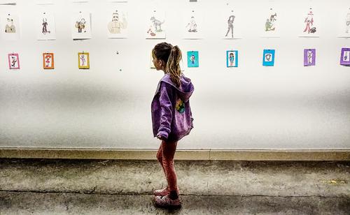
    "Faces I Can't Remember"
    facesicantrememebr.jpg

    Unrelated, I'm "officially" someone who has sold a photo book now.

    facesicantrememebr.jpg

    JPG, 3.7 MB, uploaded by OpenCube on Feb. 18, 2024.

  • Members 533 posts
    Feb. 18, 2024, 6:31 p.m.

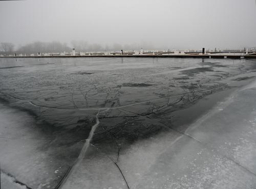
    Looking at the full size version, I feel as if I am actually standing on the ice, and, with all those large cracks, it's a place I defiitely do not want to be! The background seems to show the tombs of all those who tried! It is definiely a very engaging image.
    I also like the tonality and the white ice framing forming an arced frame around the lower half.

    Pete

  • Members 533 posts
    Feb. 18, 2024, 6:35 p.m.

    I like both these comments and cannot really think of anything sensible to add, so I will leave it at that.

    A delightful image.

    Pete

  • Members 533 posts
    Feb. 18, 2024, 6:44 p.m.

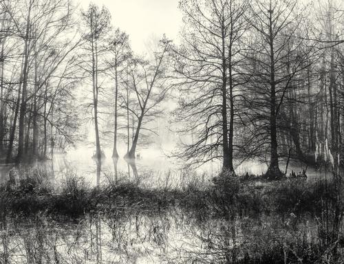
    A ditch. Hmm. That's the prettiest little ditch I have ever seen!

    There is lots going on in the picture, but not in a negative way. All the lines seem to add up to a whole and not to confusion. I think that is helped by taking colour out of the mix.
    Despite all the hard lines, there is an overall feeling of softness, and I don't mean the focus, when I say that. I think the slight toning helps that feeling too (or does my monitor need calibrating?)
    I like how the three trees on the left hand third, leaning slightly away from each other, are framed against the pale expanse of water.
    A beautiful quiet image.

    Pete

  • Members 533 posts
    Feb. 18, 2024, 7:08 p.m.

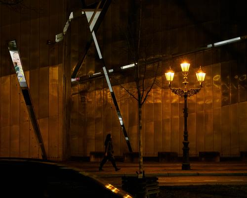
    People are finding it difficult to grasp exactly how this photo hangs together, and that is actually what I hoped! Not being able to get an exact bearing on a scene is similar to the uneasy feeling we get being in the dark in an unknown area. For that reason, I made no attempt to brighten the scene or the shadowy figure. I also liked the trusted shape of fine old street-lamp throwing some light onto the strange surroundings.

    Although it seems to be a surreal image, actually there is hardly any PP involved, apart from cropping. The building is part of the modern extension to the Jewish Museum in Berlin, which is a fantastic and very edgy building by the architect Libeskind.(I greatly encourage you to read this short article about the fascinating influences he used to create it.
    www.jmberlin.de/en/architecture-buildings
    At the very least, you will be able to see what the building looks like in daylight, allowing you to unserstand my photo. It is a great museum about Jewish life in Germany and, of course, the Shoah or Holocaust.)

    Of course, this link to the holocaust, adds another dimension of unease when interpreting the photo, and influenced my title too. I could not expect anybody to see this interpretation, unless they happened to be familiar with the building, and wondered whether to add some information in my accompanying text to help, but decided against it, as I was interested to see how the photo worked without that extra layer of knowledge.

    In any case, thanks for spending time with it and for your comments.

    Pete

  • Members 533 posts
    Feb. 18, 2024, 7:20 p.m.

    Well, the title is definitely well-chosen!
    At first it is difficult to know where to start, but then the splash of red draws the viewer in and we explore the lines aimlessly, trying to make a degre of sense by finding interesting shapes, symmetries, lines. It is worth spending a bit of time with it, which I probably would not have done if it were not in a space demanding it, such as this forum.
    It may seem strange, given the chaos, but I find the sliver of window on the left distracting, and there are enough visual spaghetti trails to follow in the centre, without being side-tracked to the edge.
    I think the red umbrella is a key, and even if you didn't notice it at the time, I do wonder if your subconscious had actually spotted it?

    Pete

  • Members 533 posts
    Feb. 18, 2024, 7:25 p.m.

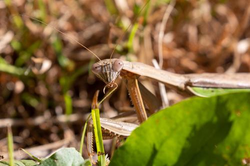
    Yes, I am so glad I am not a male mantis, lol!

    I agree with Minnie, and love the way it is peering round a leaf. Most macro photos excite the viewer by displaying minute detail, which can become a bit of a text book illustration, so it is nice to see the environment and a bit of character, even if some of insect is hidden.

    Pete

  • Members 533 posts
    Feb. 18, 2024, 7:30 p.m.

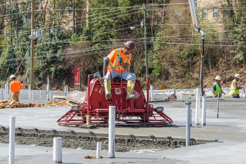
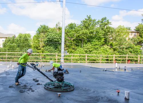
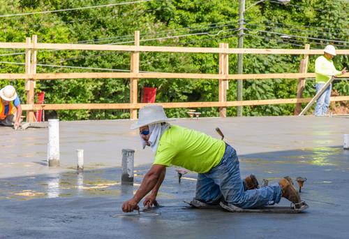
    This proves to the uninitiated, like me, just how much effort and skill goes into laying a concrete slab! The photos combine to form what almost seems to be a dance. In any case it seems to be anything but the hard work, which it undoubtably is.

    Pete

  • Members 704 posts
    Feb. 18, 2024, 8:10 p.m.

    Thank you, Mike! That's exactly what I was going for!

    😉

    Rich

  • Members 704 posts
    Feb. 18, 2024, 8:13 p.m.

    I think you are right. And I'm embarrassed to say it, but I did not notice the umbrella at the time. The mind is a terrible thing!

    😀

    Rich

  • Members 1398 posts
    Feb. 18, 2024, 9:02 p.m.

    [quote="@JSPhotoHobby"]
    Coquettish Mantis

    Mantiss 01.jpg
    [/quote
    This is where prior knowledge totally shapes my response. I know a little about mantis s. (How do you spell the plural?)
    I'm male. I suspect the subject is female. I've heard rumours. Surely they can't be true? She looks friendly and trustworthy. Ah, what the heck. Sometimes you have to listen to your heart. It's Valentine's Day after all. What could go w.........
    Great. The direct eye contact with the siren, the facial details and the veiling leaf are the ingredients here.

  • Members 1398 posts
    Feb. 18, 2024, 9:14 p.m.

    I blush to remember the photo I posted of my brick and mortar construction last week.
    As minniev said. It works as a series. Each shot zeros in closer. In 1 we get a grasp of the size of the job. In 2, the equipment is smaller. In 3 we get down to the personal. I dip my hard hat to this guy. He's using a float in each hand!!!. The weight spreaders from his knees to his toes are a revelation. Brilliant.
    A very enjoyable series with thoughtfully selected frames.

  • Members 1398 posts
    Feb. 18, 2024, 10:45 p.m.

    Duh! Sorry. I should have paid more attention to your title. As you say, what puzzled me in the photo was exactly what had caught your eye when you pressed the shutter release.
    Some architects need to go back to school.

  • Members 1398 posts
    Feb. 18, 2024, 10:57 p.m.

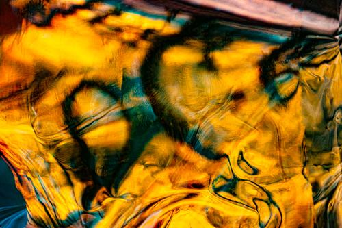
    May I suggest a slightly different title. "Faces I can't quite remember."
    It is more appropriate and also more disturbing. There are suggestions of faces here but we can't quite get them into focus or recall the when and where. But we feel we should so we keep on trying to put the pieces together. It might be embarrassing and it might make us anxious about our own fading abilities.
    Your photo has the golden glow of remembered times past plus black depths. Some areas are sharp, some fuzzy and there is distortion.
    I relate to this.