They seem very well made, but you also managed to capture them perfectly - excellent work! 👍
-
-
I haven't learned to color grade yet! I tried a bunch of things with contrast, vibrance, saturation and black and white and the original image was the one I still prefered, but always looked like it was missing color. Doesn't help It was through a filtered window and a gray overcast day. I will have to put time into learning color grading. Thanks!
-
@MikeFewster has written:
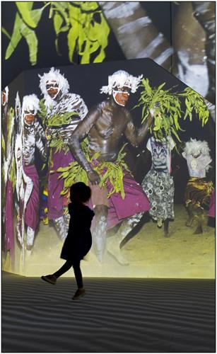
I love how the silhouette puts the child into the image, almost like they are on the near side of a fire while the other dancers are on the far side. It adds a depth to the image.
-
@RoelHendrickx has written:
RUSTY STEEL & FISHEYE
In last week's thread, a few people commented on my use of the fisheye lens in the bridge photo (thanks!);
I confess to being slightly addicted to using fisheye lenses. They can provide a unique perspective.
Depending on how you use them, they can appear to be "just normal" ultra wideangle (just avoid straight verticals or horizontals or keep them in the center).
The late Bill "Boorstrap" Turner was a master of that technique (he used it mostly on the beach, keeping his horizon centered).But if you are feeling adventurous, a fisheye can also provide a distortion that can be made part of the composition (as in the bridge image last week, where the nearby distortion was used to create a curve echoing the natural curve above, in order to get a complete eye shape).
A few years ago, we visited the site of C Mine in Genk. This is a former coalmine, of which some of the main buildings are now converted to a cultural center. The elevator shafts are kept as a link to the heritage of the site. In front of the main entrance is a very large art installation made of rusted steel in the shape of a maze.
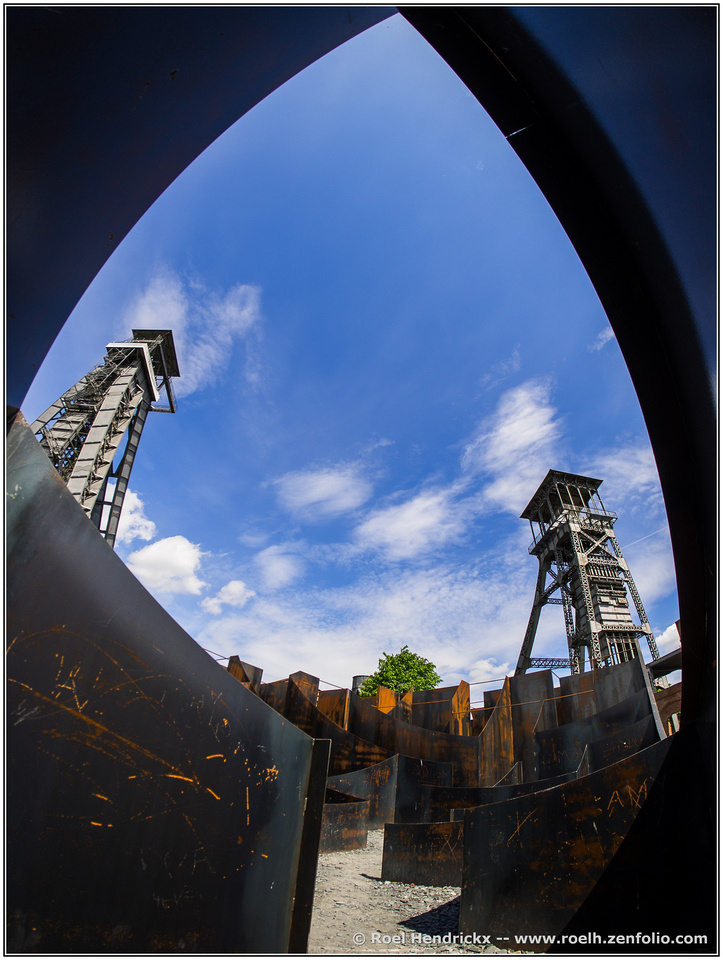
I went kinda overboard with my wide angle lenses in this unique location.
More examples here : **C Mine gallery**I love your use of this lens in the last few images. I have a very cheap one I've played with. Very interesting!
-
@WhyNot has written:
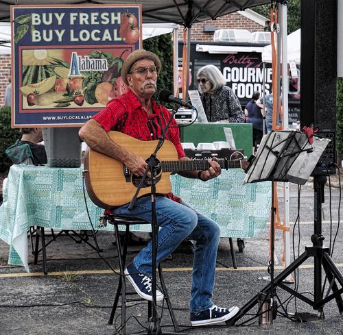
Music #2 -- Guitar
WhyNot
The sign behind him and his facial expression are really suggestive! Is he a farmer singing the blues? Or country? My truck broke, they don't make em like they used to, my dog died, we got old together, my fruits are gone, since the dog died the rabbits have taken over, and im outta coffee!
-
@ChrisOly has written:
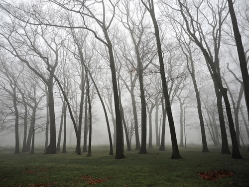
Silence
I was passing by and noticed amazing site ...
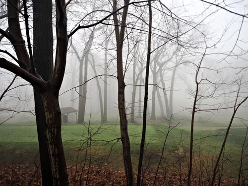
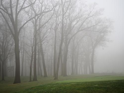
I like the third one, since the trees fill the image it has a balance that makes it seem still. The ground is darker too, closer to the trees in tone and makes it seem like the darkness is reaching up.
-
@minniev has written:
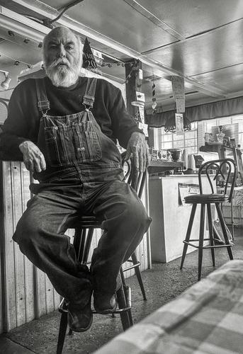
Something a little different from me, a casual portrait taken with phone of someone I met at Rozella's, the closest cafe to the country house. (No menu, just discuss what you want with Rozella and see if she can accommodate you.) This fellow knew lots of local history including the location of the ruins of what was once the most elaborate mansion in MS, now gone back to the earth. I'll have to check it out.
I feel like he is waiting for me to say something or expecting me to do something. But, I want him to tell me or show me something.
-
-
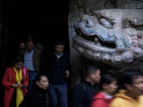
Dragon Power
In Baodingshan in Sichuan there is a small valley, where 900 years ago monks carved thousands of statues into the cliff showing various aspects of Buddhism for those who could not read, including this dragon guarding the entrance to a temple in a cave. There were plenty of tourists, who threatened to dominate the valley more than the statues, and I was keen to show the dragon as master of a thousand years, and the tourists as fleeting visitors. I tried to do this with a long exposure to blur the people, but leave the dtagon sharp-
Pete
-
@LouHolland has written:Quoted message:
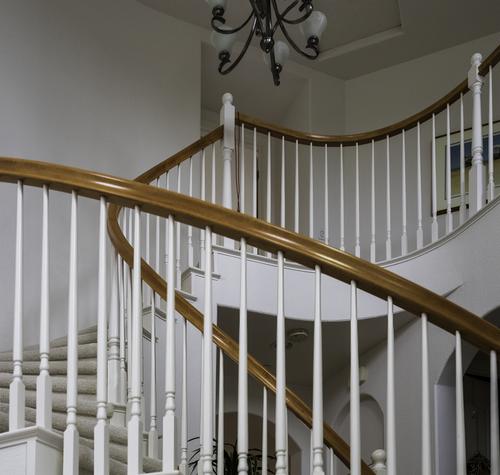
Rich, that's a good architectural representation of a beautiful stairwell and rich in its simplicity.
@Rich42 has written:Rich
Thanks Lou.
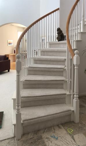
The stairs don't normally look that dramatic.
I was playing with Annie, our cat, on the living room floor (to the left) and looked up at the stairs from that perspective which greatly exaggerated the play of the curve of the rails. I made the shot with a 45mm lens on a Medium Format camera. I almost had to stand on my head to get the camera into the right position. The image required a lot of perspective distortion correction in Photoshop.
Rich
-
@ChrisOly has written:
Silence
I was passing by and noticed amazing site ...
For me it's a toss up between 2 and 3. In 2 I like the diminishing tree size and density, left to right followed by the space on the right. The green feels a little too strong. Possibly decrease vibrancy a bit and also crop off some from the lower edge. The large darker green to me feels intrusive and too strong for the softer trees and fog.
In 3, the green is considerably more muted and the tone balance feels better to me. Even so, I'd experiment with cropping a little off the bottom. I very much like the leaning trees at the front and then the layered stages back into the fog. -
@minniev has written:
Something a little different from me, a casual portrait taken with phone of someone I met at Rozella's, the closest cafe to the country house. (No menu, just discuss what you want with Rozella and see if she can accommodate you.) This fellow knew lots of local history including the location of the ruins of what was once the most elaborate mansion in MS, now gone back to the earth. I'll have to check it out.
A very clever and unorthodox composition. Our hero takes up almost the entire left hand side of the image. A series of lines leads back down through the shop. They takes us to details that don't comptete, they add tou our knowledge of the character and his world. The stool on the right fills in the details of the stool behind our subject. Yes, it's the kind of homely wooden artifact we might have expected. And we get details of what the shop sells along with handwritten signage. We aren't in the world of super chain stores here. The lighting on the hands ensures we give attention to them. They are big hands and tell their own story.
Memo to self. Get a pair of those overalls and carry them in my camera bag when traveling in the countryside. Get any subject to put them on. They add character by the truckload.
Pretty much perfect. -
@simplejoy has written:@JSPhotoHobby has written:
I worked through the Placa De Espana image I have and tried to make something of them, but it seemed out of place to share here, so I shared them here. Let me know what you think of the edits.
That said, here is the image I want to share here. Please tell me if you like it or hate it and if you have the time, why and how I should have done it better!
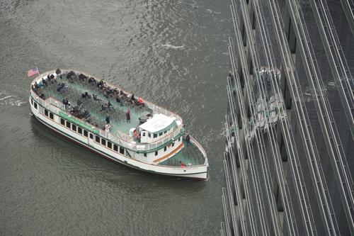
I like it - it's an interesting image because of the lines introduced by the buildings. I wasn't sure what it was at first and it almost feels like there's some distortion setting in, something deconstructing the rest of the image... and the ship is in danger of being affected as well. I would absolutely try to play with different looks in terms of color grading and also include B&W to see where it works best... my bet is on some B&W look with relatively strong contrast, but that's just a feeling. Great shot!
I agree with Simplejoy. There's something good here but it is difficult to get it to work. I like the activity on the deck and the empty chairs and the colour palette. I tried cropping in while retaining some of the building and reflections on the right. I also wanted to keep the touches of red on the flag and the passengers and, if possible in the reflection. Attached are a couple of my cropping attempts but I'm not happy with them either. I want to keep the height of your shot but bring out the deck. Mission Impossible.
[]
(/a/9iz8IV4aDFKxenHLDIOynt27q9WXXeh57NqrxqLc72gCYytKF7LbnM9VBkPi4TKq/21261/?shva=1)
I'll get back to the Spanish shots later.
-
@simplejoy has written:
I've changed my mind and won't show any of the WA lens images as mentioned previously... Here' something else instead:

(some stupid title) by simple.joy, on FlickrWhat about "Forecasting economic trends"?
Clever photo. The lift off from penline to wire in another dimension, is very smooth. The sharp red tip and black pen dominate and then the out of focus builds as we follow the line. There is never any doubt about the background. The multi squares create movement lines while also suggesting something scientific is underway. The positioning of the pen gives plenty of visual space for the red line.
Incidentally, was this originally a love letter for Valentine's Day thought? That blooks as though it could be multiple hearts along the wire. -
@MikeFewster has written:@simplejoy has written:@JSPhotoHobby has written:
I worked through the Placa De Espana image I have and tried to make something of them, but it seemed out of place to share here, so I shared them here. Let me know what you think of the edits.
That said, here is the image I want to share here. Please tell me if you like it or hate it and if you have the time, why and how I should have done it better!
I like it - it's an interesting image because of the lines introduced by the buildings. I wasn't sure what it was at first and it almost feels like there's some distortion setting in, something deconstructing the rest of the image... and the ship is in danger of being affected as well. I would absolutely try to play with different looks in terms of color grading and also include B&W to see where it works best... my bet is on some B&W look with relatively strong contrast, but that's just a feeling. Great shot!
I agree with Simplejoy. There's something good here but it is difficult to get it to work. I like the activity on the deck and the empty chairs and the colour palette. I tried cropping in while retaining some of the building and reflections on the right. I also wanted to keep the touches of red on the flag and the passengers and, if possible in the reflection. Attached are a couple of my cropping attempts but I'm not happy with them either. I want to keep the height of your shot but bring out the deck. Mission Impossible.
[]
(/a/9iz8IV4aDFKxenHLDIOynt27q9WXXeh57NqrxqLc72gCYytKF7LbnM9VBkPi4TKq/21261/?shva=1)
I'll get back to the Spanish shots later.
I tried the similar things. I even tried a square, which kinda works.
There is something unsettling about how the boat seems to imminently crash or disappear into the windows. It made me want to jump out and chase it around the corner. -
@JSPhotoHobby has written:@MikeFewster has written:@simplejoy has written:@JSPhotoHobby has written:
I worked through the Placa De Espana image I have and tried to make something of them, but it seemed out of place to share here, so I shared them here. Let me know what you think of the edits.
That said, here is the image I want to share here. Please tell me if you like it or hate it and if you have the time, why and how I should have done it better!
I like it - it's an interesting image because of the lines introduced by the buildings. I wasn't sure what it was at first and it almost feels like there's some distortion setting in, something deconstructing the rest of the image... and the ship is in danger of being affected as well. I would absolutely try to play with different looks in terms of color grading and also include B&W to see where it works best... my bet is on some B&W look with relatively strong contrast, but that's just a feeling. Great shot!
I agree with Simplejoy. There's something good here but it is difficult to get it to work. I like the activity on the deck and the empty chairs and the colour palette. I tried cropping in while retaining some of the building and reflections on the right. I also wanted to keep the touches of red on the flag and the passengers and, if possible in the reflection. Attached are a couple of my cropping attempts but I'm not happy with them either. I want to keep the height of your shot but bring out the deck. Mission Impossible.
[]
(/a/9iz8IV4aDFKxenHLDIOynt27q9WXXeh57NqrxqLc72gCYytKF7LbnM9VBkPi4TKq/21261/?shva=1)
I'll get back to the Spanish shots later.
I tried the similar things. I even tried a square, which kinda works.
There is something unsettling about how the boat seems to imminently crash or disappear into the windows. It made me want to jump out and chase it around the corner.Yes. Looking at the activity of the top deck I recalled the band on Titanic playing until the last moment. Many appear to have already abandoned ship.
-
@LouHolland has written:
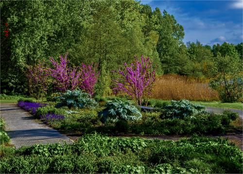
Bed with artichoke bushes
For better view please enlarge and click image >click downarrowLou, the image I'm seeing is very pixelated. I suspect that what should make the image work is a lush carpet of differing textures. The pixelation is messing up the textures so it is difficult to discuss the picture. I have tried your advice enlarge and then download. It helped a little but not enough.
-
@MikeFewster has written:
The photo was taken at the same huge sound a light show that I used last week.
mice.net.au/immersive-indigenous-art-experience-set-for-the-lume-at-mcec/
This is traditional Australian indigenous art on a huge scale. It needs the pumping sound here - a melding of traditional instruments and forms with electric rock.
