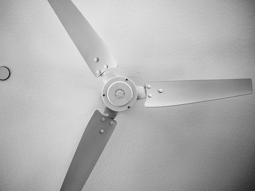
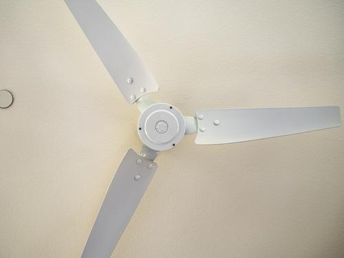
In looking at this, I'm also aware of the previous shots in your series. This one feels a bit obvious whereas in the earlier posts I felt you had directed my attention to something new in the everyday. Perhaps crop a little off the right hand edge? On this side we have a full length blade whereas the others have been sliced off with sharp angles.
-
-
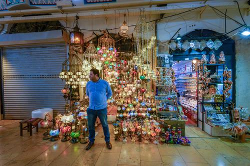
It brings back memories of a lot of expeditions to bazars with little shops like this. I love the man's pose. You have it exactly right - the air of patience, expectation and hope. Especially I like the angle of his head. He looks out of the frame for the customer who is yet to come. The shop next door may be closed but this man works at it. Nice contrast between the man and his alluring goods.
-
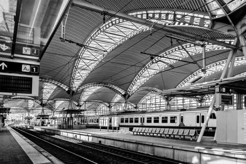
Line upon line upon line. The B&W image makes a feature of the sharpness of the lines.
In 1, the lines of the overhead wires and the roof are repeated again in the tracks. In 2 the roof arches fan out and anchor the lines. It couldn't be a bus station or port. Trains are all about lines and these shots make them the feature.. -
Mike said most of what I would have said.
I like train stations.
Antwerp and Liège-Guillemins are some of my favourites, for obvious reasons.
I've been to Leuven quite a few times (I studied there ages ago, when the new station was not yet there; I come there a few times every year; I spent a LOT of time there last year, shooting for a book), and I have visited this station often (and rode my bike through it via the elevated bike path).
But still you manage to give me a fresh look, like I have never been to this place before.
That is a great sign of your creativity in showing this location.
The B&W is an inspired choice. -
@MikeFewster has written:@Rich42 has written:
In my bedroom.
I like the tonal gradations.
Rich
In looking at this, I'm also aware of the previous shots in your series. This one feels a bit obvious whereas in the earlier posts I felt you had directed my attention to something new in the everyday. Perhaps crop a little off the right hand edge? On this side we have a full length blade whereas the others have been sliced off with sharp angles.
Chris and Mike, Thanks
I was hanging off the corner of the bed, looking up trying to line the shot up and get the camera directly under the center of the fan. I couldn't get any further away or get all the blades in the shot. My abdominal muscles were shaking with the effort it took to lever myself off the bed!
I thought about the cropping a lot, but left it as is, including the ceiling fire sprinkler.
It's a white fan against a white ceiling - naturally calling for B&W image treatment as you see it here. But the original image actually had a lot of color. The sun was setting. The porch outside the window was reflecting pink clouds onto the ceiling. But the fan blades didn't catch that light at all. I really didn't see that contrast until I processed the image. I wrestled with the B&W vs color decision for a long time.
Rich
-
@davidwien has written:
We should have a thread on interesting stations of the world!
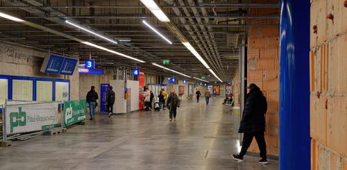
This is the underpass at Wien Meidling -- which, like everything in Vienna, is currently under re-construction, and which I show in all its gory technicolor detail.
As one can tell by the passengers' clothes, it was a beautiful sunny day here yesterday!
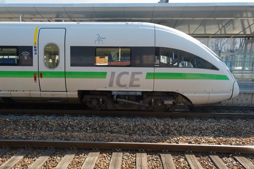
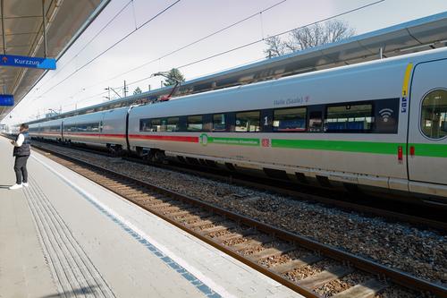
On Platform 5 we had a visit from a German Intercity Express (I couldnt get back far enough -- i.e. to the right, as my platform ran out -- to take the whole thing in one go!)
And the rest of it:
David
Railway stations are certainly worth a study. They run the full gamut from grandiose, steam punk, ultra modern to symbolic. Underground stations that reflect the location above are a genre of their own. Stations in films could be a collection too.
Number three is my pick here. The long converging lines of the station, the tracks, the overhead wires and the train all come together in one burst of movement. That train is stationary but suggests 200kmh. In this shot, I'd take out the man. He interrupts the smooth explosion of the lines. -
@RoelHendrickx has written:
EMMAÜS
On a visit to Saxonia and Silezia in north-east Germany and soutwest Poland a few years ago, we made our first stop in Dresden.
We rode bicycles (actually, quite heavy city bikes provided by our hotel; not really ideal for riding in the countryside...) along the Elbe from Dresden to Meissen.
Somewhere along the way, we came across this scene.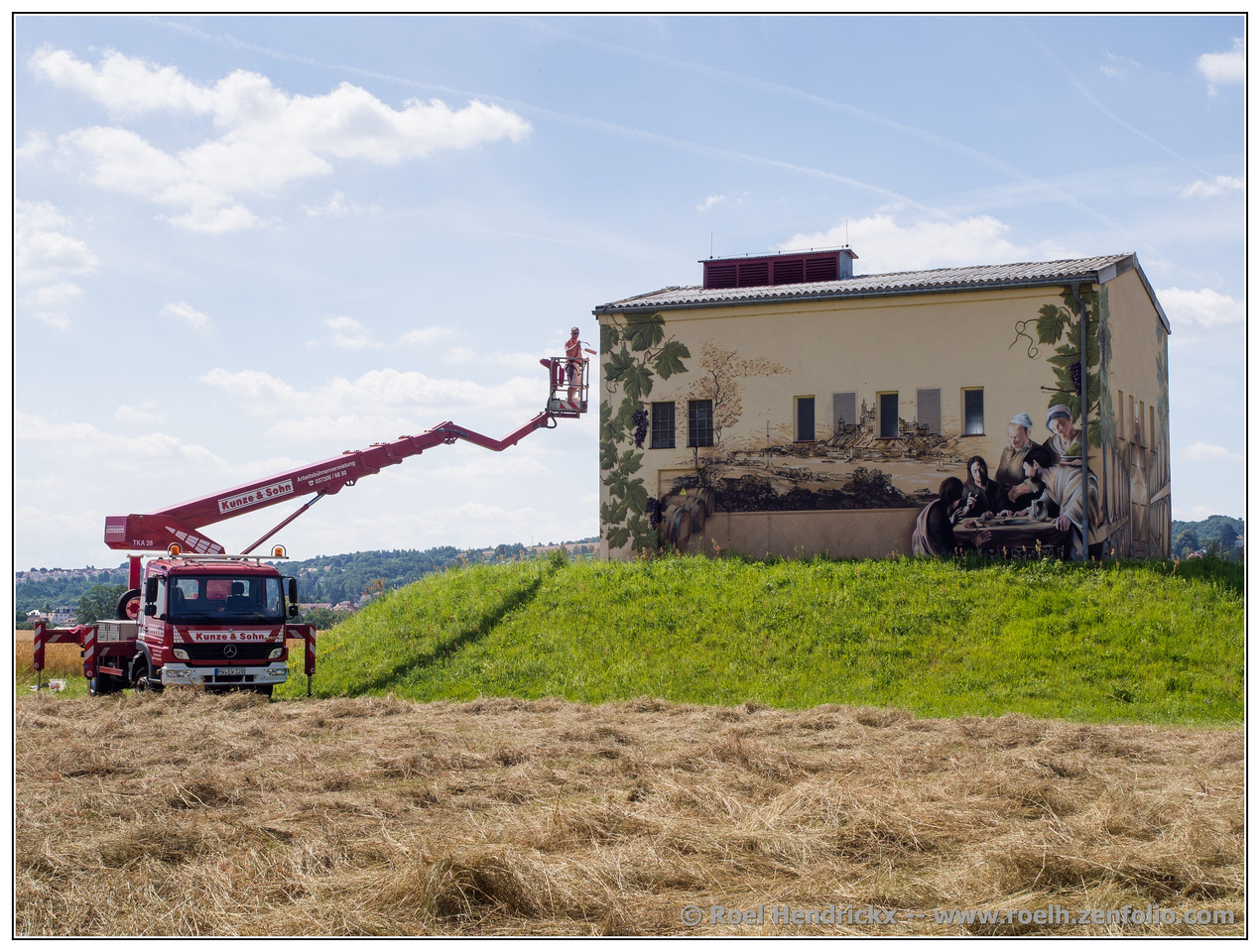
The artwork going up is quite a study - Mont St Michel? Supper at Emmaus? Wine-making? A cat in a trance? A pretty eclectic and fascinating set of topics. And of course the lift machine and its shadow provide leading lines to take us up from the corner entry to the structure. Good catch.
-
@ChrisOly has written:
Architectual Freedom
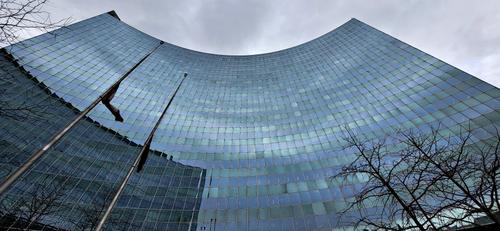
I was walking in Downtown Toronto recently and grabbed a quick shot of the Hydro building built in 1976. Must return when the weather is better.
That wide angle lens did quite a fine job for you here. Excellent architectural image with lines, curves and rectangles all obeying the rules of distortion you applied. The colors are wonderful - all those shades of blue as the sky is spread across the surface of the windows. Love the matched pairs of trees and flagpoles pointing to the same invisible vanishing point. Very nice work.
-
@Rich42 has written:
In my bedroom.
I like the tonal gradations.
Rich
I am glad I am not the only one who does things like this.
You've again found interest in the shapes and varying tonalities of an everyday object. I do think the monochrome conversion was the best choice here, just to let you make the most of the tonalities. The little half-widget along the left edge does bother me some, I probably would have removed it but I understand your choice.
Have you tried turning and fan on and using different shutter speeds? I got some weird outcomes with that when I played with it.
-
@Sagittarius has written:
Good catch. He looks ready and eager to present his sales pitch to the first prospect who wanders by.. good use of light and color and detail. Lots of glittery colorful stuff on display.
-
@LouHolland has written:
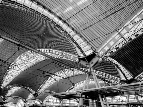
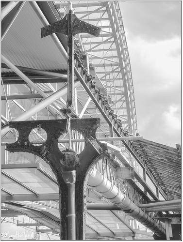
First two are train station Leuven - Belgium, Third one is a remnant of the former station.
This is quite a beautiful set of architectural images. The graceful curves of the structure are enhanced by the perfectly converted monochromes with the full range of well balanced tonalities and excellent detail. The third, though it is of a different architectural style, fits perfectly because of the choice of composition and the careful conversation. Just lovely. Well done.
-
@davidwien has written:
We should have a thread on interesting stations of the world!
This is the underpass at Wien Meidling -- which, like everything in Vienna, is currently under re-construction, and which I show in all its gory technicolor detail.
As one can tell by the passengers' clothes, it was a beautiful sunny day here yesterday!
On Platform 5 we had a visit from a German Intercity Express (I couldnt get back far enough -- i.e. to the right, as my platform ran out -- to take the whole thing in one go!)
And the rest of it:
David
Train stations are such fine subjects - always lots of leading lines, verticals/horizontals, interesting people, primary colors. A well composed series that illustrates the theme of movement.
-
@PeteS has written:
Tensions Running High
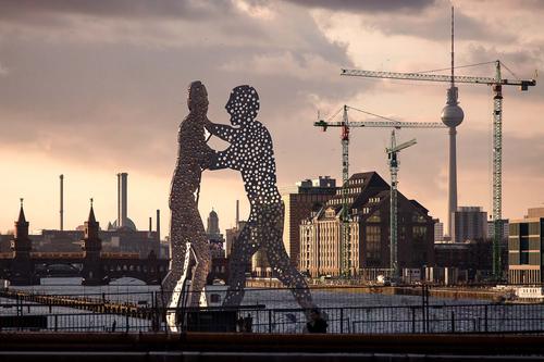
Jonathan Borofsky has created many versions of Molecule Man and this one is 30m (=100ft) high in Berlin.
The photo is 15 years old, but at last, with the help of Generative Fill in Photoshop, I have been able to remove a couple of annoying posts in the foreground, which I could not avoid whilst taking.Pete
You always find these thought provoking scenes! The two combative figures (already punched or shot full of holes, no less), is set just perfectly against the sunset sky. The towers, both construction and constructed, add to the scene but I can suspect that more of them would be too many, especially if they were on the left side of the frame. As they are, clustered on the right, they form a natural progression from left to right of small towers, pocked figures, then tall towers. The line of light down the leftmost figure and painting the front of the building add dimension to the scene. Really pleasing image.
-
@MikeFewster has written:
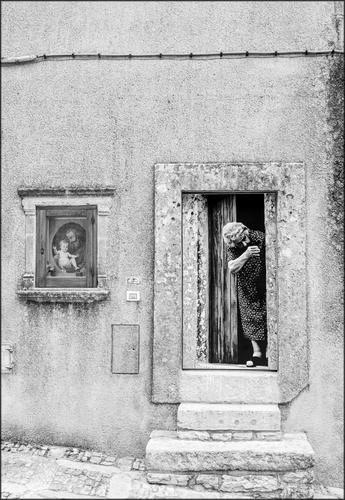
Icons
What a fascinating image! The lady emerges from an unusual doorway whose structure looks a bit like a tomb. The display to her left looks like a sort of religious shrine. The scene could be from another age, except for a few hints of electrical and other modern contrivances. There is not a discernible story here. The elements are as disconnected as the paintings on Roel's building. So we construct our own story around the character and props we have presented, which is a wonderful opportunity to participate in an artwork.
I am not sure why the darks around the lady are so very dark when there doesn't seem to be that level of contrast in the rest of the image. I wonder if lessening the blacks around her and the doorway would offer more balance and detail?? Especially around the face and those black spots that capture the eye along her side and feet, and the door.
Intriguing, and very artistic, image.
-
@minniev has written:@MikeFewster has written:
Icons
What a fascinating image! The lady emerges from an unusual doorway whose structure looks a bit like a tomb. The display to her left looks like a sort of religious shrine. The scene could be from another age, except for a few hints of electrical and other modern contrivances. There is not a discernible story here. The elements are as disconnected as the paintings on Roel's building. So we construct our own story around the character and props we have presented, which is a wonderful opportunity to participate in an artwork.
I am not sure why the darks around the lady are so very dark when there doesn't seem to be that level of contrast in the rest of the image. I wonder if lessening the blacks around her and the doorway would offer more balance and detail?? Especially around the face and those black spots that capture the eye along her side and feet, and the door.
Intriguing, and very artistic, image.
Close observation minniev re the contrast. I can't raise those shadows.
-
-
@MikeFewster has written:@minniev has written:@MikeFewster has written:
Icons
I will be very interested to see how many are following the conversations. Here's the real story of my photo and the contrast issue. The woman in the doorway was a photo itself. It neatly covered the entire door at the top of the steps.
minniev was sharply observant in picking up that something was odd in the tones.What a fascinating image! The lady emerges from an unusual doorway whose structure looks a bit like a tomb. The display to her left looks like a sort of religious shrine. The scene could be from another age, except for a few hints of electrical and other modern contrivances. There is not a discernible story here. The elements are as disconnected as the paintings on Roel's building. So we construct our own story around the character and props we have presented, which is a wonderful opportunity to participate in an artwork.
I am not sure why the darks around the lady are so very dark when there doesn't seem to be that level of contrast in the rest of the image. I wonder if lessening the blacks around her and the doorway would offer more balance and detail?? Especially around the face and those black spots that capture the eye along her side and feet, and the door.
Intriguing, and very artistic, image.
Close observation minniev re the contrast. I can't raise those shadows.
-
@Sagittarius has written:
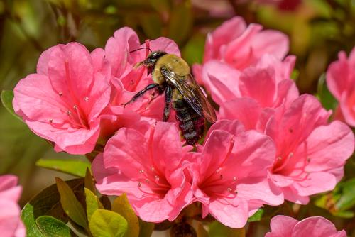
Lovely spring image. Glorious colors. We can clearly see all the little pollen dust, and it glows iridescent in the warm sunlight.
I wish my azaleas hadn't been killed by the combination of drought and freezes. I miss them. I've enjoyed taking pictures of them for so many years, until now. So your photo makes me both happy and sad. thanks for sharing.
