Blue
When I worked with color reversal (slide/transparency) film, one of our favorite techniques to increase saturation on a rainy day or in dimly-lit situations was to very slightly underexpose. The dark, underexposed slide contained a lot of saturated color dye in the shadows which could be "dug out" with over exposure during the drum scan. It was tricky. More than 1/3 to 1/2 stop too much under-exposure and the color just went muddy and grainy. When it worked it could really "pop," with brilliant color against an otherwise grayish scene.
Digital sensors don't work in the same way. They don't like under-exposure. There's no excess of saturated dye material from a chemical reversal process in the shadows waiting to be exploited by a bright drum scanner light. Under-exposure usually just looks drab.
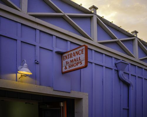
I made this exposure shortly after I had gotten my Fujifilm GFX 100S medium format camera. The lens is a Fuji GF 45/2.8 which I think is one of the greatest lenses the optical industry has ever made. I was just "test shooting."
The blue wall is in deep shadow as the sun is setting on the other side of the building and there is another building right behind my back, blocking skylight from that direction and adding gloom. The exposure is influenced a lot by the bright sky, so the shadows are really underexposed.
I'm amazed at how well I can dig color saturation and detail out of underexposure with the sensor of this camera. I like how the two spots of deeply-saturated red jump out and vibrate against the blue. And how the pool of yellow light from the overhead bulb and the sky tie together.
The "exposed construction" geometry of the wall just tops off the whole thing.
Rich