The pano is my favorite of the two. It has a cinematic look. The subject becomes the scene rather than the tourists, who are distant, small and utterly dwarfed by the landscape. rich pleasing colors.
-
-
-
-
The pano is my favourite of the two as well.
With the second photo, I focused on the surfer but unfortunately the DOF wasn't large enough to reach the stump in the foreground so it's a little too soft for my liking but not too bad.
-
@RoelHendrickx has written:@PeteS has written:
Time in Paris
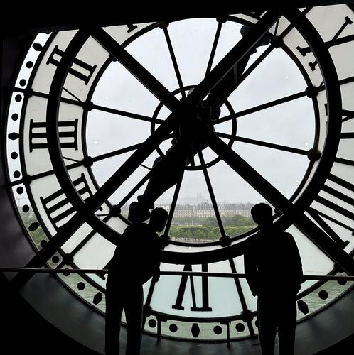
We are entertaining a Chinese visitor this week, so we did a Chinese style day-trip to Paris. Leaving by train at 5am and getting back home at 1am gave us 11 hours in a rainy Paris, but it was good fun, even if was only a short time. The photo was taken from the Musée d‘Orsay, famous for its collection of impressionist paintings, towards a shadowy Sacre Coeur Basilika on the hill in the distance.
Pete
This is straight out of Harold Lloyd, or straight out of the underrated Scorsese movie "Hugo".
Reconsidering I feel like I must add that the image is also very suitable to represent the time pressure of your “if it is Tuesday this must be Paris” style visit.
-
@minniev has written:
Portrait of My Friend Sadie.
When we got to the country house last Thursday, Sadie was here. She bounded to meet us, cried to get into the house, chewed up our shoes and garden tools, badgered our lazy old lab Zeke. We had never seen her around before, and we could not find anyone in this tiny town of 100 who had either. No luck searching for her owner with all the usual methods, so yesterday when a family said they wanted her, we took her to meet them. I shed a few tears letting her go, but she's gonna be the size of a small horse, and her new family is young, fit, and as full of energy as Sadie. So our dizzying week of puppy love ended, and all I have is the pictures. Her new family sent me a video of her lying on their sofa gnawing a big rawhide bone, living her best life.
Reminds me that our first dog arrived almost starving.
He was with us for 10 years and we still remember him today.
I'm happy that the dog found a good new home.
Beautiful photo and a touching story. -
@RoelHendrickx has written:
STILL ALIVE IN ROME
Further to the image shown last week, here is another from that series, depicting a scene a bit earlier, with Julius Caesar in the Senate, being lauded and criticized and unaware of what fate awaits him just minutes later.
I was in the same position as for the later images (crouching low, close to the scene) and was confronted with pretty hard backlighting, so I had to try and turn those circumstances into an asset.
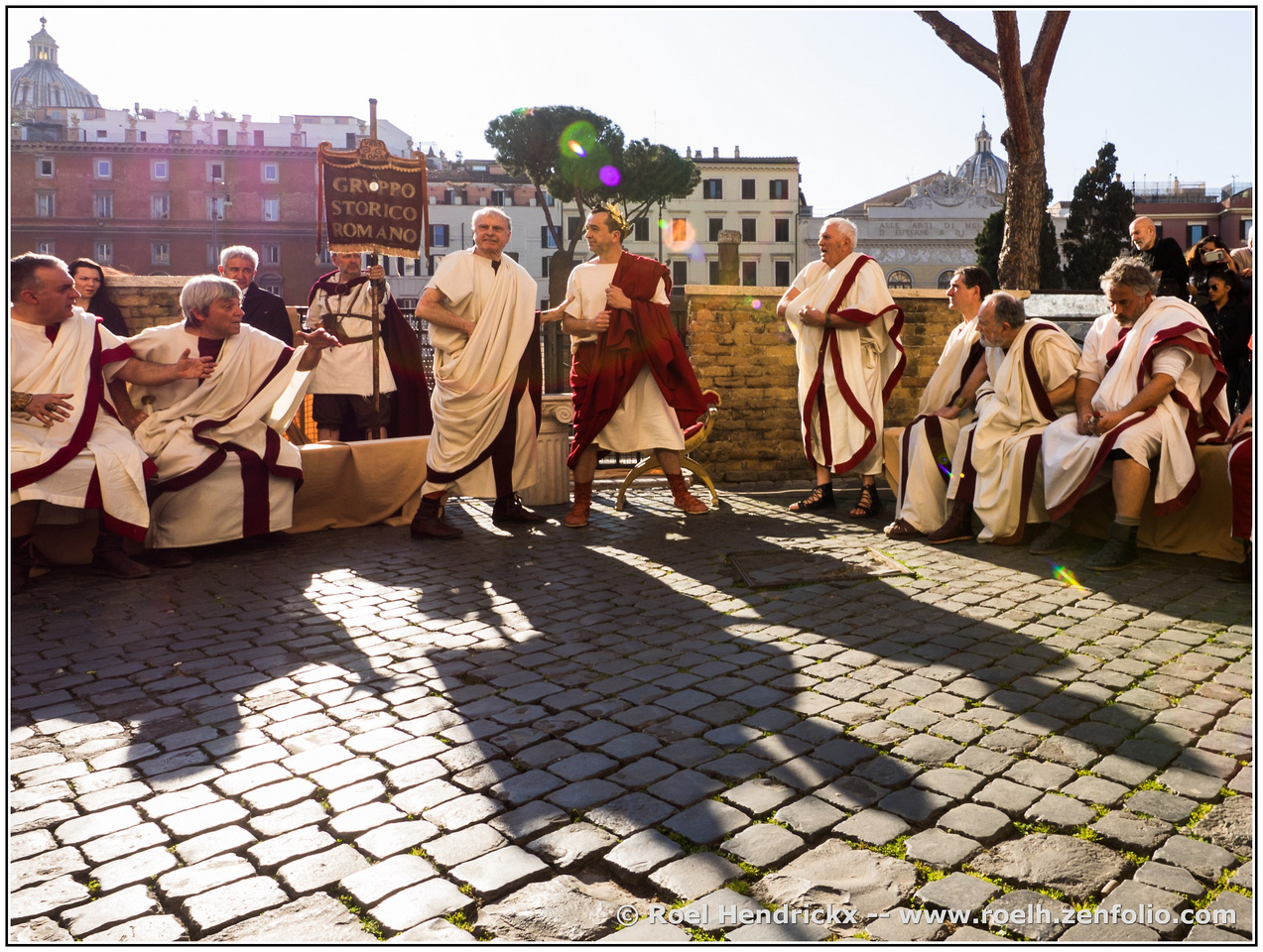
You dealt with the awkward backlighting well, without blocking up the shadows or burning out the highlights and with the actors nicely exposed. The long shadows are great leading lines, ably assisted by the cobble stones, whose texture also add interest to the foreground and prevent it becoming a blank space. Again, the internal reflection of the lens places coloured baubles of light above the main character, helping him stand out. So what‘s not to like? Nothing, it is just fine. The only problem is that we saw this photo’s younger brother last week, and it had drama, which took it to another level, which makes this photo pale slightly in comparison.
Pete
-
@MikeFewster has written:@RoelHendrickx has written:@MikeFewster has written:
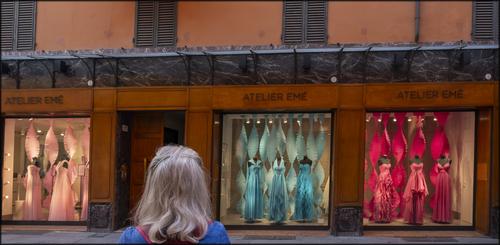
Temptations.
I really like this image because of what it shows and implies: the grey-haired woman contemplating a life in which these colourful glamour dresses are an option.
The uni-colour in every window is efficient in bringing the message across, much more so than when every window would have included dresses in different colours. Now there are four very clear colour segments, one of which is grey.
The only thing that would have made this image even more appealing, would have been a slight step to the right, in order to more completely frame the head within the natural frame of the door, and then a slightly wider crop, leaving room for a perspective correction that made all the squares more perfectly square.
Or maybe not.
Maybe imperfection is part of the message here.Nope, imperfection certainly wasn't part of the intention here. I agree with all your framing comments. A slight step to the right would have been desirable to better frame the head however it would have created more problems. I was already skewed to the right somewhat and this resulted in all sorts of perspective issues with the window squares and the angle of the verandah. There is quite a bit of space around the edges in the original to play with and I spent considerable time trying to get the rectangles and horizontals looking right. This is as good as I could manage. I'm not good at perspective corrections and I think a better job is almost certainly possible, especially if generative fill is used.
I really like the image as it is, and agree with Roel that the uni-colour window dressings and their lighting are extremely beneficial, and the colours go so well with the walls. I also agree with Roel, that a step to make the woman’s head part of a more symmetrical pattern would be beneficial, and also with Minnie, that the geometry of the windows still look a bit strange.
Pete
-
@MikeFewster has written:@Rich42 has written:
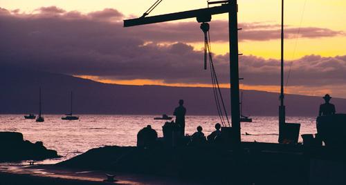
Lahaina, Maui, HI, from the wharf in front of the Pioneer Inn and the Banyan tree looking toward Lanai in much happier times, long before the fire.
Everyone stops for sunsets in Hawaii. They are almost always spectacular. But the real beauty and unpredictable, amazing colors develop in the clouds, the sky and the water in the 30 to 60 minutes after the sun has dipped below the horizon.
Rich
While the sunset gives the eyecatching colour, it's the photographer who has done the work that makes the composition work. Careful positioning of the boom frames the key parts of the image and adds an important foreground horizontal line to the many horizontal lines of the clouds, hills and bright strip of ocean. The little inlet of bright water, bottom left, breaks up what would otherwise have been a large and boring foreground shadow.
Add the cluster of vertical identifiably human shapes to the structural vertical lines.
Beautifully done.As you mention in your text, everyone enjoys a good sunset, especially photographers, which means that we are so inundated with photos of them, that our reaction tends to be “oh, not another one”, which is unfortunate. However, this photo doesn’t cause that reaction, because it is not just about the sunset itself. There are silhouetted figures and “things” to be discovered on the quay.
In terms of composition, it turns out that Mike has already said everything I wanted to say and more. So thanks, Mike, for the writing my comments, and thanks, Rich, for taking the photo.Pete
-
@ChrisOly has written:
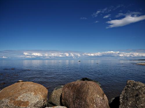
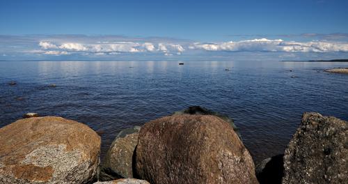
Touring Georgian Bay area in Ontario I came across this site. Reflections in the water drew my attention immediately. Point and shoot and the image was generated...
This is a nice scene, which is all about the interplay between the row of fine boulders in the foreground and those lovely clouds on the horizon. The cloud in the top right corner is lovely, but that is the problem - it distracts from the main subjects. You could remove this distraction simply by cropping, such as I have done below, or with more sky, to leave a panorama format, but you could even crop some off the left and right too, if you wanted to retain the original format.
I see what Mike means about the sharpness of the boulders and choice of aperture, but it doesn’t bother me much, probably because I am viewing on a tablet at the moment. In any case, you could probably fix that in PP such as Topaz, if so inclined.Pete
-
@minniev has written:@Kumsal has written:
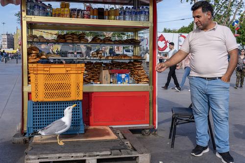
Daily visitor.
What a fun shot! Great primary colors, an interesting story, and a subtle leading line that starts at the birds tail and continues through the man's arm. We know he is coaxing the bird but we can't see what he has, if anything. Perhaps it is a trick. Perhaps it is a piece of one of the bakery items and he's sampled one before. The man's hand also seems to be nudging the edge of the shelf that serves as a frame for the bird. Interesting and entertaining image.
I agree with Minnie, that this is enjoyable, and also with her observation about the line connecting gull and man and the primary colours.
The crop is very tight, which focuses attention on the important parts of the image, however, it feels a bit cramped, so if a crop is available giving a bit more breathing room, without introducing distractions, then it might be worth a try.Pete
-
@DanHasLeftForum has written:
This is a Photoshop Elements stitched panorama of Merimbula Beach, mid Autumn (about 20C). Merimbula is a very popular town/village (especially during the summer months) on the New South Wales coast, Australia.

And this is looking in the other direction.
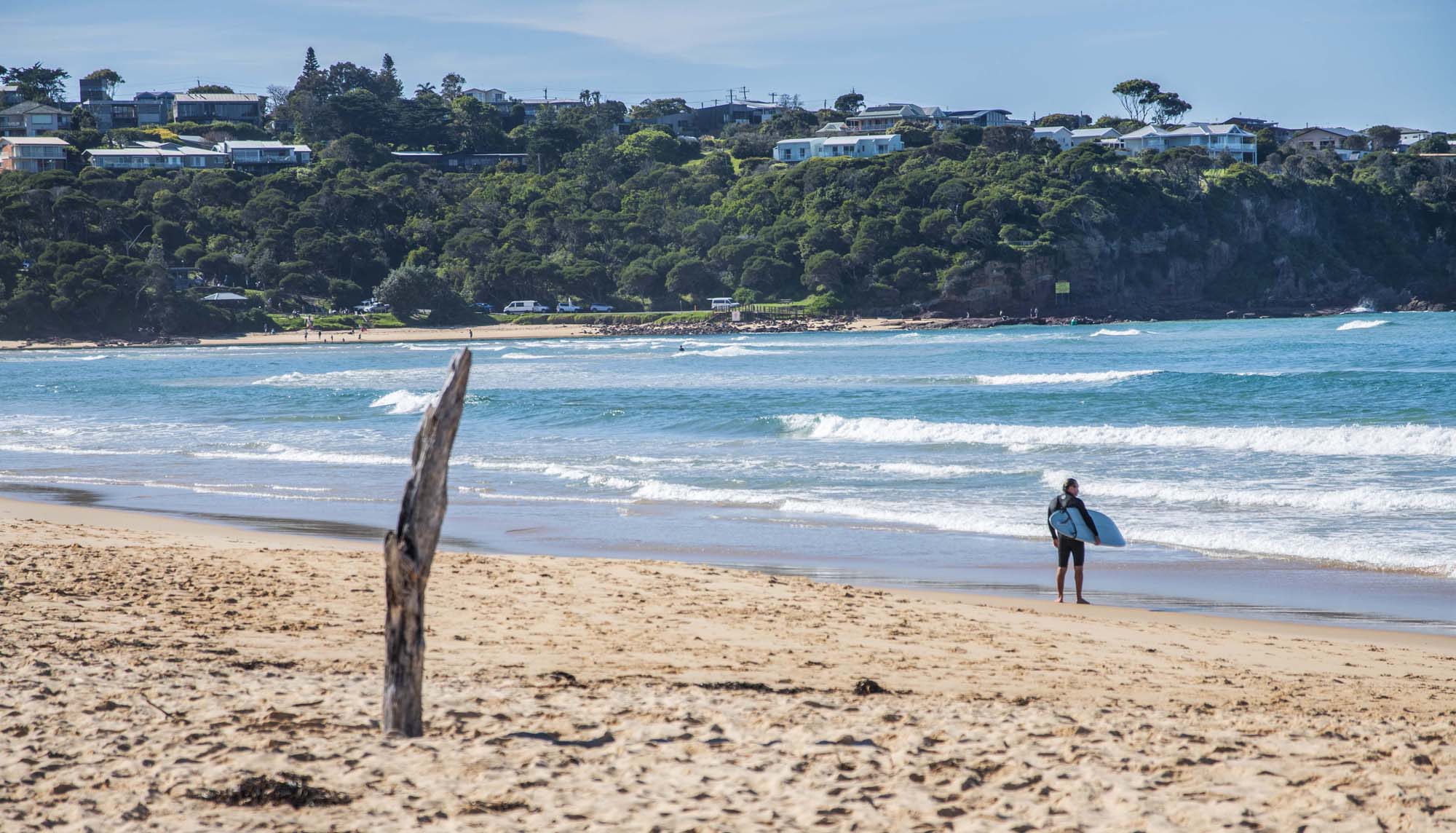
That’s a lovely beach and I like your idea of showing the view in both directions. The panorama shows a vast area of sand, sea and sky, with little human interference apart from the humans themselves. The other direction is almost urban, and the different format emphasises the more closed in feeling.
The problem with the tighter view is the dead tree, which is demanding attention centre stage, but is not sharp enough to warrant it.
Panoramas featuring waves are difficult to pull off, since the waves move and change shape between the individual photos, making it difficult to conceal joins and have convincing lines of waves, but the stitching software has done a good job. Or maybe you did, by selecting images, which had similar waves in similar places.Pete
-
@minniev has written:
Portrait of My Friend Sadie.
When we got to the country house last Thursday, Sadie was here. She bounded to meet us, cried to get into the house, chewed up our shoes and garden tools, badgered our lazy old lab Zeke. We had never seen her around before, and we could not find anyone in this tiny town of 100 who had either. No luck searching for her owner with all the usual methods, so yesterday when a family said they wanted her, we took her to meet them. I shed a few tears letting her go, but she's gonna be the size of a small horse, and her new family is young, fit, and as full of energy as Sadie. So our dizzying week of puppy love ended, and all I have is the pictures. Her new family sent me a video of her lying on their sofa gnawing a big rawhide bone, living her best life.
This is a lovely portrait of the dog, and fits perfectly with the story you tell.
Pete
-
@RoelHendrickx has written:@RoelHendrickx has written:@PeteS has written:
Time in Paris
We are entertaining a Chinese visitor this week, so we did a Chinese style day-trip to Paris. Leaving by train at 5am and getting back home at 1am gave us 11 hours in a rainy Paris, but it was good fun, even if was only a short time. The photo was taken from the Musée d‘Orsay, famous for its collection of impressionist paintings, towards a shadowy Sacre Coeur Basilika on the hill in the distance.
Pete
This is straight out of Harold Lloyd, or straight out of the underrated Scorsese movie "Hugo".
Reconsidering I feel like I must add that the image is also very suitable to represent the time pressure of your “if it is Tuesday this must be Paris” style visit.
I am glad you feel that, as it was what I was thinking when I took it. The time looms ever present, and the tourists bend to see a small slice of Paris, which can only be a dimly lit impression.
I was lucky with the people in this photo. Firstly there are only two of them, and secondly their posture, leaning in towards the distant scene. I have other attempts, but they were with many people in family group pose, or individuals in selfie mode.Pete
-
@PeteS has written:@MikeFewster has written:@Rich42 has written:
Lahaina, Maui, HI, from the wharf in front of the Pioneer Inn and the Banyan tree looking toward Lanai in much happier times, long before the fire.
Everyone stops for sunsets in Hawaii. They are almost always spectacular. But the real beauty and unpredictable, amazing colors develop in the clouds, the sky and the water in the 30 to 60 minutes after the sun has dipped below the horizon.
Rich
While the sunset gives the eyecatching colour, it's the photographer who has done the work that makes the composition work. Careful positioning of the boom frames the key parts of the image and adds an important foreground horizontal line to the many horizontal lines of the clouds, hills and bright strip of ocean. The little inlet of bright water, bottom left, breaks up what would otherwise have been a large and boring foreground shadow.
Add the cluster of vertical identifiably human shapes to the structural vertical lines.
Beautifully done.As you mention in your text, everyone enjoys a good sunset, especially photographers, which means that we are so inundated with photos of them, that our reaction tends to be “oh, not another one”, which is unfortunate. However, this photo doesn’t cause that reaction, because it is not just about the sunset itself. There are silhouetted figures and “things” to be discovered on the quay.
In terms of composition, it turns out that Mike has already said everything I wanted to say and more. So thanks, Mike, for the writing my comments, and thanks, Rich, for taking the photo.Pete
Thanks so much for the comments, Pete, and everyone else.
Actually, I didn't say that "everyone enjoys a good sunset." I said that in Hawaii, "everyone stops for sunsets." Literally.
Actually "everyone" refers only to tourists. Locals don't.
But in the "tourist areas" individuals and crowds actually stop what they're doing and stand transfixed during the final moments of the sun "touching" the horizon, then setting into the Pacific Ocean. ("Did you see the Green Flash?!")
Some actually applaud. Really!
Many stay utterly transfixed, as in the image, motionless, (even the guy in the water on a paddle board) dreamily watching the real colors develop for the next hour or so. Until dark. That would be me.
Rich

