A model who knows what they are doing. Beautifully posed to display plumage details and textures plus the head, beak and eye.
June 5, 2024
69
-

-

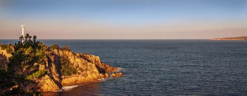
Taking a nice relaxing stroll early one morning along Quarantine Bay, Eden, Australia
-
Golden browns and blues are always a luscious and appealing combination as they are here.
When I looked at this at larger size, I enjoyed the rock and foliage textures and the lighthouse details of the promontory on the left. I'd consider a version that took a little off the top to strengthen the left right visual movement and help the connection to promontory with matching colours on the right. This would weaken the blues at the top and they balance with the blues at the bottom so if this was done, I'd darken the remaining sky at the top to bring it back to similar tones to the original. -
Thank you Mike.
Feel free to experiment with the photo.
-
This is a very quick and dirty edit. I haven't got the blue tone in the sky right but the format is about what I had in mind.
-

Excellent! The presented photo is Compositionally quite wonderful with the subject right in the middle but the building he's scaling set just off center in a variation on a rule of thirds format. Equally engaging compositional feature: the variation in the heights of the 3 policemen perfectly correspond to the heights of the buildings. You've created a sense of us as viewers moving behind them. The supporting photos add context to the story, but the first one stands alone.
It's also one of those photos I wouldn't be able to resist playing with to take a version of it into the fantasy range.
-
Definitely worth the "grab". It's interesting, it has compositional impact, and it makes us stop and look again to figure out what's going on. Why is the football airborne? Who launched it? It takes a second look to track it down. My first impression is that the two poles are playing pong or dodgeball against the humans but I have an overactive imagination anyway. Yes, you are right that the capture details aren't great. I might try conversion to monochrome or try some software filter that emulates old film on it. Reducing the photo more to the human and non human figures might emphasize what's fascinating about it - shape, line and story.
-
Another example of your gift for finding interesting stories in museums by singling out the interactions and connections between displayed objects and museum visitor. This one has the extra benefit of a captivating color contrast between the rich oranges and more subtle blue/greens.
-
Fine study of this single hat among many hats, wonderfully captured. It takes a lot of skill and good knowledge of one's equipment to capture something as complex as a cowboy hat, with all its intricacies and planes, and keep its essentials in focus while allowing the surrounding equally complex hats to defocus. Nice bokeh and color separation too. The clarify of the turquoise bauble gives us a point of visual focus, and the subtle diagonal flow guides our eyes from there. Excellent.
-
Another image that relies heavily on line (sometimes we have weeks where our posts look like we've announced a theme in advance). Here, the diagonals begin on the left and fan out in a sunburst shape. Even the circular tires form a diagonal of their own. We sense the movement of the humans in the same diagonal pattern. Even the bird is following the flow, establishing another line in the sky with his presumed flight pattern. Though there is no movement, we sense it in the photograph. Interesting image to think through, figuring out why it works.
-
A lovely bird portrait. Good detail in nice light. Bird is isolated on his (diagonal) branch, posing for a profile portrait. There is detail in every feather, and a catchlight in that shiny eye. The colors are beautifully rendered. There is a lot to love about this textbook image. His face is a bit shadowed by the angle of the light but I don't find it at all bothersome and trying to do more with the light in post would probably give it an unnatural look. Very nice. Enjoy your new toy and show us more of these wonderful Aussie birds that some of us will never see. You are off to a great start with it!
-
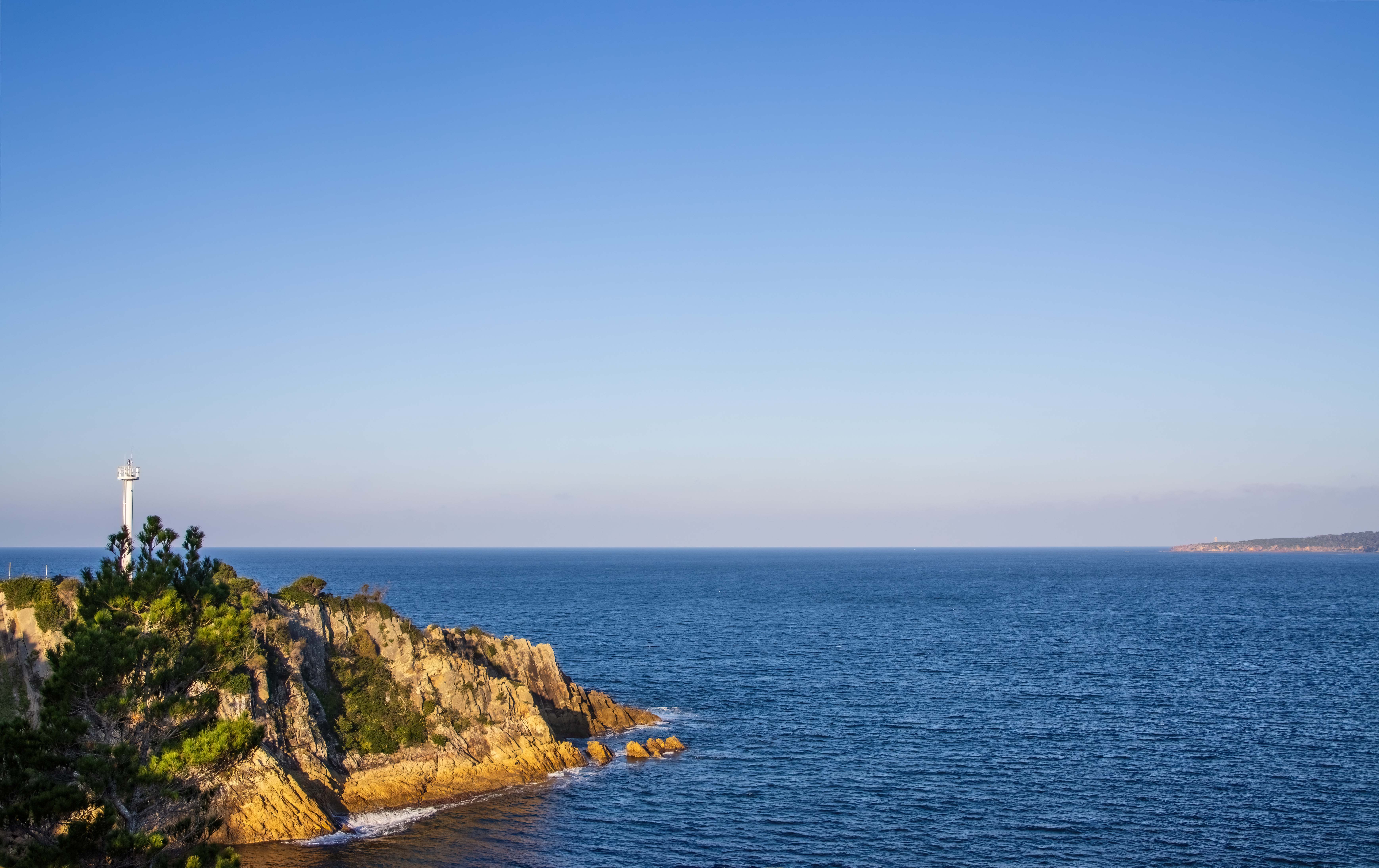
You've made the most of the nice rich golden-hour light and created a pleasing image even though you were not gifted the dramatic clouds usually associated with such light. The single white vertical shaft of the light interrupts the horizontal lines of sea, land and color, giving a bit of punctuation to the composition. I like Mike's crop to make even more of that visual interruption.
-

I’ll send you the JPG and the RAW.
I will!BTW : as for “a sense of us as viewers moving behind them” : that was exactly what I wanted to achieve AND also exactly what I did.
After getting some shots of the balloon sculpture as such (like the ones shown for context), I was walking back to my bicycle in order to head home when I crossed the three policemen walking in the other direction, so I immediately did a 180 and started stalking them, waiting for the opportunity to get the shot I already had in my mind.
This came close.
I also envisaged a more compressed shot bringing the coppers and the gorilla even closer, but that would have required getting closer and lower, AND i would have lost identifying our Antwerp architectural icon.
The closeups are OK, but the building could have been any building, even something irrelevant like, say, the Empire State Building.
-

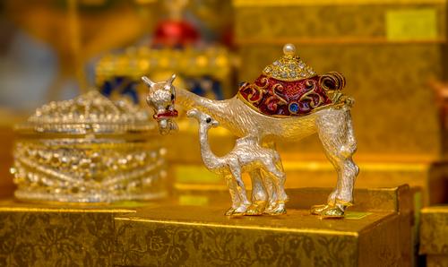
Camel
-
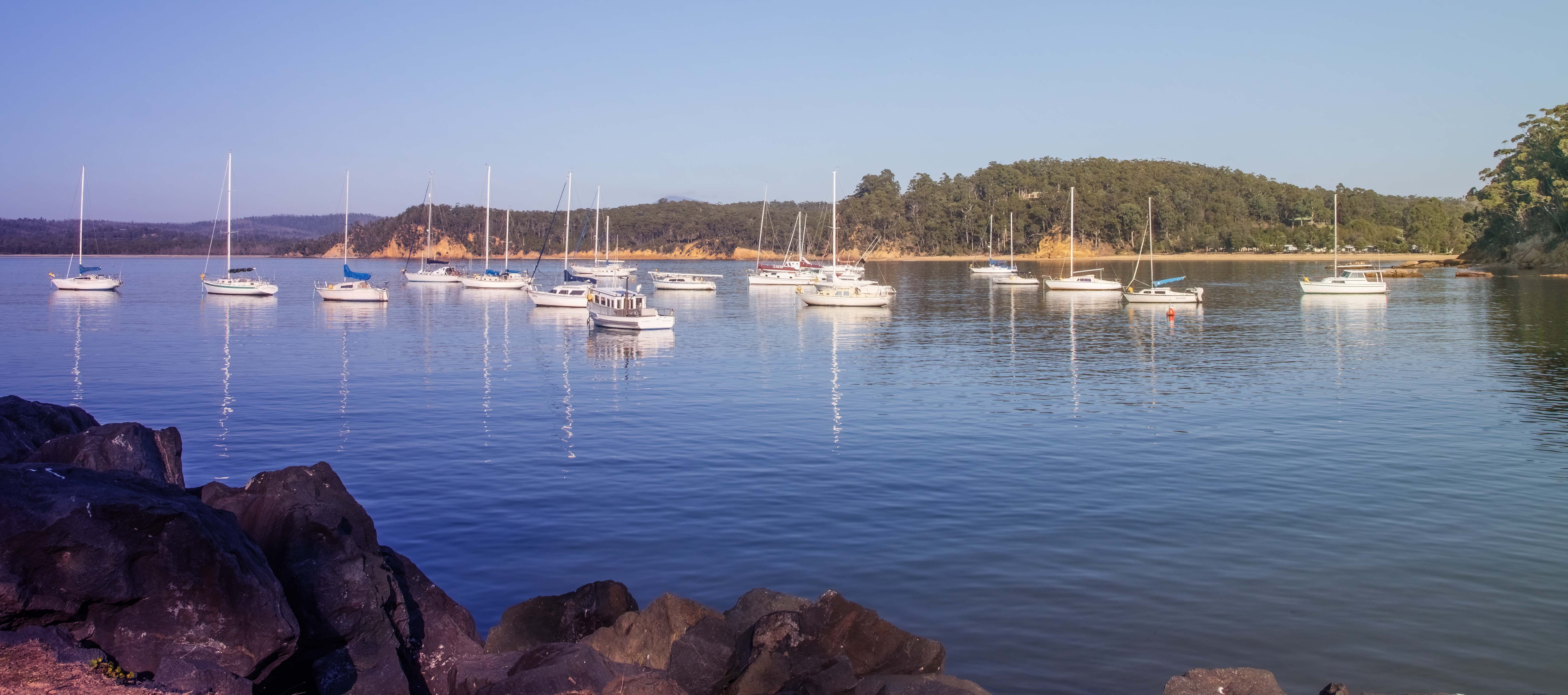
That crop looks interesting and I'm still tossing up whether I prefer the original or the cropped version.
In the original I deliberately placed the horizon on the bottom 1/3rd horizontal to include more of the sky even though it is cloudless. There is no right or wrong answer in situations like this. The final image largely comes down to personal taste and style.
-
Thank you. I am glad you like the image but just to be clear, the "golden hour light" is artificial and part of my attempt to create a digital art version.
My normal workflow is to create a documentary version from the raw file and where an image particularly interests me, I try to create a nice looking digital art version as well.
Fwiw, below is the original "documentary" version from the raw file.
-

The light is an important factor in this photo and well done for experimenting with extra-golden hour, although actually the original light is also very attractive. In the version you posted, I think the water needs to be a bit more blue, with less of the added gold.
The composition is unusual, with the visual weight of the land in the bottom corner counterbalanced by a sliver of land on the right of the horizon. (Interestingly I was convinced the horizon was not straight and was lower on the left, however, it is straight and maybe it was an optical illusion as a result of the left side looking heavier.) In any case it works surprisingly well, and the open space of sky and water it leaves gives a sense of the vastness of the lake. This would be a point in favour of leaving the crop as posted, although Mike‘s crop has its merits too. The sense of space may be reduced, but the crop results in a more balanced image.Pete
-
A bejewelled camel may be the centre of attention, but the real jewel is the seemingly real, but, of course, inanimate affection shown by the adult camel to the offspring. Having all that golden opulence out of focus in the background is a great way to set off the silver camels.
Pete