Zebra mobile! Your excellent eye caught something most of us would have missed and captured it in a way that made it into art. The slash of bright red is transformative in making this image super impactful, and the dizzying swirls carry our eyes around the frame and it almost refuses to release us. Intriguing.
June 12, 2024
63
-

-

That strange thing on his head was his hair.
I don't recall if it was real hair or a little glue-on wig (I think the latter).
There was a routine during the show, IIRC, where he dressed up as a giant baby with an oversized diaper and other paraphernalia, and that little curl of hair tied in with that routine. Memory is a bit foggy by now. -
Yes questions...
He moved his rear and the shutter was way too slow to freeze him. I liked the pic because he kept his head still which is often where motion blur happens.
The "unattached foot" is something that could have been edited out. It's actually an odd bit of growth out of the small branch. I started to wonder if he had lost a leg, but I suspect his other leg is hidden by his body. Below is another view. -
My first reaction to what you have done to this photo was that it looks faked and is boring. My second reaction, having compared it with the original is the same, but even stronger. You have killed the impact of the original.
The original is much better and stronger, despite the obvious “flaws”. Even Beethoven got away with breaking the “rules” of counterpoint!
David
-
I agree with you; but none of the unavoidable “disadvantages” bothers me in the slightest! An excellent photo, Mike!
David
-

Clearly the impact the original has on you is different to the impact it has on me and some other members here.
You are entitled to your opinion just like I and everyone else is but I still disagree with you for the same reasons posted earlier.
Maybe you need to go back to the OP and refresh your memory of the criteria the op has laid out for this thread.
This one in particular 😀
If you need to be taken seriously, have a go at explaining how my post, in your opinion, was against the op's criteria.
-

This is where I get very frustrated with the flat view forum. It is impossible to have a discussion with several people with different views and bring it all together. Everyone has to be reading all the threads that are scattered all over the place and then pick out how the comments relate to each other.
Here's my attempt to take out those objects on the right. Full marks to the sharp eyes of Pete who noted the irregularities on the frame on the right and deduced that I'd probably already had a crude go at cleaning up this edge.
This version is even cruder. I spent some time on it and tried to use the new object replacement, content aware replace tools. It didn't work well. I then tried to repair the damaged areas and blend them in. That didn't work well either. This kind of major change to an image isn't something I do often and I'm clearly not good at it. I'm sure that many others could do this seamlessly.
Of course, I understand the reactions to the pole and the items on the table but I wouldn't want to change them, just the bits on the right.
-
These are a bit frustrating. I wanted to view them larger to take in the subtleties of the varying degrees of sharpness but I couldn't get them to enlarge.
Traveling with a circus would be a dream opportunity to be grabbed with both hands and all cameras. Using extreme dof to bring out divisions between life and performance is full of possibilities.
Especially, I wanted to see more of 3 where the dof is being used to create the moment between the performer and the waiting stage. What I feel I am looking at is the reality of the stage that waits for the performer. He stands confronting that moment of truth. The sharper stage area v the less focused performer outline is a wonderful and meaningful inversion of the usual where the individual is expected to be in focus.
PS. This is another forum discussion where I am finding then flat view structure limiting. -
In Australia we have many art sites where similar feelings regarding cultural meeting are being expressed. What I find particularly interesting here is the similarity between the Australian and Canadian art responses. I guess circles, places to sit and openness to the sky have universal connotations. Poles are significant in Australia indigenous art as well, especially in the top end region.
At first I felt that the structure should take up more of the image but I have changed my mind. Keeping it relatively small allows the cloud plenty of space to add a statement about the scale of human matters in the scheme of things. It works. -
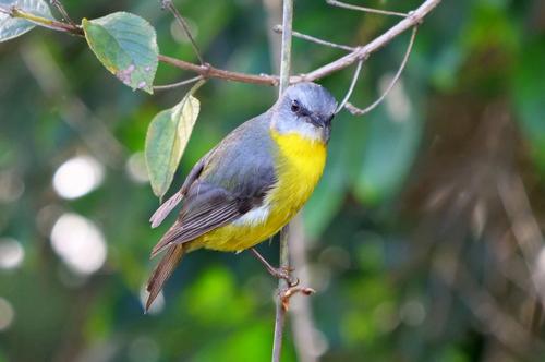
I'm biased because I'm very fond of Eastern Yellow Robins. They are super cute and very welcoming to humans who dig up garden beds for them. A pair of them used to perch near me, or on my hand, whenever I began gardening. They looked at me quizzically just as yours seems to be doing.
The crossing twigs give a focus point alongside the eye plus fine lines that are proportionally right with the legs.
The tiny piece of twig that resembles another foot in an amusing touch that I feel should be left in. It encourages and rewards closer study. -
Seascapes and green foliage are difficult to work with, especially on calm days. They need sunshine to make them pop. If, however, the photographer tries to compensate for what the weather has dished up by adjusting the tones and adding contrast, the result can look artificial.
Looking at this as large as I could get it, I thought that the central terraced area with what I think are olive trees, became the most interesting section. The distinctive individual trees gives texture. The shot has plenty of sharpness and detail. I'd consider enlarging the central area and using the interest in the details there to compensate for the flat lighting. -
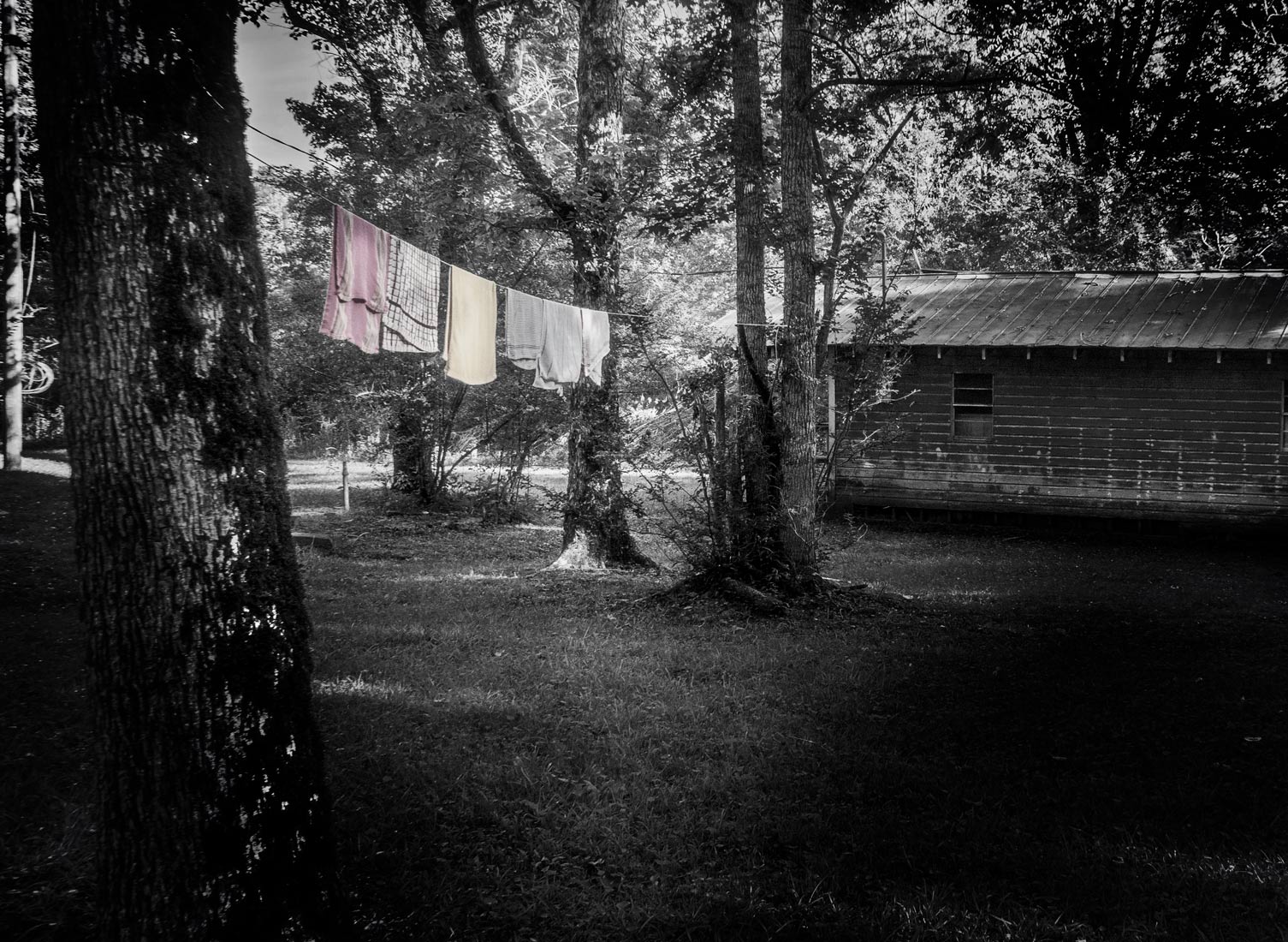
Sometimes you, but not necessarily everyone, have to have colour. B&W would not have worked here for everyone. Interesting because the red and yellow towels make up a very small area of the image but they possibly lift everything or somethings. They give the line (pun alert) that connects the foreground tree to the cabin. They bring life and meaning but not necessarily for everyone. The place lives but not necessarily for everyone. Subconsciously we but not necessarily everyone fill in and generate questions possibly about the people who perhaps live here. The colours, being bright, make us but not necessarily everyone, feel good about them or something .
-
Before you edited your post you posted: (people can see previous versions of posts by clicking the 'edited x times' link in a post)
Just out of curiosity, who are the "we" and "us" you refer to?
Having an opinion and expressing it is good especially if done constructively but trying to speak on everyone else's behalf as you seem to be doing here is just nonsense.
I wasn't going to comment on the photo at all but since some people might justifiably assume you are including me in your opinion I need to set the record straight.
Personally, I see the photo as an uninspiring snapshot. Imo B&W would have worked better giving the scene a nostalgic look and more interest.
You shouldn't assume everyone "sees" or interprets photos the same way as you do.
This version works much better for me because it takes away the "clutter" in the scene due to the colours but a hint of the original colours in the tea towels helps to highlight them as the subject.
It appears you edited your post after you saw this post.
-
I did. Thank you for clarifying the matter for those who may not have seen my first post.
-
Eye popping. I can't recall seeing a reflection break up anything like that on a vehicle. A zebra crossing crossed with something from the 1960s.
A good catch. -
Bright is famous for the Autumn colours of the main street. You may have picked up some of that colour here or the red glow might be entirely from the low angle sun. It doesn't matter. The result is dramatic and made even more so by the dark framing mountains, sky and foreground.
An atmospheric panorama. -
Not quite but yes, this stitched panorama was shot in mid Autumn with the sun low and to the right, so the colours of the leaves were close to their best for that time of year.
I posted in another thread (or maybe it was earlier in this one; I can't remember) that my normal workflow is to first create a documentary version of what I saw and then where appropriate experiment with creating a digital art version. The above is the "artistic" version with the red glow being artificial.
Below is the documentary version being pretty much what I saw at the time.
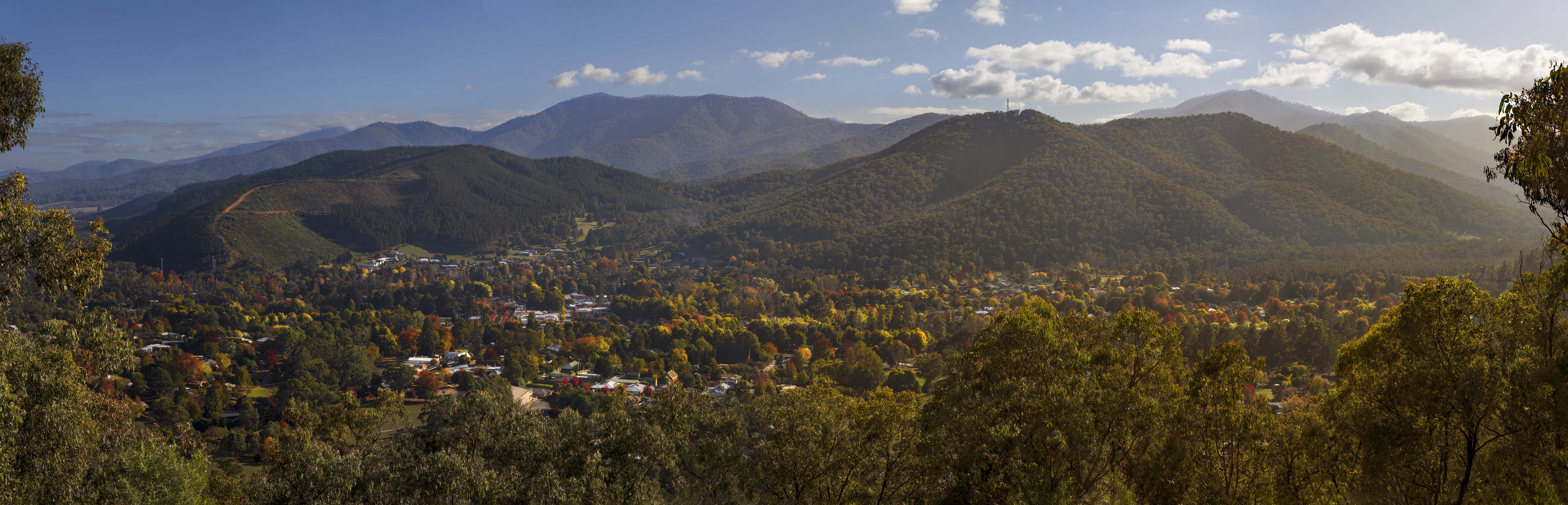
"Drama" and "atmosphere" in a sort of night scene is exactly what I was aiming for with this "artistic" version. 👍
-
Drop acid and you might see this without a mirror. (not that I would know; I am a drug-sissy)
Very cool effect. It's amazing what light will do if you let it.