• Members 663 posts
    June 21, 2024, 1:46 a.m.

    I disagree that "stretching" the image, as described above, should be done only in 16 bit mode. Yes, those types of edits ideally should be done in 16 bit mode where possible to reduce the risk of posterization or banding but very often they can be done successfully in 8 bit mode without visually impacting the image quality in "normal" viewing situations.

    It really also depends to a large extent on the nature and content of the image and how much "stretching" is applied. More often than not small amounts of "stretching" the image in 8 bit mode will be undetectable in "normal" viewing situations.

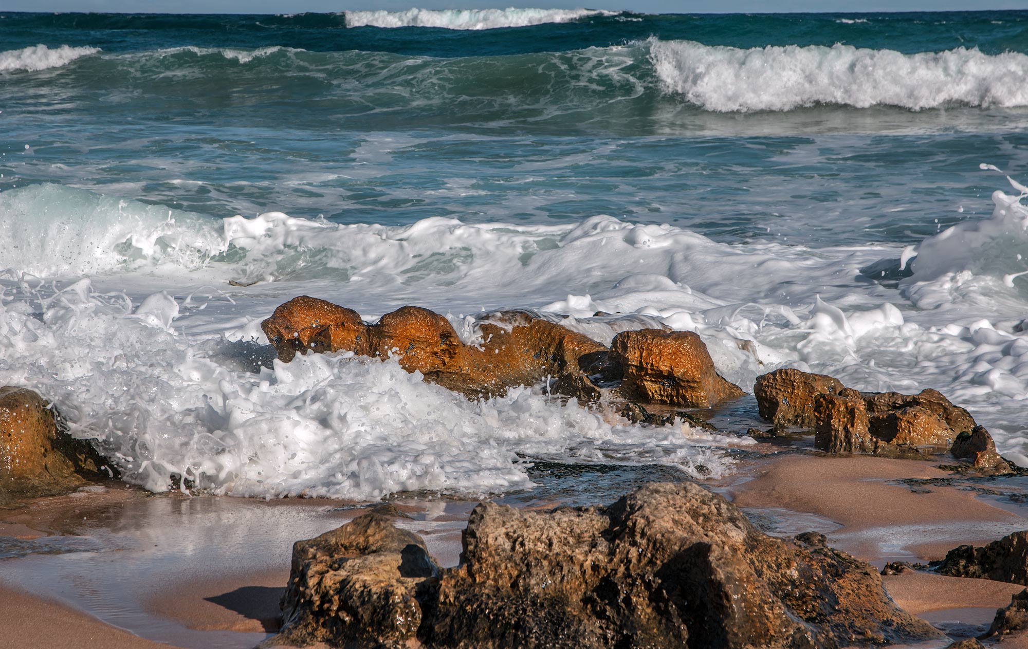
    If you see any posterization or banding in the edited version (done in 8 bit) I posted of Alan's image please feel free to circle it as I don't see any on my screen.
    [/quote]

    I gave the advice about editing only in 16 bit mode, because so often, 8 bit files are not just 8 bit TIF or PS files, but images that also have been converted to JPEG.

    Editing such files can easily result in banding or posterization. I agree, depending on a number of factors, including viewing conditions, the image degradation may not be readily visible. In many cases, however, it is easily obvious.

    But its there.

    My advice stands, to be safe, try to limit tone editing to files which have more than 8 bits of tone information.

    Yes. I have edited JPEGS and posted them as an expedient way of getting the job done. We all do it.

    Rich

  • Members 3332 posts
    June 21, 2024, 1:55 a.m.

    We are basically in agreement. The only point of difference I had was your original statement that "stretching" an image should be done only in 16 bit mode.

    You originally said:

    Now you are saying:

    which is consistent with my reply to your original post:

    I pointed out that in my experience, although I agree that ideally "stretching" should be done in 16 bit mode when possible, more often than not if done in 8 bit mode it is undetectable in normal viewing situations because of the factors I described earlier.

    The edited version of Alan's jpeg image I did in 8 bit mode is one example where I cannot detect any posterization or banding when viewed on my screen because the amount of "stretching" I applied was small.

  • Members 3332 posts
    June 21, 2024, 2:41 a.m.

    It depends on what you mean by "exposed". It appears what you really mean is that it has a pleasing image lightness.

    Whenever I see "exposed" or "exposure" anywhere I take it to mean the amount of light that struck the sensor per unit area during the shutter actuation.

    I can properly/correctly set exposure and the image could initially still appear dark because I might have had to set a fast shutter speed to freeze motion or a small aperture to get the DOF I want. Just because an image is dark does not necessarily mean the exposure (as defined above) was set too small (underexposure).

    My typical workflow is to set the largest exposure (as defined above) within my DOF and blur requirements without clipping important highlights. The initial rendering could then be lighter or darker than I desire but it doesn't matter because I set the final image lightness in post.

    By setting the largest exposure as described above I have maximised the quality of the raw data in terms of minimising noisiness and I then set image lightness in post.

    For me -

    Correctly exposed means setting the largest exposure within my dof and blur requirements without clipping important highlights.

    Underexposed means I screwed up by not letting as much light onto the sensor that I could have and still meet my dof and blur requirements without clipping important highlights.

    Overexposed means I screwed up by letting too much light onto the sensor and clipping important highlights and/or I set a too large an aperture or too slow a shutter speed to meet my dof and blur requirements.

  • Members 720 posts
    June 21, 2024, 6:54 a.m.

    The very late (or very early) light on the rocks creates a deeply saturated colour palette that is always effective: blues and oranges go together as cookies and cream. I like how you placed the horizon ultra high in the frame. It is still there (as opposed to an image that would show ONLY sea and rock), and thus creates a sense of being anchored, but it does not intrude.

  • Members 720 posts
    June 21, 2024, 7:08 a.m.

    Blackfriars is indeed very peculiar.
    A great opportunity to juxtapose the classic shapes of the architecture of St Paul's with the glass-steel-and-light modernity of the station itself.

    I do feel that the building left (with that bright red light as a real eye magnet) does not add much to the shot.
    Cloning out just the red light would be a possible solution to eliminate that distraction.
    But the center of interest is really in the center of the image.
    I think a better option for a tighter and more concentrated image would be to crop this image to square, cutting off the building on the left just next to the red light and then to cut from the right whatever is necessary to get to square. Maybe adjust a little top or bottom if that is needed for more harmony and balance but I don't think much would be required. It is a ready-made square IMHO.

  • Members 3332 posts
    June 21, 2024, 7:34 a.m.

    Thank you Roel. I'm glad you like it 😊

    I posted elsewhere that my normal workflow is to first create a documentary version and where something really grabs my interest I experiment with creating an "artistic" version, as I have done here. I posted earlier in this thread in reply to someone else's comment that I was going for a sort of golden hour look for the foreground to help separate it more clearly from the background.

    The documentary version below doesn't allow the water flowing between the rocks in the foreground to stand out enough for me.

    Fwiw, this is the documentary version.


    dprevived.com/media/attachments/73/91/4qGWPwL4BERSH9XIvegZUcSaNFnf6X0GUO3UNil4Vg6kW9Gi5YpyfTGhvHhBkJ2x/surfrollingin-or.jpg

    surfRollingIn_orig.jpg

    JPG, 453.0 KB, uploaded by DanHasLeftForum on June 21, 2024.

  • June 21, 2024, 9:29 a.m.

    Good, but I think you should have retained your original crop - combination of flower and 'sword' works better on initial, symmetric composistion.

  • Members 720 posts
    June 21, 2024, 10:54 a.m.

    I do also like your "documentary version", but the (over) saturated version has more graphical impact (which I think was the idea).
    It is not a "reality as it was" shot, but more like an artistic interpretation, like also a painter would do.

    Colour use is e.g. impressionistic paintings (Van Gogh, Cezanne, ...) is sometimes very liberal.
    There is no real pure blue or green in a person's face. But Van Gogh uses those colours in portraits and it works, because of the overall impression created.

  • Members 1185 posts
    June 22, 2024, 12:12 a.m.

    I need to be able to see this photo at a larger size. There are many repeating rectangle shapes while one of these frames a peron who becomes the point of interest. The image doesn't show in enlarged form and I feel that this is needed to appreciate the photo.

  • Members 3332 posts
    June 22, 2024, 12:19 a.m.

    Clicking on Roel's image opens it in a new tab or simply download the image and view it enlarged.

  • Members 249 posts
    June 22, 2024, 12:26 a.m.

    Right click on the photo and open it in a tab or window.
    Then you will see the photo on Zenfolio, only 724x960 pixels.

  • Members 1185 posts
    June 22, 2024, 12:28 a.m.

    I don't think this comes off for two reasons. The most important of these is the wave/sky at the top. The band of sky feels too narrow mand the bright patch of breaking water on the top wave takes the eye straight to it. If the band of sky was wider , approximately to match the height of the wave beneath it, there would be a series of horizontal shapes that formed a pattern and the image would feel better balanced.
    The warm oranges of the foreground rocks and the touch of the same colour in the water, beautifully complement the dark blue/greens of the water. While I enjoy the "look" for the pleasure of the colours, it appears over manipulated. How a viewer responds to that is a matter of personal taste.

  • Members 1185 posts
    June 22, 2024, 12:31 a.m.

    Meant to add. Loved the textures in the water breaking around the rocks.

  • Members 249 posts
    June 22, 2024, 12:31 a.m.

    I find the photo very interesting and good, but it raises a lot of questions for me.
    Can you say more about this photo?

  • Members 249 posts
    June 22, 2024, 12:36 a.m.

    Shadows and lights, especially the people and the dog in the shadows, make this photo a good one.

  • Members 1185 posts
    June 22, 2024, 12:50 a.m.

    You have my total attention. That's a lens high on my "to be considered" list in the Sony mount. To begin with. I'm talking about the lens. What F stops were you using? For a 16mm FF 1.8 lens, the IQ is outstanding. Even more so when the price of the lens is considered. When you get to try it for astro shots, please show them here.
    Back to the images. IMNHO, this is excellent use of a wa lens with landscape. Too often a wa is used simply to cram lots into the picture. You are using it to create lines from the foreground into the distant background and the viewer moves through the landscape. The place looks magnificent and I'd like to go there. Put that down to the photos.

  • Members 1185 posts
    June 22, 2024, 12:54 a.m.

    Hmm. Interesting Kumsal. That's what I usually do here when I want to see an image larger but when I tried it on Roel's photo, this time it didn't enlarge. But it is showing at bigger size for you?

  • Members 3332 posts
    June 22, 2024, 1:11 a.m.

    Thank you Mike. I think there are very few images that everyone will like completely.

    There will always be aspects of images some people like, some will not like and some won't care much one way or the other.

    I consider all feedback from wherever my images can be viewed.