• Members 1074 posts
    June 22, 2024, 1:59 a.m.

    I agree with Mike on this one.

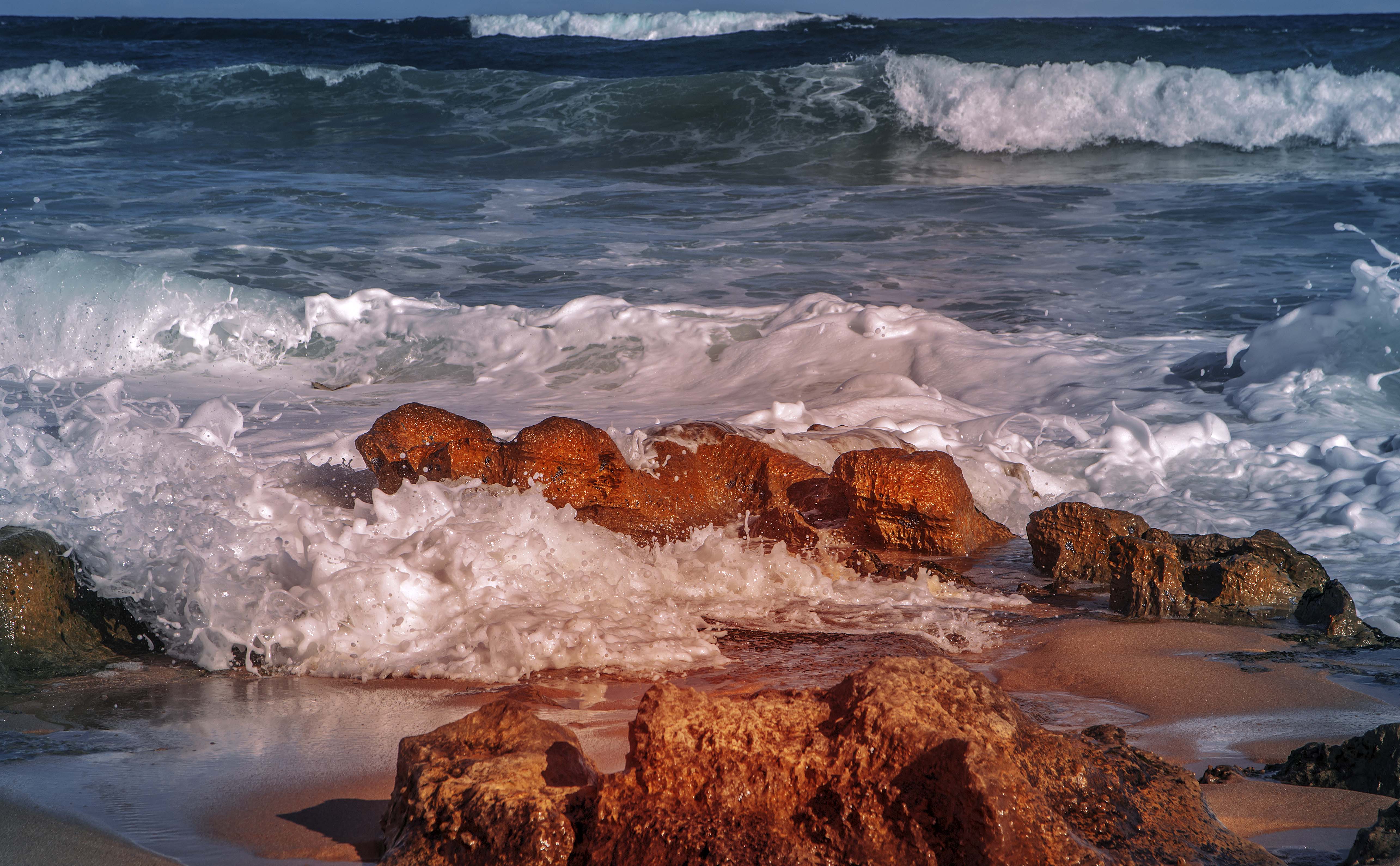
    The horizon is too close to the top of the picture.
    When I first looked at the image I struggled to understand the lighting in the foreground. Was there some sunlight sneaking through some trees? Was a flash used? I can understand the intent. But I am very familiar with beach / ocean scenes and it is overdone - just doesn't look natural.

  • Members 1351 posts
    June 22, 2024, 2:29 a.m.

    Let me clarify a bit. When I posted, i hadn't got down through the discussion and come cross the other posts discussing this. Once again, I'm snarling about flat view forum discussions.
    I have no objection at all to things not looking natural. If however this is done, I feel it has to be done boots and all. Van Gogh, or whoever, the lot. Neither do I object to poetic licence from the photographer in adjusting tones etc etc. In Dan's image, it looks as though the warming has the intent of looking natural but it hasn't come off. With some time and care, I feel that it would be possible to do some warming of the foreground area and get a more narural result.

  • Members 1351 posts
    June 22, 2024, 2:41 a.m.

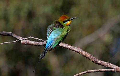
    Wonderful birds. For those not familiar with them and their nesting nad social behaviour, google. They are tiny but migrate over long distances.
    Bryan's shot brings out the dazzling plumage. The spikey beak and tail play with the photo's twig perch.
    I've often tried to photograph these and never got such a good shot.

  • Members 1351 posts
    June 22, 2024, 2:47 a.m.

    No, it won't.
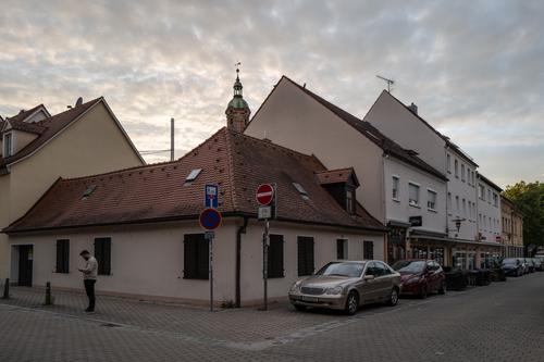
    A carefully chosen angle that uses the lines and radiating structure to make the image. It's sharp and that is important with all the edges converging on a point.

  • Members 1351 posts
    June 22, 2024, 3 a.m.

    It isn't easy to get a shot like this to work. It is late in the day and overcast. Most of the subject area is in shadow. The scene might have looked like a probably flat, why bother moment, but it doesn't. Your angle lifts everything. The lines running back from the centre create the variation and movement that holds the attention. The sky, lighting and clouds, fan out from much the same central point and the flanking traffic signs, roof edge and weather vane and the V gutter marking all add to the strong centre.
    Yes, evening atmosphere but much more than that. The photographer has made it a moment and place to explore.

  • Members 3915 posts
    June 22, 2024, 3:35 a.m.

    We're going round in circles now because I discussed earlier why and how I did things in the documentary and "artistic" versions.

    Only the documentary version was intended to be totally natural being as close as I could remember to what I saw.

    There will always be aspects of images some people will like, some will not and some won't care one way or the other.

    Thank you for your thoughts.


    dprevived.com/media/attachments/e2/de/U9YuJorTomgB6rNokBG5WbtsBimvbjqGd4psSV1XUrPFRJTscxmAvkFPFLcLu3z5/surfrollingin.jpg

  • Members 1351 posts
    June 22, 2024, 4:48 a.m.

    When a subject is placed as plumb centre as is the case here, using a diagonal line, especially having it placed just off the diagonal, is a good move in bringing interest and balance to the whole image. The lighting though is too flat. The yellow should be jumping up from the greens, even if it was taken in shaded conditions. Lifting the brightness and contrast would also give edge to the delicate water drops. If you are working with a program that has texture and clarity controls, try giving some mid range contrast with either of those.

    An edit. My dislike of flat view forums increases. After I wrote the above I found that the lack of "pop" has already been addressed by others. While we have you here Alan, how is the move to a version of threaded forum coming along?
  • Members 1351 posts
    June 22, 2024, 5:09 a.m.

    I'm going to discuss this photo plus the first of the medieval and minniev's comments. It's too hard to run the discussions all over the place.
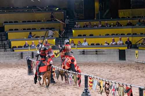
    Photo 1. Just as minniev says. Here, the space on the right works because our hero is charging into it. It doesn't work in shot 2 where they have left the space and we give more attention to the empty seats and this lowers the drama. As m says, the first photo is super sharp. The point on the "spear"? is wicked and can't be missed. The armour feels like metal and I think this is a result of the hard defition of the edges. The horse is wonderful. All that power frozen for our enjoyment of the details.
    I'll take a guess. Looking at the edges, something like Topaz was used in PP?

  • Members 3915 posts
    June 22, 2024, 5:17 a.m.

    You are attempting to speak on behalf of everyone else in some of your opinions above.

    You are not speaking on my behalf because I don't agree with all the opinions you expressed above.

  • June 22, 2024, 7:49 a.m.

    Waiting on Bob to finish the threaded code and Martin to give us a new Misago update. I know this is the most asked for improvement, but we are all part timers here.

    Alan

  • Members 1351 posts
    June 22, 2024, 8:28 a.m.

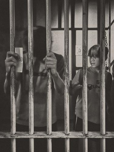
    I'm interpreting the photo as an experience at a museum where visitors have an opportunity to enter into the exhibit and that what we are looking at is a contemporary young man visiting and coming to terms with what he finds.
    There are two stories. On the left. A figure, face obscured, gripping the bars. They are strong hands. There's a piece of paper in one hand but I have no idea of the meaning. The left figure appears to be experiencing the role while the boy appears to be watching the person to his side. There's just enough hint of a message
    in the unfinished "Lib" on the T shirt to make a counterponted message.
    The bars cover everything. Right across, from top to bottom and again in the shadows behind.To ram the point home further, a length of chain as well.
    No compromise, B&W grain.
    Still, there is hope. The boy's haircut is avowardly anti institutional and his T shirt hints suggests different values. He's taking in what he is looking at but he doesn't appear beaten down by it.
    As someone who has never been to Mississippi but has read the books and seen the films and the news coverage, I feel good that Mississippi has such a Museum.

  • Members 1351 posts
    June 22, 2024, 8:36 a.m.

    I made no such claim and I can't see how you can possibly come to such a conclusion. If you have a different interpretation I'd encourage you to write about it. That;s what the forum is for.

  • Members 3915 posts
    June 22, 2024, 9:13 a.m.

    Who are the "we" and "our" you refer to in your opinions above?

    It is reasonable for anyone to assume you could mean everyone.

  • Members 1351 posts
    June 22, 2024, 9:35 a.m.

    No.
    You need to expand your experience of the use of pronouns.

  • Members 1074 posts
    June 22, 2024, 9:37 a.m.

    In a C&C situation, it is not unusual, nor uncommon, for respondents to use the 3rd person - it is a common literary form (from one who absolutely hated Arts and concentrated on STEM). Using that form, the respondent in no way intends to speak for everyone.

  • Members 3915 posts
    June 22, 2024, 9:45 a.m.

    You don't get to decide how other people must interpret what they read in forums.

    To eliminate potential ambiguity people have the option to use the 1st person when posting opinions.

    Why not post why in your opinion it would be unreasonable to assume Mike was including at least me and everyone else following this thread when using "we" and "our" in his opinions.

    He could have just as easily said "I" to eliminate ambiguity or misrepresentation of other people's opinions. By choosing to instead use 3rd person plural he is clearly referring to himself and other people, not just himself.

  • Members 3915 posts
    June 22, 2024, 10:07 a.m.

    So you cannot say who you referred to when using "we" and "our" in your opinions when you had the option to instead use the 1st person if you genuinely meant to refer to only yourself.

    By using "we" and "our" when posting your opinions it seems to me you are attempting to mislead anyone (members and non-members) reading this thread into believing you have more support for your opinions than actually might exist.

  • Members 3915 posts
    June 22, 2024, 10:13 a.m.

    Ok, no problem. I wasn't going to comment on the photo but in order to eliminate any ambiguity because you are using "we" and "our" in your opinions -

    that is total nonsense if you are including me when you said "we" in your opinion above.

    That is also total nonsense if you are including me when you said "our" in your opinion above.