Classic shot and very well captured.
-
-
It's all about history. Very poignant reminder and b&w rendition is ideal.
-
Again showing us how simple compositions work so nicely when the focus is well planned/executed. A lovely wheel design form with spokes running out from the tack sharp center of the frond, and the colors/tones playing well with the focus. Bet it printed nicely.
-
To me, the subtly colored but quite beautiful light in the sky is the star of the show. Of course the architecture is a nice frame for it, with a kind of reverse vanishing point there at the corner, and the various points of the roofs holding the sky in a V shape. Interesting angle. (I wish the cars weren't there but that is often the case for me in cities. Cars just aren't that photogenic).
-
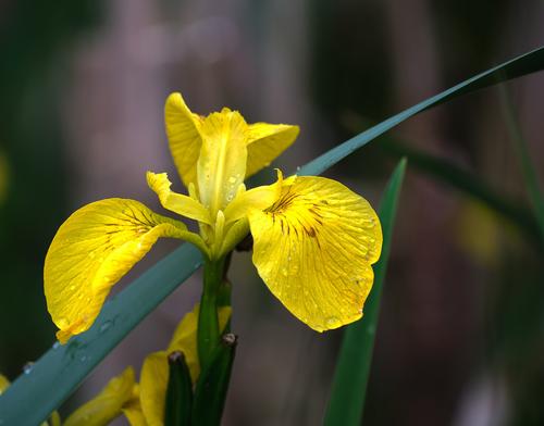
Lovely flower - is it a pond iris? I'm not that good with identification. I like the composition with the sword of the leaf running diagonally behind the flower. I do think Dano's edit below brings out the color and detail a bit more, including the lovely water drops.
-
This wonderfully caught moment would make anyone smile - the genuine pleasure on the child's face, the creepy/funny figures, and the interface between the two. The strong colors make it even more fun, but the moment would be just as decisive in monochrome.
-
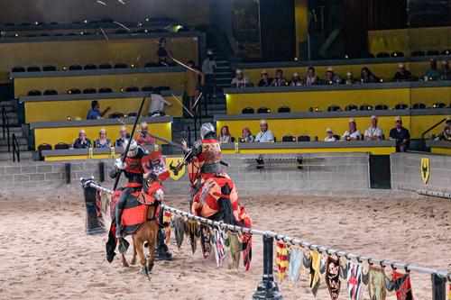
Fascinating event that I've always wanted to see because it would be so fun to photograph. Your charging knight is ferociously sharply caught, from spear tip to horsetail, so much that he seems to be charging off the screen at us. Not sure how you accomplished that but it certainly assures that he is the main event. Can even make out a scar on his face, perhaps from a prior joust, and the weirdly intense expression on his face.
-
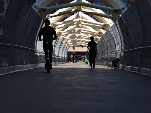
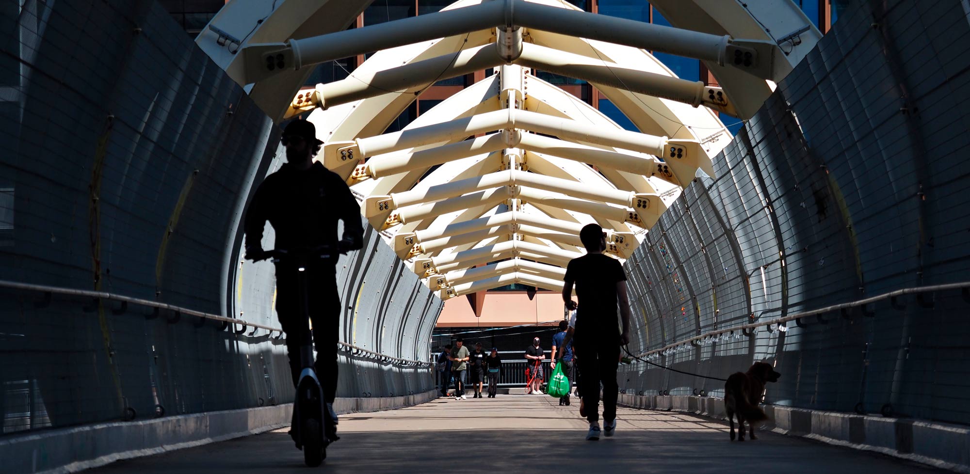
This would be less interesting if your pedestrians were lone everyday walkers, and would rely for interest on the light round shape set against the dark almost featureless backdrop, and the strong leading line - a good photo but reliant on design. But the odd conveyance on the left and the dog on the right make this much more intriguing, and press me to dig deeper and find more. Well spotted and caught.
-
-
Thanks for the education. I didn't know you could do that. I'll have a play.
Alan
-
Alan,
The histogram shows that the image is underexposed. While you can do edits using Levels and Curves controls, “stretching” the image to make it appear to occupy the whole graph, this should only be done on 16 bit files as the tone adjustments will result in posterization if done at 8 bits.
The idea is to expose to get the lightest values as far to the right of the histogram without overexposing (clipping highlights).
Rich
-
@Rich42 has written:
The histogram shows that the image is underexposed. While you can do edits using Levels and Curves controls, “stretching” the image to make it appear to occupy the whole graph, this should only be done on 16 bit files as the tone adjustments will result in posterization if done at 8 bits.
The idea is to expose to get the lightest values as far to the right of the histogram without overexposing (clipping highlights).
I can do that with the raw files. I'll have a play tomorrow. Thanks for the information.
Cheers
Alan
-
-
This one looks much better with a lot more pop on my screen than your original one.
-
@Rich42 has written:@AlanSh has written:@DanHasLeftForum has written:
As you can see there is plenty of luminosity headroom to the right of the data, so using a Levels Adjustment Layer I moved the white point slider to the left until the luminosity histogram came close to the right side and then moved the black point slider slightly to the right to make sure there are at least some strong blacks resulting in more overall contrast.
Thanks for the education. I didn't know you could do that. I'll have a play.
Alan
Alan,
The histogram shows that the image is underexposed. While you can do edits using Levels and Curves controls, “stretching” the image to make it appear to occupy the whole graph, this should only be done on 16 bit files as the tone adjustments will result in posterization if done at 8 bits.
The idea is to expose to get the lightest values as far to the right of the histogram without overexposing (clipping highlights).
Rich
I disagree that "stretching" the image, as described above, should be done only in 16 bit mode. Yes, those types of edits ideally should be done in 16 bit mode where possible to reduce the risk of posterization or banding but very often they can be done successfully in 8 bit mode without visually impacting the image quality in "normal" viewing situations.
It really also depends to a large extent on the nature and content of the image and how much "stretching" is applied. More often than not small amounts of "stretching" the image in 8 bit mode will be undetectable in "normal" viewing situations.
If you see any posterization or banding in the edited version (done in 8 bit) I posted of Alan's image please feel free to circle it as I don't see any on my screen.
-
@ChrisOly has written:@DanHasLeftForum has written:
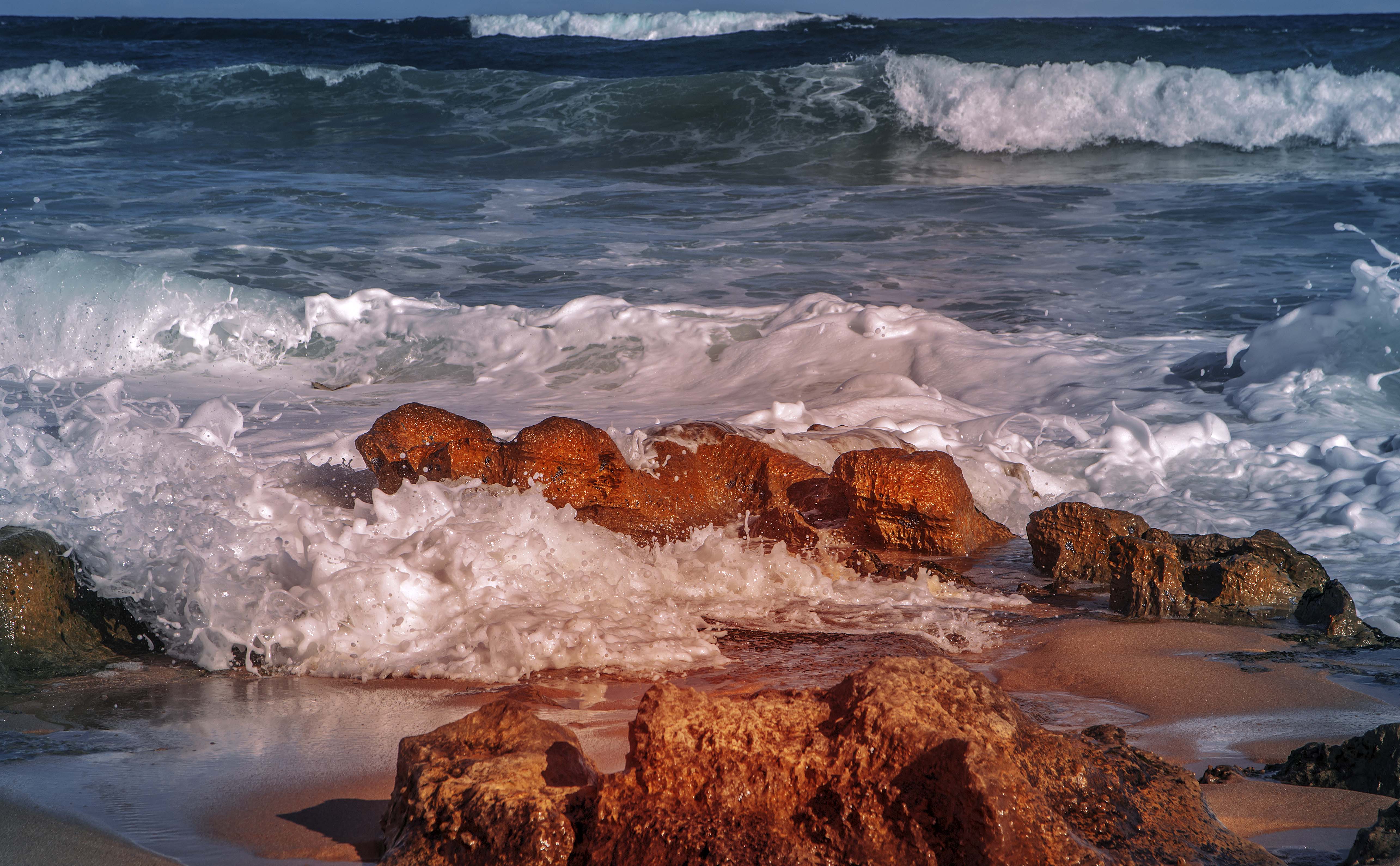
Surf Rolling In
Raw nature at it's best. like the tonal difference.
Thank you Chris. Glad you like it 😊
-
@ChrisOly has written:
Not too busy.
Pedestrian walkway in downtown Toronto
Very nice and interesting image 😊.
I agree with minniev's comment in that the "silhouetted" pedestrians and dog in the foreground make the image by being an intriguing foreground leading into an interesting background.
The only thing that "bugs" me only slightly is the amount of empty space at the bottom of the image and the line on the concrete between shadow and light not being horizontal. Maybe a crop and straightening similar to below might create an illusion of a panoramic worm's eye view?
The "front" of the image being dark, the whole scene looks much better when viewed enlarged.
Fwiw, this is my suggestion for a possible crop and straightening to create a different look and feel for the scene.
-
@AlanSh has written:
This is my next attempt from Capture One.
Pretty image.
If you have done no tone editing, this image is very well exposed.
Rich
