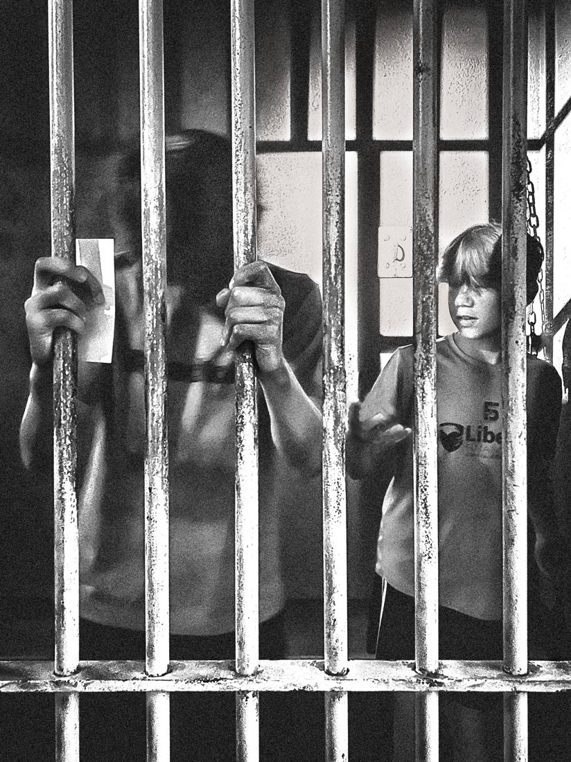
Your intervention makes it look like a newspaper print almost, and that is a good effect for this subject.
Minnie's was "subtler", and made the two boys look almost the same shade of grey.
Your version extends contrast to bring a bigger juxtaposition of dark and bright.
That is, of course, perfectly fitting for the subject.
After all, when it comes to civil rights (and the denial of them), black and white can (and should) be united.
-
-
@RoelHendrickx has written:@DanHasLeftForum has written:@minniev has written:
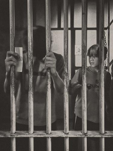
The Mississippi Civil Rights Museum.
Very nice subject telling a powerful story.
But looking at the luminosity histogram it confirms what I initially see in that contrast is low due to a lack of a well defined black point and a well defined white point. Consequently the image lacks "punch" on my screen. I like monochromes or sepias as well but they need to have "punch" for my liking.
Fwiw below is an edited version of your image using a Levels Adjustment Layer to add contrast by defining clear black and white points. I then used a Dodge and Burn Layer (50% gray filled layer in overlay blend mode) to help add some punch especially to the hands, two prisoners and the scene overall.
This version has much more "punch" on my screen.
Your intervention makes it look like a newspaper print almost, and that is a good effect for this subject.
Minnie's was "subtler", and made the two boys look almost the same shade of grey.
Your version extends contrast to bring a bigger juxtaposition of dark and bright.
That is, of course, perfectly fitting for the subject.
After all, when it comes to civil rights (and the denial of them), black and white can (and should) be united.Creating monochromes is obviously very subjective with a lot of flexibility for the final look.
-
@DanHasLeftForum has written:@RoelHendrickx has written:@DanHasLeftForum has written:@minniev has written:
The Mississippi Civil Rights Museum.
Very nice subject telling a powerful story.
But looking at the luminosity histogram it confirms what I initially see in that contrast is low due to a lack of a well defined black point and a well defined white point. Consequently the image lacks "punch" on my screen. I like monochromes or sepias as well but they need to have "punch" for my liking.
Fwiw below is an edited version of your image using a Levels Adjustment Layer to add contrast by defining clear black and white points. I then used a Dodge and Burn Layer (50% gray filled layer in overlay blend mode) to help add some punch especially to the hands, two prisoners and the scene overall.
This version has much more "punch" on my screen.
Your intervention makes it look like a newspaper print almost, and that is a good effect for this subject.
Minnie's was "subtler", and made the two boys look almost the same shade of grey.
Your version extends contrast to bring a bigger juxtaposition of dark and bright.
That is, of course, perfectly fitting for the subject.
After all, when it comes to civil rights (and the denial of them), black and white can (and should) be united.Creating monochromes is obviously very subjective with a lot of flexibility for the final look.
Agree completely.
There is a huge range in atmospheres that can be created within monochrome.
As much as with colour.Minnie's was fine, but your version is more in line with my usual preference. (I usually also go for higher contrast if I convert to B&W)
-
@RoelHendrickx has written:@DanHasLeftForum has written:@RoelHendrickx has written:@DanHasLeftForum has written:@minniev has written:
The Mississippi Civil Rights Museum.
Very nice subject telling a powerful story.
But looking at the luminosity histogram it confirms what I initially see in that contrast is low due to a lack of a well defined black point and a well defined white point. Consequently the image lacks "punch" on my screen. I like monochromes or sepias as well but they need to have "punch" for my liking.
Fwiw below is an edited version of your image using a Levels Adjustment Layer to add contrast by defining clear black and white points. I then used a Dodge and Burn Layer (50% gray filled layer in overlay blend mode) to help add some punch especially to the hands, two prisoners and the scene overall.
This version has much more "punch" on my screen.
Your intervention makes it look like a newspaper print almost, and that is a good effect for this subject.
Minnie's was "subtler", and made the two boys look almost the same shade of grey.
Your version extends contrast to bring a bigger juxtaposition of dark and bright.
That is, of course, perfectly fitting for the subject.
After all, when it comes to civil rights (and the denial of them), black and white can (and should) be united.Creating monochromes is obviously very subjective with a lot of flexibility for the final look.
Agree completely.
There is a huge range in atmospheres that can be created within monochrome.
As much as with colour.Minnie's was fine, but your version is more in line with my usual preference. (I usually also go for higher contrast if I convert to B&W)
Roel & Danno - Thanks to both of you for your feedback on the processing. The high-contrast version is a good alternative, and I understand your preference for it. And I always appreciate anyone who takes the time to edit one of my photos to show me an alternative take.
I'll take a little trip down memory lane to explain my choices. I was attempting to emulate a photograph rather than a newspaper print. I grew up in Mississippi in the 60s in a newspaper family so I cut my photography teeth on news photography of that era. Those jail cells had very dim lighting, usually a single hanging bulb in the hall outside the cell block. The few windows were high, small and deeply recessed. The only way you'd get a photo at all was to sneak your camera in as a visitor, with the kind of film you'd use at a high school football game, and leave the flash off. The result would be murky, with poor focus and limited DOF. If anyone were brave enough to publish it, it would be halftoned via a rotograving machine before being affixed to a wood block and locked into the flatbed letterpress amid type that was set in hot metal on a linotype and headlines set hot in a Ludlow. By the time I was 13 I could do all of it except the linotype and the press.
Your ideas about increasing contrast have made me think of doing up a halftone in PS. That would produce a more contrasty but even less detailed version that looked something like a 1964 newspaper. By the early 70s, everyone was going offset, and the process and output changed. My most interesting photo collection is from our family's old Herald archives from the 60s. It's a window into life in small-town Mississippi during that very troubled era - the good, the bad and the ugly.
-
@minniev has written:@RoelHendrickx has written:@DanHasLeftForum has written:@RoelHendrickx has written:@DanHasLeftForum has written:@minniev has written:
The Mississippi Civil Rights Museum.
Very nice subject telling a powerful story.
But looking at the luminosity histogram it confirms what I initially see in that contrast is low due to a lack of a well defined black point and a well defined white point. Consequently the image lacks "punch" on my screen. I like monochromes or sepias as well but they need to have "punch" for my liking.
Fwiw below is an edited version of your image using a Levels Adjustment Layer to add contrast by defining clear black and white points. I then used a Dodge and Burn Layer (50% gray filled layer in overlay blend mode) to help add some punch especially to the hands, two prisoners and the scene overall.
This version has much more "punch" on my screen.
Your intervention makes it look like a newspaper print almost, and that is a good effect for this subject.
Minnie's was "subtler", and made the two boys look almost the same shade of grey.
Your version extends contrast to bring a bigger juxtaposition of dark and bright.
That is, of course, perfectly fitting for the subject.
After all, when it comes to civil rights (and the denial of them), black and white can (and should) be united.Creating monochromes is obviously very subjective with a lot of flexibility for the final look.
Agree completely.
There is a huge range in atmospheres that can be created within monochrome.
As much as with colour.Minnie's was fine, but your version is more in line with my usual preference. (I usually also go for higher contrast if I convert to B&W)
Roel & Danno - Thanks to both of you for your feedback on the processing. The high-contrast version is a good alternative, and I understand your preference for it. And I always appreciate anyone who takes the time to edit one of my photos to show me an alternative take.
I'll take a little trip down memory lane to explain my choices. I was attempting to emulate a photograph rather than a newspaper print. I grew up in Mississippi in the 60s in a newspaper family so I cut my photography teeth on news photography of that era. Those jail cells had very dim lighting, usually a single hanging bulb in the hall outside the cell block. The few windows were high, small and deeply recessed. The only way you'd get a photo at all was to sneak your camera in as a visitor, with the kind of film you'd use at a high school football game, and leave the flash off. The result would be murky, with poor focus and limited DOF. If anyone were brave enough to publish it, it would be halftoned via a rotograving machine before being affixed to a wood block and locked into the flatbed letterpress amid type that was set in hot metal on a linotype and headlines set hot in a Ludlow. By the time I was 13 I could do all of it except the linotype and the press.
Your ideas about increasing contrast have made me think of doing up a halftone in PS. That would produce a more contrasty but even less detailed version that looked something like a 1964 newspaper. By the early 70s, everyone was going offset, and the process and output changed. My most interesting photo collection is from our family's old Herald archives from the 60s. It's a window into life in small-town Mississippi during that very troubled era - the good, the bad and the ugly.
Having known Minnie for a while now, I was aware of her history.
I am glad she shared some of it here.
And I am impressed with her long history in (important) photography and journalism.
Makes me feel young (good) and a total amateur (hmmm...). -
@minniev has written:
Roel & Danno - Thanks to both of you for your feedback on the processing. The high-contrast version is a good alternative, and I understand your preference for it. And I always appreciate anyone who takes the time to edit one of my photos to show me an alternative take.
I'll take a little trip down memory lane to explain my choices. I was attempting to emulate a photograph rather than a newspaper print. I grew up in Mississippi in the 60s in a newspaper family so I cut my photography teeth on news photography of that era. Those jail cells had very dim lighting, usually a single hanging bulb in the hall outside the cell block. The few windows were high, small and deeply recessed. The only way you'd get a photo at all was to sneak your camera in as a visitor, with the kind of film you'd use at a high school football game, and leave the flash off. The result would be murky, with poor focus and limited DOF. If anyone were brave enough to publish it, it would be halftoned via a rotograving machine before being affixed to a wood block and locked into the flatbed letterpress amid type that was set in hot metal on a linotype and headlines set hot in a Ludlow. By the time I was 13 I could do all of it except the linotype and the press.
Your ideas about increasing contrast have made me think of doing up a halftone in PS. That would produce a more contrasty but even less detailed version that looked something like a 1964 newspaper. By the early 70s, everyone was going offset, and the process and output changed. My most interesting photo collection is from our family's old Herald archives from the 60s. It's a window into life in small-town Mississippi during that very troubled era - the good, the bad and the ugly.
No problem and thank you for sharing your back story behind your image. I can certainly see now why you chose the final look you did and well done on that.
Just to clarify, I wasn't aiming particularly for a newspaper style look in the edited version I posted. That was Roel's original interpretation of the style of my edited version.
I too on a few occasions experiment with monochromes but as I mentioned in my original reply with my edited version my style for monochromes is to try to add "punch" and "pop" to appropriate extents for the image. Basically I generally try to use high contrast to highlight elements important to me in the scene.
-
@DanHasLeftForum has written:@minniev has written:
Roel & Danno - Thanks to both of you for your feedback on the processing. The high-contrast version is a good alternative, and I understand your preference for it. And I always appreciate anyone who takes the time to edit one of my photos to show me an alternative take.
I'll take a little trip down memory lane to explain my choices. I was attempting to emulate a photograph rather than a newspaper print. I grew up in Mississippi in the 60s in a newspaper family so I cut my photography teeth on news photography of that era. Those jail cells had very dim lighting, usually a single hanging bulb in the hall outside the cell block. The few windows were high, small and deeply recessed. The only way you'd get a photo at all was to sneak your camera in as a visitor, with the kind of film you'd use at a high school football game, and leave the flash off. The result would be murky, with poor focus and limited DOF. If anyone were brave enough to publish it, it would be halftoned via a rotograving machine before being affixed to a wood block and locked into the flatbed letterpress amid type that was set in hot metal on a linotype and headlines set hot in a Ludlow. By the time I was 13 I could do all of it except the linotype and the press.
Your ideas about increasing contrast have made me think of doing up a halftone in PS. That would produce a more contrasty but even less detailed version that looked something like a 1964 newspaper. By the early 70s, everyone was going offset, and the process and output changed. My most interesting photo collection is from our family's old Herald archives from the 60s. It's a window into life in small-town Mississippi during that very troubled era - the good, the bad and the ugly.
No problem and thank you for sharing your back story behind your image. I can certainly see now why you chose the final look you did and well done on that.
Just to clarify, I wasn't aiming particularly for a newspaper style look in the edited version I posted. That was Roel's original interpretation of the style of my edited version.
I too on a few occasions experiment with monochromes but as I mentioned in my original reply with my edited version my style for monochromes is to try to add "punch" and "pop" to appropriate extents for the image. Basically I generally try to use high contrast to highlight elements important to me in the scene.
Interesting discussion, thanks.
And yes, when I say what a style of image-processing looks like, I am not trying to guess at the internal intentions of the image maker/processor.
I am just expressing what impression it creates for ME.
All C&C is subjective. It should be.
Photography is art, not mathematics. -
@MikeFewster has written:@Fireplace33 has written:
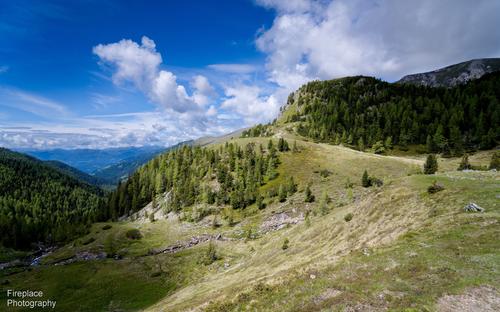
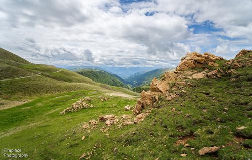
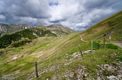
Some wide angle views of the Nockberge in Carinthia
Spent a week hiking with my wife in the Nockberge in Kärnten, Austria. Pretty good hiking conditions; not too hot and not too cold :-)It was good opportunity to try out a new lens I just bought for my Z7
The Viltrox Z mount 16mm F1.8 has had some pretty good reviews so far and I bought it to try some Astrophotography, haven't had that possibilty yet, but here are some first shots in the meantime of the Nockberg mountains
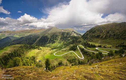
It’s a beautiful area with natural parks and fairly gentle, often grass covered, round shaped mountains, more like hills than the more rocky Alps....and here's one more taken a few days later with the Z14-30 F4
It's the Nockalmstrasse road, and I also posted this last week in the another weekly thread.
It's a 34km long curvy road, that’s loved by motorcycles and sport cars, and snakes it’s way through the area up to a height of 2042m. I searched the map for a good place to get a photo. Then we hiked to that spot, it’s off the beaten track but we found it !You have my total attention. That's a lens high on my "to be considered" list in the Sony mount. To begin with. I'm talking about the lens. What F stops were you using? For a 16mm FF 1.8 lens, the IQ is outstanding. Even more so when the price of the lens is considered. When you get to try it for astro shots, please show them here.
Back to the images. IMNHO, this is excellent use of a wa lens with landscape. Too often a wa is used simply to cram lots into the picture. You are using it to create lines from the foreground into the distant background and the viewer moves through the landscape. The place looks magnificent and I'd like to go there. Put that down to the photos.Thanks Mike. Glad you liked the images :-)
I finally got a chance to respond to this week's thread.
The F stops I used for the first 3 shots with the viltrox lens are shown below the images in my original post, it was F7.1 for two of them and F8 for the other. I'll have to get used to opening it up more. It is a very wide angle lens so, of course, even with the lens wide open the DOF is already large and it is quite sharp. As you mentioned, often in such images I want foreground objects to be in focus too, but even so, I should venture toward a bit wider aperture with this lens :-) By theway, it is well built and resonably compact. -
@RoelHendrickx has written:
HAVANA COLOURS
Another older image this week. One from the trip I made to Havana for guidebook photography.
While I was checking off the spots on my list (shops, restaurants, hidden cultural gems), I kept my eyes wide open for the million opportunities that Havana has to offer the photographer around every single street corner.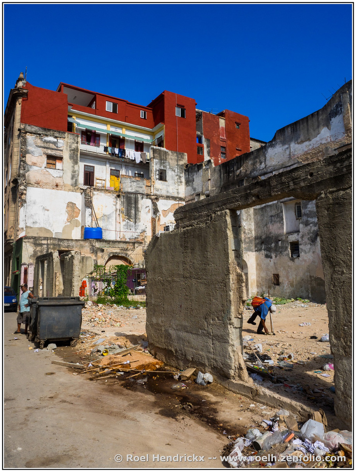
It's interesting the see such scenes. Not really a clean and pleasent place, it's all broken down and doesn't look like it will be renovated any time soon. But your shot has picked out some colourful elements in these back streets
-
@PeteS has written:
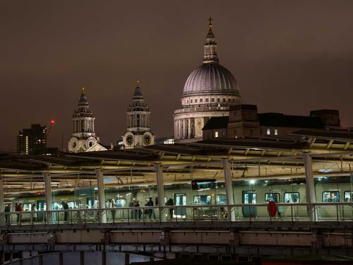
One or Two Worlds?
Blackfriars Railway Station in London must have one of the best views of any railway stations in the world. It is built on a bridge across the Thames, with a view from the platform of St.Paul's Cathedral, and down the river to the Tower of London, Tower Bridge, the iconic modern buildings of the City financial district amongst other things. There is no pain at all if the train is a bit late.
Pete
A cool view with an apt title! +Interesting & well processed too!
-
@Bryan has written:
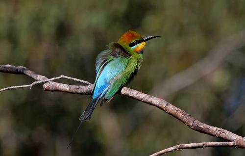
Rainbow Bee-eater
very pretty and colourful bird, well captured
-
@Fireplace33 has written:@MikeFewster has written:@Fireplace33 has written:
Some wide angle views of the Nockberge in Carinthia
Spent a week hiking with my wife in the Nockberge in Kärnten, Austria. Pretty good hiking conditions; not too hot and not too cold :-)It was good opportunity to try out a new lens I just bought for my Z7
The Viltrox Z mount 16mm F1.8 has had some pretty good reviews so far and I bought it to try some Astrophotography, haven't had that possibilty yet, but here are some first shots in the meantime of the Nockberg mountains
It’s a beautiful area with natural parks and fairly gentle, often grass covered, round shaped mountains, more like hills than the more rocky Alps....and here's one more taken a few days later with the Z14-30 F4
It's the Nockalmstrasse road, and I also posted this last week in the another weekly thread.
It's a 34km long curvy road, that’s loved by motorcycles and sport cars, and snakes it’s way through the area up to a height of 2042m. I searched the map for a good place to get a photo. Then we hiked to that spot, it’s off the beaten track but we found it !You have my total attention. That's a lens high on my "to be considered" list in the Sony mount. To begin with. I'm talking about the lens. What F stops were you using? For a 16mm FF 1.8 lens, the IQ is outstanding. Even more so when the price of the lens is considered. When you get to try it for astro shots, please show them here.
Back to the images. IMNHO, this is excellent use of a wa lens with landscape. Too often a wa is used simply to cram lots into the picture. You are using it to create lines from the foreground into the distant background and the viewer moves through the landscape. The place looks magnificent and I'd like to go there. Put that down to the photos.Thanks Mike. Glad you liked the images :-)
I finally got a chance to respond to this week's thread.
The F stops I used for the first 3 shots with the viltrox lens are shown below the images in my original post, it was F7.1 for two of them and F8 for the other. I'll have to get used to opening it up more. It is a very wide angle lens so, of course, even with the lens wide open the DOF is already large and it is quite sharp. As you mentioned, often in such images I want foreground objects to be in focus too, but even so, I should venture toward a bit wider aperture with this lens :-) By theway, it is well built and resonably compact.Inspired by your shots I did some follow up on the lens. Reviewers are impressed with the corners, even wide open or with just a little stopping down so you are probably right in thinking this lens can be opened up more. When you get around to it (now there's an excuse for another trip) I'll be most interested in the results.
-
@Rich42 has written:
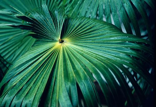
Kodachrome
Rich
Well spotted and executed. The lines ,texture and colours all working together. The DOF is just right so that the slightly blurry lines on the leaves at the lower edge quickly draw you in to the middle "focus" point, where everthing is nice and sharp!
-
@AlanSh has written:
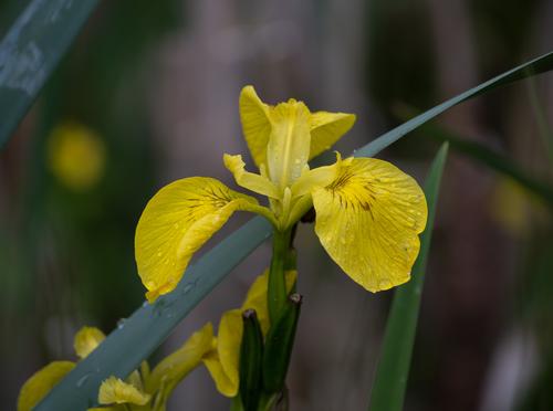
Flowers after the rain. Taken when out on a walk with my camera club.
Pretty flower, the little drops of water help too. Your slightly brighter version is even better.
-
@Sagittarius has written:
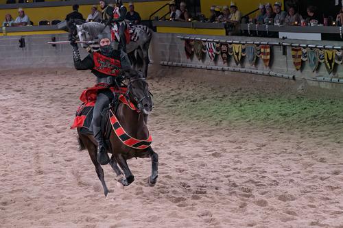
Medieval times
Thois is cool!!
Lots of speed and power visible here; with the horse almost flying. I wouldn't want to be on the receiving end of that spear !! -
@minniev has written:
The Mississippi Civil Rights Museum.
Interesting and poignant image. The jail at the Parchman farm has lots to tell about injustice.
-
@Fireplace33 has written:@RoelHendrickx has written:
HAVANA COLOURS
Another older image this week. One from the trip I made to Havana for guidebook photography.
While I was checking off the spots on my list (shops, restaurants, hidden cultural gems), I kept my eyes wide open for the million opportunities that Havana has to offer the photographer around every single street corner.
It's interesting the see such scenes. Not really a clean and pleasent place, it's all broken down and doesn't look like it will be renovated any time soon. But your shot has picked out some colourful elements in these back streets
I am glad that you picked up on the colour aspect of the image.
The title was a clear hint to look exactly there.Did you see that a duo of blue and red gets repeated three times in the image?
Mind you, this was something that I actually did not notice while shooting (unless instinctively and subconsciously), but only afterward (and in fact just recently while looking for a image to post)...There is (biggest colour patches) sky and building (with no extra manipulation on the colour of that sky - that is just Olympus blue).
There are the two splashes of colour in the still life against the left hand side wall.
And there are the colours in the bending man within the natural frame.These repetitions of colour bring a kind of subconscious harmony to what otherwise would be chaos.
(At least, that is what I think myself of this image, in retrospect and with hindsight.) -
@Kumsal has written:@MikeFewster has written:
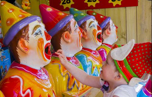
Carnival
The photo is so colorful that I saw the child at second glance.
The child's action takes the photo to the highest lev+1
