This view through one architectural experiment and onto the next (a bit less adventurous) reminded me of a couple of structures visited in recent years:
The Centre Pompidou in Metz
The Setas in Sevilla.
It is where art and architecture meet (and ideally, go hand in hand instead of fist to fist).
June 26, 2024
184
-

-
This image reminds me so much of certain scenes in Scotland, that I am already aching to go back there
(although changes are slim our little hiking group will - after five tours we have covered most of the territory; some want to move our playing field to the Dolomites or the Pyrenees or to Balkan Mountains... We'll just have to keep Scotland on the backburner for trips with the grandchildren - when we have them...)The shapes and curves and swirlings in your dramatic sky are in perfect harmony with the landscape on the foreground.
The majestic mountains (part sunlit, part in shadow and precisely that creates more drama) sit between, like delicious Toblerone.I do like the very bold PP, because of the medium we are looking at. A small image on a computer screen.
It would probably be a tad too much for a very big print on a wall.(And now of course you have us wondering what that distraction was. I have not taken out my magnifying glass to try and figure out WHERE it was, let alone WHAT.)
-
I appreciate the series, and especially the fact that you showed us two different takes on the same spot, with different shutter speeds.
Interesting comparison. -
At one point in my photographic "career" (haha on that) I was working on a project called 50/50.
It was a series of images shot in real life and without content manipulation, but that looked like composites of two very distinct photos.
The images were all split exactly down the middle (horizontally or vertically) and the idea was that both halves would work well as individual photos, but with a huge juxtaposition through the combination.This image of yours could have fit right in, for exactly the reasons stated in your title: the colour temperature difference is remarkable.
I only think I would have tried to stand further back from the concrete pillar, in order to have it slimmer in the frame.
But I am guessing that was not physically possible, or maybe you would have ended up with unwelcome distractions on the edges of the frame. -
When shooting interesting buildings in crowded city situations, I often shoot the buildings not from ground level up, but starting a bit higher.
It helps be get rid of pedestrians, cars, garish shop windows, traffic signs, garbage bins and other eye-sores.
I have the feeling that you have employed a similar strategy here, but in a rather extreme way.
We only see the roof, and then not even the whole roof.
It leaves me with a feeling of wanting to see more.
Do you have any other images of the same building (maybe in portrait orientation)?
That lonely branch of palm tree fills a bit of empty space, but not quite enough for my taste. Being that small and on the border, makes it feel less like a deliberate inclusion than like something that was hard to avoid. *(I do understand of course that you wanted to stand straight in front of the building.) * -
Personally, I am quite happy with Roel’s oríginal. Moving his wife off the railings, while a “clever” trick, destroys the great sense of humour of the original. It never occurred to me that the original was a fake, either.
David
-

SUPERB FAIRY WREN
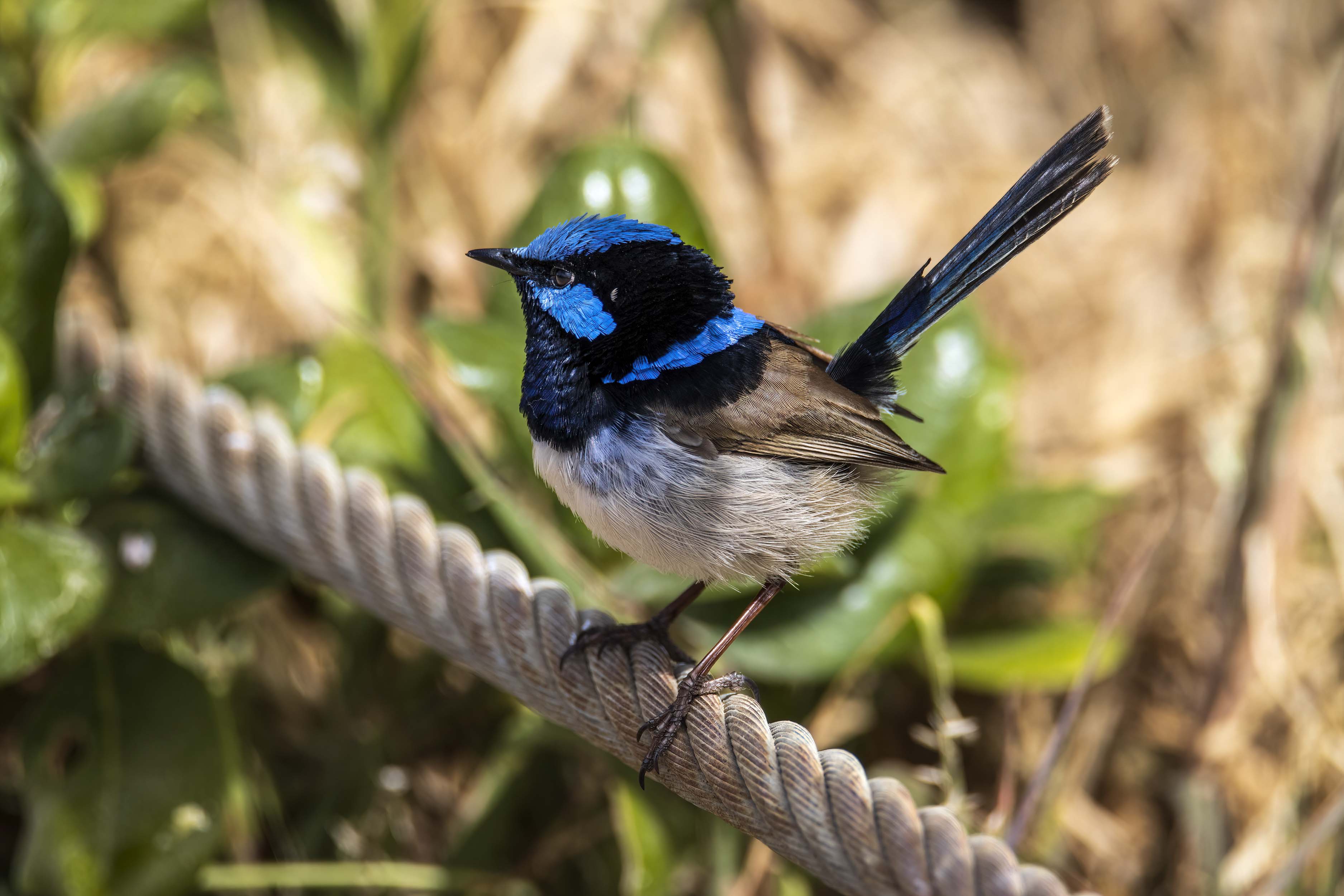
Canon 90D f/6.3, 1/2000s, ISO 250, 552mm (883mm eq)
-
Your comment about the little columns got me thinking about how to make it more realistic. I know you would never do this but I couldn't resist the temptation to have a bit more play with this one.
To a trained eye experienced with fish-eye lenses the manipulation probably would still be detected but to anyone else it might get through notwithstanding the rushed imperfect selection of your wife.
Anyway I'll let this one go now and thank you for letting us "play" with a very interesting image.
I straightened the little columns.
-

Roel,
There are times one has to take what one gets. I couldn't get much else.
But I like the way I was able to line things up for the upper part of the building with the geometry that results in this shot. Getting more of the building in the frame was not possible for a number of reasons and realize it may seem incomplete. But that's the image! 😉
It's a landmark here, and those who know the structure would kind of "get" the composition, (I think!).
I actually liked that the palm intruded just a bit, just a "skosh," but understand that others might feel it needs to be more present.
Thanks for the comments!
Rich
-

That shot just hurts my eyes.
An image has good separation blur where the background is (mostly) indistinguishable and minimal separation blur where the background is distinguishable with minimal blur. There is generally no happy medium - certainly not in this case.
I can't be sure on sharpening but the bird's head feathers look like they have had hot wax combed through them - a common result of over sharpening.Edited for clarity.
-

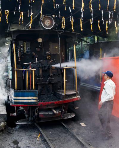
The Man and The Machine
One of the highlights of Darjeeling, India, is the Darjeeling Himalayan Railway, which is affectionately, but also slightly disrespectfully, known as the Toy Train. It serves the dual purpose of a tourist attraction and a valuable transport link down to the lowlands, the airport and the main Indian Railway system. Most of the timetabled services are now carried out by the six diesel locomotives, but there are still at least twice that number of steam locomotives, many of which date back to the 1880s, whilst their younger siblings are from the 1920s!
Every morning, they are fired and steamed and brought to life with a mixture of love, care, skill and persuasion with heavy blunt objects. It is gloriously labour-intensive and a symbiosis of man and machine.Pete
-

-
Nope, I don't like it but that's me and the way I look at photos compared to the way I look at painting. In a couple of previous posts Dan has altered the original to bring up warm areas. OK. The warming was consistent. Here it isn't only warming. There are patches of different colours that to me appear that look randomly applied. The feathering at the edge of the patches is jarringly sudden. I know Dan wasn't intending the shot to look realistic but to me , it's too close. Either the image maker goes for it with whatever non realistic techniques they want to apply, or they need to be more subtle.
PS. Some of my favourite wines over the years have come from that valley. -
This image from Chris appeals to me hugely. From early school years age I was entranced by the miracles of triangulation. Its ability to create strong structures from lightweight materials seemed like magic. It still awes me. The photo is a homage to the principle. Frame structures and triangulation are everywhere in the shot. We look through a lattice work and see cranes using the principle to support ridiculous loads on such flimsy beams. We see what they can do with those cranes.
When I get around to setting up my construction company, I'll buy this photo to put on the entrance foyer wall. -
You are misquoting me because a lot of that I didn't say at all.
For the sake of clarity to those who don't read every post I have struck out where I have been incorrectly quoted.
-
Thank you for your thoughts Mike 🙂
Yes, this image is not everyone's cup of tea.
-
Thank you for your thoughts Bryan 🙂
You are the first one ever who has said that image hurts their eyes.
I suspect it might be related to the way your screen is rendering the image. Your screen is most likely calibrated and profiled differently to mine.
-

A pleasing uncluttered shot that is made interesting by the strength of the triangles. There are other shapes involved (quite a few in fact) but the triangles are doing the heavy lifting. I like that bird.