I've looked at the interesting discussion and various crops offered in response to your image. All are successful, but in different ways. The cropped image showing just the columns and pedestrian is a very different image than the one you've chosen to show us with the wobbly reflection of what's outside the columns. The verticals are powerful in both. In the cropped versions the horizontals play more of a role. In the original version, the wobbly reflection causes us to speculate more about the outside world and the recurrent circle motif that's repeated in both sections helps tie the sides together. I won't even say which I prefer because I don't think it matters. Both have equal merit.
July 10, 2024
115
-

-
Another interesting architectural detail image. Like many of your such images, this one is about line, angle, geometry, texture, color. The detail you selected for capture has good flow in the lines to take our eyes into the design and out again. Blue and orange are always going to have eye appeal. Lovely sky looks good enough to eat.
-
Lovely image that is a little quirky with its very defined cloud foundation line up top and the tilted foreground with its rustic fence almost running out the lower corner. The hazy mountains are sandwiched in between the jaws of these two horizontal shapes. The blues and the haze are more predominant as we move further into the background. If you'd had a lone figure with his back to you, it would put me in mind of Caspar David Friedrich's "Traveler" painting, moody and mysterious.
I've read comments recommending more contrast, but I don't think it needs that. I am not as much a fan of high contrast as most photographers, and actually prefer low contrast images that offer some mystery like this one. In my own editing of my raw files of nature photos, I often deliberately remove/reduce contrast for a softer look. So this one appeals to me just as presented.
-
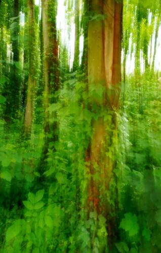
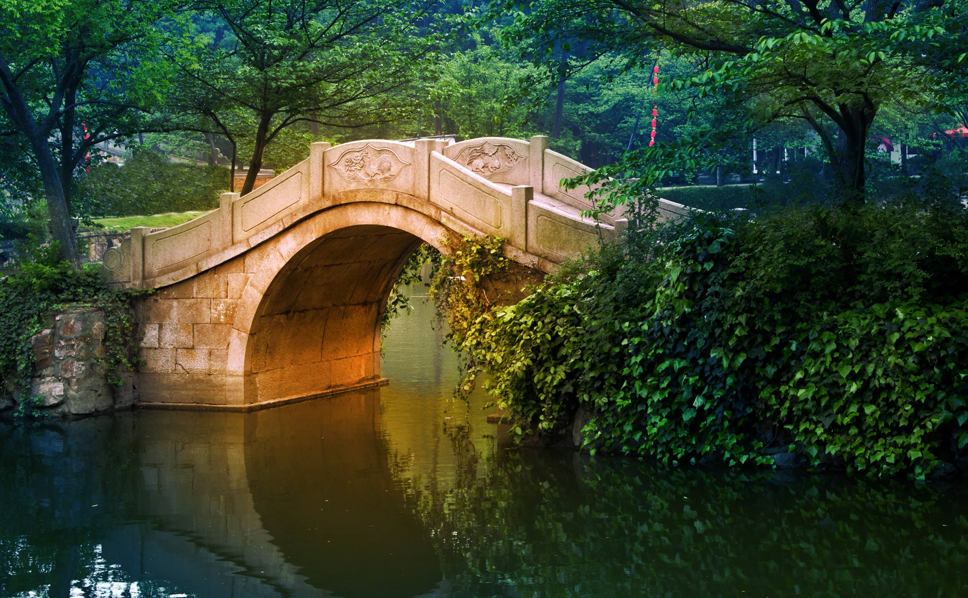
Well, now. That looks more like something I'd do than Mike Fewster would do. Forests are the hardest things to capture effectively, and ICM is one of the ways we can try to get a feeling if not a documentary rendition of a forest. Images from this set could keep me playing for hours in post. I have a bit of an obsession about straightening things so I took some tilt out of the trees in the background of your forest a little to get more impact from the repeating verticals, then added a quick and dirty Orton effect. The sky has a bit of lost detail, not unusual when you slow the shutter down of course. It could be dealt with using the original or some other way. A fun shot.
-
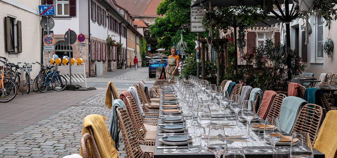
An inviting and exotic table setting, presumably for an outdoor banquet for which the guests have not yet arrived. Though your model's small at that distance, she's well placed at the vanishing point where the table, the walls, the road, and the trees all gather together, forming a coherent composition. The muted colors have enough vibrance to be interesting and soothing at the same time. I do prefer the straightened version; that dark triangle of nothing at the lower right corner was a visual distraction.
-
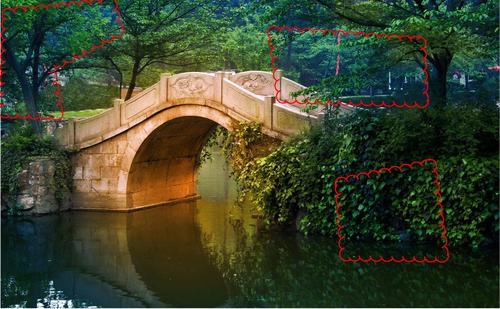
A pleasant image. The three quarters angle is a very good fit for this lovely scene, showing architectural detail but also overlapping with landscape in a visually engaging way. It looks like you've done some color manipulation but it is harmonious with the scene and not disconcerting. It's unfortunate that some structure in the background is heavily wrapped in plastic but only you could decide whether it is worth the time to rid yourself of it. If printing for public display I would do the arduous task of editing the background, but for a keepsake, likely not. (AI could possibly help but sometimes it makes a worse mess of such things). I might also raise the darkest shadows on the right 1/3 of the image a bit.
-

I had another look at the straightened version and given the importance of the location of the woman (according to the op) I think she should stand out a bit more than she does at the start of the background, so to speak.
I cropped the straightened version even more and this version also works well for me.
-
Thank you minniev. 😊
It was an overcast day with some smog in the air. The documentary version looked ok but didn't really do much for me.
This is the documentary version but with the plastic covered works you mention below cloned out with foliage, which is fairly quick and easy to do.
Luckily foliage is normally very easy to clone and so I cloned out the plastic on a separate layer in PSE. I will need to tidy it up a bit more later on.
This is the "artistic" version with the plastic you mentioned cloned out.
On my screen I can see the details in the shadows on the right 1/3.
Feel free to edit and post any of my images to whatever you feel would be an improvement 😊
-

In your artistic version a lot of green turned purple.
-
That's interesting because I don't see any purple on my screen or in the print.
-
I would clone out wine glasses in the very front.
-
Kumsal can do that if he wants to.
-
I see this on my calibrated monitor as well as uncalibrated. -
I don't see how you see exactly the same colors on a screen that is supposed to be calibrated and profiled and on an uncalibrated screen.
Either both your screens are calibrated and profiled or they are both uncalibrated and not profiled.
The two top areas are a darkish blue/green and the bottom right is green on my calibrated monitor and print which is what I wanted.
I don't doubt you see different colors on your screen but that just shows that your screen is calibrated and profiled differently to mine or it's not calibrated and profiled.
What brightness is your screen calibrated to and how did you profile your screen?
-

I'd agree with all of that. And add enjoyment of the sharp edges of the twig against the water movement.
-
@DanHasLeftForum
I calibrate my monitors with SpyderX Elite for 120 cd/m2. -
I also use a Spyder but calibrate to 90 cd/m2 which gives me a very good match with my profiled printer.
I also use Perfx Gamut Viewer 3D to check the quality of the screen and printer profiles - ensure there are no missing or protruding chunks in the 3D view of the profiles.
Another possibility is that maybe your eyes and my eyes see some colours slightly differently.
-
It took me a while and some external discussion to work out what had happened here. Dan's version looks considerably sharper and more detailed than the original. How was that possible? Now I assume that Dan has downloaded and worked on the enlarged version and the enlarged version isn't only bigger, it has considerably more information in the image. Moral. Always look at the enlarged option for images on Dprevived.
Now the photo. The lead in time for a big event must be tense for a restaurant. It shows here. There is a sense of the scale. Everything is set up. There is just enough detail to interpret the woman as a waitress making a small adjustment. Visually I like the harmony between the road surface and the table tops. Together they produce converging lines that accentuate the scale of the event. Kumsal's angle picks up the careful placement of the table settings, glasses and chairs. The perfection creates a certain tension. We know the perfection wont last and soon there will be intense activity.
I like the suggested adjustment but not so much because of the table edge shape. The foreground glass and the left foreground chair are now closer to us. This draws us into the image. We become more part of the moment.