SUNSET & SUNRISE IN THE MIDDLE AGES
I've recently been de-archiving some older galleries that Zenfolio had seen fit to archive.
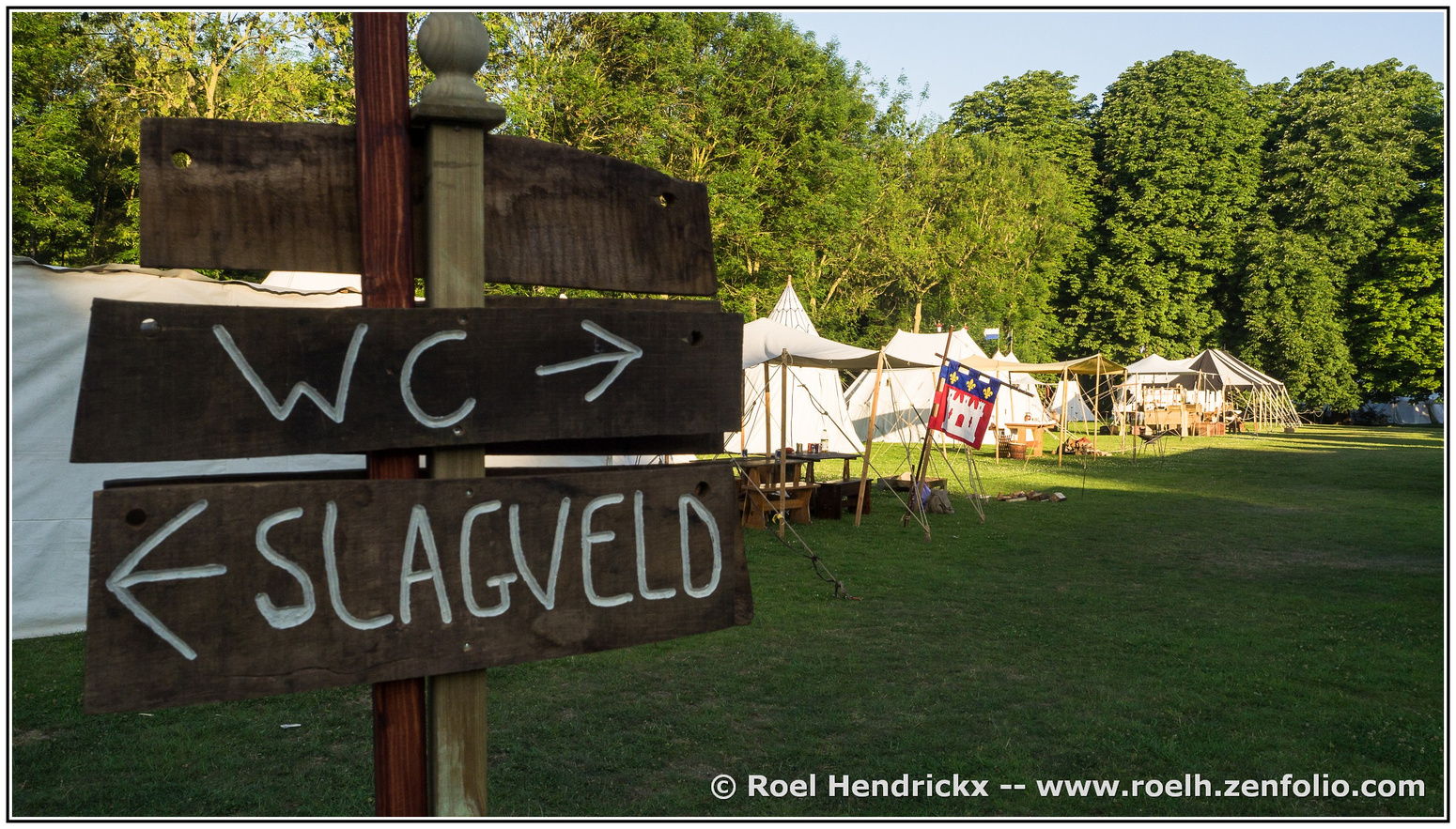
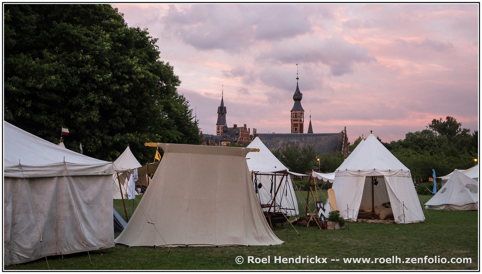
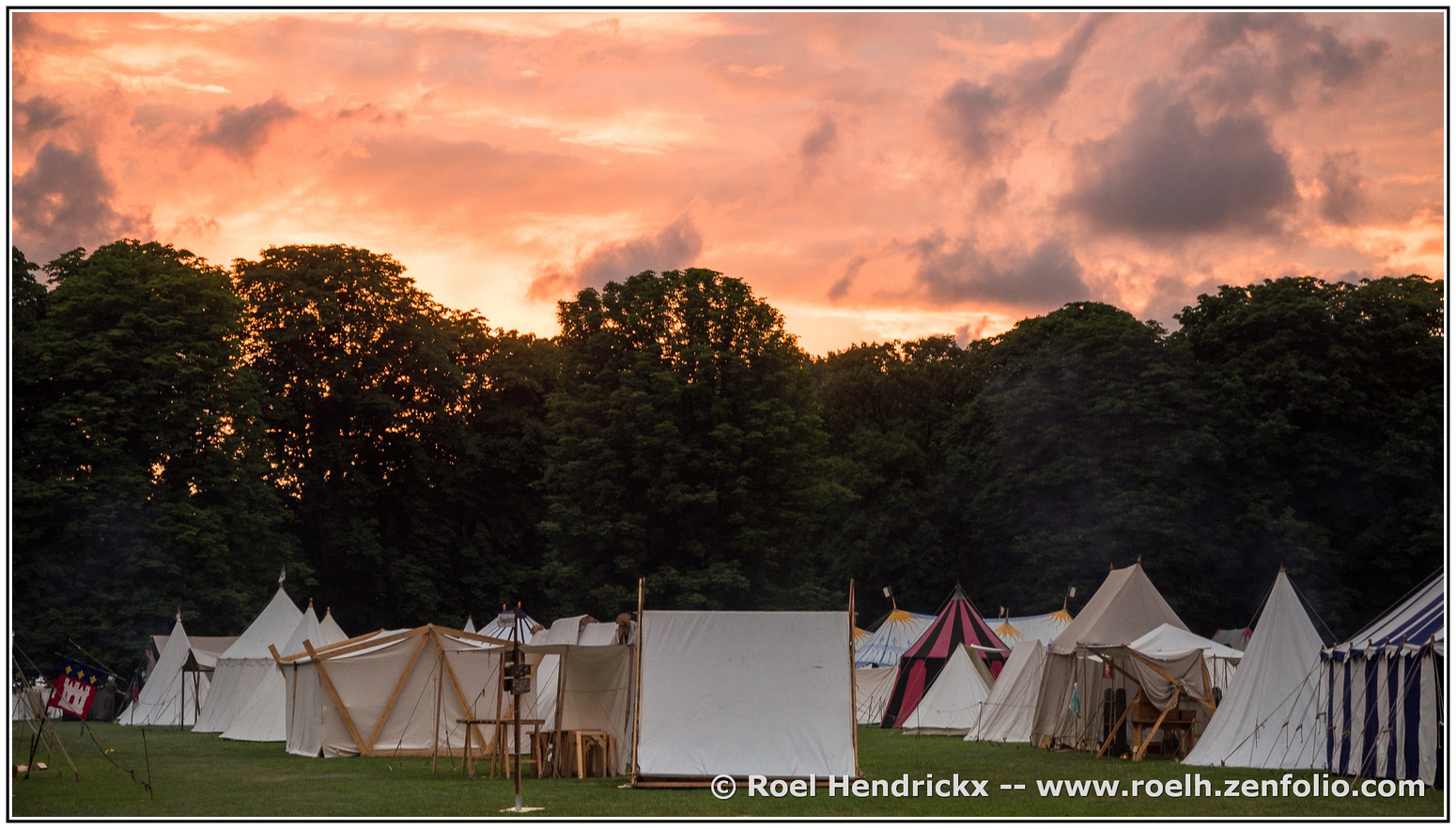
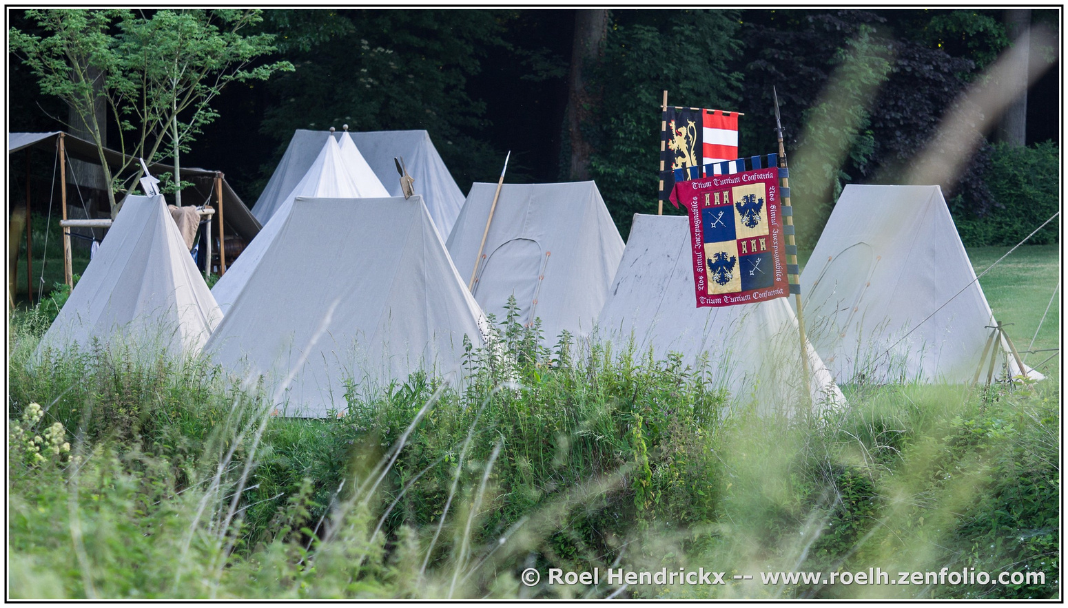
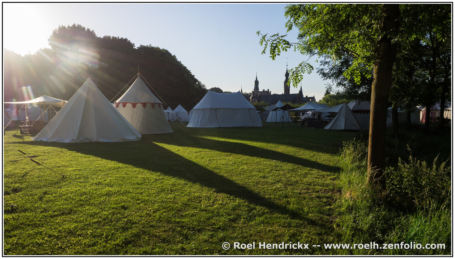
One of the retrieved galleries is one that I shot "after hours" and "before hours" at a yearly Middle Ages reenactment event in Deurne (close to my home).
The event is called -- in ancient Flemish spelling - "De Quaeye Werelt" (The Bad World) and it is one of the biggest such events in Europe.
Some info (in Flemish):
dequaeyewerelt.be/
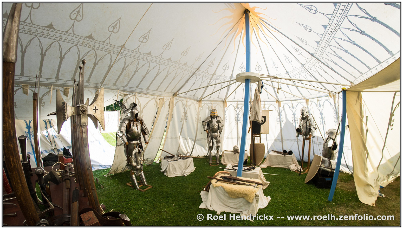
Over three or four days, scores of visitors come to Sterckshof in Deurne to witness medieval reenactment groups from many different countries, with some groups representing military companies (royal army, mercenaries, knights) and others presenting the life of tradespeople, farmers and craftsmen, all living in tents and pretending they are attending a medieval yearly fair or gathering in a provincial town or small city.
The event has "official hours" during which visitors can roam the site freely, and attend numerous spectacles, like presentations of falconry or even military parades, tournaments and a daily battle between knights and foot soldiers. The site is very crowded then.
I chose to come later in the day, mingling with the reenactors in their "spare time", when they drink beer, roast a piglet and prepare for the night (or have just woken up).
The resulting photo gallery (with some further explanation) is here:
roelh.zenfolio.com/p124954993
For this thread now here, I have selected a few images in identical ratio, without people (you'll have to go find those in the gallery), but more as an evocation of the atmosphere in the medieval camp at sunset and sunrise :
(thanks, Dan, for catching the error in my original posting)
This last one is very Monty Pythonesque, in that it gives directions to the lavatories and the battlefield.