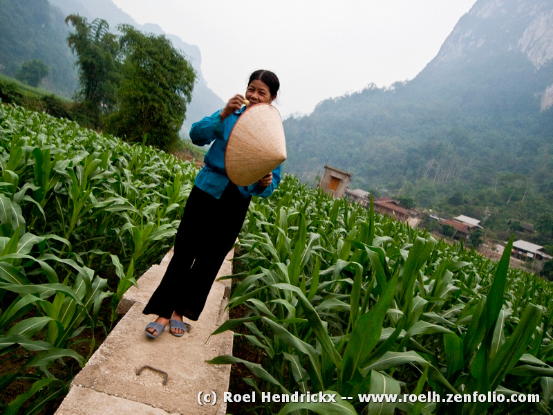
• Aug. 8, 2024, 8:15 a.m.

    Thank you all for your comments on my post.

    I wanted to put 4 different types of images in and see which resonated with you all.

    I had to crop from the left as I'd captured the leg and fot of a passenger sitting down.

    It didn't stay empty for long - I got lucky.

    This was one where I got what I intended. I saw that yellow line and wanted it as my leading in.

    Alan

  • Members 720 posts
    Aug. 8, 2024, 12:31 p.m.

    Alan,

    I will probably also still get back to your images.

    My usual MO with this thread is to start it and then let it develop between the contributors, adding my own comments only when I feel a big need (also sometimes replies to quenstions on my own images). It is usually during the weekend or Monday when I look through all the contributions and add thoughts where I think they can be useful, and I also guarantee that every contributor gets at least ONE comment (if not from anyone else, then from me). Fortunately that is seldom necessary as usually all images get some kind of feedback already in the first days. I do not comment extra when I have nothing to add.

  • Members 1185 posts
    Aug. 8, 2024, 1:04 p.m.

    The image also features a trademark of your style. Diagonal lines linking the foreground to the subject, usually but not always, a human subject. Fascinating. Here you deliberately tilted the camera (or did it in PP, but I'd bet it was with the camera) to ensure the stone on which she stands is a diagonal. I've always found it uncanny how often lines in cobblestone roads cooperate to create this effect for you. Out of curiosity, from your archives, when do you first see this technique emerging?
    In this image, you have used it to tie the woman into what I take to be her homeland. Wall, crops, village and hills radiate from her. She is at one with her surroundings. It's interesting to imagine the shot without the tilt. All the same subject matter would be there and the same conclusions might be reached. Only the association would not be quite as strong.

  • Members 1185 posts
    Aug. 8, 2024, 1:19 p.m.

    I'm not surprised that you have this as a print on your wall. I like it a lot. Macrophotography has to be sharp and detailed. That's the point of looking at macro, we can examine what is there but we can't see.
    Here we get the detail and we get more. It's an excellent composition. The off centre bee and the flower below on the right are balanced by the lines to the left. The colours are glorious. The warm golds of the bee are built on in the rest of the image and complemented by lilac shades that are perfectly placed to give emphasis to the subject bee. Add the out of focus background that helps show off the sharp details on the bee.
    Great work.

  • Members 1185 posts
    Aug. 8, 2024, 1:29 p.m.

    Perfect timing. Thank you Alan, I probably would have missed the Olympic rings and they bring a delicious touch of humour. It's a gentle smile as the viewer picks up on the long term potential for the boys. A classic example of how what we bring to viewing an image changes the image interpretation.
    Check the style of the boy on the right. Very impressive. He may be smaller and behind but he's going to overtake the bunch in front. Another message?

  • Members 665 posts
    Aug. 8, 2024, 3:16 p.m.

    I like a concept and composition. The background is to bright IMO. With BG toned down the subject will stand out better.

  • Members 665 posts
    Aug. 8, 2024, 3:18 p.m.

    Nice "action" shot. The only comment is to leave more space on the right.

  • Members 665 posts
    Aug. 8, 2024, 3:23 p.m.

    Vivid colors and good details. Never have been a fan of crooked images.

  • Members 1185 posts
    Aug. 8, 2024, 11:08 p.m.

    The title and extra information from Chris may have shaped my response? It would be a revealing experiment to post the same image in different places with and without the text to see the extent to which the information plays a role for viewers.
    I felt caged in. This was reinforced by the size and positioning of the figures. Although on the fringe, they are dwarfed and enclosed by the structure. The tone range does the same. It's limited. The full 10 stages of tone from pure black to pure white noticeably adds life to a monotone image and this image is essentially monotone. The tone range here is further contributing to the feeling of restriction.
    Chris, I'm not sure what your intention was here. "Beehive" might well be meant to have a negative connotation as a place for humans. With that interpretation, I think Beehive succeeds most effectively.

  • Members 3332 posts
    Aug. 9, 2024, 1:50 a.m.

    Nice scene and colours but the bottom right corner is a bit messy/untidy and so throws the scene a little out of balance for me.

    I would have cloned out the bench and extended the flower bed under the trees on the right so that the gap between it and the right edge of the frame matches the gap between the left edge of the flower bed and the left edge of the frame resulting in a more balanced look imo.

  • Members 1185 posts
    Aug. 9, 2024, 4:34 a.m.

    As Chris says. With large forward facing eyes like those plus the emphasis from the rings around the eyes, the owl encourages mythical significance.
    In Minniev's photo, despite the relatively small size of the owl and the camouflage blending, there is no missing the subject.
    The branches direct the viewer to the bird and those eyes lock onto the viewer. Contact. I was instantly reminded of a book I read many years ago. "I Heard the Owl Call My Name." It's a story that totally synchronizes with yours and I felt that from the image even before I read your text.
    It's good to hear that your husband has recovered.

  • Members 1185 posts
    Aug. 9, 2024, 5:18 a.m.

    I imagine that most of us here are familiar with Robert Frank's classic photography book, "The Americans." Rich's photo would be right at home in that collection. The ordinariness becomes the point. Revealing in the ordinariness. A particular demographic at a stage of life. Like many of Rich's shots I'd like to see it as part of a series.
    Here I like the small touches. The sunglasses, the cultivated tans, the tummy spilling over the waistband, the cigarette and the reflection in the glass that give place.
    This time I think it would be better to let the shot speak for itself without the title.

  • Members 1185 posts
    Aug. 9, 2024, 6:45 a.m.

    I see what you are saying. The shapes a man and partner and the colour become appropriate as well. Pareidolia.
    Well spotted. The bench to the right takes my eye away from the subjects a little.

  • Members 720 posts
    Aug. 9, 2024, 7:40 a.m.

    Robert Frank does indeed come to mind as a reference point.
    But certainly also Martin Parr (the Magnum photographer).
    What I appreciate extra in this image is how, behind those people, the reflections are revealing and hiding aspects: * there is the ocean horizon that is probably the most "beautiful" thing around there * and there is just a sliver of the photographer's own reflection, who positioned himself so as to be obscured (mostly) by the border of the window pane.

  • Members 3332 posts
    Aug. 9, 2024, 8:34 a.m.

    Thank you Sagittarius.

    I actually did experiment with toning down the background along with many other looks while I was creating this version before finally settling on this one.

  • Members 663 posts
    Aug. 9, 2024, 7:41 p.m.

    Thanks everyone for the comments!

    Just a note about the reflection in the windows - The horizon is way out of kilter. Horrors! Something I never do!

    I straightened it in one of my edits, but found that leaving it crooked added to the zany look of the scene.

    No one noticed her abdominal scar, or the sign in the window. 😮

    Rich

  • Members 1383 posts
    Aug. 9, 2024, 8:32 p.m.

    Though I don't often feel the tilt adds to a picture, it does in this one. Yes, it would still be a good image if it were straightened. The halves would be pleasingly bisected, the subject would be engaging and smile worthy, the trees would be balanced by the buildings, the path and hat would still guide us through. The featureless sky would still be featureless either way. But something about the tilt makes our subject's half hidden smile a bit warmer, a bit more fun. And fun and warmth enhance connection, even across cultures and languages.

  • Members 1383 posts
    Aug. 9, 2024, 8:41 p.m.

    A very well composed and sharply taken image that would be lovely with or without your color treatment. The elements are perfectly placed for a pleasing visual, and the OOF elements, even the light and shadow, are well balanced with the in focus elements and with each other. Though the color treatment is clearly unrealistic, it is visually harmonious and almost believable in a way that emphasizes rather the beauty of the image rather than fights against it. Like it a lot.