That's all well and good and I assume it also refers to Kumsal and Rich42 who both in recent threads have struggled to cope with people who posted images or critiques they do not like.
Aug. 7, 2024
128
-

-
Such discussions are probably more beneficial in the long term if they were held in a thread of their own because
-
Mike's proposed topic is off-topic in this type of thread.
-
In a weekly thread like this, it will be totally lost and most likely never looked at again or seen by anyond else after that week.
If Mike was interested in a genuine discussion he should start his own thread with an appropriate thread title. Anyone interested could then contribute to it.
-
-

Unless we all will be using same terms and definitions, any discussions are useless. It remind me of an old Russian fable how swan, crow fish and pike tried to move a cart. Swan tried to move it up, crow fish tried to move it under a rock and pike tried to move into the seaweeds. But cart has not been moved yet.
-
Thank you everybody who looked and commented on my image.
@Dan, I do not add or remove anything in the image unless I absolutely have to. IMO the part of the bench balances image. YMMV.
-
No problem Sagittarius 🙂
-
Not necessarily as long as people make it clear in a post what definition they are using for terms that can mean different things to different people.
For example, when taking about exposure I normally include the definition I use - amount of light striking the sensor per unit area during a shutter actuation - because exposure means different things to different people.
In Mike's case, all he needs to do is post the criteria he uses to determine whether an image looks natural or not to him.
I don't see any need for a lengthy discussion like he is proposing.
-
So in my post I had to explain that I do not add or remove from my picture because I had to predict that you might interpret my picture that way?
-
In your post you didn't use any terms that could be ambiguous, so I don’t see what you mean.
I posted that in my opinion the bench throws the image out of balance and you replied that in your opinion the bench provides balance.
We are using the same definition of balance but have different preferences and opinions for what we like regarding balance.
-

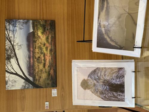
First, that emu again.
He's selling well. So well that I am considering redoing the image as a larger print.
Dan, if you take what I said to mean what you tell me I mean, you haven't read what has been said with either care or comprehension.
There are a lot of issues and trying to give one sentence answers doesn't do it. What is "natural" "realistic" "plausible" is only a small part of what this is about. The C&C Weekly thread has been running for a long time and no thank you Dan, I'm not (as you later suggest) going to start another forum. Believe me, I'm at home here. I'll write it because I think some of the newer contributors haven't fully grasped the thinking behind what goes on here and I think they would get more from what happens here if that was understood. -
You're making things up because nowhere did I suggest you start your own forum.
I said it would be more appropriate to start your proposed discussion in another thread, not another forum.
You have the option to start your own discussion in your own thread here on dprevived instead of hijacking one of Roel's threads.
In any case I posted what criteria I use to determine if an image looks natural to me or not.
How other people determine if an image looks natural to them has no influence at all on how I determine if an image looks natural to me.
-
You are right in a small way Dan. Yes, I should have said thread not forum. However the rest of your statement re hijacking shows you still haven't grasped how this discussion group works.
Yes, I read your criteria and I'm not going to take up the discussion now for the reasons I have already given. In particular, I don't want to get into the kind of slanging match you are inviting here. There's a bigger picture that needs to be considered first. Patience. -
Being right leads me to wonder where in the real world you might also have deliberately not told the truth.
This is Roel's thread, not yours. It should be up to him if your proposed discussion is appropriate in one of his threads or whether he prefers you start your own thread, especially since there is no threaded view on dprevived.
In any case, the criteria you use to determine if an image looks natural or not to you has no influence at all on how I determine if an image looks natural to me or not.
-

The tilt changes the angle we view this in more ways than one. The usual vertical angle means the viewer can quickly, even subconsciously, identify the scene. It fits into a well-known pattern and the brain quickly identifies a human in a field, but by being off by 45°, it no longer matches the memory bank immediately, and the viewer has to spend slightly longer to identify what is going on. This in turn triggers the question „Why?“ as the brain naturally tries to work out why it was tricked for future reference, and the viewer probably then consciously wonders why the photographer has done it. This all means the viewer is forced to spend time thinking about the image, and simply scanning to the next image is less likely.
It also indicates that the photographer is less interested in a purely documentary image, and more in the feeling and the relationship between subject and viewer.
Finally the lines of concrete slabs, horizon and slopes of hills are not so obviously seen as such, but more as abstract leading lines, giving the image additional dynamism.
All this would be rather wasted if the subject was unable to live up to the composition, but the happy, slightly coy smile of the woman in traditional dress, surrounded by the crops the village and the attractive hilly landscape is delightful.Pete
-
This is a good example of where severe processing has succeeded in enhancing the image. The warm colours and the sharp bee are positives, and the complementary colour in the centre probably helped attract my attention in the first place and then spend time studying the detail in the bee. It was only then that I realised the colours could not be as seen, but it didn’t matter, as they were attractive. The focus roll off pretty much coincides with the introduced orange, which helps blend it in a natural way.
Pete
-

Pete,
As much as I value your analysis of images here, I disagree with you on this. It's just a bee caught in a mostly monochrome flower bed. With a lot of post-processing color editing. The color manipulation is obvious and a bit heavy-handed. It's a mildly garish attempt in whatever the image editing program, probably Photoshop, to create a false "spot" light source for dramatic effect and is otherwise un-remarkable. The photographer saw the bee in the flowers and was easily able to capture it decently sharp with the amazing rapid-focus capabilities of most any current available. Or the bee suddenly landed on the flower while that was being photographed. It happens all the time. With the bee as the center of interest, the central and surrounding flowers fall where they do in no particular composition.
Kind-of pleasant, semi-complementary colors, though.
Rich
-
Everything I wrote in reply to Roel about the tilt and leading lines applies to this photo. This is definitely not meant to be seen as a pure record of a fine car, but an artistic and emotional interpretation, by both the sculptor and the photographer.
Studying the image reveals parts of the car elongated and flying out of the engine, in an unusual explosion. All doors, bonnet and boot are open and lead towards the epicentre of the explosion. This makes a dynamic sculpture, enhanced by the bright red, and Mike has emphasised it with the wide angle lens, the tilted composition and tight crop. The reds may have been brightened, but in any case they have been thrust forward by the teal tint in the ground and chrome work.
I have seen similar sculptures by a German artist named Stefan Rohrer, so maybe this is by him. In any case, I think the artist would approve of your interpretation.Pete
-
I posted recently that one of the aims for my images is to get people talking about them.
You are contributing to that so thank you for posting your opinions.
-
Thank you Pete. I'm glad you like it.
As I posted earlier,, the print certainly attracts eyeballs. Whether people then like it or not is for them to decide. That is the way I like it.
-
The picture is constructed with quadrants of the windows, tiles, the buildings themselves and the roof structure, however the latter forms a much more fluid structure with waves, like a net. Maybe that is the reason I feel enclosed, or maybe it is because the structure is between the viewer and the open sky. The quadrants of the windows in the buildings become apparent and net-like and the buildings suddenly seem to trap rather than shelter. The tiny people are on the horizon. Are they scraping or are they trapped too?
A thought-provoking image. -
The owl is amongst a canopy of branches, but their diagonals lead to it and it’s big eyes hold us there, so it is the dominant subject, even though it is actually relatively small in the frame. The tilt of the owl gives it an intruding and inquisitive aspect, and, looking down at the viewer, it has an air of superiority. All this dovetails beautifully with the Choctaw wisdom to form a very satisfying whole.
-
The series shows a deserted world, yet the presence of people is felt strongly by their structures.
In the first, the leaky lock gates allow little fountains of water to flow, and you have judged the speed nicely to give the right amount of blur in the water. That is very subjective, as some people prefer an extremely blurred, milky flowing water and others prefer every droplet caught sharply, but for me, that is about right.The second has a beautiful symmetry and leading lines, as others have already suggested. The train is small, but it hints at the .life, which is about to be brought to the scene. The plants amongst the buildings on the left of the yellow line contrasts well with the building amongst the plants on the right.
The third is a homogenous scene of vegetation, split by the water of a river or canal. The man-made structure seems to be hiding amongst the trees, reminding us of human presence.
The last is a busy little street, except it is deserted. It seems to be a very attractive place, which makes the lack of people even more interesting.