Naw, I'm about as far as you can get from the Pacific and still be in the US. Our herons are mainly Great Blues. We see some little blues, and some occasional other passersby as they migrate but the Great Blues rule. Same body type, same flight form, same eyes. Obviously cousins! And yeah I understand the devils' bargain we make when we use m43 equipment. It's portable, it's lightweight, you get a lot of bang for your lens length buck, lots of built in toys. But you pay for it with noise and detail when you're not in really great light. Always choices about whether to risk using a higher ISO, or risk lack of sharpness with lower shutter speeds, or whether to underexpose and try to do more in post, or whether to just walk away and grumble about it.
-
-
@MikeFewster has written:@PeteS has written:@davidwien has written:@ArvoJ has written:@minniev has written:
I am undecided about fixing things. Do I ...
No, no, no - IMO best approach is not to fix anything.
Your crop looks pretty good already.
My idea, a bit different:It seems to me that the important part of the picture is your friend. This crop really allows one to see him well. I like it very much!
David
It’s a fine portrait, and I am sure the family will be delighted. No doubt they are most interested in seeing him, so I like this crop. I also agree that the mask, teeth and cooling cap should be left, showing him true to life.
On my iPad, the photo seems to have a slight green cast and is a bit too bright, so have tried to fix that. The adjustments used in iPad Lightroom were
Red +12
Yellow +2
Exposure -0.37
Highlights -27I have been looking through the responses from others to minniev's photo and note that everyone wants to avoid any cleaning up. Agreed. When I wrote mine, I hadn't spotted the green cast that Pete is noting. I think he is right. On the tractor it just punches up the green and the emphasis is fine. The tractor is a character in itself and an important part of the man.
The house walls and especially Sylvestor's face might need to be adjusted slightly. Minniev, you know both and can consider whether or not it is necessary.Thanks Mike. I am continuing to work on it and will finalize next week, so all input is appreciated. The color work is the hardest decision. We do have a real live color cast that affects how everything looks (and captures) in summer, because there's so much green and yellow that reflects down on us outside, especially later in the day. Getting rid of all of it makes the photos look abnormal because it doesn't reflect what the world looks like to us. So it's a balancing act. I'm still fiddling.
-
@DanHasLeftForum has written:@minniev has written:
In Memory of a friend -
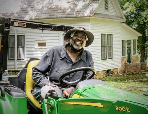
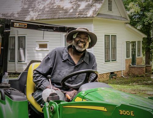
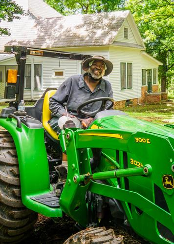
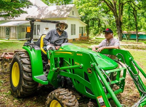
I'd like to get some helpful suggestions before I make a print for the family of my friend and neighbor Sylvester who died last week. I took this a few weeks before his death. His family really liked this casual shot because Sylvester, though always full of joy, usually pulled a serious face whenever his picture was taken. So I want to make a decent print for his mom and son. I'm sorry I didn't have a better lens on the camera at the time but it is what it is in terms of capture and I never dreamed I wouldn't have more opportunities.
I'd like feedback on the crop, color, possible repairs, etc. I am attaching an uncropped version so you can see what other real estate is available or even show me what you think I should do. (I cropped out my brother and some of the extraneous area of the yard and tractor). I am undecided about fixing things. Do I repair the dental bridge Sylvester kept putting off? Do I remove the cooling towel under his hat and the dust mask around his neck or just consider them part of what he was doing at the moment (working with his much-beloved tractor). Do I clean up the background or ignore it? I don't want to get it too pristine because a man who works a farm is never pristine. Thanks in advance for your ideas.
In both versions he doesn't stand out enough and blends a little too much into the background for my liking. I wouldn't change anything on Sylvetster.
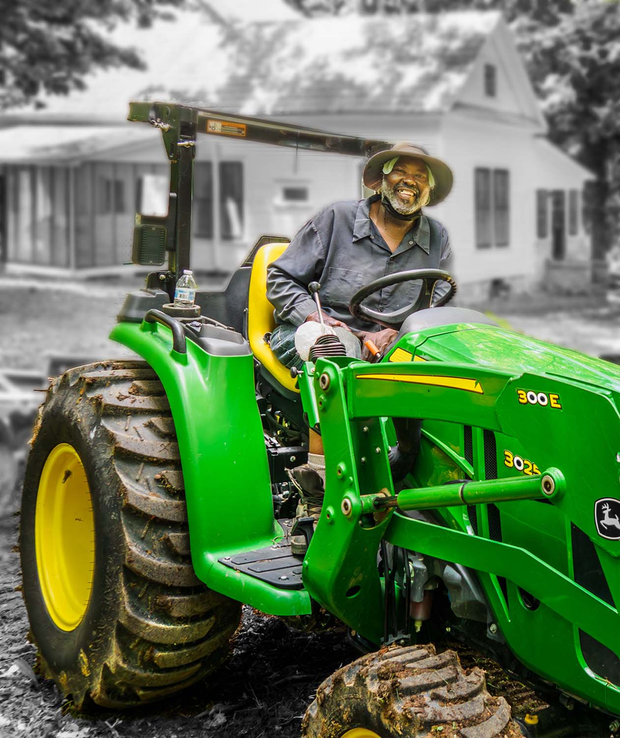
Perhaps a crop something like this with the background set to B&W and blurred slightly to help him stand out more in the foreground. Also applied a bit of selective dodging and burning.
Just some food for thought 😊
Thanks for a creative suggestion. I had considered a little regressive blur but hadn't tried it yet. I'm not sure about a totally discolored background but selective muting of saturation might be a thought. Sylvester's mom is even older than me and I think pretty traditional so I don't want to get too creative in this one. Appreciate.
-
@19andrew47 has written:@minniev has written:
In Memory of a friend -
I'd like to get some helpful suggestions before I make a print for the family of my friend and neighbor Sylvester who died last week. I took this a few weeks before his death. His family really liked this casual shot because Sylvester, though always full of joy, usually pulled a serious face whenever his picture was taken. So I want to make a decent print for his mom and son. I'm sorry I didn't have a better lens on the camera at the time but it is what it is in terms of capture and I never dreamed I wouldn't have more opportunities.
I'd like feedback on the crop, color, possible repairs, etc. I am attaching an uncropped version so you can see what other real estate is available or even show me what you think I should do. (I cropped out my brother and some of the extraneous area of the yard and tractor). I am undecided about fixing things. Do I repair the dental bridge Sylvester kept putting off? Do I remove the cooling towel under his hat and the dust mask around his neck or just consider them part of what he was doing at the moment (working with his much-beloved tractor). Do I clean up the background or ignore it? I don't want to get it too pristine because a man who works a farm is never pristine. Thanks in advance for your ideas.
It is difficult to lose friends and family Paula. Sylvester looks much too young to leave life and he is obviously happy on his green machine.
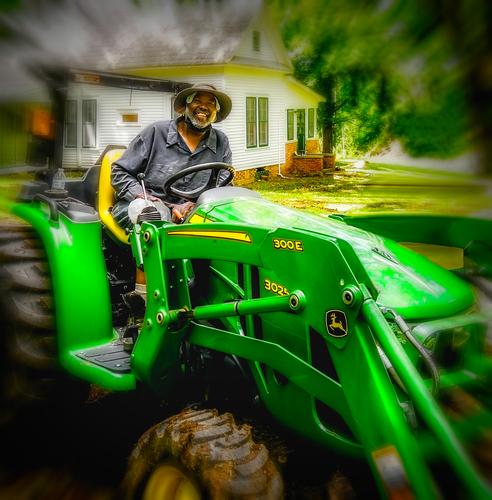
For your crop I would leave a tad more on the left side so as not to abbreviate the fender. As I recall you are using PS. Assuming you are on the cloud plan with the Ai abilities you could ask it to remove your brother from the image. It does a pretty good job of that sort of thing from the examples I have seen. I could not do it manually and get a decent result. If you do have it and you can get it to do a good job then I would crop the image as shown in the example below. I also like the close up crop that was shown that crops out most of the tractor. Dan's result is good too but I have no idea what the family will like and they may prefer a more straight up image.
I am sure you will make an excellent choice as always.
I am glad to hear from someone who loves vehicles and can appreciate Sylvester's love for this beautiful green machine. I like the idea of including a bit more of the vehicle for the part it played in his life, which was significant. Not entirely sure about the blur edge. Like I told Dan, Sylvester's mom is even older than me so is on the traditional side and I want to please her first of all. It does call more attention to that trademark smile though.
-
@MikeFewster has written:@Rich42 has written:@TimRichards has written:@Rich42 has written:
There are a few little "complexities" I hope will be seen.
Chris,
Is that a real "seagull" in the window?
Tim
I don't know if the building is completely abandoned. It's certainly very neglected and falling apart. Notice the grass growing inside the foundation ventilation window.
I think it's fascinating finding abandoned buildings with the belongings of the last inhabitants just left in place as though life is meant to just pick up again as though there had been no interruption, some day. There are lots of such places along this run-down stretch of The Strand.
On the other hand, the place may be an actual rental property, just waiting for a customer. One man's trash is another's treasure. What I describe as abandoned and decaying may be perceived as vintage and attractive to someone else.
I'm glad you noticed the silhouetted seagull model inside the bungalow. I liked the angle the sun was coming in the window, illuminating the far wall below the sign/tapestry hanging there.
The flat color, the high-contrast light and shadows, the "mundane," ordinary subject, reminded me of the style of a painter whom I'll leave unnamed, for now.
Rich
Let me guess. Mondrian? Now I''ll write what I was going to say, then I'll check later posts to see if we are on the same correlation bus.
I often see places as flat planes and shapes of colour, especially compilations of rectangles. I have always liked Mondrian's painting. Stylistically, Rich's image could hardly be further removed from Roel's when Roel uses diagonal lines to build depth.
Often I look at images like this with my eyes squinting a bit to remove the small details. Everything gets reduced to blocks of colour. Alternatively the image can become a kind of "Where's Wally " where the viewer searches for and interprets the small features that paradoxically hidden in the large flat spaces. I think what then happens is that there is an immediate response of something like calmness from the blue, regular blocks. Then there is a discovery period that contrasts with the first response.
I have been called away so have to leave this. Still struggling to try to put what I want to say into words.Thanks Mike!
No, not Mondrian, though it's flattering that you suggest that.
I think if the light and shadow playing out inside the room were more visible, the late afternoon, high-contrast lighting -Edward Hopper feel that I experienced at the scene might have come through.
The window screen is too dirty to let it show, but when I was there, the inside looked much brighter. I guess I could bring that quality out more in post processing.
Another subject that I need to (actually) revisit and/or work on with the material I already have.
Rich
-
@minniev has written:@Sagittarius has written:
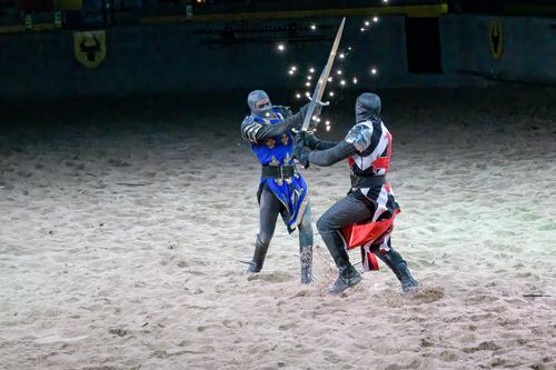
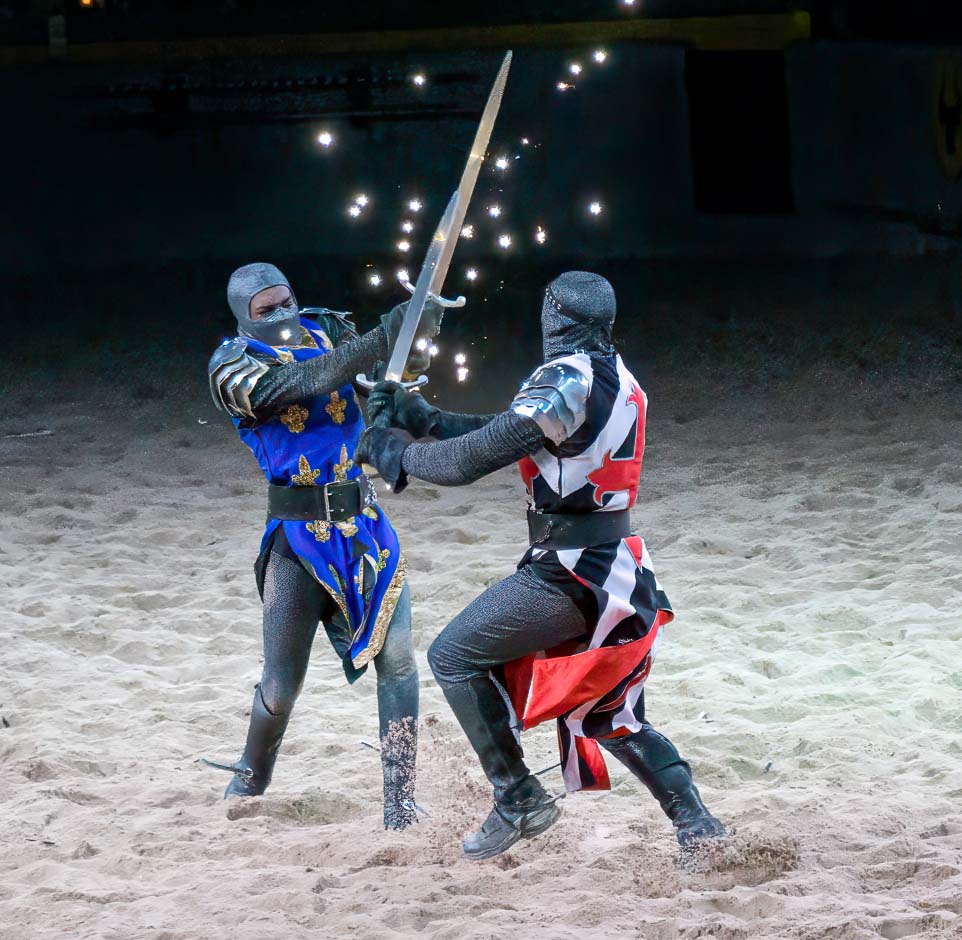
Fight
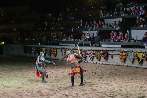
Nice sparring match. The lights (unsure how that was done) make it even more interesting. I think I would crop more to get in closer and eliminate the distraction in the dark part of the left side.
When I first glanced I thought this might be a mockup using action figures but these guys are real! (I have had a lot of fun with mockups my grandsons set up so that's probably why I thought of it).
Thank you minniev. The lights are actual sparks flying off of the swords when they hit each other. The reason I have not cropped it is that I wanted to give a hint that this match is in arena and not on the beach. 😀
-
@Sagittarius has written:@DanHasLeftForum has written:@Sagittarius has written:
Fight
Sensational photo but I would crop out the logo/shield/whatever it is near the top left in the background and darken the back wall because it doesn't add anything for me. For me it's a distracting eye-magnet taking my eyes off the subject of the photo - the combatants.
This crop works much better for me.
As always, just some food for thought.
Thank you for looking and commenting. The reason I left a hint of the background is to show that this fight is in the arena and not on the beach. 😀
No problem but I initially thought it was on a beach anyway and the back wall was just some kind of barrier for spectators.
-
@19andrew47 has written:@minniev has written:
In Memory of a friend -
I'd like to get some helpful suggestions before I make a print for the family of my friend and neighbor Sylvester who died last week. I took this a few weeks before his death. His family really liked this casual shot because Sylvester, though always full of joy, usually pulled a serious face whenever his picture was taken. So I want to make a decent print for his mom and son. I'm sorry I didn't have a better lens on the camera at the time but it is what it is in terms of capture and I never dreamed I wouldn't have more opportunities.
I'd like feedback on the crop, color, possible repairs, etc. I am attaching an uncropped version so you can see what other real estate is available or even show me what you think I should do. (I cropped out my brother and some of the extraneous area of the yard and tractor). I am undecided about fixing things. Do I repair the dental bridge Sylvester kept putting off? Do I remove the cooling towel under his hat and the dust mask around his neck or just consider them part of what he was doing at the moment (working with his much-beloved tractor). Do I clean up the background or ignore it? I don't want to get it too pristine because a man who works a farm is never pristine. Thanks in advance for your ideas.
It is difficult to lose friends and family Paula. Sylvester looks much too young to leave life and he is obviously happy on his green machine.
For your crop I would leave a tad more on the left side so as not to abbreviate the fender. As I recall you are using PS. Assuming you are on the cloud plan with the Ai abilities you could ask it to remove your brother from the image. It does a pretty good job of that sort of thing from the examples I have seen. I could not do it manually and get a decent result. If you do have it and you can get it to do a good job then I would crop the image as shown in the example below. I also like the close up crop that was shown that crops out most of the tractor. Dan's result is good too but I have no idea what the family will like and they may prefer a more straight up image.
I am sure you will make an excellent choice as always.
With all due respect Andrew...
Death is a serious matter.
There is no room for Photoshop tricks.
I always tell myself please hold back, but in this case I just can't. -
-
@Sagittarius has written:
No this was a show in a big arena.
So what? That is just repeating your previous post.
I didn't doubt your comment but when I initially viewed your image without the extra information I thought it was on a beach as described earlier.
-
@DanHasLeftForum has written:@Sagittarius has written:
No this was a show in a big arena.
So what? That is just repeating your previous post.
I didn't doubt your comment but when I initially viewed your image without the extra information I thought it was on a beach as described earlier.
So nothing. Just showed to the people where this event happened.
-
@Sagittarius has written:@DanHasLeftForum has written:@Sagittarius has written:
No this was a show in a big arena.
So what? That is just repeating your previous post.
I didn't doubt your comment but when I initially viewed your image without the extra information I thought it was on a beach as described earlier.
So nothing. Just showed to the people where this event happened.
Ok, no problem.
Your intent wasn't clear because you chose to reply to my post instead of replying to the thread. There are 2 buttons to choose from when replying to posts.
-
@PeteS has written:
Into the Unknown
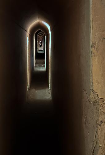
The Bara Imambara in Lucknow, India, has a huge 18th century hall, which is one of the largest rooms in the world with a vaulted roof without any beams. It was built on marshy ground, so the huge walls and arches needed for the support could not be solid, and are hollow, with hundreds of arches and passageways within the walls and foundations. Almost inadvertently the builders created a massive maze, which formed a useful escape route for the royal family. Tourists are shown around the upper galleries, with many glimpses of the ornate rooms below, but the lower levels are too difficult to navigate and are out of bounds. Apparently a British explorer, who insisted he was up to the task, is still down there.
Interestingly this huge, ornate building was started by the local ruler during a famine to provide income for farmers who would otherwise have starved. He knew their pride would not allow them to simply take a gift of money. It is said that each night the nobility would knock down what had been built the previous day, thus prolonging the building work until the end of the famine.
The photo shows one of the galleries in the maze.
(I am on a rainy beach holiday with grandchildren at the moment, so had to find something stored on my phone. Only phone cameras were allowed in the Bara Imambara, so that is what I used. Pixel-peepers will be disappointed!)
The photo is good but the story make it much better. The repeating, diminishing arches with the tiny figure at the end convey the scale and atmosphere. The text adds more meaning and scale to what we see. The offset to the left is clever. It gives light and detail to the stone wall and shows a corner. The actions of the ruler deserve to be more widely known. A European king doing this would have been besainted and immortalized in legend.
A thought for the Australians looking at this photo. Dan and Bryan, remember Weeties boxes? Perhaps they were before your time. -
@minniev has written:@MikeFewster has written:@PeteS has written:@davidwien has written:@ArvoJ has written:@minniev has written:
I am undecided about fixing things. Do I ...
No, no, no - IMO best approach is not to fix anything.
Your crop looks pretty good already.
My idea, a bit different:It seems to me that the important part of the picture is your friend. This crop really allows one to see him well. I like it very much!
David
It’s a fine portrait, and I am sure the family will be delighted. No doubt they are most interested in seeing him, so I like this crop. I also agree that the mask, teeth and cooling cap should be left, showing him true to life.
On my iPad, the photo seems to have a slight green cast and is a bit too bright, so have tried to fix that. The adjustments used in iPad Lightroom were
Red +12
Yellow +2
Exposure -0.37
Highlights -27I have been looking through the responses from others to minniev's photo and note that everyone wants to avoid any cleaning up. Agreed. When I wrote mine, I hadn't spotted the green cast that Pete is noting. I think he is right. On the tractor it just punches up the green and the emphasis is fine. The tractor is a character in itself and an important part of the man.
The house walls and especially Sylvestor's face might need to be adjusted slightly. Minniev, you know both and can consider whether or not it is necessary.Thanks Mike. I am continuing to work on it and will finalize next week, so all input is appreciated. The color work is the hardest decision. We do have a real live color cast that affects how everything looks (and captures) in summer, because there's so much green and yellow that reflects down on us outside, especially later in the day. Getting rid of all of it makes the photos look abnormal because it doesn't reflect what the world looks like to us. So it's a balancing act. I'm still fiddling.
The question is whether these strong colors are actually needed around the deceased.
They distract a lot from him.
Solution: Get rid of the colors! -
@minniev has written:@DanHasLeftForum has written:@minniev has written:
In Memory of a friend -
I'd like to get some helpful suggestions before I make a print for the family of my friend and neighbor Sylvester who died last week. I took this a few weeks before his death. His family really liked this casual shot because Sylvester, though always full of joy, usually pulled a serious face whenever his picture was taken. So I want to make a decent print for his mom and son. I'm sorry I didn't have a better lens on the camera at the time but it is what it is in terms of capture and I never dreamed I wouldn't have more opportunities.
I'd like feedback on the crop, color, possible repairs, etc. I am attaching an uncropped version so you can see what other real estate is available or even show me what you think I should do. (I cropped out my brother and some of the extraneous area of the yard and tractor). I am undecided about fixing things. Do I repair the dental bridge Sylvester kept putting off? Do I remove the cooling towel under his hat and the dust mask around his neck or just consider them part of what he was doing at the moment (working with his much-beloved tractor). Do I clean up the background or ignore it? I don't want to get it too pristine because a man who works a farm is never pristine. Thanks in advance for your ideas.
In both versions he doesn't stand out enough and blends a little too much into the background for my liking. I wouldn't change anything on Sylvetster.
Perhaps a crop something like this with the background set to B&W and blurred slightly to help him stand out more in the foreground. Also applied a bit of selective dodging and burning.
Just some food for thought 😊
Thanks for a creative suggestion. I had considered a little regressive blur but hadn't tried it yet. I'm not sure about a totally discolored background but selective muting of saturation might be a thought. Sylvester's mom is even older than me and I think pretty traditional so I don't want to get too creative in this one. Appreciate.
No problem minniev.
Obviously you know Sylvester's mum better that anyone here. Using the ideas posted in this thread just do whatever you think she will like best.
-
@minniev has written:@JSPhotoHobby has written:
I could have used a polarizer, but I didn't know what a polarizer was yet.
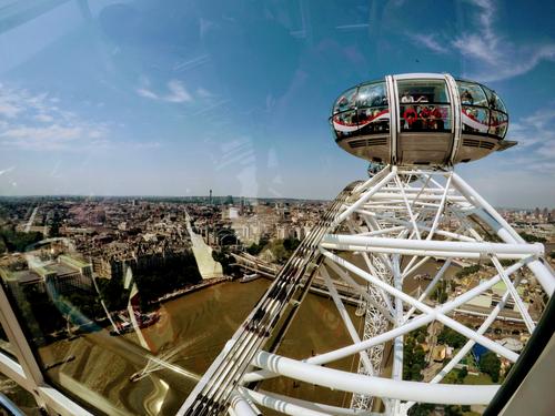
I never seem to have a polarizer when I need it, so I'm usually no better off for knowing. We take our pictures with what we have, in terms of knowledge, equipment and conditions. This is an interesting object (a viewing platform in a big city, seen from another similar platform?). The humans caught inside and thus suspended look like travelers in a space ship. I'm curious what/where it is. Photos that make people curious are generally considered successful. I wouldn't bother to try to clean up the reflections, either, they are part of the story for this one.
Ha. Add me to the polarizer tragics. Sometimes I remember to put it in the bag. Then if I remember it, probably I'm using a lens it wont fit. As a result, I have bought a larger P filter but then I find I haven't got the right thread size. And so on.
I know what we are on but not where. I can't place the bridge below and the tower. There is one of these wheels in London but I don't think this is London.
The photo. You have brought out the interesting gondola structure these wheels use and the ingenious pivoting way they are attached to the structure. There's a sense of the structure too and pause for thought as we feel the height and get a good view of the gondola fastenings.
The reflections on the glass are more of a plus than a negative, They help the viewer feel that are inside a gondola and on the ride.
It is a well chosen angle. The obvious shot would have centred the gondola. Instead we see a lot more of the city as well and this further impresses us with the height. -
@MikeFewster has written:
They help the viewer feel that are inside a gondola and on the ride.
I disagree. Your opinion does not apply to every viewer.
-
@minniev has written:@minniev has written:
In Memory of a friend -
Thanks for all the thoughtful ideas so far on this project that I care a lot about. More may come in so I won't finalize anything yet, but I wanted to go ahead and start working on some of the ideas. So far I have cropped in further, sort of a cross between Arvo and JS's versions. I did some color correction based on Pete's ideas and Arvo's demo. I lowered brightness along the edges but kept it in the middle because his face was already shaded by his hat. I won't be able to go up there to see his mom till next week so I've just printed up a sample on a good luster paper and have it in the matt so I can study it and see if time or other ideas change my thinking.
@ChrisOly has written:Interesting proposal to comment - you will probably get as many ideas as there are people looking at this image. My personal view is not to change anything, keep it as authentic and real as possible. The only suggestion is to "trim" your brother to showcase the tractor as a integral part of the main person you intend to present.
Thank you Chris. My crop is of just Sylvester, and enough of the tractor to recognize it. He loved that thing.
@Rich42 has written:Minnie,
Making prints for your friend's family will be a wonderful gift that they will cherish.
Don't over think this. Don't worry about any "photographic" qualities you see in the images. His family will see none of those. They will only see him, and experience memories triggered by his facial expression and other cues in the image that escape you. I would make prints of both the versions you show here. Just as they are.
Rich
The main thing to me was catching his contagious smile, which almost always disappeared if he knew you were taking his picture. I caught him off guard while we were having a fun afternoon tearing up an old stump together and pulling treasures out of the roots, stuff that was cast off by both our grandparents long ago.
@ArvoJ has written:No, no, no - IMO best approach is not to fix anything.
Your crop looks pretty good already.
My idea, a bit different:Thanks Arvo, you got me thinking more creatively about the crop and the color balance. Mississippi in summer throws a yellow-green cast over everything, so I did need to beat that back a bit more.
@davidwien has written:(referencing Arvo's version) It seems to me that the important part of the picture is your friend. This crop really allows one to see him well. I like it very much!
David
thanks David. I agree.
@PeteS has written:It’s a fine portrait, and I am sure the family will be delighted. No doubt they are most interested in seeing him, so I like this crop. I also agree that the mask, teeth and cooling cap should be left, showing him true to life.
On my iPad, the photo seems to have a slight green cast and is a bit too bright, so have tried to fix that. The adjustments used in iPad Lightroom were
Red +12
Yellow +2
Exposure -0.37
Highlights -27Appreciate it Pete. So far I'm leaving the broken dental crown, the head cooling cloth in there. They are part of him, I agree. The color numbers were helpful. I didn't tone it down quite as much as you and Arvo did, because Mississippi in summer paints us all yellow green. Cropping further made him jump out more, a good thing.
@JSPhotoHobby has written:I think simple, spontaneous headshots make a nice way to remember someone.
If the tractor is something he is known for, then I would keep it in the image.
If not, then I would crop in pretty close to make him easier to see.
In a perfect world, assuming you could retake an image, the arm from the tractor wouldn't intersect with his head and a mild background blur to increase his separation.When my Uncle passed, my cousin and I scanned hundreds of photos from his life time and choose random ones from different eras. Everyone remembers a person from different times and experiences. We didn't remove or alter the images, we left in all the friends and family members to help every one remember the times they were there with him. We played them on a loop on a tv from a memory stick.
For family, my cousin uploaded all the images to a cloud drive so family members could get copiesI agree, and wished I'd taken some closer shots that day, but I had no reason to think there wouldn't be many more opportunities. I did leave enough of the tractor for it to be recognizable, since he loved it so. He had never bought a piece of brand new farm equipment before and it was his darling. The crop I used for the version I'm with right now is like yours but closer in like Arvo's. Appreciate the help.
More thinking about this shot. I prefer minniev's original crop for another reason. The tractor beam thing that is behind Sylvester's head looks odd when the crop becomes tighter. More tractor in the shot and the beam is more easily recognized as part of the tractor and the viewer doesn't think about it. The beam is simply part of Sylvester;s much loved tractor. Less tractor in the shot and the viewer is distracted in trying to work out what the beam is. I prefer the more vertical crop from minniev as well. The shape is called portrait mode for a reason. We need to ask psychologists why but it really does feel appropriate for people whereas wider views do take the eye more to the surroundings.
