I know exactly what you mean about the reflections. See my comment for Australian viewers in my response to Pete's photo. I think only Australian viewers will get it.
Aug. 14, 2024
135
-

-
They are magnificent cars with superb lines.
I agree with Dan. A little more light and contrast brings out the flow of the lines, the lustre of the paintwork and the chrome detailing that is a big part of the attraction of these vehicles. -
I appreciate it when sometimes a photographer shows the original image. We get a window into the creative thinking that went into the final image. It's the difference between a snapshooter and a photographer.
-
Yes, my camera can hit those kinds of speeds and yes, it spins my head.
-
Thank you for looking and commenting. The reason I left a hint of the background is to show that this fight is in the arena and not on the beach. 😀
[/quoteIt is an awesome shot. Initially I thought the bright dots were lights of some kind behind the combatants. But they are sparks. Once that sank in I could practically hear the clash of steel on steel. The zig zagging line up through legs and arms of the red fighter adds lots of movement. The same for the red lining on the lower section of his coat. The moment screams of action. The light/dark bottom and top adds more drama and shows off the sparks.
Re the crop v the wide angle. I see what you are saying about the arena but then I like the detail of the close up. The close up makes it more apparent that those are sparks. Can we compromise with a series of shots? One to establish the setting then close ups to get seven more involved in the action?
Whatever, its a fabulous shot. -

I agree with all comments that I quoted (but I don't get the Ozzie reference of course).
I love these kinds of architectural marvels.
It's great that you gave the receding layers enough space. This image would not be half as succesful if it were limited to a crop of just the lit parts. The expanse around it, creates tension in the composition and tells us about the scale of this space. -
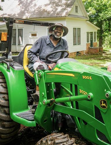
I have read through most if not all of the input that you have received on this image, and I am glad that the thread participants are actively helping you here with your decision process, giving lots of options and ideas, but also lots of motivations why some of the PP ideas would be less suited.
Obviously you, having known the man and his family, will be the ultimate judge of what you think those left behind, will cherish most as a memory.
We can only offer our two cents and - in view of all the feedback already received - I will give mine by referring to previous ideas.
1) I would certainly not glamourize the image by "correcting" perceived flaws in the person's own appearance (like "correcting" his teeth): the man is who he is (or rather: was who he was). An idealized version is not what his relatives lived with. To me it would feel like applying make up to a dead person.
2) The crop you initially used is good. It shows the man in his environment and doing his thing (without the distraction of the second person in the wider view).
You might consider going just a bit tighter even, but you should avoid losing the clarity of him sitting on the tractor. Square might work.3) I am not in favour of gimmicky processing tricks like selective colouring, a vignette etc. The portrait is about the person, not about the photograph and even less about the photographer/dark room artist. That kind of tricks distract from the pure beauty of the spontaneous portrait and smile. The only PP trick I might consider doing, would be to do what you would have achieved with a faster lens, i.e. create a bit more blur in the far background. But I do not think it is necessary.
4) However, I am really in favour of the B&W treatment : it will make the image timeless and soften the impact of the bright hard green of the tractor.
-

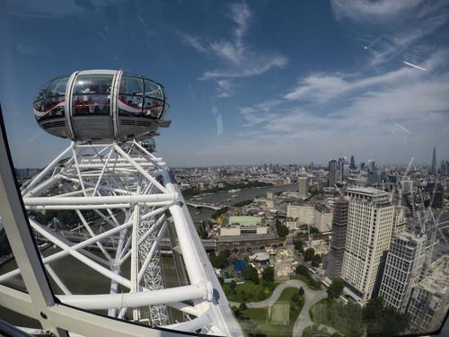
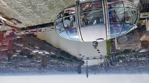
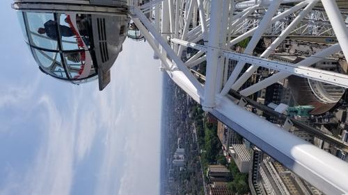
It is a shot from the London Eye, just facing away from Westminster/Big Ben. You are right, a bunch of big cities have "Eyes" now, including Vegas and the new largest wheel in Nanching. The gondolas are busy and everyone wants their go at the iconic shot of Big Ben. It was a nice group though, everyone got a chance to get that shot on the way up. I've been more attracted to the, um, "human interest?" parts. What are people looking at, what are they doing? I think this composition worked despite the distracting reflections. The reflections make me feel more present in the image because you kind of see the distorted reflections of other people in the gondola. I just wish they were a little softer or better defined.
I did move to another part of the car to control the reflections better but I don't think the compositions were as interesting. The river disappearing behind the wheel makes me want my turn at the top to see where it goes.
-

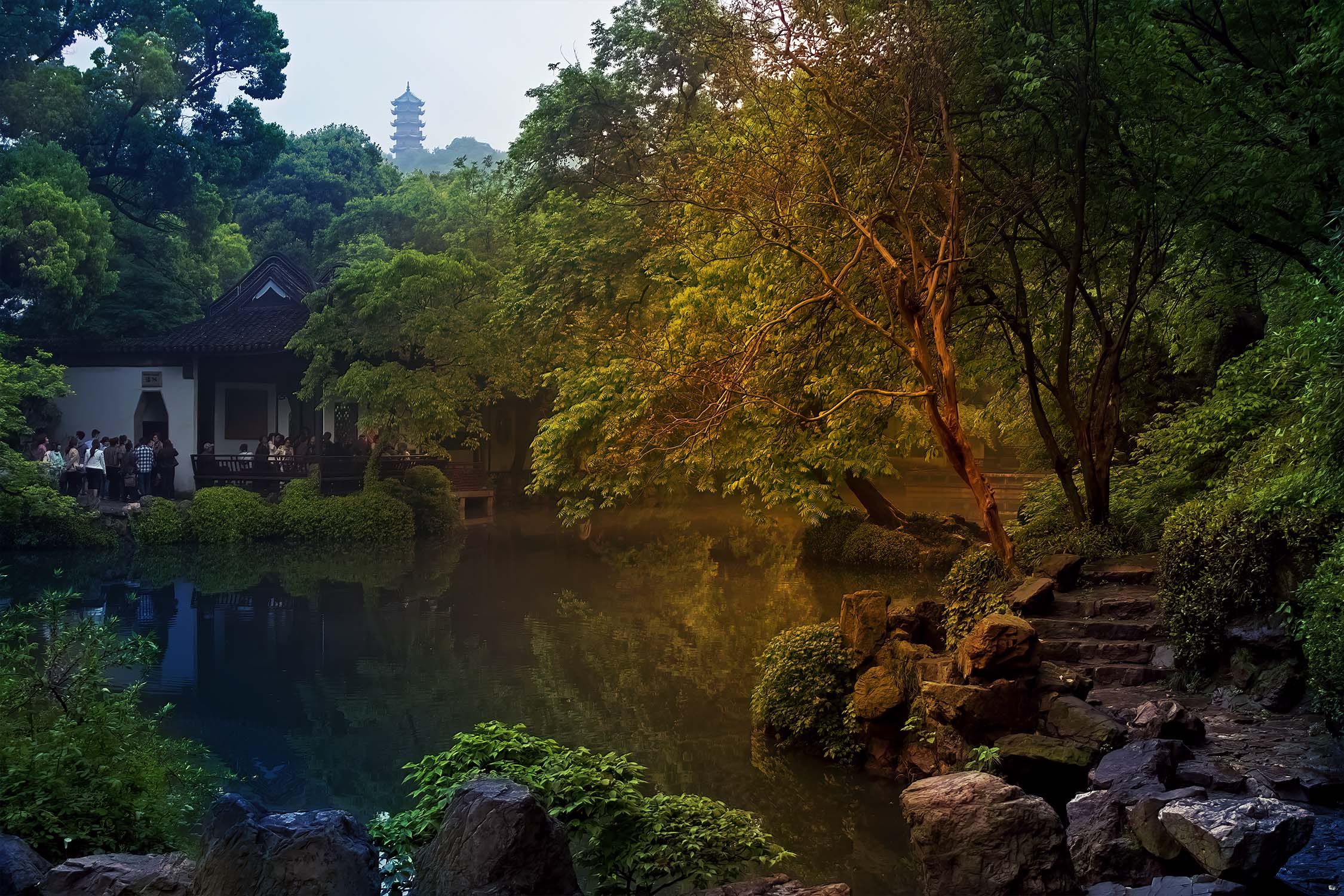
This is one of several scenic lakes we came across walking around Jichang Garden, Wuxi, about 90 minutes from Shanghai on a bullet train.
-
Weeties is a much loved Australian breakfast cereal. It has been on Oz tables for generations.The logo on the packet shows Willie Weeties holding up a packet of Weeties on which there is a picture of Willie holding up a packet of Weeties on which there is a picture...and so on. Rectangles on rectangles on rectangles.....I don't know whether they still do it but once school kids argued about how many squares they could see going back and whether or not the series could continue forever. Seriously, those discussions were the first time any of us had tried to grapple with the idea of infinity. Last year I heard Weeties and grasping the infinite being discussed by a scientist here on a radio talkback program.
-

You have a good photo there, it needs very little. Do not "fix" things, they are part of the personality, they are unique, and would only look odd, out of place if you did. You do not need to clean up the background, the smile and the personality already does that far more effectively, and again it would look odd. The family already like the photo because it shows the person, they connect with that, don't change the person.
If you're going to print you need to make sure that it's bright enough, so very quickly and all done in Camera Raw:
Decrease vibrancy a touch (tractror is a little too vibrant)
Subtly raise the brightness with a rough painted mask on the subject and tractor (don't try to be precise just use a brush with a feathered edge - precise masks look too clinical, by using your hand and a feathered brush you soften and preserve local transitions). You can use more than one brush on the mask and control the opacity so you can bring the face up slightly more.
Use a local brush on the face and shirt with a colour balance, just to counter the green light reflected off the tractor.
Final mask to add a very subtle vignette.
Don't look at the photo with a photographers eye and try to make it conform to your idea of a photo, it's a good shot of a person, trust that.
I hope this helps.
-

I think you enjoy fooling photo experts.
You've already done it!
Where is this warm spotlight supposed to come from? -
I'm curious to see who will praise this photo next.
-
I'm happy to see you picked up on the fact it obviously isn't a documentary version.
The lighting in the actual scene was dull and flat so I added some warmth to the scene.
From all the feedback I have received since it was first posted on the www some like it and some don't and that's fine.
It gets people talking about my images which is what I aim for. Thank you for contributing.
If you don't like it then that's fine. I have no issue with that but surely you are not suggesting that everyone should extrapolate that to mean that no-one else must like it, are you?
-

This is wonderful. Capturing the combatants, with their colourful costumes against the dark backgrounds is good. Even better is the moment you captured, with the red knight in action, with one foot off the ground, whilst the blue knight stands with both feet planted firmly, showing a seemingly strong defence. But the real killer is the shower of sparks from the clash of steel blades, lighting up so dramatically against that black background, which show the real power involved and evidence that is not merely a choreographed touching of swords.
I agree with Mike about the benefits of a crop or the original and could live with either, or be greedy and like vote for both.Pete
-
I too enjoyed seeing both versions. Actually it made me appreciate your edited version even more, especially as you edited it in a way I almost certainly would not have tried. I may well have cropped the same way, but I would not have made the image more blue, and I think doing that has made the background seem darker and less inviting, allowing the flower to stand out more, even though it too has a blue cast. Nice touch.
-
Nicely caught bird in flight from an attractive angle.
I photographed a heron this morning, which is the European variety, and no doubt yet another species in the collection! I haven’t even seen the result on the back of the camera - I took quite a few photos this morning! -
I agree with Minnie that the reflections are actually an interesting part of the photo, and add a touch of mystery. The photo is about the London Eye experience and shows a capsule and part of the Eye’s structure, so the reflections are really just a confirmation that the photographer is in a similar capsule. (Where else, I suppose!) Had your photo just shown the view over London, then the reflections would probably have been an annoyance.