👍
-
-
I agree with you on this shot Kumsal. It is a little overexposed and it shows in the yellows and reds and the blacks should be blacker. At the time of posting I was busy and grabbed an older shot without a lot of thought or examination of the image. I wanted to post something quite different to my contribution last week and liked the concept and framing here. If I get around to it, I'll post a better version later today.
-
While I prefer my cropped suggestion, I can see the point of using the background to give more context, as you have done. There is a gentle use of suggested lines to draw us to the frog. It is subtle and uses repeated round forms rather than actual lines.
-
Once again this is where I find the flat view of the forum difficult. It is hard to have a conversation with interchanging and developing opinions.
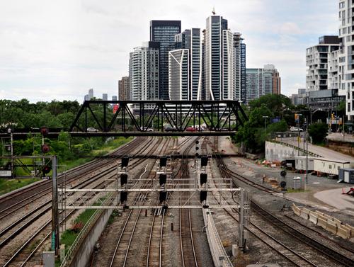
Generally I'd agree with you about focus points in images. Not here. To me, the impact of the photo is the flow of the railway lines and the metamorphosis of those lines into the verticals of the buildings. I agree that there is no focal point here. It is the total sweep I like. It would be a good image to build a debate around. " Can rules be broken and if so,when and why?"
My suggested crop was quick and crude. To maximize the possibilities of the shot I'd want to retain the railway lines curving in from the right lower corner. Then I'd want to remove the buildings on the right. -
@minniev has written:
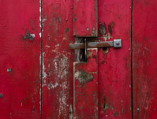
Red
Folks who've been on the thread for a while may recall that when I'm too occupied to take new pictures I sometimes play Lightroom Catalog Roulette, where I spin the catalog and let it fall where it may, then submit whatever it falls on, maybe with a new edit or maybe not. This is a closeup of an old herring shed on Grand Manan Island. The abandoned herring outfit was a photographers' paradise, with most of the equipment lying about.
Well, the catalogue wheel fell on a very nice photo.
Although not technically abstract, I see it as abstract to the extent where I like the lines and shapes which tend to make me think about what exists beyond the shed door.
The colours in the photo are also very easy on my eyes.
-
@Kumsal has written:@ChrisOly has written:
Urban Crossroads
Departing downtown Toronto and heading West...
A good photo.
But, as always, it's about cropping the photo, which is starting to bore me.
What I'm actually interested in about this photo: where is the focus point?If you mean for the viewers' eyes then imo a very good photo doesn't always need a "focus point".
In this image the rail tracks act as leading lines into the scene for me.
-
@Fireplace33 has written:
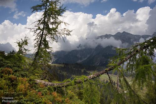
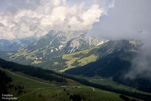
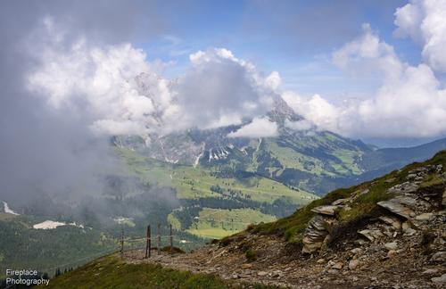
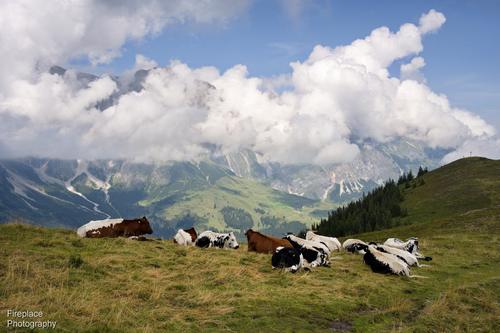
Fluffy clouds and B&W cows
Last weekend in Mühlbach, took the “Karbachalm” cable car up, then hiked on to about 350m higher to the double summit of the Schneeberg mountain. Then walked all the way down to the Dienten saddle where we’d parked a second car. Not too hot, a great day for hiking and it didn’t rain until we got back to the car 😊
These are the views on that day from the top looking over to the Hochkönig mountain range.
The clouds looked nice; big, white and fluffy.
My favourite shot was with the photogenic B&W cows sitting down taking a rest, chewing the cud or perhaps just enjoying the viewOnce more I'm drooling over the scenery you share in your photos. It could hardly be more different from what I see when I look out my window at the moment over central Australian desert.
I like your clouds. The shapes are varied and interesting. They convey height and coolness. They create frames within frames for the landscape. Their highlights and shadows gives form to them while avoiding hot spots.
And the cows would be my favourite too for the same reasons you give. -
@Kumsal has written:
If we start correcting each other's photos to our liking and ignore technical circumstances, then we'll have endless discussions in this forum.
I want to avoid that.But a technically correct image will not always look how its creator wants it to.
If you want to avoid endless discussions on "artistic" images then simply don't comment on them and ignore them.
Problem solved!! 🙂👍
Those who are interested in those discussions will continue to do so as they are entitled to.
Or, another option you have is to start your own thread here on dprevived and run it how you prefer it to be run.
-
@Kumsal has written:@Kumsal has written:
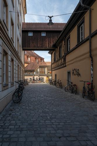
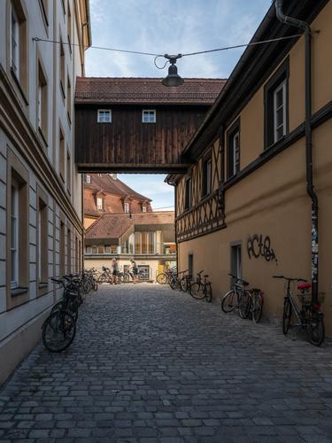
Side street in Bamberg
Fortunately, the cyclists didn't take long to arrive.
* Please do not edit this photo.And this version according to Mike's suggestions:
Yes, that is getting closer to what I had in mind although I'd have cropped still closer to the closest bike. What I'm getting at with the suggested brightening of the sidewalls (only a little, I'd want to keep the cyclists at the back brighter than the side walls) is this. There;s quite a difference between the way a camera uses a scene and the way our eye sees it. When our eye looks at a scene like this in real life, it adjusts for brightness and shadow as it moves across the scene. From where you are standing, the foreground bikes would have looked brighter with more detail. When we look at a photo, the eye can't change like that. The photographer has a choice. Adjust the shadow areas so they are closer to what the eye would have seen or leave it as the camera recorded the scene. Shooting RAW collects more information that allows the shadow lifting if that is what the photographer wants.
-
@JSPhotoHobby has written:
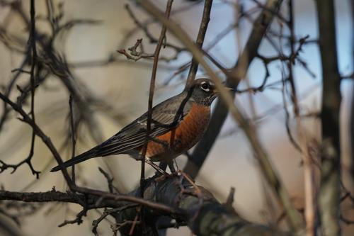
Photographing birds when they hide in bushes is tricky. It is the natural habitat of small birds like yours. They like bushes like this for safety. Yes, in your photo the bushes obscure the bird but I'd argue that this is very much the bird in its natural habitat and so the various twigs and branches are justified. The bird itself is in sharp focus. That's an achievement with all the fore and rear stuff making focus difficult. The subject has all the detail needed to identify it and note the distinguishing characteristics. Looking at it large, there's plenty of light and shade. I wouldn't brighten the image. This is a bird in its natural cover. The last thing it wants to do is "pop."
You have got it. -
Thanks Chris.
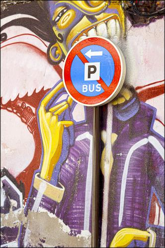
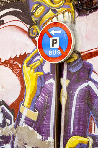
I'm not sure whether or not the mural was painted with the sign in mind. It looked older than the sign but perhaps there had been an older sign at the spot previously? -
@minniev has written:
Red
Folks who've been on the thread for a while may recall that when I'm too occupied to take new pictures I sometimes play Lightroom Catalog Roulette, where I spin the catalog and let it fall where it may, then submit whatever it falls on, maybe with a new edit or maybe not. This is a closeup of an old herring shed on Grand Manan Island. The abandoned herring outfit was a photographers' paradise, with most of the equipment lying about.
Is there actually a LR function that plays roulette like that or do you take a stab at the catalogue?
It's a glorious lush, exotic red. All the better to contrast with peeling paint, weathering wood, nail heads and touches of rust. Good up large with the textures of things like the paint dribble and the surface of the metal. Or it could be admired as a modern art arrangement of only shapes and colour. -
@MikeFewster has written:
This is a bird in its natural cover. The last thing it wants to do is "pop."
You have got it.We're not sure that is the case. Did you ask it? 😉
The brighter and cropped version looks better on my screen.
-
@Kumsal has written:@MikeFewster has written:
Lollipop
Very well seen and captured.
With this photo I can see why you sometimes have something to criticize about my photo editing.
It's probably the screen or its calibration.
I downloaded this photo and opened it in Photoshop.
The red and yellow colors are partially overexposed.
Automatic enhancement in Camera Raw suggests an exposure correction of -0.42 EV.
The colors then look better, actually the whole photo, and no more overexposure.
You probably edited the photo to your liking.
If we start correcting each other's photos to our liking and ignore technical circumstances, then we'll have endless discussions in this forum.
I want to avoid that.I went back and had a look at the original as it was before I posted it. It looked more saturated on the original than the post. I don't know why. So here's the original with a bit more saturation and the blacks made blacker. Hopefully, it will look right by the time it gets to the screen.
-
@Rich42 has written:
A few years ago, after shooting nothing but digital since 2003, after decades of film before that, I had a (very) brief episode of nostalgia and scored a Nikon EM in absolutely mint condition for $19 at eBay. (Yes, $19). The EM was (is) a remarkable camera - a full size film SLR that was (is) smaller than a Leica (yes) , including its match needle exposure system. In a (in)famous episode of misogyny, Nikon marketed it as a small and delicate "camera for women." Women weren't interested and men avoided it like a plague. It was a marketing disaster and it disappeared from Nikon's catalogue quickly. It is jewel of a camera. Professional in every respect for its era. It was decades ahead of its time.
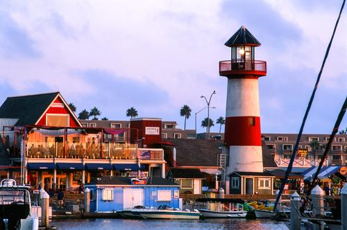
I was "testing" the camera and Fuji 400 ISO color negative film. I caught the Oceanside, CA Harbor Lighthouse at sunset with the sun just hitting the horizon.
It's Friday night and the energy is just getting going. And it is fun!
Upstairs, customers are outside at the tables of the Lighthouse Oyster Bar and Grille where the food is absolutely fresh every day from the fishing fleet, docked just out of the image. Luis's Especiale pasta and seafood stew is to die for.
Downstairs Dominic is making fantastic pizza and Italian food. The restaurant bar is an attraction of its own not only for drinks but for its huge Ice Cream Bar and Italian desserts made fresh daily. Spumoni forever!
And at the Rockin' Baja Lobster, you can get everything from a Hamburger to Lobster. And they play nothing but Rock and Roll!
Yowzer!
Rich
This is photojournalism country. Photo and text complement each other. Lots of activity. Lots of energy. Perfect weather. The striped lighthouse is vibrant. The furled sails on the right promise adventure.
The text belts along with all the rhythm of a goodtime rockn'roll song. We can't tell the story from the photo but the story doesn't surprise. It all fits together like a Jimmy Buffet album cover. -
@Rich42 has written:
Nice scene and light but a little too oversaturated on my screen.
-
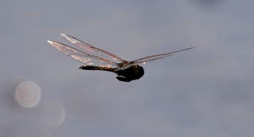
I tripped over some unseen wire in the paddock the other day. Lens was cradled in my left hand, elbow bent (which is how I support the 1.5kg of G9 + PL 100-400 when walking). So landed on knees, one hand and one elbow. Neither the camera nor the lens hit the ground but the jolt telescoped the lens out a bit. I was worried about the lens becoming de-centred or something else. The couple of shoots since then were inconclusive - nothing focused sharp enough to tell.
However today proved that all is well. And,,, my little friends are back... 😊
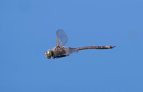
The Emperor, looking bold...
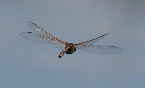
and delicate
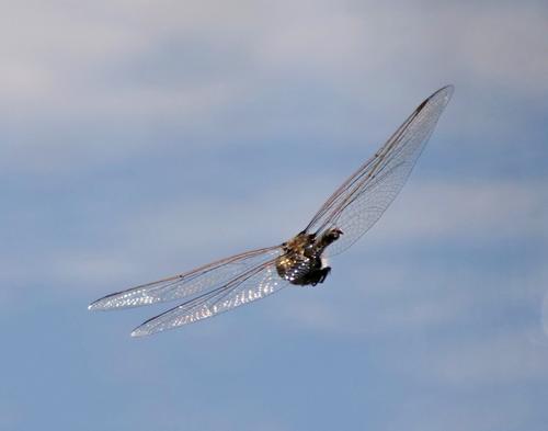
Enjoying the sun
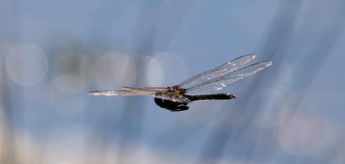
some headlights
and some moonlight...
-
@Bryan has written:
I tripped over some unseen wire in the paddock the other day. Lens was cradled in my left hand, elbow bent (which is how I support the 1.5kg of G9 + PL 100-400 when walking). So landed on knees, one hand and one elbow. Neither the camera nor the lens hit the ground but the jolt telescoped the lens out a bit. I was worried about the lens becoming de-centred or something else. The couple of shoots since then were inconclusive - nothing focused sharp enough to tell.
However today proved that all is well. And,,, my little friends are back... 😊
The Emperor, looking bold...
Yes, looks like it is still working fine. They are really difficult to capture in flight, they dart around constantly changing direction. You did well here :-)
Hope you are also still "working fine" and well recovered OK after the fall !
