• Members 3945 posts
    Aug. 21, 2024, 10:21 a.m.

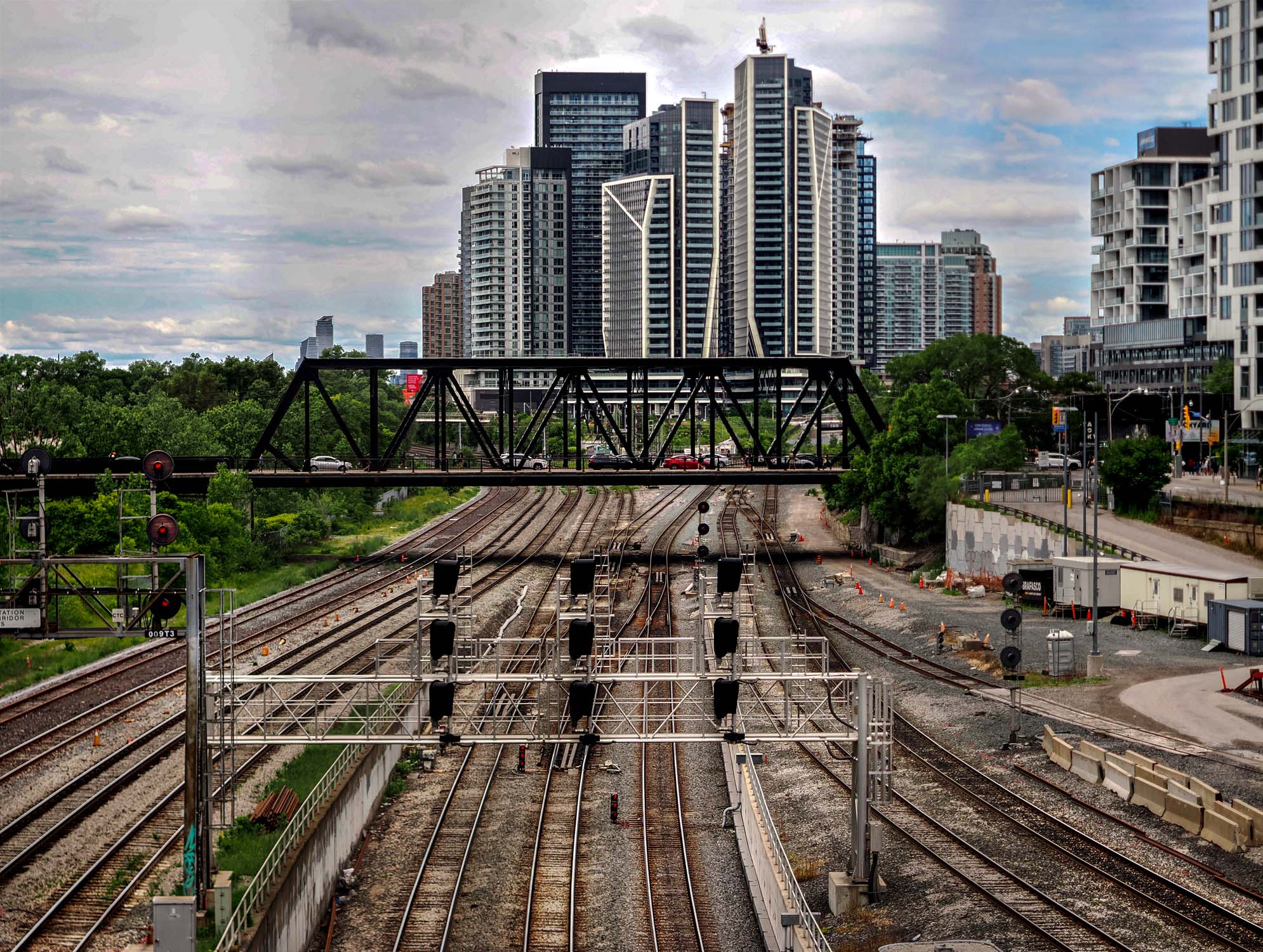
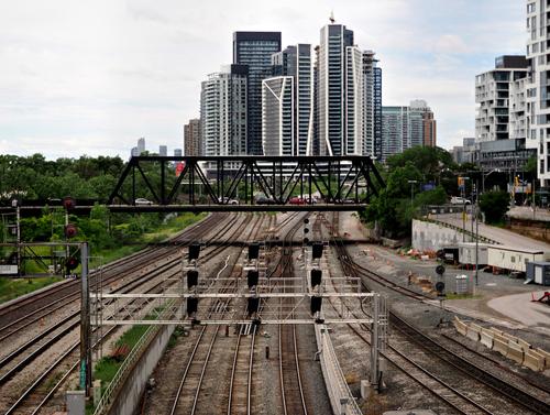
    Very nice story telling urban scene but unfortunately the near washed out sky detracts from it.

    Luckily it's not clipped much so can be recovered to a large extent.

    This version with a some selective dodging and burning on the rail tracks looks significantly better on my screen.

    Just some food for thought 😊


    dprevived.com/media/attachments/7d/82/2mGxdUJNHD6EpOJ9RPTORmbUnAs2NmPXXU8juLUurlV1edc3N2eciutIYjBrtoYJ/urbancrossroads.jpg

    urbanCrossroads.jpg

    JPG, 566.7 KB, uploaded by DanHasLeftForum on Aug. 21, 2024.

  • Members 1074 posts
    Aug. 21, 2024, 11 a.m.

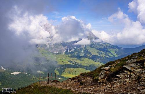
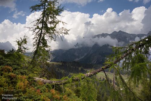
    You are blessed with wonderful scenery there.

    I wondered if a contrast boost might reduce some of the cloud / atmospheric haze. It did, so I had a bit more of a play. A subtle tweak to saturation seemed ok and and a boost in shadows and reduction in highlights brought the shaded foreground up a bit and seemed to even out the lighting (but did bring some haze back...). I hope it passes muster...

    Nice depth of field and detail, I am guessing you were further away than the foreground suggests?

    dsc-5596-smaller-a.jpg

    dsc-5596-smaller-a.jpg

    JPG, 2.6 MB, uploaded by Bryan on Aug. 21, 2024.

  • Members 689 posts
    Aug. 21, 2024, 11:15 a.m.

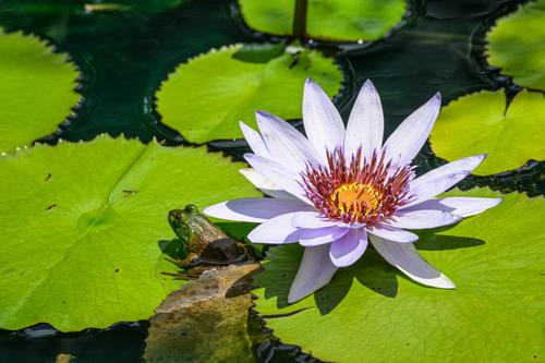
    Princess and the frog
    Princess and the frog.jpg

    Princess and the frog.jpg

    JPG, 1.9 MB, uploaded by Sagittarius on Aug. 21, 2024.

  • Members 1361 posts
    Aug. 21, 2024, 11:21 a.m.

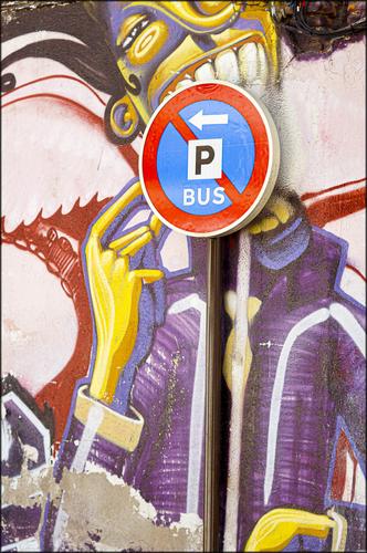
    Lollipop

    Lollipop.jpg

    Lollipop.jpg

    JPG, 2.2 MB, uploaded by MikeFewster on Aug. 21, 2024.

  • Members 319 posts
    Aug. 21, 2024, 11:28 a.m.

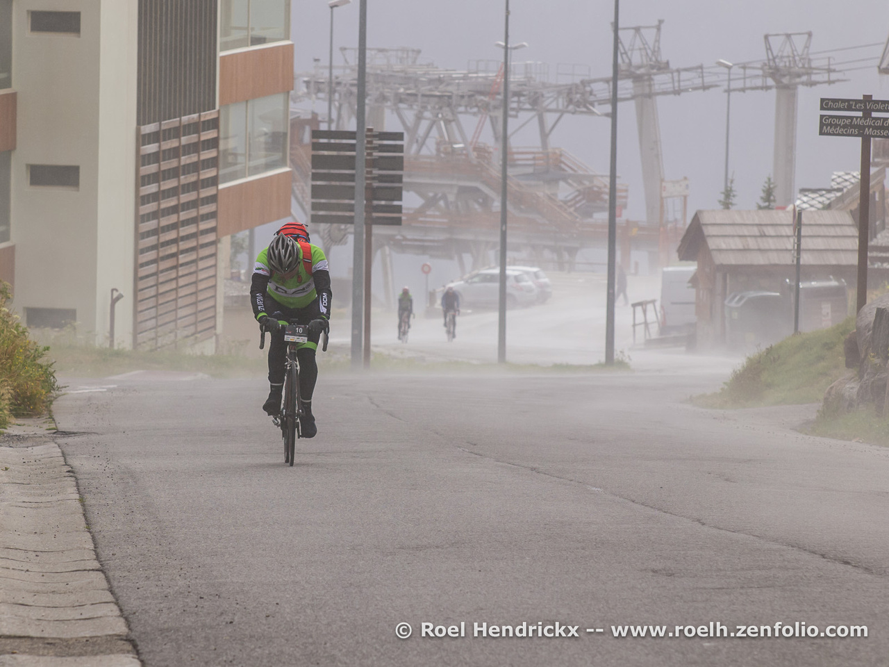
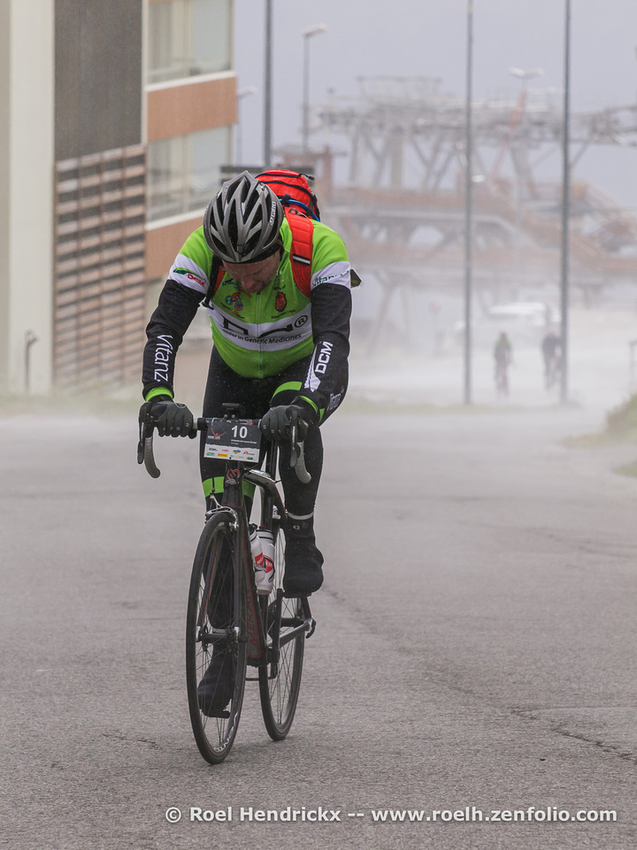
    If I could have seen a facial expression in the second photo, I would prefer it.
    But, in both photos, his face is facing downward.
    In the first photo, I can see the environment in which the race is taking place and that he is racing up a hill.
    That's why I like the first photo better.

  • Members 319 posts
    Aug. 21, 2024, 11:40 a.m.

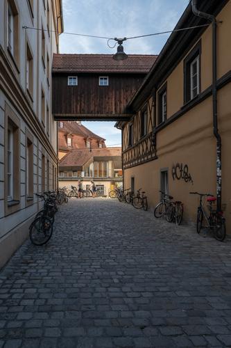
    Side street in Bamberg
    Fortunately, the cyclists didn't take long to arrive.
    * Please do not edit this photo.

    L1000265.jpg

    L1000265.jpg

    JPG, 2.3 MB, uploaded by Kumsal on Aug. 21, 2024.

  • Members 855 posts
    Aug. 21, 2024, 11:45 a.m.

    Thanks Bryan, yes, I'm certainly pleased and feel lucky to live here.

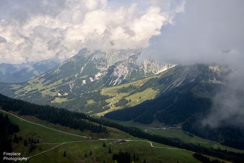
    The day itself was quite hazy, there was really a lot of moisture still hanging in the air from all the rain the previous night, some of the paths had incurred noticeable damage from that prolonged heavy rain.
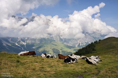
    Thanks for the edit. When I processed these I did remove some of that haze, but if you remove more then it soon starts to look unnatural to me, ending up with a saturation level and contrast level that you wouldn’t normally see. In the compositions I tried instead to use that somewhat hazy background compared to the sharper foreground, to emphasize the depth in the image, keeping it looking fairly natural. Also, I didn’t want the foreground to steal the show from the background and so actually reduced the contrast and saturation there a bit . It’s all a matter of taste of course :-)

    I think haze has got a bad name, but it can be quite attractive and useful sometimes ;-)

    Thanks, it was taken at about 35mm (FF), I wasn't that far away from the foreground, so the haze didn't affect the foreground, leaving it quite sharp.
    There was another photographer there at the same time with a tall tripod. He had setup a little higher than where I took this photo and he wanted to make a panorama and avoid most of the foreground. I think that result might have been a bit flat without the extra contrast provided by the foreground, but I didn't see his result so can't say for sure.

  • Members 1361 posts
    Aug. 21, 2024, 11:56 a.m.

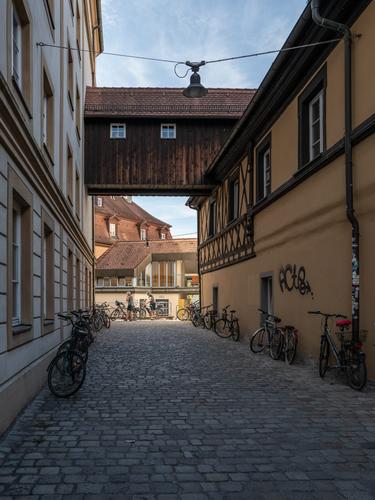
    It's a classic old European street. It's the cycles and cyclists that add interest. Therefore you could consider two ways to increase their presence in the photo. Crop up from the bottom so the base of the shot is just below the closest bikes. This would give a U shape line of bikes linking those parked on the right, those across the back and then those down the left. As it stands, all the empty space now at the bottom of the shot adds nothing to the cycle theme. I think you should raise the shadows a little as well. I know you don't like altering what you think is the original scene. If you wish, I'm happy to explain why I think it would be OK here, even from your approach to photography Kumsal. I wont do it unless you tell me to go ahead.

  • Members 1361 posts
    Aug. 21, 2024, 12:10 p.m.

    A beautiful pairing. The sharp detailing in the flower is quite exquisite and demands exploration. Ditto the frog prince. It is the pair of them side by side that makes the shot. I'd crop in hard around the two of them. The image is detailed and sharp enough to carry the enlargement. I dont think the surrounding water lily leaves are adding much. Make the most of the flower details so they and the frog dominate the image and their sharpness impresses.
    An appropriate title.

  • Members 1361 posts
    Aug. 21, 2024, 12:35 p.m.

    The first has more sense of place. The ski lifts extending to the right give balance to the rider on the left. The added background tells more about the slope being climbed.
    The second is all about the rider. The downturned head suggests the struggle.
    The chasing riders are more distinct in one than two. they do a bit more to suggest "race." In one, I like the space in front of the rider. There's more pain to come.
    I prefer one. Some of the preference is because I can see more of the location. In a series on the race you need some establishing shots but perhaps these are already there? Given that these were part of a reportage cover, I think they have to be seen along with the series to make a comparison.

  • Members 319 posts
    Aug. 21, 2024, 12:51 p.m.

    And this version according to Mike's suggestions:

    L1000265.jpg

    L1000265.jpg

    JPG, 2.7 MB, uploaded by Kumsal on Aug. 21, 2024.

  • Members 1361 posts
    Aug. 21, 2024, 12:56 p.m.

    What I hugely like here is the flow of the railway lines into the tall city buildings. The extended parallel lines that make up each merge together. The travel flows into the city and vice versa. If that idea appeals, consider a crop something like the following to give more weight to the lines of the rails and building and stressing how they flow together. Taking out the buildings to the right keeps our attention on the movement of the lines. In the original, the sky highlights are blown out a bit. With the crop, this doesn't matter as the attention is transferred to the lines of the buildings and the lack of sky detail helps them stand out.
    rail lines..jpg

    rail lines..jpg

    JPG, 110.0 KB, uploaded by MikeFewster on Aug. 21, 2024.

  • Members 1074 posts
    Aug. 21, 2024, 1:03 p.m.

    Yes I hear you. I try to be careful not to push beyond what would appear natural but have probably been guilty of it occasionally - mostly when I didn't realise what I had done...

    Something to remember there.

  • Members 855 posts
    Aug. 21, 2024, 1:33 p.m.

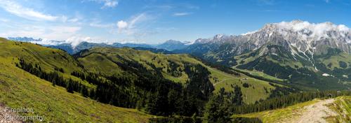
    Many thanks JS, I've visited this place quite a few times over the years, I did make a make a pano on one or two of those trips. Here's one from 2017. It was a different type of sunny day with no haze and less clouds, and you can definitely see more of the surroundings, especially if you zoom into this pano shot :-)
    It's a different type of photo of course than the "details" picked out in my OP :-)

    P8071260 pano_stitch de2 smaller (2).JPG

    P8071260 pano_stitch de2 smaller (2).JPG

    JPG, 12.7 MB, uploaded by Fireplace33 on Aug. 21, 2024.

  • Members 1243 posts
    Aug. 21, 2024, 1:38 p.m.

    It's humorous and very colorful capture. Initially, takes a moment to decipher the set-up, but understandably it become obvious what the scene is all about longer you look at it. Very interesting and intriguing shot.

  • Members 1243 posts
    Aug. 21, 2024, 1:43 p.m.

    Very warm and appealing image with typical European feel. I would however lopp off some cobblestone passage from the bottom - 20%(imho).

  • Members 1243 posts
    Aug. 21, 2024, 1:45 p.m.

    Magnificent and sharp image of a lily. Background is ideal. Very appealing shot.

  • Members 855 posts
    Aug. 21, 2024, 1:46 p.m.

    I like the original image from Chris too for the same reasons that Mike mentions and the crop here seems to emphasize that.