VELDSTRAAT SWIMMING POOL
I shot new images for an upcoming update of the book "500 Hidden Secrets Antwerp".
One of the newly featured locations is a renovated Public Swimming Pool in the Veldstraat.
The pool dates from the early 20th Century and is a nice example of functional art deco style (not TOO many ornaments but done tastefully).
This image is an outtake that will not be included in the book.
For the book, more "objective" and less arty images are preferred.
It is very rare that a fisheye image gets selected by the publisher.
In this case, other, more classic images of the pool and some of the decorations were chosen.
I still like it though.
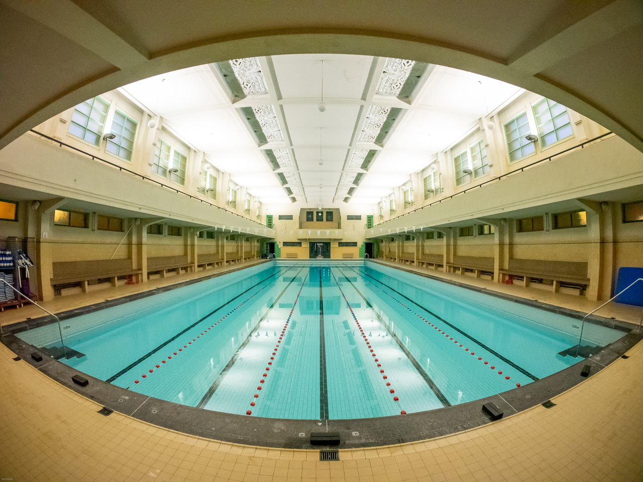
EXIF is incomplete because the Rokinon 7.5mm fisheye is a manual lens that does not communicate with the camera.
Aperture was probably close to wide open. Shutter speed was just good enough for hand-holding.