• Members 701 posts
    Sept. 12, 2024, 7:40 p.m.

    Mike,

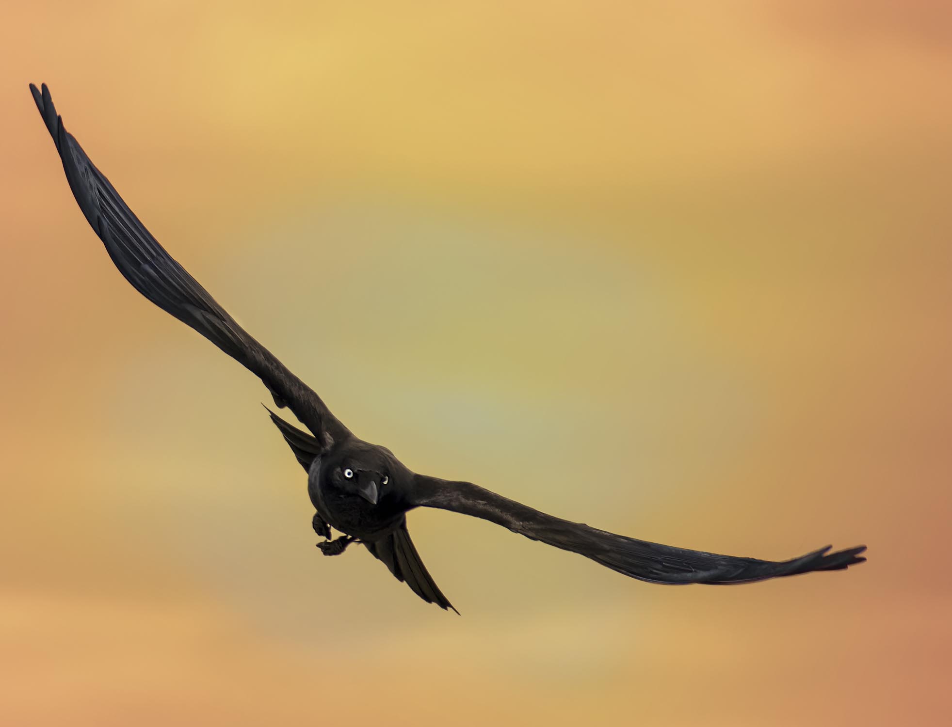
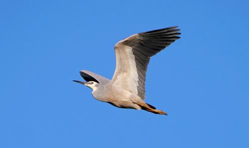
    This is not a bird of prey. It's a crow. Very graceful (in flight, only).

    While they might invade another bird's nest and eat eggs or very young, they don't attack from the air. They're scavengers. They do attack hawks in the air to drive them away, but not as prey. They don't use their claws as a bird of prey would. They scream their heads off and nip at the tail feathers and wing tips.

    From the angle and position of the wings, he or she is probably looking for a landing spot.

    Rich

  • Members 319 posts
    Sept. 12, 2024, 9:22 p.m.

    With the title, the photographer creates the impression that a bird of prey is taking aim at its prey.
    This is misleading if you can't tell a crow from a bird of prey.

  • Members 1361 posts
    Sept. 12, 2024, 9:33 p.m.

    You are both correct. I still like the shot though. I assumed the dark colour was from the background light and that the photographer had PP d the yes. The claws should have alerted me.
    Looking at it again, I think I was misled by Alan's comment.

  • Members 1361 posts
    Sept. 12, 2024, 10:08 p.m.

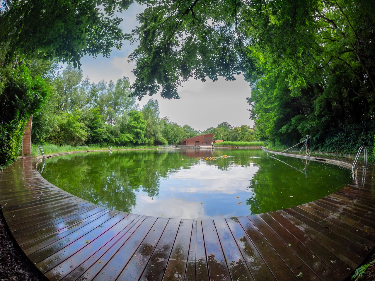
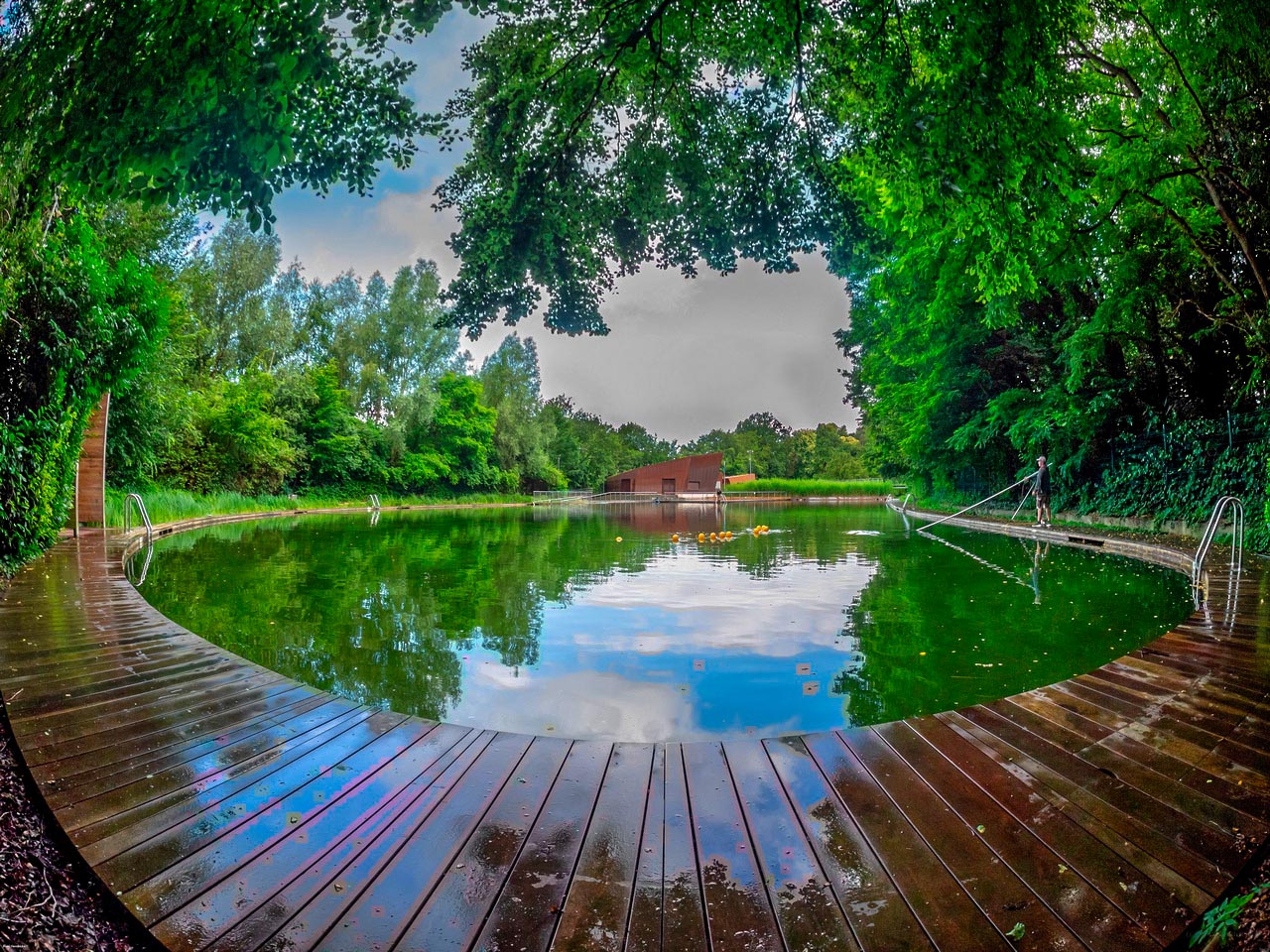
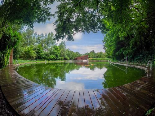
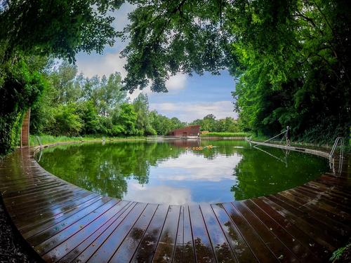
    The original first, then the suggested edit.
    The "eyeball" format of the image gets attention. The framing green foliage and the decking lines combine to draw the viewer into the scene. What more can you ask of a travel guide shot on a hot day?
    The edit. It doesn't work. The burning in of the clouds is overdone. It hasn't added detail, it just looks like a dark bulls eye blob that doesn't mesh with the rest of the cloud formation. The clouds weren't overexposed in the first place. Then compare the edited version with the original along the tree line at the bottom of the burnt in cloud area.
    The greens in the edited version now look lollipopped. The worst aspect is the disconnection between the sky and an overbrightened reflection. Reflections need a little less saturation than the original. The reflection blue has been over saturated and the clouds now seem from a different image.

  • Members 3945 posts
    Sept. 12, 2024, 10:23 p.m.

    I took this photo from the decking in our backyard during one of the Covid lockdowns.
    .
    I first noticed the crow out of the corner of my eye. I spun to my left and hit the shutter button. The camera was in burst mode, as I was photographing other birds at the time, and was lucky to get this keeper.

    The crow swooped across the backyard and landed at the base of a tree near the right boundary fence.

    The image gives me the impression it was "zeroing in" on its landing spot during its "final approach".

    The background was edited in post.

    Earlier this thread I posted a link to a similar version and the original.

  • Members 3945 posts
    Sept. 12, 2024, 10:29 p.m.

    The edit isn't meant to be a final image. After all, I spent only about 5 minutes on it and I don't have the raw file which I would need for a final image.

    The edit is a starting point for food for thought.

    The edited sky looks better on my screen.

  • Members 1361 posts
    Sept. 12, 2024, 10:37 p.m.

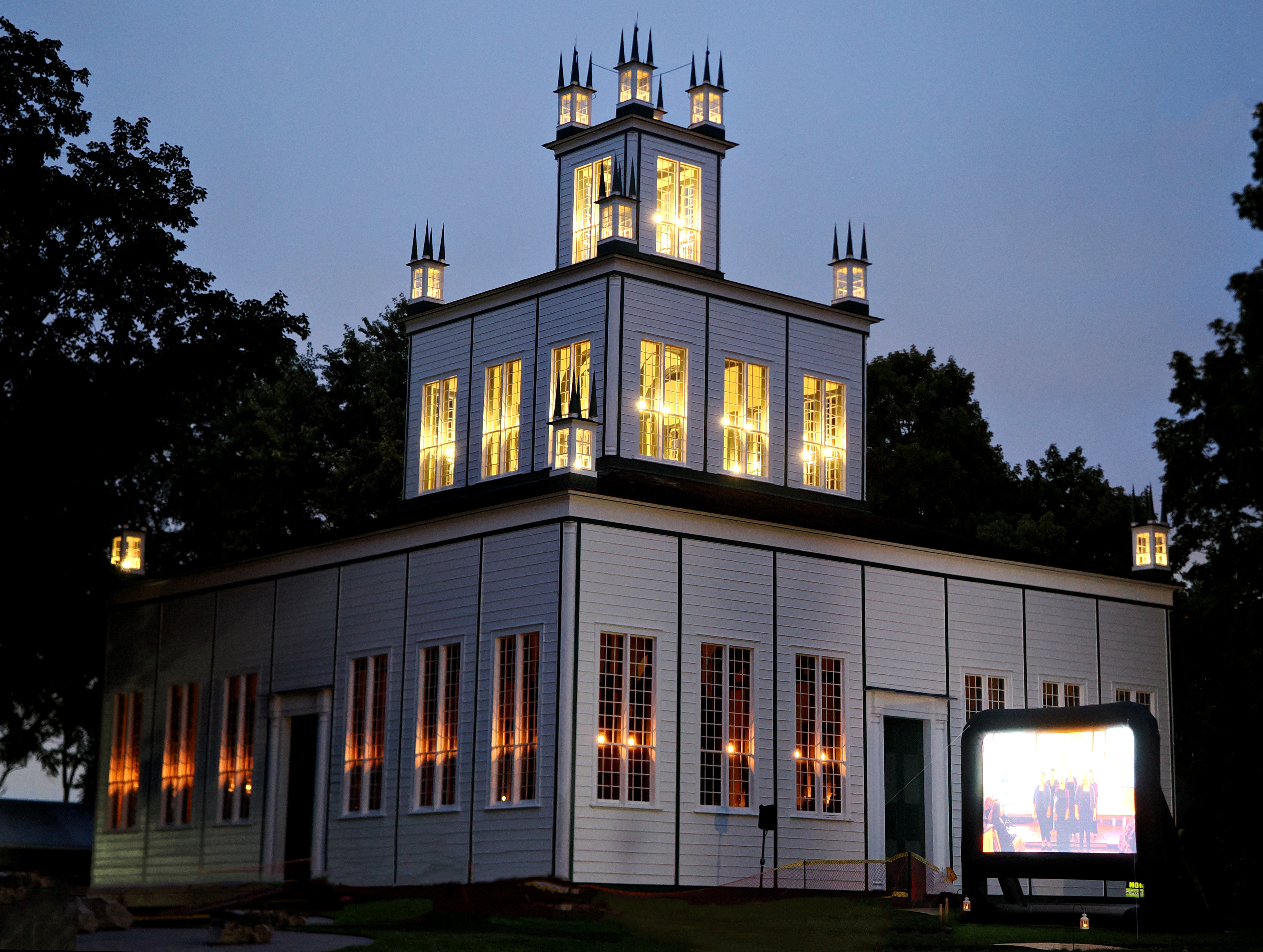
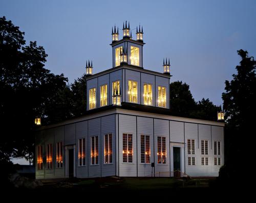
    Once again, I was prompted to do some googling to find out about the subject. An intriguing slice of history with unusual buildings.
    As the building here is the subject, I think some work on the verticals PP is required. I don't know what lens was used but I'm assuming it is at the wider end. It depends on the lens and whatever vantage point you were shooting from but some correction might have been possible by having the camera a little higher.
    Re Dan's suggestion of exposing to the right. Yes, ETTR works but it would have added a further problem here. Check the media screen. It is already too bright and overexposed. The exposure you have works well to bring out the lighting that is a feature of the building. I'd be looking to reduce the highlights locally in the screen area. The screen is a part of the celebration, it should be clearer while not detracting from the image. In this case, I think a noise reduction program would be a better step than ETTR. But I'd note Dan's guide to ETTR for future use.

  • Members 1361 posts
    Sept. 13, 2024, 12:22 a.m.

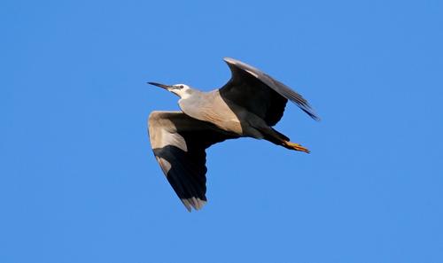
    I think you are getting the exposures about right here for capturing the birds in flight against the sky. A little bit of wingtip blur adds movement without losing the main details. The shadows might be opened up a little but you wouldn't want to open them completely. They add depth and reality.
    I agree with Chris re liking the third shot, it is a bit more unusual in the moment you have caught it although in this case I'd have cropped in a little closer.

  • Members 3945 posts
    Sept. 13, 2024, 4:49 a.m.

    I would use ETTR for a scene like this.

    For anyone interested, let's consider a practical example showing the benefits of ETTR and how it would help immensely in reducing the visible noise in Chris' photo below.

    dprevived.com/media/attachments/a0/4d/da6S86yceZTx1OEgKFaucOe0fhuVLPlGHQ083ufOIkBswRSx7zFbIYLtztXppqgT/r1010011x.jpg

    Chris said he set ISO to 2500.

    I described the ETTR process earlier and so won't repeat it here. Suffice to say that with ISO 100 , 4.66 stops lower than 2500, at least 22 times more light would have hit the sensor than the amount that hit the sensor with ISO 2500. That is a huge extra amount of light that would increase the SNR in the raw data significantly. It is higher SNR that reduces the amount of visible noise in an image.

    Now, after setting base ISO (assuming iso 100) and ETTR'ing, when you open the raw file in the raw converter it will most likely look way too light. That is ok and expected but no important highlights have been clipped.

    In post you then adjust the image lightness of the ETTR'd data back to what you like as a final image. Let's assume the ETTR'd raw data is adjusted so that the image lightness is as close as possible to the original ISO 2500 jpeg.

    Although the image lightness of both the ISO 2500 and ISO 100 ETTR'd and processed images is as close as possible, the ISO 100 ETTR'd final image will have significantly less visible noise than the ISO 2500 jpeg.

    The ETTR'd final image will have far less visible noise than the ISO 2500 image because the SNR of the ISO 100 raw data will have been very much higher than the SNR in the ISO 2500 raw data. The higher SNR is due to the extra amount of light that hit the sensor in ISO 100 shot as described earlier.

    So whether you ETTR or not is not dependent on whether you want to raise shadows or not. Using ETTR is all about getting as much light onto the sensor as possible within DOF and blur constraints without clipping important highlights. This maximises the SNR within the DOF and blur constraints resulting in minimising visible noise in the final image after processing the raw data to a final image.

  • Members 1361 posts
    Sept. 13, 2024, 5:49 a.m.

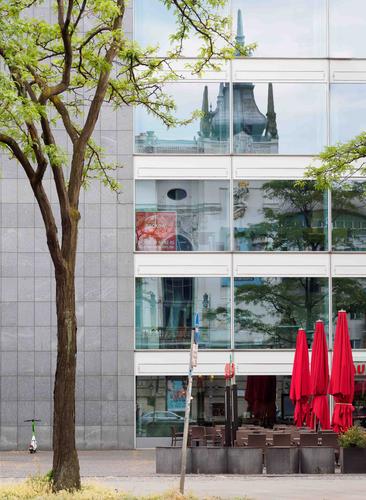
    A gentle little composition of vertical lines. As always, repeated vertical lines convey dignity and harmony. Here they suggest that the different aspects of the city are at ease with each other. Different eras, different styles. The repeating tree forms and the repeating furled umbrellas pull the foreground and background together as does the grey of the modern wall and the similar grey in the reflection. A city at peace with itself and its history.

  • Members 1361 posts
    Sept. 13, 2024, 6:02 a.m.

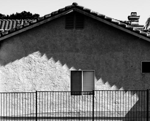
    I'm struck by the similarity of these shadows to similar sawtooth shadows I've been looking at from Japanese roofs.
    Why do I like shots like this? I don't know but I do.
    The horizontal line across the bottom feels a little heavy to me. Perhaps crop just above it?

  • Members 1361 posts
    Sept. 13, 2024, 10:03 a.m.

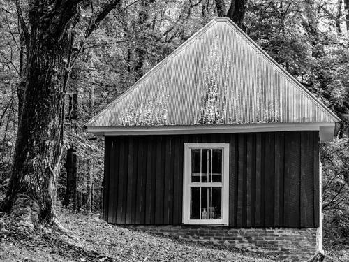
    Curious indeed. How thick are the walls? A cool room of some sort? Is there a ceiling or does the interior extend right up to the roof? Do you get snowfalls that warrant such a tall and steeply pitched roof? But connected to the master bedroom via an underground vaulted ceilinged tunnel? This is the stuff of paperback novels with lurid covers. I'm envious.
    By not showing a doorway (they usually give clues to purpose or at least to domestic activity, you have prodded the viewer into asking about the purpose. It looks old but in good condition. It would have fooled revenue collectors.
    Any moonshining tradition in the family?

  • Members 3945 posts
    Sept. 13, 2024, 11:40 a.m.

    I disagree.

    With ETTR you can reduce the amount of visible noise the noise reduction app would need to remove.

    The more noise a NR app needs to remove the more likely it is you could end up with unwanted artefacts.

    In Chris' image there is still considerable visible noise. ETTR would have reduced that considerably by adding at least 4 stops of light onto the sensor, given ISO was 2500.

    Any residual noise would then be much easier for a NR app to remove with less likelihood of unwanted artefacts.

  • Members 1548 posts
    Sept. 13, 2024, 11:42 a.m.

    That plan sounds logical to me. I would do much the same.. This is a wonderfully composed image that has terrific eye appeal, and is well served by the fish eye lens. Trying to imagine it with another lens is now hard to do once we've seen the magic it can make. That wet rounded walkway is just delicious.

    The sky, however, is a problem. Your original version is less troublesome than the offered edits but still, the gray is a dead giveaway of insufficient detail, and the reflection reminds us what is blown out. Perhaps there is some additional detail in the sky in your original raw file or one of the others in that set that can be retrieved - which is always preferable. Just for the heck of it I pretended it was mine and that I had irretrievably lost sky detail and reconstructed a sky from the reflection in the pond. Imperfect for sure but the concept may have some promise and it was a fun exercise for which I thank you.

    p722597021-6.jpg

    p722597021-6.jpg

    JPG, 404.8 KB, uploaded by minniev on Sept. 13, 2024.

  • Members 1548 posts
    Sept. 13, 2024, 11:49 a.m.

    Yes, I remember this one and the conversation about it on the original critique section here, with a more saturated background with that version. I really like the image, and prefer this less saturated version which lets the bird take precedence over the sky. His eye is almost the same color as a portion of the sky now, which makes him stand out even more. It is an excellent capture to begin with, with a straight-on pose that brings us right into connection with the bird. There is enough detail but not too much, allowing the image to remain artistic rather than documentary. I love the tilted pose, the searching gaze, the spread tail and tucked feet. Really nice one.

  • Members 1548 posts
    Sept. 13, 2024, noon

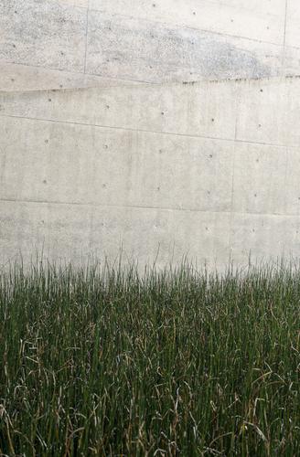
    Though I know nothing about the museum you hoped to photograph in, I can say that I probably prefer this to whatever you might have found there. Many museum photos have the disadvantage of being photographs of someone else's art (or at least, one's interpretation thereof), where this is a photograph that is your own art. It's an interesting abstract with an interesting but limited color palette, a limited set of compositional concepts (lines), and a limited set of textures. There is a visual challenge in puzzling out the lines and the changes in directionality of those lines. Visually it is very "contained" and manages to be both soothing and unsettling at the same time. I like it.

  • Members 1074 posts
    Sept. 13, 2024, 12:03 p.m.

    I can't add anything to your comments and I do like your sky. I just thought a bit of contrast would help plus a wee sharpen

    Roel Minnie Edit p722597021-6 USM10R05C20.jpg

    Roel Minnie Edit p722597021-6 USM10R05C20.jpg

    JPG, 544.7 KB, uploaded by Bryan on Sept. 13, 2024.

  • Members 1548 posts
    Sept. 13, 2024, 12:31 p.m.

    Beautiful structure with a wealth of architectural details, dramatically (and historically) lit. You've captured the lighting so nicely, and the contrast between the warm candle/lantern type light with the deep blue of the early night sky creates a welcoming and comforting air. The outdoor screen is a harsh reminder of our being in the modern era, and I agree with some that it shows up too bright, which might be unavoidable in a single capture in these conditions. The screen can be subdued somewhat in post, so that it isn't as much of a distraction, unless you like its brightness for the contrasting message of old/new.

    I honestly wanted to see what this wonderful old structure looked like without the screen so I tried an edit and asked Photoshop to get rid of it. It did a fairly credible job of it, I think. So I went a bit further, gave it some breathing room and straightened it a touch, then did a bit of noise reduction.

    p.jpg

    p.jpg

    JPG, 3.5 MB, uploaded by minniev on Sept. 13, 2024.