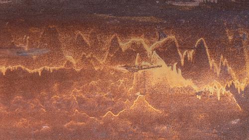
When I posted this photo I had just returned from a hot and disappointing day walking up and down hills between galleries (some of which turned out to be closed or had specific, previously unannounced closures of some exhibits for photography) on Naoshima. I quite like the photo I posted but it wasn't what I had been looking forward to shooting when I set out.
-
-
@MikeFewster has written:@MikeFewster has written:@MikePDX has written:
Abstract Distractions 3 - Rust Conquers all (the final chapter)
My final set of abstract photos - for now at least. A person can really go crazy looking into the details of a rusty surface.
G'Day MikePDX
It has taken me a while to get around to these. I've been hopping on and off ferries and trains and buses and sitting in various waiting places trying to write responses where I can get net access.
I like them individually and collectively. Each has repetitions of colour and form that make it worth looking at in its own right. Collectively there is pleasure in the variety of forms rust can take. Rust can produce such strong colours.
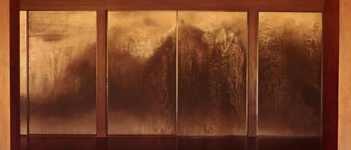
In the next day or so I'll download some shots I took yesterday at an expensive art installation. Keep your eye on your second example.The following is a wall from one of the many art installations on Naoshima. In one village, complete old houses scattered around the town are preserved and turned into works of art. The Art House project. The wall is in the Ishibashi family home site. Compare it with MikePDX's second rust image.
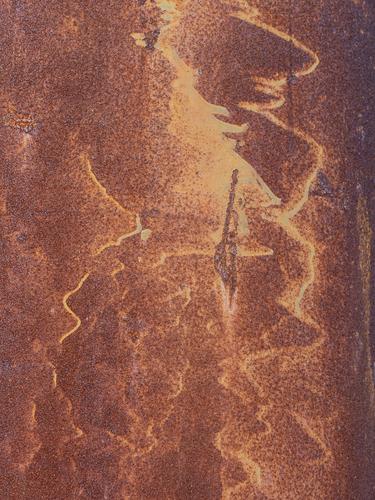
That's a very interesting comparison. Curiously, your photo is almost as if you were looking at mine through a window.
One of the things I'm coming to learn about abstract photos is to look at them from all angles with an open mind. My shot is of a steel pier in a boat basin. It originally presented itself as seen below. But once I rotated it, it became a mountain scene, maybe in China. Here is a similar shot to the unedited original:
-
-
@Sagittarius has written:
These are all mine, don't even think about it.😀
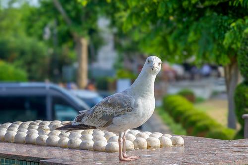
Please do not editThe combination of the photo and the title and the gull's accusatory expression made me smile. The molded design does indeed look like 100 eggs rowed up and I began to follow your storyline and imagine the gull was fooled by them. It's a cute shot with a great little story.
-
@JSPhotoHobby has written:
I'm not sure these came out very well, I shot this on my phone and edited in lightroom on my phone.
The tiny screen makes this very difficult for me.You can edit.
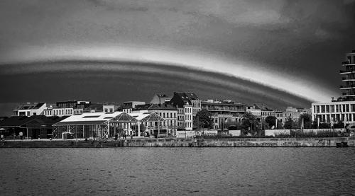
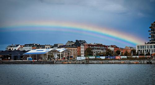
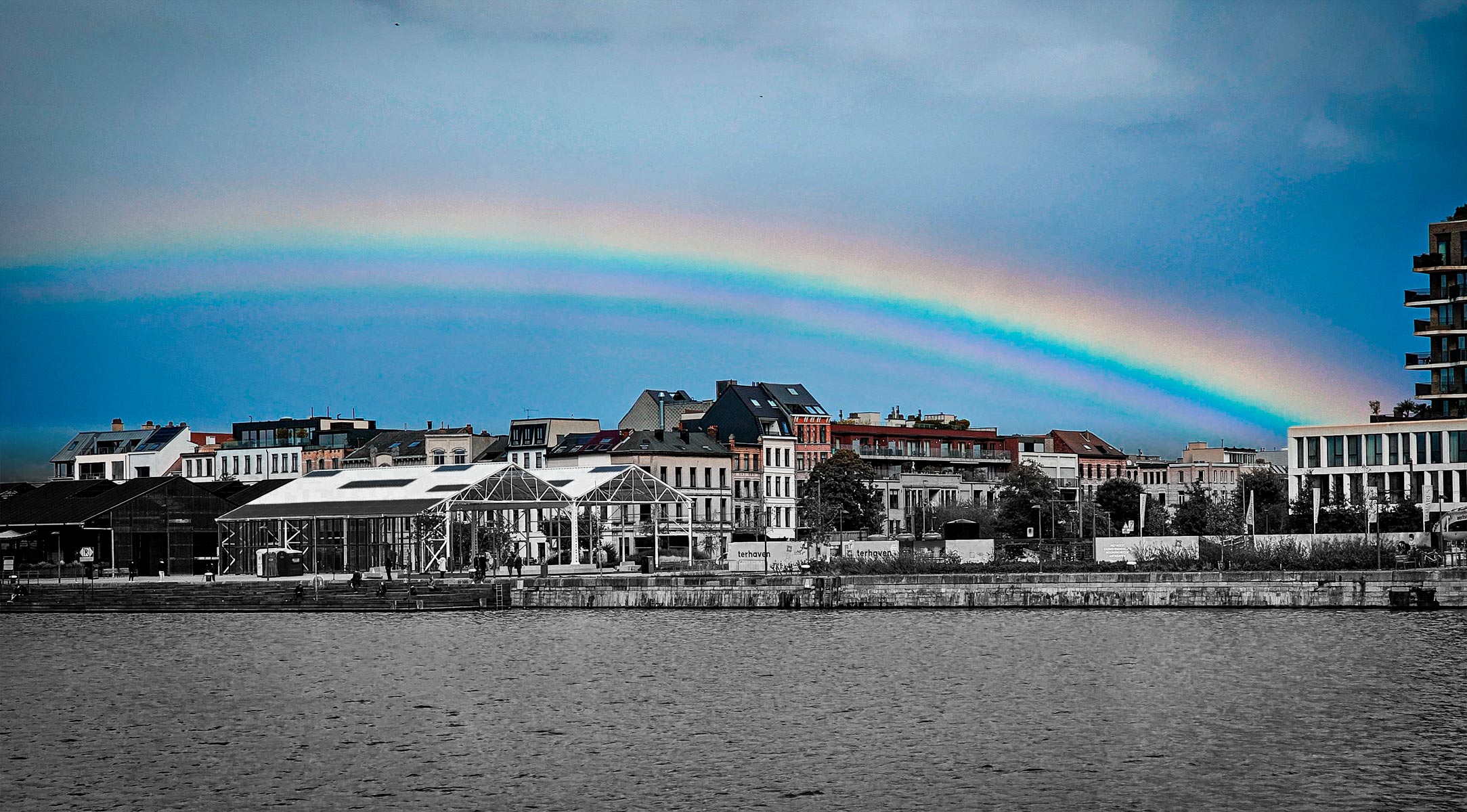
Lovely rainbow and the rainbow IS the story and the subject here. I really like the concept of black and white for a rainbow, something I've never tried and am now asking myself why I have never thought of it. Like many phone images, it is noisy, and the noise multiplies when you do any editing on them. A dose of noise removal might help.
-
@DanHasLeftForum has written:@ChrisOly has written:
Nostalgic Ritual
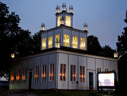
Sharon Temple built 1832 has a long running annual tradition to illuminate the site on the first Friday of September to celebrate the "harvest" among the community with music (choir) and the "feast" of local produce etc.
Image taken on tripod with release cable and iso set for 2500.
As I showed earlier, ETTR would have helped immensely in reducing the visible noise.
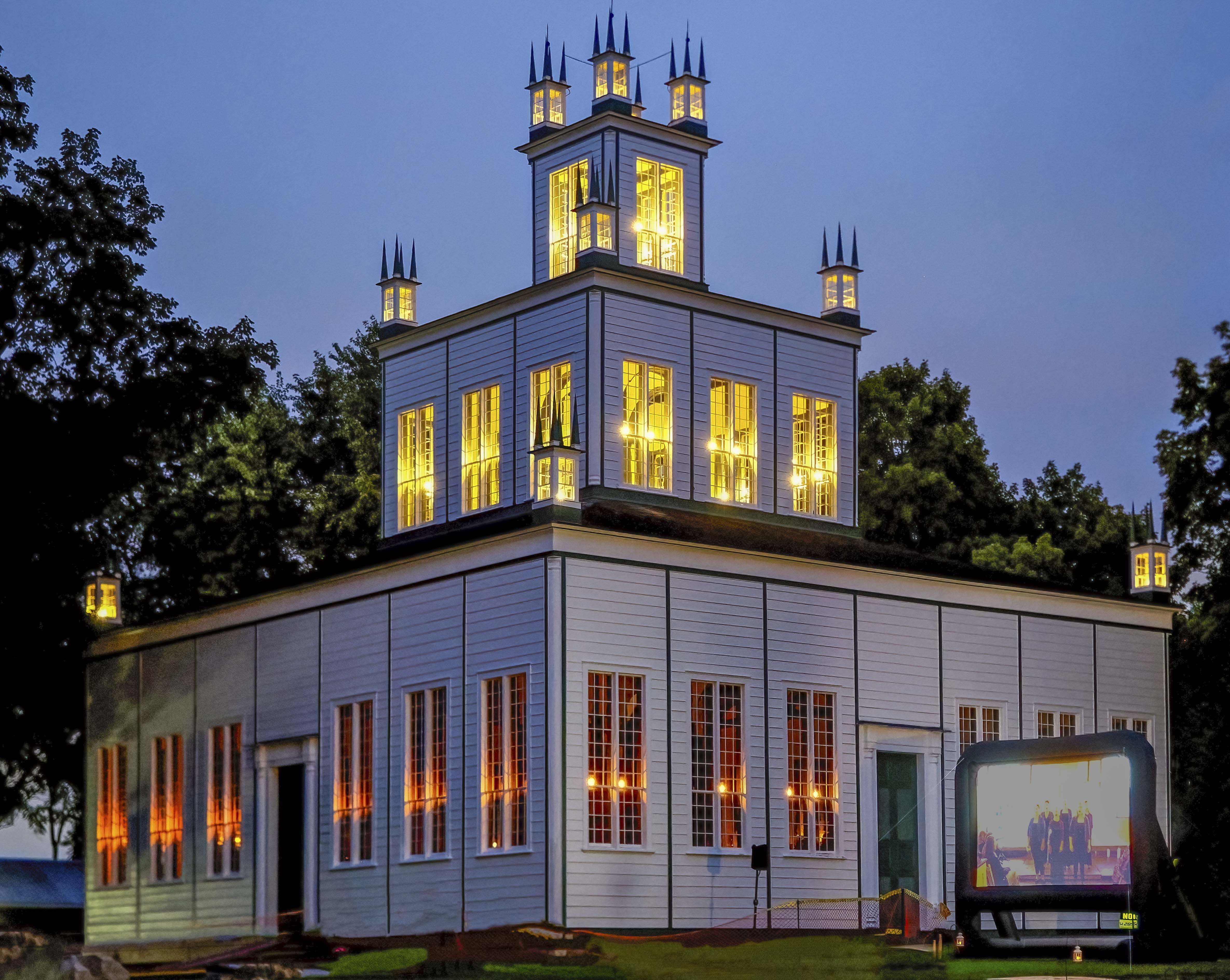
Fwiw, I straightened and denoised and sharpened as much as I dare to push it using Topaz Denoise AI. Photoshop's denoising outputted a far too grainy sky with considerable artefacts in the foliage on the left which are too noticeable for my liking.
I used ACR and Photoshop Elements for some tonal adjustments which work better for me. The screen really needed a separate shot appropriately exposed to be inserted into the final image.
If I had a nearly noiseless raw file which ETTR would have provided the image would have cleaned up much more.
Anyway, just some food for thought 😊
I already liked the original photo (and the story).
Good angle resulting in a classic and harmonious symmetrical composition.
The lighting of the windows adds a lot.And then Dan made the image pop some more.
-
@minniev has written:@RoelHendrickx has written:@minniev has written:@RoelHendrickx has written:
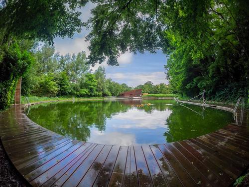
SWIMMING POOL BOEKENBERGPARK
Like the image from last week, this is another outtake (not selected by the editors and ublisher) from my images for the new upcomlng edition of "500 Hidden Secrets Antwerp" from Luster Publishers.
And like last week, it is an ultra wide angle (fisheye) image of a peculiar swimming pool
This is the Boekenbergpark outdoor swimming pool: a closely monitored but fairly natural (no chemicals) swimming pond in one of Antwerp's parks.
It is open year round. In winter, the local club of "polar bears" (cold water swimmers) take their dips and swims. In summer, the crowd is somewhat bigger.I went there very early morning, because it would clear that shooting images there with bathers, would create a privacy- and rights nightmare for the book.
I happened to arrive when the pond cleaning crew was working.
This provided me with pretty free general access, also to the areas where normally only barefoot bathers are allowedA stroke of luck.
I rely on these strokes of luck for my tourist guide photography.
Because meticulous (hour to hour) planning to photograph 15 to 20 locations in one day may sound like a good idea but is actually totally unpragmatic.
Making strict appointments for certain hours is even less viable. I try to get access when I am there, and if not, I move on to another item.
What I do prepare, is a clear list of the locations, and a map with all the adresses and opening hours (for shops, museums, restaurants). And then I wing it.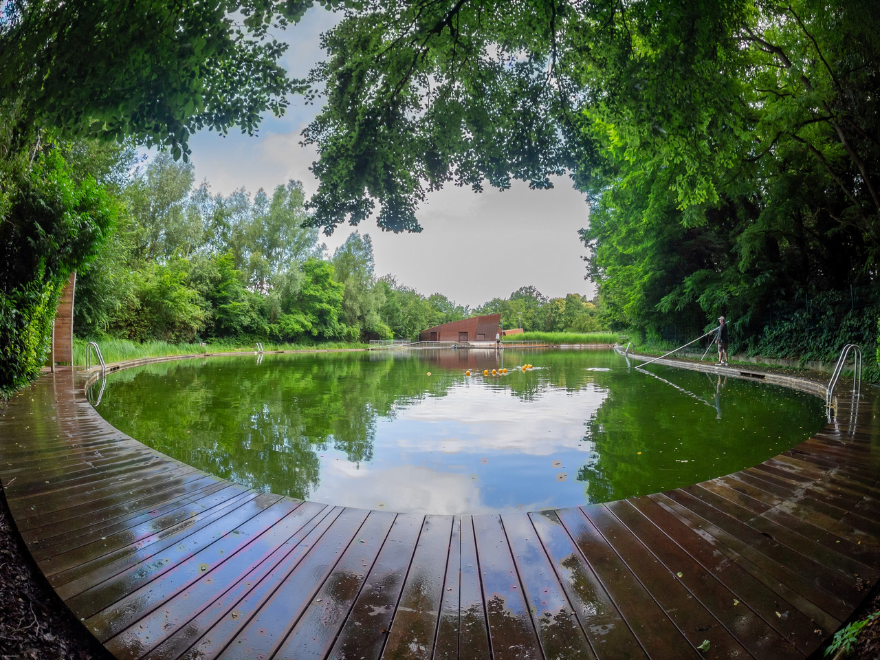
That plan sounds logical to me. I would do much the same.. This is a wonderfully composed image that has terrific eye appeal, and is well served by the fish eye lens. Trying to imagine it with another lens is now hard to do once we've seen the magic it can make. That wet rounded walkway is just delicious.
The sky, however, is a problem. Your original version is less troublesome than the offered edits but still, the gray is a dead giveaway of insufficient detail, and the reflection reminds us what is blown out. Perhaps there is some additional detail in the sky in your original raw file or one of the others in that set that can be retrieved - which is always preferable. Just for the heck of it I pretended it was mine and that I had irretrievably lost sky detail and reconstructed a sky from the reflection in the pond. Imperfect for sure but the concept may have some promise and it was a fun exercise for which I thank you.
That is a wonderful intervention.
I wish I was able to do things like that.
But I am (a) a bit too lazy and (b) a bit too stubborn, insisting that in principle, I try to avoid digital manipulation in the sense of content replacement.
It's not like there are pulitzer prizes or World Press Photo rules involved (it is "just" guidebook photography), but I still always try to get the shot that is required, working with the situation that presents itself, selecting angles and vantage points etc to hide distractions. It is a big part of the fun and challenge for me.
Sky replacement has probably become always easier, but somehow it rubs me wrongly (not in other people's images but in my own).I feel much the same. In general, I don't do sky replacement. I have probably done it less than a half dozen times before today, and then only for play to see what would happen. Once I did it for pay because a fellow wanted a particular image of mine "with puffy white clouds", and all the factors in the image would never be available together again, ever. So I went back to the scene and reshot it on a day with puffy white clouds, then dropped that sky into the image he liked. He was thrilled. I still felt kinda weird about it.
This image was a unique opportunity to actually try to replace a lost sky with itself because of the clarity of the reflection and the other information available in the image about what the sky was like in real life. I just made a patch of the reflected sky, turned it upside down and dropped it in place.
One last touch is missing: the sky, which has been replaced quite well, should at least be as bright as the reflection in the swimming pool.
I notice that we are getting further and further away from real photography.
Does the moment captured with the camera have anything to do with reality?
What is this forum actually about? -
@Kumsal has written:
What is this forum actually about?
The explanation in the op is very clear to me.
-
@DanHasLeftForum has written:@Kumsal has written:
What is this forum actually about?
The explanation in the op is very clear to me.
But creativity in Photoshop is much more difficult than in photography.
What isn't there in the photo could probably only be added in Photoshop by very talented painters. Because they have a feeling for light and shadow, color moods and reflections.
Photographers usually lack the eye for this, which I see again and again in this forum. -
@Kumsal has written:@DanHasLeftForum has written:@Kumsal has written:
What is this forum actually about?
The explanation in the op is very clear to me.
But creativity in Photoshop is much more difficult than in photography.
What isn't there in the photo could probably only be added in Photoshop by very talented painters. Because they have a feeling for light and shadow, color moods and reflections.
Photographers usually lack the eye for this, which I see again and again in this forum.All the original and edited images in this thread are within the scope described in the op.
Just post the type of images you are interested in within the op's scope just like everyone does.
-
@DanHasLeftForum has written:@Kumsal has written:@DanHasLeftForum has written:@Kumsal has written:
What is this forum actually about?
The explanation in the op is very clear to me.
But creativity in Photoshop is much more difficult than in photography.
What isn't there in the photo could probably only be added in Photoshop by very talented painters. Because they have a feeling for light and shadow, color moods and reflections.
Photographers usually lack the eye for this, which I see again and again in this forum.All the original and edited images in this thread are within the scope described in the op.
Just post the type of images you are interested in within the op's scope just like everyone does.
I think I can comment on every post in this forum.
It's about whether whatever you do at least corresponds to human perception.
Without contradictory elements, the spectrum is very broad.
Then, of course, artistic freedom comes into play... -
@Kumsal has written:@DanHasLeftForum has written:@Kumsal has written:@DanHasLeftForum has written:@Kumsal has written:
What is this forum actually about?
The explanation in the op is very clear to me.
But creativity in Photoshop is much more difficult than in photography.
What isn't there in the photo could probably only be added in Photoshop by very talented painters. Because they have a feeling for light and shadow, color moods and reflections.
Photographers usually lack the eye for this, which I see again and again in this forum.All the original and edited images in this thread are within the scope described in the op.
Just post the type of images you are interested in within the op's scope just like everyone does.
I think I can comment on every post in this forum.
It's about whether whatever you do at least corresponds to human perception.This is where I and I suspect some others disagree, at least to some extent.
If the intention for a final image is a close as possible documentary representation of the scene then yes I totally agree with you that the final image on the creator's screen should correspond to their perception of the scene when the photo was taken.
If the intention is not a documentary representation of the scene then just about anything goes.
@Kumsal has written:Without contradictory elements, the spectrum is very broad.
Then, of course, artistic freedom comes into play... -
@minniev has written:@JSPhotoHobby has written:
I'm not sure these came out very well, I shot this on my phone and edited in lightroom on my phone.
The tiny screen makes this very difficult for me.You can edit.
Lovely rainbow and the rainbow IS the story and the subject here. I really like the concept of black and white for a rainbow, something I've never tried and am now asking myself why I have never thought of it. Like many phone images, it is noisy, and the noise multiplies when you do any editing on them. A dose of noise removal might help.
Ditto on the originality of a B&W rainbow: it becomes a halo of sorts.
Noise seldom bothers me.
Especially in a B&W image, I tend to just think of it as “grain” and that turns a defect into an artistic asset.
There are exceptions of course. -
@JSPhotoHobby has written:
I'm not sure these came out very well, I shot this on my phone and edited in lightroom on my phone.
The tiny screen makes this very difficult for me.You can edit.
I like the colour version much more but to highlight the rainbow more, maybe a combination of the 2 images?
I used a black to white gradient on a layer mask with the 2 images stacked on top of each other.
-
@DanHasLeftForum has written:@Kumsal has written:@DanHasLeftForum has written:@Kumsal has written:@DanHasLeftForum has written:@Kumsal has written:
What is this forum actually about?
The explanation in the op is very clear to me.
But creativity in Photoshop is much more difficult than in photography.
What isn't there in the photo could probably only be added in Photoshop by very talented painters. Because they have a feeling for light and shadow, color moods and reflections.
Photographers usually lack the eye for this, which I see again and again in this forum.All the original and edited images in this thread are within the scope described in the op.
Just post the type of images you are interested in within the op's scope just like everyone does.
I think I can comment on every post in this forum.
It's about whether whatever you do at least corresponds to human perception.This is where I and I suspect some others disagree, at least to some extent.
If the intention for a final image is a close as possible documentary representation of the scene then yes I totally agree with you that the final image on the creator's screen should correspond to their perception of the scene when the photo was taken.
If the intention is not a documentary representation of the scene then just about anything goes.
@Kumsal has written:Without contradictory elements, the spectrum is very broad.
Then, of course, artistic freedom comes into play...This is the kind of thing I'm writing about in my far from finished piece on photography C&C.
I agree with Dan. Photography isn't one thing. If a photographer's aim is to try to produce an image as seen by the human eye, that's fine. It's an entirely OK aim for a photographer to have and they make their photographs accordingly.
However, there are many other possibilities when making photographic process images.
Then there is what the viewer brings to the experience. A shown image is a communication that triggers responses. At this point it is relevant to consider most of the factors in our response to art in general. -
@minniev has written:
Mystery Building
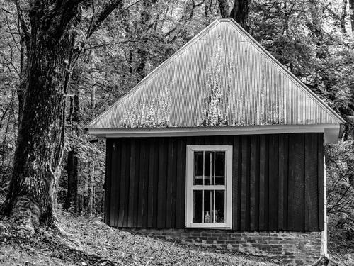
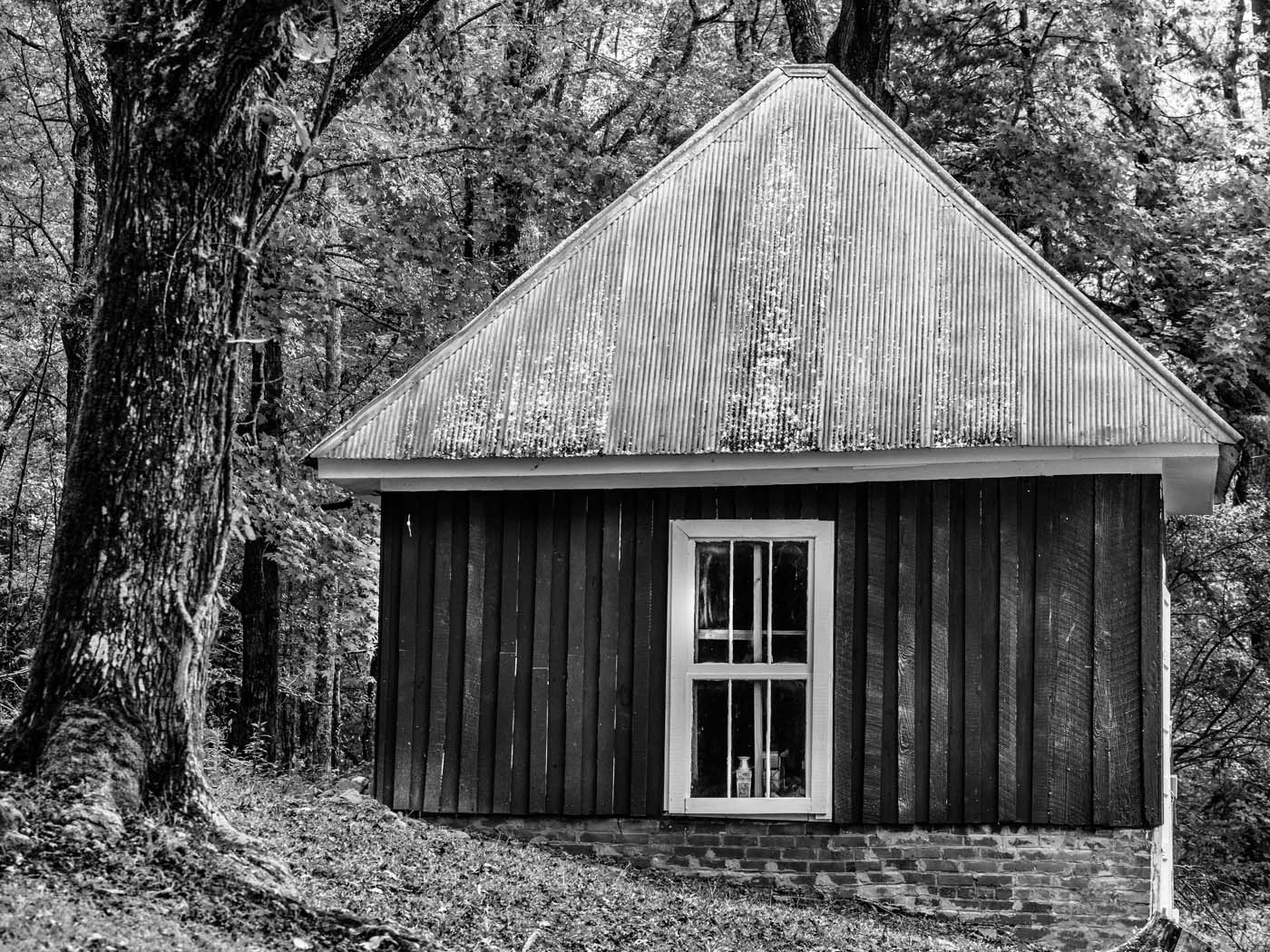
We have a couple of surviving outbuildings on the farm that we are unsure about, and this one is the most confusing. Two historical architects have been unable to ascertain what it was. My mother and her siblings referred to it as the playhouse because when she was a small child (about 1930) my grandfather turned it over to the children. But it was built in 1908 as an extension of the original house, connected to the master bedroom by a 10 ft long underground brick vaulted tunnel. So it must have had some function for the farm or house. It is one 12x12 room, with 4 windows, originally just shutters, one door, no chimney, and a brick shelf on all 3 sides about 3 ft high.
Very nice photo and back story.
For me though, the roof blends too much into the background because they both have similar lightness. I think more contrast between the roof and background help to hut stand out more overall.
Here I just darkened the background a bit around the edge of the roof and brought out a bit more texture and detail in the walls timber to also help the hut stand out more.
Anyway, as usual, just some food for thought.
-
@minniev has written:
Mystery Building
We have a couple of surviving outbuildings on the farm that we are unsure about, and this one is the most confusing. Two historical architects have been unable to ascertain what it was. My mother and her siblings referred to it as the playhouse because when she was a small child (about 1930) my grandfather turned it over to the children. But it was built in 1908 as an extension of the original house, connected to the master bedroom by a 10 ft long underground brick vaulted tunnel. So it must have had some function for the farm or house. It is one 12x12 room, with 4 windows, originally just shutters, one door, no chimney, and a brick shelf on all 3 sides about 3 ft high.
@ChrisOly has written:I would guess only, but it does resemble some kind of storage or utility structure.
It's well built and it sits on solid stone foundation which suggests being of somewhat permanent nature.
Nevertheless, tin roof, stone base and wood siding and the fact it's surrounded by trees create great interest by it's simplicity and functionality, whatever it may be.Thanks Chris. We figure it had some important purpose for the farm business, close to the house. My grandfather's "office"? A storage area with better accessibility to the main road? Park of the dairy operation? Dunno. Still a mystery.
@MikeFewster has written:Curious indeed. How thick are the walls? A cool room of some sort? Is there a ceiling or does the interior extend right up to the roof? Do you get snowfalls that warrant such a tall and steeply pitched roof? But connected to the master bedroom via an underground vaulted ceilinged tunnel? This is the stuff of paperback novels with lurid covers. I'm envious.
By not showing a doorway (they usually give clues to purpose or at least to domestic activity, you have prodded the viewer into asking about the purpose. It looks old but in good condition. It would have fooled revenue collectors.
Any moonshining tradition in the family?Thanks for thinking with me Mike! The roof is open to the rafters but with a small planked area over about 1/3 of the west side. Extra cedar shakes and some other old farm implements were stored there when I got it. The house and this outbuilding have the same high pitch pyramidal roof, though snowfall has always been rare and light here. It supposedly allows hot air to rise from living and work areas during hot summers. We know the underground section was used as a storm cellar, but the elaborate nature of the layout wasn't necessary for just that purpose, so there must have been another reason. That whole underground section became unstable in the 1950s and was sealed off, so no chance to explore it. My mother remembered it and some of the vaulting was visible when another portion of the tunnel collapsed when I was a young adult. Moonshining? Yeah. But my grandfather kept the still on the back 40, He and two neighbors and a couple of their sharecroppers tended it back there, and if the Government Men were in the area, they moved it across the fenceline onto the property of a man they didn't get along with. And the doorway is the white protrusion barely visible on the right side. The vaulting started there, and runs into the external wall of the bedroom. I salvaged some of the bricksand made a brick walkway to mark the lines of the old vaulting.
@DanHasLeftForum has written:Very nice photo and back story.
For me though, the roof blends too much into the background because they both have similar lightness. I think more contrast between the roof and background help to hut stand out more overall.
Here I just darkened the background a bit around the edge of the roof and brought out a bit more texture and detail in the walls timber to also help the hut stand out more.
Anyway, as usual, just some food for thought.
Thanks. Yours are subtle improvements that I think make it a better photo!
-
@minniev has written:@DanHasLeftForum has written:
Very nice photo and back story.
For me though, the roof blends too much into the background because they both have similar lightness. I think more contrast between the roof and background help to hut stand out more overall.
Here I just darkened the background a bit around the edge of the roof and brought out a bit more texture and detail in the walls timber to also help the hut stand out more.
Anyway, as usual, just some food for thought.
Thanks. Yours are subtle improvements that I think make it a better photo!
Thank you minniev.
I mainly dodged and burned using a separate layer in Photoshop Elements with some additional brightening of the top left window panel in the door.
