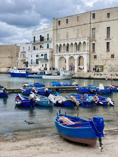
Like that vertical boat at first and followed by row of horizontally located ones. It draws your eye in to explore the surroundings and beautiful buildings ahead. Impending weather change is evident in the sky. The colours play a major role here.
-
-
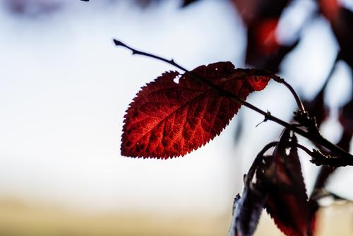
That bright red leaf is simply magical and magnificent. The background with yellow and blue and almost white sets the tone.
-
I have a couple quick thoughts on this image. I love the composition. The leading lines going out to sea (well out to the lake) make me want to climb into one of those boats and go out exploring. But then I'm curious about your camera settings. It seems like f/2.8 is way too shallow a DOF for an expansive scene like this. It looks like your point of focus was on the foreground rocks, leaving some of the boats a bit out of focus. Was that the intent?
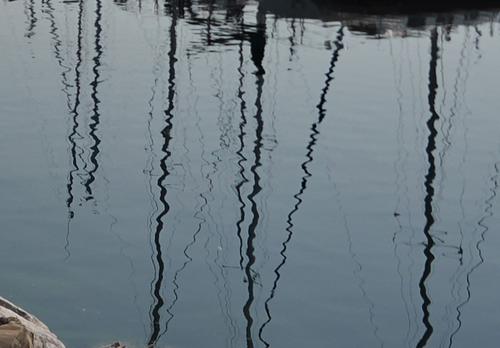
And finally, just as an aside, this would be a great place to do some water reflection photography. With more direct sunlight and a steady ripple in the water, you could get some great shots here. Your shutter speed of 1/8000 clearly captures some of the potential, as can be seen here in this tight crop of your original.
-
Absolutely stellar shot.
You have captured the essence of water and sky and the vessels add a different dimension to the scene. It all harmonizes so well. -
Incredibly interesting (imho) shot. Like the colours, texture, random streaks - it's just perfect abstract. Perfect for the eye and mind.
-
Given the anger management you have exercised initially at the beginning of this project, this take is excellent reward for all the frustration you have endured. The position of your subject is absolutely perfect in relation to the environment surrounding this location. I really like the background, the texture and almost non colour. The ribbon of grass at the bottom is ideal.
-
I may be in minority, but I prefer the subject in it's natural environment. I may be persuaded to introduce a smidgen of a border, but to me reality is more convincing.
-
Thanks for comments. Yes, at the moment of capturing this scene I was really attracted by amount of rocks gathered to create this wall, hence f/2.8.
At another time I would select f/5.6 or higher. It all depends on various conditions or mood.And yes, idea of water reflections entered my mind too. Maybe next time...
-
@RoelHendrickx has written:
MONOPOLI (PUGLIA)
An (Iphone 11) image from yesterday, minutes before the rain.
The blue makes it - and it all points to the blue boat in the distance. Lovely image.
Alan
-
@Rich42 has written:
The sun is crossing the Celestial Equator, creating the Autumnal Equinox. Summer is over and Autumn begins.
I always find it a little sad.
Rich
Your title is perfect. I might add "and darkness descends." The translucent red leaf trying desperately to grab the last of the summer light. For me - and I emphasize that because not everyone will see it the same way - that thin strip of black along the top can be helpful to this concept. But it should occupy more of the frame. If you have more image to work with, you might consider adding more black across the top - enough to just about equal the band of light tan across the bottom.
-
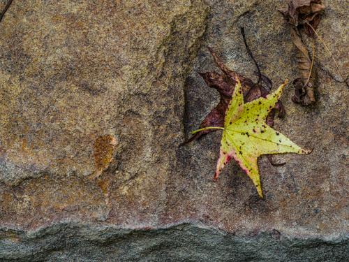
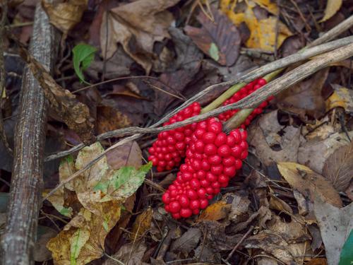
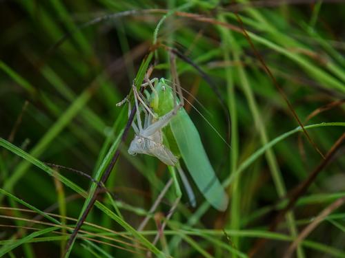
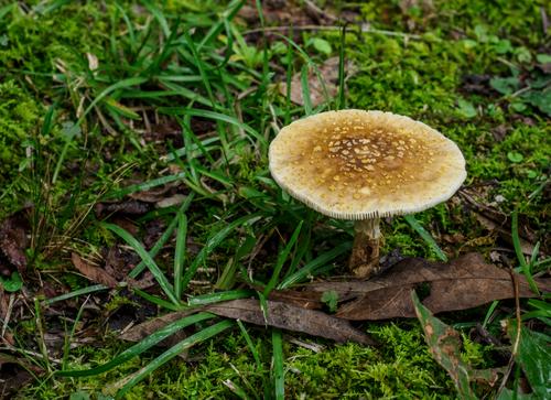
Morning Walk /Late September, just a bunch of record shots of what I found last week on my walkabout.
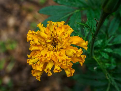
marigold gone wild, end of summer
sweetgum leaves drop the earliest. Sandstone boulders are common here and this one was once a foundation piece for the barn
This is what jack-in-the-pulpit does in fall
I have no idea what is going on here. A grasshopper mourning over a nymph that never developed? Cannibalism?
Wet weather brings out the mushrooms. This one may be amanita?
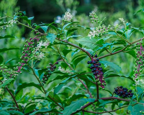
Southern pokeberry leaves are poisonous but if cooked in a very particular way are nutritious and tasty. My cousin poaches eggs in poke sallet (a dish made of the stewed leaves) but I don't think I'd trust myself to make it. Poke grows wild and is plentiful, so was always made use of by poor folks in the rural south. -
@Bryan has written:
The back story on this one.
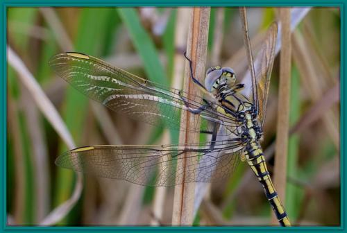
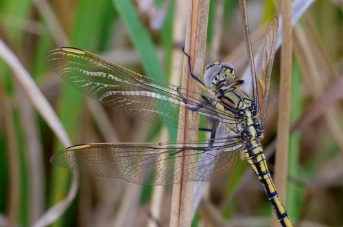
I was trying to capture the sunlight reflecting off his wings on either side. As I crossed, my shadow was cast over him. I took a couple in the shadow just to see. It turned out the images in shadow were more sharp and detailed. The sun reflections were too strong. After some pp and a crop leaving just the insect, comments were made about the busy background - fair enough. Normally I don't like cropping off parts of a subject but it was the only way to reduce the amount of background - and the wings and body were the main part anyway. It still seemed to be missing something and the idea of a border came...[Edit] In view of Mike's comments below, and because there may well be a discussion about borders, I have included the borderless version below for comparison.
As I explained, I don't trust my judgement on borders. Could you add another with a very thin black border please? -
@MikeFewster has written:@Bryan has written:
The back story on this one.
I was trying to capture the sunlight reflecting off his wings on either side. As I crossed, my shadow was cast over him. I took a couple in the shadow just to see. It turned out the images in shadow were more sharp and detailed. The sun reflections were too strong. After some pp and a crop leaving just the insect, comments were made about the busy background - fair enough. Normally I don't like cropping off parts of a subject but it was the only way to reduce the amount of background - and the wings and body were the main part anyway. It still seemed to be missing something and the idea of a border came...[Edit] In view of Mike's comments below, and because there may well be a discussion about borders, I have included the borderless version below for comparison.
As I explained, I don't trust my judgement on borders. Could you add another with a very thin black border please?As I explained, I don't trust my judgement on borders. Could you add another with a very thin black border please?
Why not add a border yourself that you think would be more appropriate?
-
@ChrisOly has written:@MikePDX has written:@ChrisOly has written:
MOORED
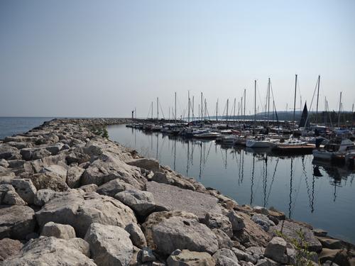
Meaford, Ontario on Georgian Bay just gained a breakwater wall to protect the shore and boats from stormy weather.
I have a couple quick thoughts on this image. I love the composition. The leading lines going out to sea (well out to the lake) make me want to climb into one of those boats and go out exploring. But then I'm curious about your camera settings. It seems like f/2.8 is way too shallow a DOF for an expansive scene like this. It looks like your point of focus was on the foreground rocks, leaving some of the boats a bit out of focus. Was that the intent?
And finally, just as an aside, this would be a great place to do some water reflection photography. With more direct sunlight and a steady ripple in the water, you could get some great shots here. Your shutter speed of 1/8000 clearly captures some of the potential, as can be seen here in this tight crop of your original.
Thanks for comments. Yes, at the moment of capturing this scene I was really attracted by amount of rocks gathered to create this wall, hence f/2.8.
I'm not sure what you mean here.
You said you were attracted by the amount of rocks needed to build the wall but then selected an aperture whose resultant DOF meant that most of them and much of the background are blurred.
If the rocks were so important wouldn't you have wanted at least most of them to be reasonably sharp?
Out of curiosity, why didn't you set a much smaller aperture to give a much larger DOF. Surely you didn't need 1/8000s shutter speed did you?
@ChrisOly has written:At another time I would select f/5.6 or higher. It all depends on various conditions or mood.
And yes, idea of water reflections entered my mind too. Maybe next time...
-
-
@JSPhotoHobby has written:
Wonderful image!
The colors, the composition, and the flow of action.
It's both abstract and personal. There's also a sense of mystery. What is going on here? So many possibilities!
Good stuff.
Rich
-
@RoelHendrickx has written:
MONOPOLI (PUGLIA)
An (Iphone 11) image from yesterday, minutes before the rain.
The strong cobalt blue of the boats dominates the image in a good way, driving the eye on a journey from lower right corner halfway up the frame in a diagonal route. then the other less powerful blues and contrasts pick up the job. A compelling scene that ties culture, architecture, history and scenery together.
-
@Bryan has written:
The back story on this one.
I was trying to capture the sunlight reflecting off his wings on either side. As I crossed, my shadow was cast over him. I took a couple in the shadow just to see. It turned out the images in shadow were more sharp and detailed. The sun reflections were too strong. After some pp and a crop leaving just the insect, comments were made about the busy background - fair enough. Normally I don't like cropping off parts of a subject but it was the only way to reduce the amount of background - and the wings and body were the main part anyway. It still seemed to be missing something and the idea of a border came...[Edit] In view of Mike's comments below, and because there may well be a discussion about borders, I have included the borderless version below for comparison.
That dragonfly is beautiful even without the rest of his tail. I am of mixed minds about the border. I see its purpose as you described, but it feels too heavy and too green. I tend to favor digital borders similar to what I'd do with a print, which is set a whitish matt around it, and a modest black frame around the matt. For a routine digital display without a pseudo-matt, a very thin black border can give an image a more finished look. But by all means keep experimenting, and employ what you find appealing, he is your dragonfly and you've matched the color of the frame nicely to the photo.
