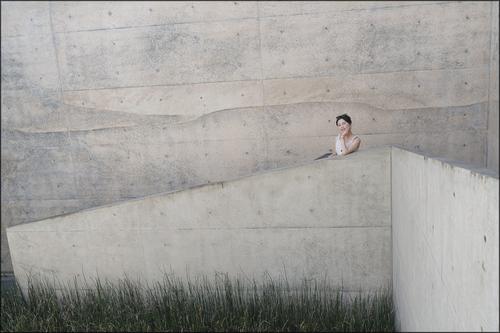
Adding a model makes it a very different photo. The original version was an abstract, while this is an environmental portrait. We see the same textures, lines, and colors, but it is no longer about them but about the woman perched at a pivotal point in the lines. Interesting to see how a human can quickly dominate any scene we enter, and become the center of attention. There may be a political message in there somewhere.
-
-
The clouds are a photographer's delight, tying the series together into a coherent whole. The third is my favorite, because of the story, the visible tension in the man's movement, the effect of the shadow, and the implied force. And of course the warm rich light. That is a wonderful image.
The bird image must be seen at full size to be appreciated. It, too, is a wonderful image with lots of horizontal lines. A bit of fantasy will allow me to imagine the birds being emitted from the wind farm or loosed from the small buoy. But the birds themselves are gloriously free, highly detailed, and buoyant themselves against those beautiful clouds.
The first and fourth suffer a bit from the bright sun and the angle. I run into this problem often especially on the water, and have never been able to tame it with camera work or with basic PP. I end up converting a lot of them to monochrome.
-
I love your abstracts but lack the artistic knowledge to properly critique them so can only say what impacts they have on me.
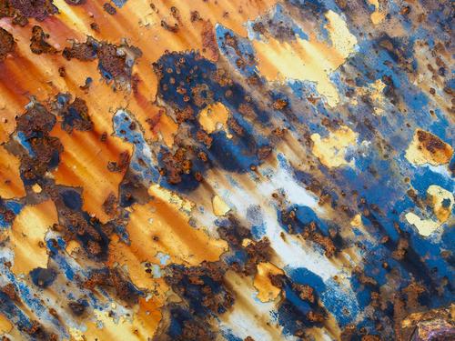
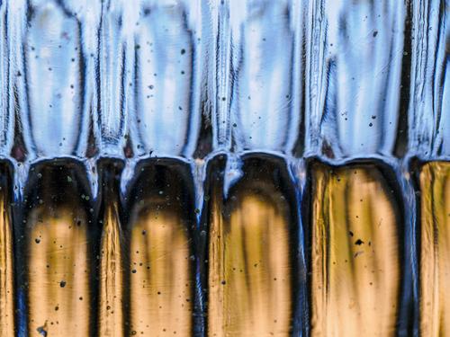
The first has a nice flow from upper left to lower right that feels natural to my eye. The colors are wonderful. The mix of blue and orange, complementary on the wheel, is probably my favorite color combination and I've noticed that most people have strong positive responses to that combo. Add texture as you have here, and you have a winner.
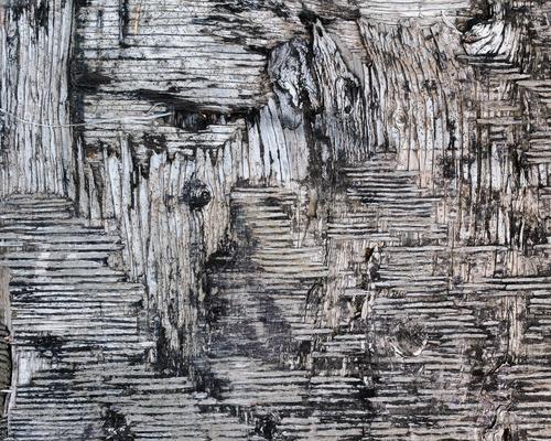
The second reads like an ancient scroll in some indecipherable language. I want to touch it, feel the rough texture, and discover its secrets. The detail is mesmerizing, made more intriguing by the near total lack of color. More color would be a distraction here.
The third is a puzzle. The colors work: a more subdued complementary set of blues and golds. I'm distracted by trying to figure out what it is - books set on edge, Skeletor's teeth, water running out of chutes, a hairbrush??? It seems to ask for more sharpness on the ridge where the two colors meet, but that may be a senseless impression, based too much on trying to figure it out.
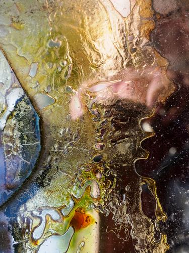
The fourth is fascinating, a little creepy (is that flesh colored thing a hand? What is it reaching for?). The colors nice and rich, the sinuous details in what must surely be liquid are wonderful. This one has more story than the others, and because I am attracted to story, it's my favorite.
PS - I really miss threaded view too. Flat view lends itself to confusion and inhibits real conversation.
-
Long ago when I was a child, some magazine (I think Readers' Digest) had a regular feature on its final page with a set of monochrome close ups (they weren't called macro's back then) that you were supposed to identify the object from. I loved that puzzle. (The answers were printed upside down at the bottom).
-
@ChrisOly has written:
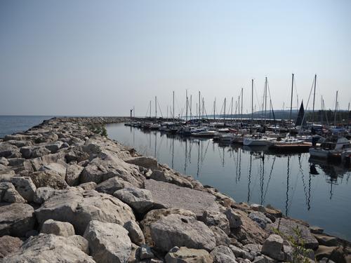
MOORED
Meaford, Ontario on Georgian Bay just gained a breakwater wall to protect the shore and boats from stormy weather.
A cohesively designed image with super powerful leading lines that we are compelled to follow from the lower left corner around the bend to the boat masts, which drive us right back down to the lower right corner by way of the reflections. The graphic nature of the image would lend itself well to a monochrome conversion. Nicely spotted.
-
@Rich42 has written:
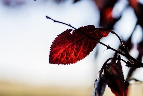
The sun is crossing the Celestial Equator, creating the Autumnal Equinox. Summer is over and Autumn begins.
I always find it a little sad.
Rich
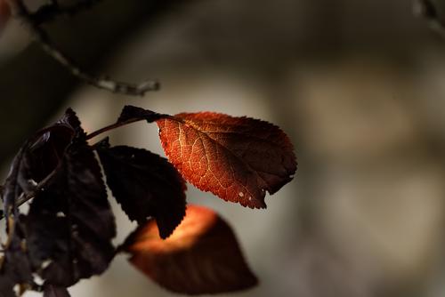
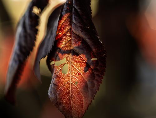
Gorgeous. The lovely rich color palette and the backlit sawtooth leaf make this image so powerful you can almost taste it. Would make a great print. Well done. I love it.
-
@JSPhotoHobby has written:
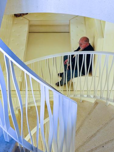
A nice study in form, shape, and line, with a story built into it. The muted colors - light lemon and light blue - are complementary and work beautifully together without overwhelming the story of the man who has descended into a kind of well via a series of geometries. Well spotted.
-
@MikeFewster has written:
As I explained, I don't trust my judgement on borders. Could you add another with a very thin black border please?
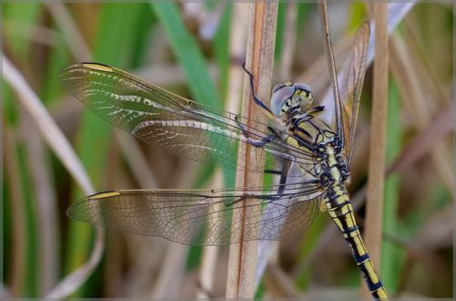
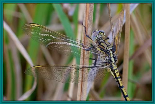
Black seemed to make the legs and stripes on the body stand out too much, so I went with a grey and opacity. Even then, the colour of the viewing background impacts the border's effect - the dark background of my browser makes the border look lighter than the light grey background of the image viewer... Anyway, enough of borders - I am very proud of this image..
-
@MikePDX has written:@Rich42 has written:
The sun is crossing the Celestial Equator, creating the Autumnal Equinox. Summer is over and Autumn begins.
I always find it a little sad.
Rich
Your title is perfect.
I might add "and darkness descends."
Well then, I could have posted . . .
or . . .
😱
Thanks for the comments!
Rich
-
@MikeFewster has written:
Naoshima. Chichu museum.
Version 2 of much the same shot as last week.I don't know if it was meant to be such, but this is a beautiful, quiet, muted, minimalist abstract, with the grounding of a real figure to anchor it.
Lovely.
Rich
-
@MikePDX has written:
Abstract Distractions Reprise - But wait there's more!
I said that last week was going to be the final episode. But I lied - here are a few more of my favorites.
Ultimately, I make photos for myself - both for the end product and for the enjoyment of the process of discovery that happens when I'm out photographing. This has been a new area of photography for me. While these images speak to me, I don't really know if they resonate with others.
So I would just like to say that I'd really appreciate some thoughtful critique. Abstract art, if I can call this art, is very subjective. Each viewer comes away with a unique impression. And to that viewer, it doesn't really matter what I saw in them. It might have been Jackson Pollock who said, "My work ends where the viewer's imagination begins."
Do you get something from them? Saying no is perfectly acceptable, but it would be helpful to me if you'd give some thought to why that is. It's OK if we don't agree - that's part of the learning process. Likewise, if they do speak to you, why? Something more thoughtful than just a "like." In this social-media-frenzied world, "likes" are cheap and not at all helpful. Serious critique is difficult, but it stretches the brain and makes better photographers of both the receiver and the giver.
(I really miss the old DPR threaded view...)
This is a wonderful set of abstracts. I love these kinds of images and look for them all the time, but seldom seem to find them (although they are probably right under my nose).
Non photographers (muggles) never see them and few photographers are really perceptive enough to spot these kinds of opportunities.
Rich
-
@MikeFewster has written:
Naoshima. Chichu museum.
Version 2 of much the same shot as last week.yes, the lady makes it special now :-)
-
@Bryan has written:
The back story on this one.
I was trying to capture the sunlight reflecting off his wings on either side. As I crossed, my shadow was cast over him. I took a couple in the shadow just to see. It turned out the images in shadow were more sharp and detailed. The sun reflections were too strong. After some pp and a crop leaving just the insect, comments were made about the busy background - fair enough. Normally I don't like cropping off parts of a subject but it was the only way to reduce the amount of background - and the wings and body were the main part anyway. It still seemed to be missing something and the idea of a border came...The dragonfly is beautifully captured!
The frame shows how it could look when printed out and hung on the wall. Looks like this frame would work well! -
@MikePDX has written:
Abstract Distractions Reprise - But wait there's more!
I said that last week was going to be the final episode. But I lied - here are a few more of my favorites.
Ultimately, I make photos for myself - both for the end product and for the enjoyment of the process of discovery that happens when I'm out photographing. This has been a new area of photography for me. While these images speak to me, I don't really know if they resonate with others.
So I would just like to say that I'd really appreciate some thoughtful critique. Abstract art, if I can call this art, is very subjective. Each viewer comes away with a unique impression. And to that viewer, it doesn't really matter what I saw in them. It might have been Jackson Pollock who said, "My work ends where the viewer's imagination begins."
Do you get something from them? Saying no is perfectly acceptable, but it would be helpful to me if you'd give some thought to why that is. It's OK if we don't agree - that's part of the learning process. Likewise, if they do speak to you, why? Something more thoughtful than just a "like." In this social-media-frenzied world, "likes" are cheap and not at all helpful. Serious critique is difficult, but it stretches the brain and makes better photographers of both the receiver and the giver.
(I really miss the old DPR threaded view...)
I like this set a lot. The abstracts are colourfull and interesting. I have no idea what they are, I hope you'll let us know :-)
-
@Rich42 has written:
The sun is crossing the Celestial Equator, creating the Autumnal Equinox. Summer is over and Autumn begins.
I always find it a little sad.
Rich
Definitely a clear sign that Autumn is here. The glowing red colour of the leaf is bright and rich, it fits together well with the gentle beige colour at the bottom in a nice diagonal compostion.
-
@DanHasLeftForum has written:@ChrisOly has written:@MikePDX has written:@ChrisOly has written:
MOORED
Meaford, Ontario on Georgian Bay just gained a breakwater wall to protect the shore and boats from stormy weather.
I have a couple quick thoughts on this image. I love the composition. The leading lines going out to sea (well out to the lake) make me want to climb into one of those boats and go out exploring. But then I'm curious about your camera settings. It seems like f/2.8 is way too shallow a DOF for an expansive scene like this. It looks like your point of focus was on the foreground rocks, leaving some of the boats a bit out of focus. Was that the intent?
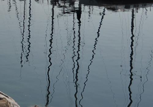
And finally, just as an aside, this would be a great place to do some water reflection photography. With more direct sunlight and a steady ripple in the water, you could get some great shots here. Your shutter speed of 1/8000 clearly captures some of the potential, as can be seen here in this tight crop of your original.
Thanks for comments. Yes, at the moment of capturing this scene I was really attracted by amount of rocks gathered to create this wall, hence f/2.8.
I'm not sure what you mean here.
You said you were attracted by the amount of rocks needed to build the wall but then selected an aperture whose resultant DOF meant that most of them and much of the background are blurred.
If the rocks were so important wouldn't you have wanted at least most of them to be reasonably sharp?
Out of curiosity, why didn't you set a much smaller aperture to give a much larger DOF. Surely you didn't need 1/8000s shutter speed did you?
@ChrisOly has written:At another time I would select f/5.6 or higher. It all depends on various conditions or mood.
And yes, idea of water reflections entered my mind too. Maybe next time...
Some people have this insatiable desire to psychoanalyze every picture -
Facts are: image taker envisioned a scene and selected A for aperture priority and together with setting a lens at f/2.8 and 12mm , camera optimized the process at iso 125 and 1/8000s. That's it, that all. End of story. -
@minniev has written:
Morning Walk /Late September
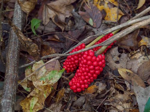
Love this burst of red. Very engaging and attractive and appealing.
-
@ChrisOly has written:@DanHasLeftForum has written:@ChrisOly has written:@MikePDX has written:@ChrisOly has written:
MOORED
Meaford, Ontario on Georgian Bay just gained a breakwater wall to protect the shore and boats from stormy weather.
I have a couple quick thoughts on this image. I love the composition. The leading lines going out to sea (well out to the lake) make me want to climb into one of those boats and go out exploring. But then I'm curious about your camera settings. It seems like f/2.8 is way too shallow a DOF for an expansive scene like this. It looks like your point of focus was on the foreground rocks, leaving some of the boats a bit out of focus. Was that the intent?
And finally, just as an aside, this would be a great place to do some water reflection photography. With more direct sunlight and a steady ripple in the water, you could get some great shots here. Your shutter speed of 1/8000 clearly captures some of the potential, as can be seen here in this tight crop of your original.
Thanks for comments. Yes, at the moment of capturing this scene I was really attracted by amount of rocks gathered to create this wall, hence f/2.8.
I'm not sure what you mean here.
You said you were attracted by the amount of rocks needed to build the wall but then selected an aperture whose resultant DOF meant that most of them and much of the background are blurred.
If the rocks were so important wouldn't you have wanted at least most of them to be reasonably sharp?
Out of curiosity, why didn't you set a much smaller aperture to give a much larger DOF. Surely you didn't need 1/8000s shutter speed did you?
@ChrisOly has written:At another time I would select f/5.6 or higher. It all depends on various conditions or mood.
And yes, idea of water reflections entered my mind too. Maybe next time...
Some people have this insatiable desire to psychoanalyze every picture -
Facts are: image taker envisioned a scene and selected A for aperture priority and together with setting a lens at f/2.8 and 12mm , camera optimized the process at iso 125 and 1/8000s. That's it, that all. End of story.That's fine but it sounds like that to select aperture you simply "spin" the aperture dial and wherever it lands is the aperture you use.
For that scene if the rocks were important to me I would have chosen a much smaller aperture to get as much of the rocks at least reasonably sharp.
