• Members 720 posts
    Sept. 18, 2024, 5:49 a.m.

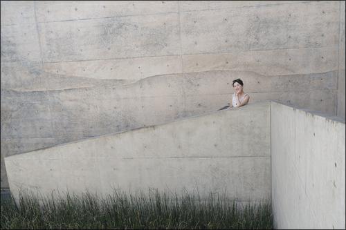
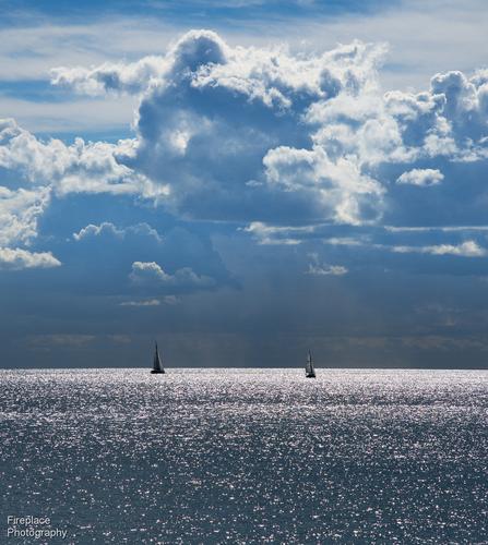
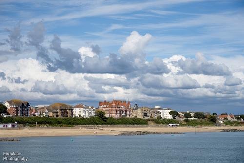
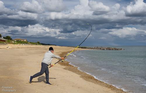
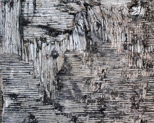
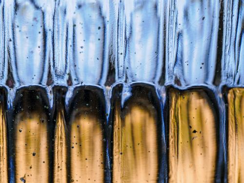
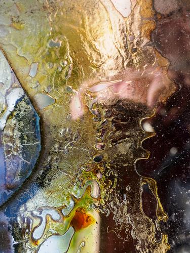
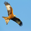
    Welcome to the Wednesday Comments and Critique (No Theme & No Brand) thread!

    We are dedicated to continuing the great tradition of this C&C thread because we are convinced that looking at, and talking about images is vital for better photography.

    Our tried and tested concept (15 years and running!) is a weekly "peer-to-peer" photo comments & critique encounter, in which you GIVE and RECEIVE.

    The idea is simple: you post a photo or photo-based image that you have made and get critique on it. And in return you give other people your honest but constructive opinion of their images.

    Any Theme, Any Camera, Any Style, Any Subject.

    We are still figuring out how to create the convenience of threaded view on this new forum.
    For now, let us agree that you post an image or essay with a title and short explanation, and that all comments include the image as a quote.
    Replies to comments may or may not include quotes.

    THREAD GUIDELINES – THE SHORT & SWEET VERSION
    • This thread does not care about brands. It’s not about the tool, but the image.
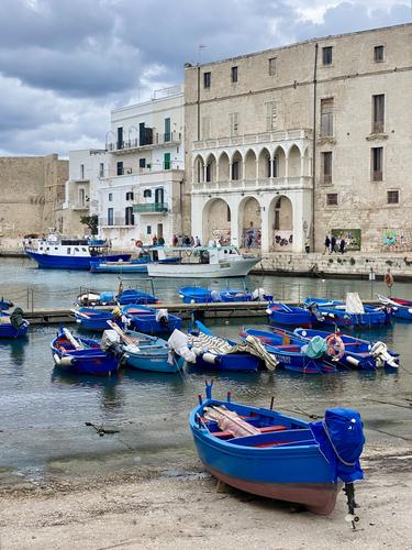
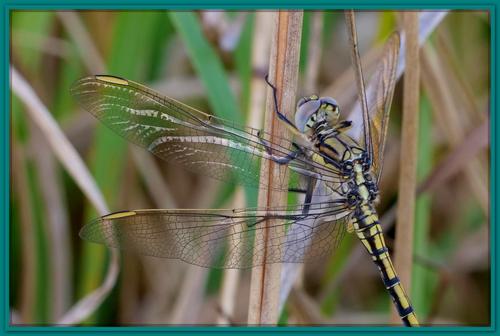
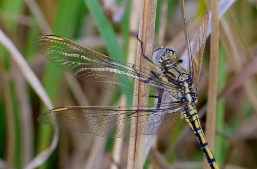
    • Post one image or essay that you have made and would like to get comments on.
    An entry can either be a single image or a short essay. With an essay we mean not a collection of random images without any connection, seeking C&C on more than one of them. We mean instead a limited number (3 to 10) of connected images that together try to tell a story, create a fuller picture of a situation, event or location, etc.
    • Add a clear title to your post to distinguish your entry.
    • Look at the other images/essays and give your comments on at least one of those.
    • For comments, try to go beyond a simple pat on the back or a short dismissal.
    • Do you like an image (or essay) ? Try to explain WHY it appeals to you.
    • Negative feedback is OK (we all want to learn), but be polite and constructive. Try to explain why the image (or essay) does not appeal to you and how it might be improved.
    • Please stay on topic, i.e. concentrate on the image and the photographic comments, without getting into politics or other distractions. No non-photographic arguments.

    The critique you give is vital.
    What was your first impression? What catches your eye about an image? Why?
    What do you like, and what distracts you? What would you change?

    Fiddle with the image in your head - composition, perspective, color balance, exposure.

    PLEASE NOTE CLEARLY:
    Unless the original poster specifically states (for every individual posting offered for C&C) that they do not want their image(s) to be downloaded, altered or reposted, it is understood that within the context of this thread, other participants are free to download and alter the posted image and repost it in a reply for C&C purposes. That reposted image may remain permanently within the week's thread, or you may remove it after a short period of time if you prefer. The downloaded and altered images are not to be used for any other purposes nor uploaded anywhere else than within the context of the C&C in this thread. No copyright disputes here!

    Encourage - it is a scary business putting your work up for other people to judge!

    More general feedback is also welcome.
    Do you know something about taking the same sort of image that would make matters easier - share your own as an example in your reply.

    Have fun, be respectful and let’s stick together!

  • Members 720 posts
    Sept. 18, 2024, 5:55 a.m.

    MONOPOLI (PUGLIA)

    An (Iphone 11) image from yesterday, minutes before the rain.

    RoelH 202409 - Monopoli porto di pesce Puglia - IMG_4446.jpg

  • Members 976 posts
    Sept. 18, 2024, 7:28 a.m.

    The back story on this one.
    I was trying to capture the sunlight reflecting off his wings on either side. As I crossed, my shadow was cast over him. I took a couple in the shadow just to see. It turned out the images in shadow were more sharp and detailed. The sun reflections were too strong. After some pp and a crop leaving just the insect, comments were made about the busy background - fair enough. Normally I don't like cropping off parts of a subject but it was the only way to reduce the amount of background - and the wings and body were the main part anyway. It still seemed to be missing something and the idea of a border came...

    P1309303c.JPG

    [Edit] In view of Mike's comments below, and because there may well be a discussion about borders, I have included the borderless version below for comparison.

    P1309303b.JPG

    P1309303b.JPG

    JPG, 1.7 MB, uploaded by Bryan on Sept. 18, 2024.

    P1309303c.JPG

    JPG, 1.8 MB, uploaded by Bryan on Sept. 18, 2024.

  • Members 1185 posts
    Sept. 18, 2024, 8:23 a.m.

    Naoshima. Chichu museum.
    Version 2 of much the same shot as last week.

    Naoshimam Museum. Version 2.jpg

    Naoshimam Museum. Version 2.jpg

    JPG, 857.4 KB, uploaded by MikeFewster on Sept. 18, 2024.

  • Members 1185 posts
    Sept. 18, 2024, 9:22 a.m.

    Posters here seem to either like or dislike added borders. I like them and usually add one to my posts. Bryan's shot is a good example of why add one. The border stops lines and tones drifting off into the background, imnho. A border gives a visual containment to the image. This is what we are looking at. I recognize from previous discussions here that not everyone feels the same way.
    Bryan's image has strong lines that converge on the thorax. The strong lines are given more prominence because that are the lines that are better focused. There are many other lines in the image that take the eye away to the edge but I don't feel they distract because of their softer focus. The border finalizes the visual movement. I'd have preferred a thinner black border but that's just me and I'm forever wincing at the elaborate frames put around paintings in galleries. They don't seem to worry anyone else.
    I have no problem with the busy background. The contrast between sharp and soft focus sufficiently lifts the dragonfly out while still leaving it within its natural surroundings. You have captured the tracery in the wings and the fine leg details of your subject. I particularly like the thin brown like running down the central stalk. It adds a touch of matching fineness to the stalk.

  • Members 3334 posts
    Sept. 18, 2024, 9:39 a.m.

    Personally I don't like borders with online images and so very, very rarely use them.

    They generally make me feel like I am looking at the image through a window.

  • Foundation 1405 posts
    Sept. 18, 2024, 12:40 p.m.

    Naah: too interesting! 😀

    David

  • Members 796 posts
    Sept. 18, 2024, 1:42 p.m.

    Pretty clouds at Clacton
    Here's a few scenes on a walk along Clacton beach, England
    Any favourites here ?

    DSC_6528 smaller.JPG

    DSC_6530 smaller.JPG

    DSC_6548 smaller.JPG

    DSC_6573 smaller.JPG

    DSC_6607 smaller.JPG

    DSC_6573 smaller.JPG

    JPG, 2.5 MB, uploaded by Fireplace33 on Sept. 18, 2024.

    DSC_6530 smaller.JPG

    JPG, 2.0 MB, uploaded by Fireplace33 on Sept. 18, 2024.

    DSC_6548 smaller.JPG

    JPG, 1.8 MB, uploaded by Fireplace33 on Sept. 18, 2024.

    DSC_6528 smaller.JPG

    JPG, 1.3 MB, uploaded by Fireplace33 on Sept. 18, 2024.

    DSC_6607 smaller.JPG

    JPG, 1.7 MB, uploaded by Fireplace33 on Sept. 18, 2024.

  • Members 52 posts
    Sept. 18, 2024, 2:31 p.m.

    Abstract Distractions Reprise - But wait there's more!

    I said that last week was going to be the final episode. But I lied - here are a few more of my favorites.

    Ultimately, I make photos for myself - both for the end product and for the enjoyment of the process of discovery that happens when I'm out photographing. This has been a new area of photography for me. While these images speak to me, I don't really know if they resonate with others.

    So I would just like to say that I'd really appreciate some thoughtful critique. Abstract art, if I can call this art, is very subjective. Each viewer comes away with a unique impression. And to that viewer, it doesn't really matter what I saw in them. It might have been Jackson Pollock who said, "My work ends where the viewer's imagination begins."

    Do you get something from them? Saying no is perfectly acceptable, but it would be helpful to me if you'd give some thought to why that is. It's OK if we don't agree - that's part of the learning process. Likewise, if they do speak to you, why? Something more thoughtful than just a "like." In this social-media-frenzied world, "likes" are cheap and not at all helpful. Serious critique is difficult, but it stretches the brain and makes better photographers of both the receiver and the giver.

    (I really miss the old DPR threaded view...)

    Stevenson Abstract-1.jpg

    Stevenson Abstract-2.jpg

    Stevenson Abstract-3.jpg

    Stevenson Abstract-4.jpg

    Stevenson Abstract-4.jpg

    JPG, 1.1 MB, uploaded by MikePDX on Sept. 18, 2024.

    Stevenson Abstract-3.jpg

    JPG, 1.2 MB, uploaded by MikePDX on Sept. 18, 2024.

    Stevenson Abstract-2.jpg

    JPG, 2.0 MB, uploaded by MikePDX on Sept. 18, 2024.

    Stevenson Abstract-1.jpg

    JPG, 2.1 MB, uploaded by MikePDX on Sept. 18, 2024.

  • Members 976 posts
    Sept. 18, 2024, 2:36 p.m.

    The first one appeals to me because there are a lot of different shapes and depth to explore in those clouds. The sunlit water stretching into the distance with the yachts and the well balanced lighting make for a pleasant image (at first glance I thought the indistinct clouds on the horizon were far away hills...). I assume it is a crop which leaves me wondering what we can't see from the original. Number 4 would be my 2nd choice because again there is a lot going on in those clouds.
    In their own way they are all recognisable to me as very typical English cloud scenes. I can't say we ever have scenes like that in Australia or at least not so often.
    I didn't like the buildings along the beachfront in the 2nd (they seemed to intrude between sky and shorefront) until I viewed them close up. There's lots to explore there too - nice capture.

  • Members 52 posts
    Sept. 18, 2024, 2:44 p.m.

    Re: the border. The one time I've found where adding a stroke around the image is helpful is when a very dark image is projected onto a black screen. Then it provides the viewer with a clue about where the image ends. Other than that, borders can be helpful or distracting, depending on the situation. Here, as MikeF said, the border helps keep the viewer's eye in the image. But to me this particular border feels too heavy. It seems like it is calling attention to itself, to the detriment of the main subject. The borderless shot could be titles "Hiding in plain sight." It's tougher to say that about the one with the border.

  • Members 52 posts
    Sept. 18, 2024, 2:52 p.m.

    Both this and last week's shots are good examples of minimalism - simple yet effective. To my eye, this one would have been more effective if the model were staring off into space rather than looking at the camera. That would create in the viewer's mind a need to invent a story. As it is, this has become a photo about the person, not so much the overall place.

  • Members 976 posts
    Sept. 18, 2024, 3:14 p.m.

    They are all quite colourful / engaging in their own right but I am at a complete loss as to what the original subjects might have been. A tongue in cheek guess at the 3rd might be an abstract of Grandpa's clappers sitting in a glass of water on the bedside table...
    At first glance I thought the 1st was a closeup of a piece of weathered stone. The 2nd looks like a piece of weathered wood but I've never seen the fibres cross like that so I guess I am wrong there... Possibly plywood? In the last my imagination says a high altitude shot of an alien world with pink clouds and odd coloured landscapes...
    I will expand on engaging. They all contain recognisable aspects / visual cues but none of them have enough to give the game away. So I do hope we get an explanation by the end of the week...

  • Foundation 157 posts
    Sept. 18, 2024, 3:28 p.m.

    In complete agreement - and at a total loss as to what they are (except interesting & intriguing)

    Perhaps we could have a new competition here - MikePDX provides us with a new abstract each week and we have to guess what it really is....

    Tim

  • Members 976 posts
    Sept. 18, 2024, 3:33 p.m.

    This is all very interesting.

    First off, I am pretty sure that that is the first one I have applied a border to - I had tried a couple over time but didn't experiment enough to get something I liked. I don't mind borders but I know there is no one border for all - each image lends itself, if at all, to different styles / colours.

    Flipping between the original and border version in my image viewer, I was quite satisfied with the overall effect and Mike's words described what I felt.
    After adding the original to my post, and seeing them both together, I wasn't so sure - for your reasons above...
    I won't edit it now but I will keep the lesson in mind...
    [Edit] I think it wants a border but as you say it needs to be lower key...

  • Members 52 posts
    Sept. 18, 2024, 3:36 p.m.

    One one level, it is an interesting exercise to attempt to figure them out. But on another level, it really doesn't matter what the subject is, but rather what the viewer sees in them. The tell-all memoir may come later. 😉

  • Members 1103 posts
    Sept. 18, 2024, 3:43 p.m.

    MOORED

    R1010010S.jpg

    Meaford, Ontario on Georgian Bay just gained a breakwater wall to protect the shore and boats from stormy weather.

    R1010010S.jpg

    JPG, 3.5 MB, uploaded by ChrisOly on Sept. 18, 2024.

  • Members 663 posts
    Sept. 18, 2024, 3:58 p.m.

    Summer's-Gone.jpg
    Summer has gone, again

    The sun is crossing the Celestial Equator, creating the Autumnal Equinox. Summer is over and Autumn begins.

    I always find it a little sad.

    Rich

    Summer's-Gone.jpg

    JPG, 2.7 MB, uploaded by Rich42 on Sept. 18, 2024.