Adding a model makes it a very different photo. The original version was an abstract, while this is an environmental portrait. We see the same textures, lines, and colors, but it is no longer about them but about the woman perched at a pivotal point in the lines. Interesting to see how a human can quickly dominate any scene we enter, and become the center of attention. There may be a political message in there somewhere.
Sept. 18, 2024
87
-

-
The clouds are a photographer's delight, tying the series together into a coherent whole. The third is my favorite, because of the story, the visible tension in the man's movement, the effect of the shadow, and the implied force. And of course the warm rich light. That is a wonderful image.
The bird image must be seen at full size to be appreciated. It, too, is a wonderful image with lots of horizontal lines. A bit of fantasy will allow me to imagine the birds being emitted from the wind farm or loosed from the small buoy. But the birds themselves are gloriously free, highly detailed, and buoyant themselves against those beautiful clouds.
The first and fourth suffer a bit from the bright sun and the angle. I run into this problem often especially on the water, and have never been able to tame it with camera work or with basic PP. I end up converting a lot of them to monochrome.
-
I love your abstracts but lack the artistic knowledge to properly critique them so can only say what impacts they have on me.
The first has a nice flow from upper left to lower right that feels natural to my eye. The colors are wonderful. The mix of blue and orange, complementary on the wheel, is probably my favorite color combination and I've noticed that most people have strong positive responses to that combo. Add texture as you have here, and you have a winner.
The second reads like an ancient scroll in some indecipherable language. I want to touch it, feel the rough texture, and discover its secrets. The detail is mesmerizing, made more intriguing by the near total lack of color. More color would be a distraction here.
The third is a puzzle. The colors work: a more subdued complementary set of blues and golds. I'm distracted by trying to figure out what it is - books set on edge, Skeletor's teeth, water running out of chutes, a hairbrush??? It seems to ask for more sharpness on the ridge where the two colors meet, but that may be a senseless impression, based too much on trying to figure it out.
The fourth is fascinating, a little creepy (is that flesh colored thing a hand? What is it reaching for?). The colors nice and rich, the sinuous details in what must surely be liquid are wonderful. This one has more story than the others, and because I am attracted to story, it's my favorite.
PS - I really miss threaded view too. Flat view lends itself to confusion and inhibits real conversation.
-
Long ago when I was a child, some magazine (I think Readers' Digest) had a regular feature on its final page with a set of monochrome close ups (they weren't called macro's back then) that you were supposed to identify the object from. I loved that puzzle. (The answers were printed upside down at the bottom).
-
A cohesively designed image with super powerful leading lines that we are compelled to follow from the lower left corner around the bend to the boat masts, which drive us right back down to the lower right corner by way of the reflections. The graphic nature of the image would lend itself well to a monochrome conversion. Nicely spotted.
-
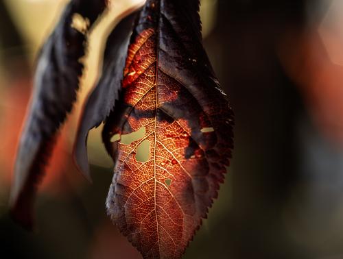
Gorgeous. The lovely rich color palette and the backlit sawtooth leaf make this image so powerful you can almost taste it. Would make a great print. Well done. I love it.
-
A nice study in form, shape, and line, with a story built into it. The muted colors - light lemon and light blue - are complementary and work beautifully together without overwhelming the story of the man who has descended into a kind of well via a series of geometries. Well spotted.
-
Black seemed to make the legs and stripes on the body stand out too much, so I went with a grey and opacity. Even then, the colour of the viewing background impacts the border's effect - the dark background of my browser makes the border look lighter than the light grey background of the image viewer... Anyway, enough of borders - I am very proud of this image..
-

Well then, I could have posted . . .
or . . .
😱
Thanks for the comments!
Rich
-
I don't know if it was meant to be such, but this is a beautiful, quiet, muted, minimalist abstract, with the grounding of a real figure to anchor it.
Lovely.
Rich
-
This is a wonderful set of abstracts. I love these kinds of images and look for them all the time, but seldom seem to find them (although they are probably right under my nose).
Non photographers (muggles) never see them and few photographers are really perceptive enough to spot these kinds of opportunities.
Rich
-

yes, the lady makes it special now :-)
-
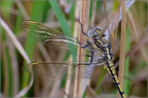
The dragonfly is beautifully captured!
The frame shows how it could look when printed out and hung on the wall. Looks like this frame would work well! -
I like this set a lot. The abstracts are colourfull and interesting. I have no idea what they are, I hope you'll let us know :-)
-
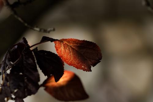
Definitely a clear sign that Autumn is here. The glowing red colour of the leaf is bright and rich, it fits together well with the gentle beige colour at the bottom in a nice diagonal compostion.
-

Some people have this insatiable desire to psychoanalyze every picture -
Facts are: image taker envisioned a scene and selected A for aperture priority and together with setting a lens at f/2.8 and 12mm , camera optimized the process at iso 125 and 1/8000s. That's it, that all. End of story. -
Love this burst of red. Very engaging and attractive and appealing.
-

That's fine but it sounds like that to select aperture you simply "spin" the aperture dial and wherever it lands is the aperture you use.
For that scene if the rocks were important to me I would have chosen a much smaller aperture to get as much of the rocks at least reasonably sharp.