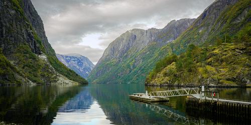
I like your composition and it is a great landscape. It doesnt seem over saturated to me, but, for my taste, the clouds are a bit over dramatic, and I wouldnt darken them or increase the contrast as much. In fact the process has introduced contour lines in the cloud, which is probably due to processing on a JPEG and that did not have as much information as a RAW, and could not provide the data needed for the icrease in contrast.
In any case I enjoyed your image.
Oct. 2, 2024
94
-

-

Good composition and use of backlight.
The fact that a person is visible in this photo is a distinguishing factor. -
Somehow the colors in this photo don't match.
How could the furthest mountain be so blue?
The lighting doesn't allow it. -
A decent photo ruined by post-processing.
-
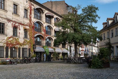
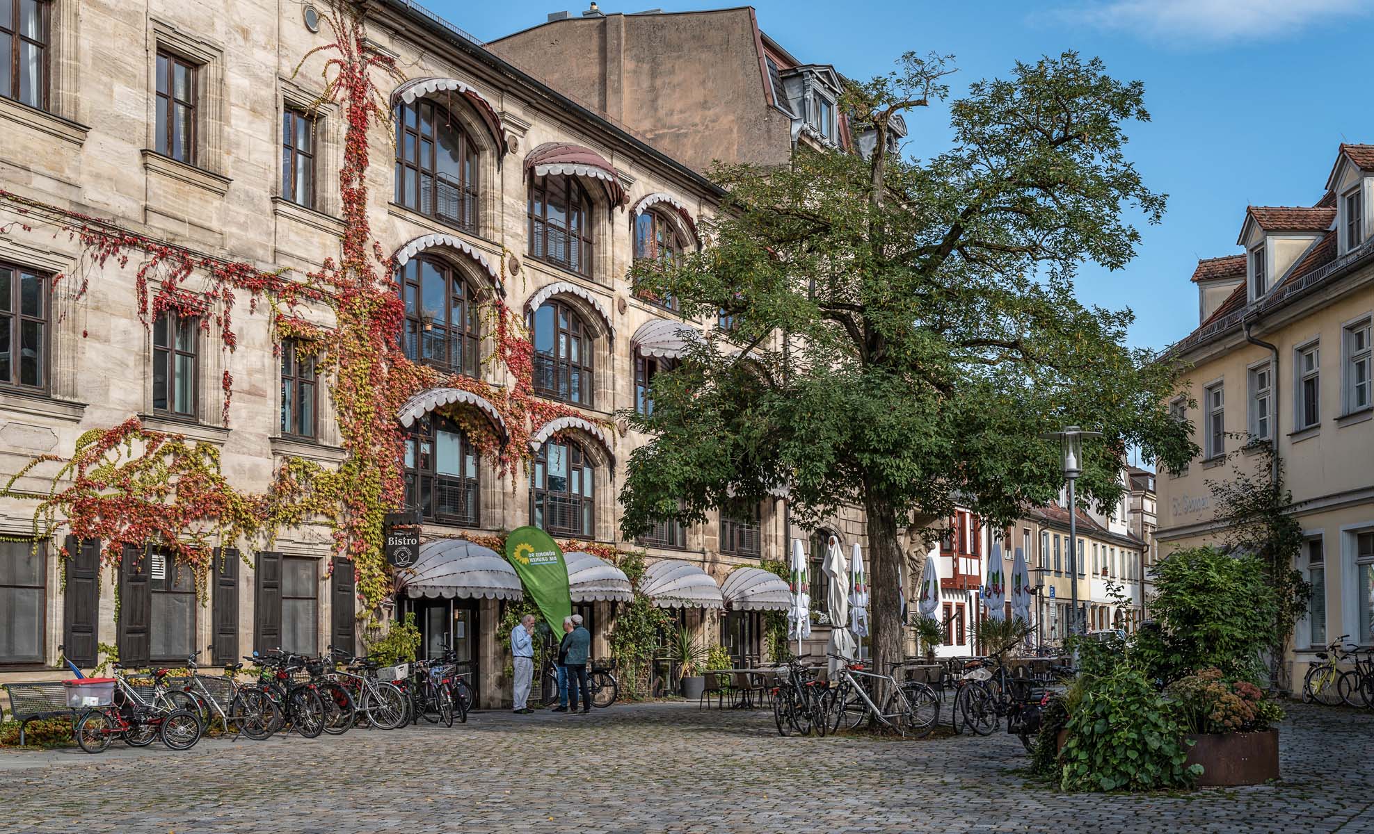
The old city center
-

Thank you for your opinion 🙂
-

Sometimes I can get round that effect from a mask by creating the mask but then "feathering" it with the application of Gaussian blur to the mask.
-
Wonderful images 👍. I like these very much.
The colours are very refreshing 🙂
-
They don't need to match exactly unless the intention was a close as possible documentary version.
See above. The intention might have been to add some artistic feel to the final image.
-
The thing is that a photo cannot be half realistic and half artistic.
The photographer has to be aware of what his concept is.
Otherwise, the result is something half-baked. -
At this point I have to give my honest opinion, minniev:
at least two of these photos have been heavily manipulated.
After that I lose interest and don't want to comment any further. -
That is an opinion and not an established fact. You do not get to dictate how other people must create their images.
A final image can be a blend of realism and art unless the intention for it is a close as possible documentary representation of the scene.
My concept when taking a photo is to first set up the composition and then maximise the quality of the raw data by getting as much light onto the sensor as possible within my dof and blur requirements without clipping important highlights after which in post I have the option to create a final image that is a close as possible documentary representation of the scene and/or an artistic representation and/or a blend of the two.
-
What was your "concept" when you took this plain vanilla snapshot?
In any case, this version below looks more realistic and better on my screen.
-
Or just set the selection tool's hardness/feathering in the selection brush's settings.
-
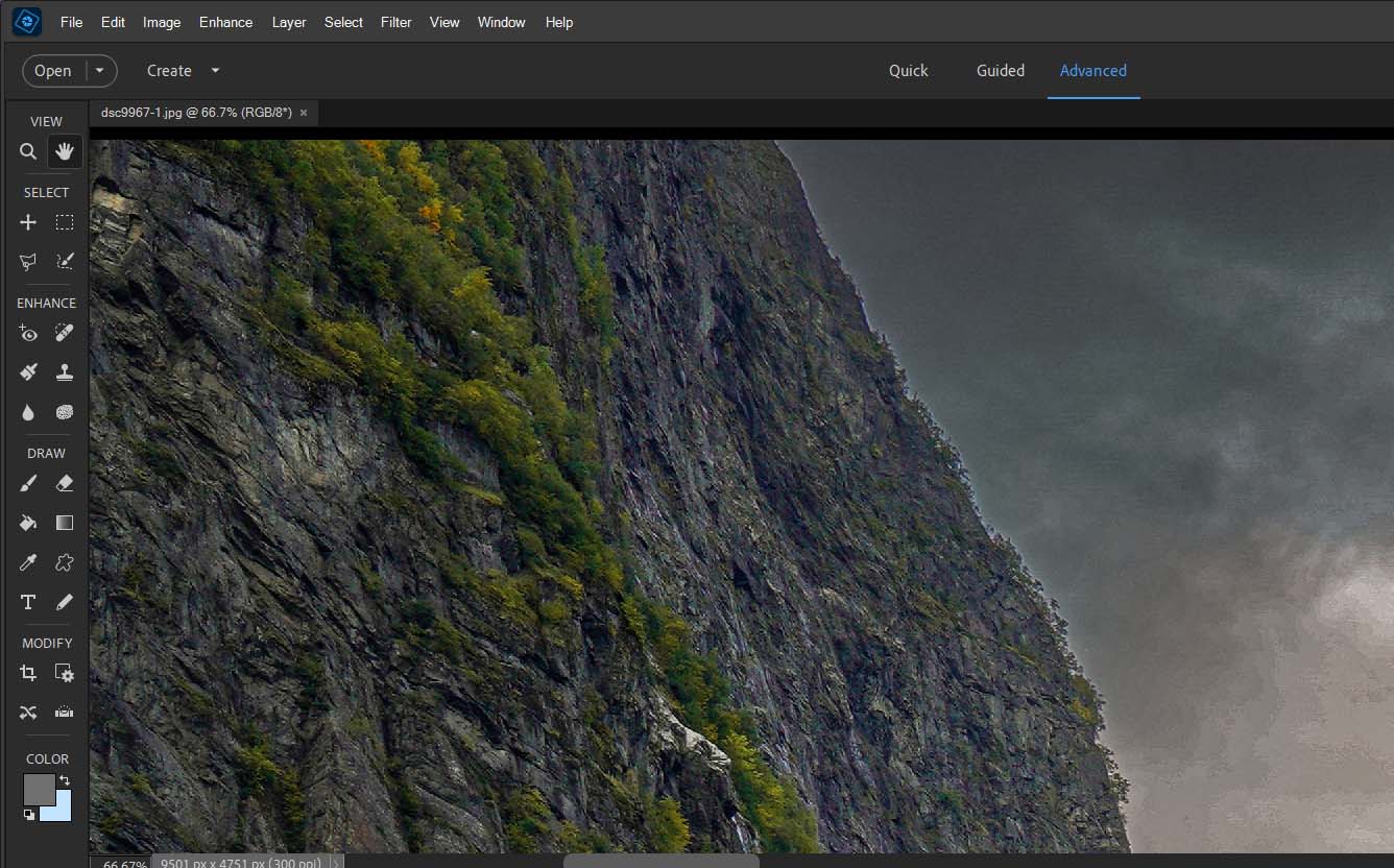
The mask for the sky needs tidying up all the way across.
On the left side near the top the mask edge is very crude as can be seen below.
The Refine Selection Brush (Ps and PSE) usually does a pretty good job with outputting accurate selections for fiddly masks like this one is, especially on the left side.
-

Don't understand why there is so much "drama" added to the sky, it does nothing but add artifacts and a sense of falseness. Stormy clouds are dark because they are thick and the base is low, often below the mountain tops. Higher thinner clouds just don't look the same, the contrast between the dark clouds and lighter mountain tops just looks instinctively wrong when you look longer. Why can't it stay peaceful, placid scene that it was? As that it's a lovely photo.
-

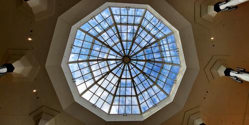
Look up
-
I have to choose just one, even though I like all. Love that abstract, could be hanging on the wall, somewhere. Very cool and calm.