Proving once again that a memorable photograph can be made without exotic locations. Love the pattern "printed" across the textured bark. The pattern is a mix of sharply rendered and blurred shapes that convey the complexity of the canopy above. The tiny sparks of bokeh splattered across the dark background adds interest rather than distracts. Well done.
-
-
A pleasant image shot from a compositionally effective angle with a nice vanishing point just past the thirds vertical. Nice mix of colors as well. The men and the bikes add human interest and story. I think the image would benefit from raising the shadows to be able to see more about the humans, and to mitigate the dark blob of stuff on the right that's a bit of an eye magnet.
-
Beautiful! The brillian blue color is nicely set off against the muted gold background. The geometry of the decogon (?) and its delicate intersecting lines, both interior and exterior, are fun to explore visually. I'm of mixed minds about whether it would work better as a square crop eliminating the posts and lights on the outer edge. It creates a different picture to crop square but not necessarily better. Both versions are nice options.
-
An interesting topic for discussion. My take: I totally agree that visual understanding is the primary consideration in photographic art (and that includes a really broad array of subtopics). Logic comes in when we try to build a bridge to presentation of that visual understanding. Some of the logic pertains to how we use whatever camera/lens we're using, while other logic applies to how we fiddle with the pixels we gathered to get an end result we are pleased with (and that can differ for screen presentation vs print presentation).
I confess I have a small obsession with taking photos that include the sun in the frame. I offered one last week for the edit-me-an-image thread and saw a dozen different, interesting interpretations of it. There's a way to use loss of detail as a compositional element.
Your first image is a study in the unexpected use of light. Two very powerful leading lines converge at the thirds intersection. Visually we intuit that they must converge on the subject, which turns out to be...light! An "overexposed" section of the sea with minimal detail turns out to be the focal point. Look up and we see why. The image would be less satisfactory with the "overexposed" half sphere of sunlight to confirm what we are looking at. It's a well balanced piece of nice photographic art.
The second one is not quite as appealing to me. Though I love that light, I don't much like the oval-ish rainbowed blob of sun. I don't mind its effects, and the scene itself is beautiful. Yes I'd have shot it myself and have a bunch of shots with similar lighting. A larger, rounder, more symmetrical blown area (or a sun-star) might give a nicer feel to it.
-
@minniev has written:
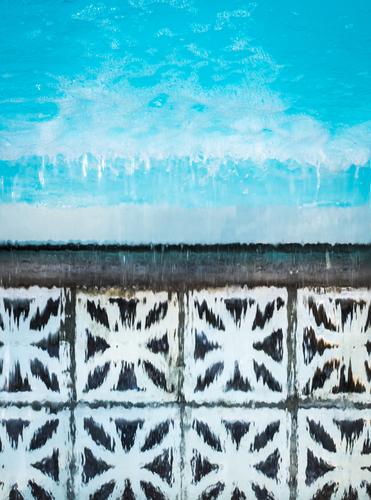
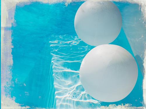
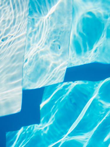
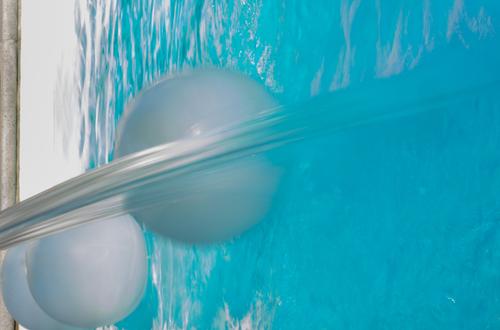
Pool Play
@Bryan has written:Wow. You have captured some intriguing abstracts there from pool water, sunlight and reflections. Lots of questions as to what is happening in each scene.
Thank you Bryan, intrigue is what I was hoping for! The elements were as you say: light, water, reflections. Also the pool waterfall and a few solar floats. Of course there's one with an added texture frame (#2), and some trickery involving slow shutter (#4) and shooting angle (#3). And some of my favorite tricks, turning captures sideways (#4) or upside down (#1).
@Rich42 has written:Wonderful abstracts.
How did you get the underwater (?) images?
Rich
Thank you Rich. None of them were underwater. #1 is turned upside down, #4 is flipped on its side, #3 is shot straight down from poolside; the one with the frame (#2) is the only one presented in its normal angle.
@DanHasLeftForum has written:Wonderful images 👍. I like these very much.
The colours are very refreshing 🙂
Thank you Dan. Pool water is such an extreme blue, it doesn't need any tinkering to make it bold!
@Kumsal has written:At this point I have to give my honest opinion, minniev:
at least two of these photos have been heavily manipulated.
After that I lose interest and don't want to comment any further.I appreciate your honest opinion but I have to say this is one of the funniest comments I've ever had on any of my photos! This set may well be the least edited set I've ever shared. A basic curves adjustment in Lightroom was all that was done to these 4, other than the texture frame layered on #2. All that you assumed was "heavy manipulation" is just camera work and my choices in angles. Maybe the upside down or side flips fooled you?
And please don't ever feel that you are required to comment on anyone's submissions or apologize for not commenting on images that don't interest you. All of us are free to comment on as many or as few of the images as we prefer. Roel asks that if we submit a photo, that we at least comment on one, but past that it is all voluntary!
@ChrisOly has written:I have to choose just one, even though I like all. Love that abstract, could be hanging on the wall, somewhere. Very cool and calm.
Thanks Chris, I think that's one of the most abstracted of all. Pretty much SOOC except I cloned out a dead bug or two.
-
@Andrew546 has written:
There is nothing wrong with clipping highlights.
If clipping highlights gives you the look you want then of course not.
But clipping important highlights generally does not give me the look I am after in my final images.
Clipping unimportant highlights normally doesn't concern me at all.
A Luminosity Histogram allows me to push it to the right edge in post when appropriate resulting in occasionally only minimal clipping of a single channel which still gives me the look I am after.
-
@DanHasLeftForum has written:@Kumsal has written:@DanHasLeftForum has written:
** GOING HOME **
Mother and father taking the kids home after a big day out 😊
A decent photo ruined by post-processing.
Thank you for your opinion 🙂
@minniev has written:A sweet family portrait that works well. Perhaps the colors are adjusted but they are enough within the realm of possibility that the colors don't distract from the story and may well be authentic. (my local ducks sometimes swim in purple water though here more likely in the blue hour of morning than at evening).
I would remove the blurred twigs of grass that intrude from the left.
Thank you minniev.
I am still in two minds about the removal of the twigs of grass 😵. They do add some natural framing of the ducks which I like.
This version has the grass removed.
-
-
@Sagittarius has written:
Handsome guy.
Rich
-
@minniev has written:
Pool Play
You're right, I don't have to comment on all the photos.
I'll never do that again!
With the utmost respect: this photo raises a lot of questions for me. -
@Kumsal has written:@minniev has written:
Pool Play
You're right, I don't have to comment on all the photos.
I'll never do that again!
With the utmost respect: this photo raises a lot of questions for me.Minniev said only a Curves adjustment and a texture layer was applied to it.
What questions does that raise for you?
If her intention wasn't to produce a close as possible documentary representation of the scene then any post processing is valid and then whether anyone likes it or not is totally subjective.
-
@Kumsal has written:@minniev has written:
Pool Play
You're right, I don't have to comment on all the photos.
I'll never do that again!
With the utmost respect: this photo raises a lot of questions for me.I guess it comes down to what is meant by "heavy manipulation". This is just a photo of a couple of solar balloon floats in a swimming pool with a texture overlaid and blended with a blend mode in PS to create a grungy edge. There's some effects from the texture and blend mode, more noticeable nearer the edges. If that constitutes heavy manipulation, then I agree. To me, heavy manipulation is when I spend significant time doing painstaking work on the wacom tablet, tinkering with a bunch of layers, masks, & brushwork (or when a heavy duty software filter is employed to emulate that, though it never quite does).
-
@Sagittarius has written:
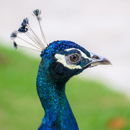
Beautiful profile portrait. You've captured the intricate details of those wonderful feathers including his little top-knot. Nice catchlight as well. Handsome guy.
-
@minniev has written:@Kumsal has written:@minniev has written:
Pool Play
You're right, I don't have to comment on all the photos.
I'll never do that again!
With the utmost respect: this photo raises a lot of questions for me.I guess it comes down to what is meant by "heavy manipulation". This is just a photo of a couple of solar balloon floats in a swimming pool with a texture overlaid and blended with a blend mode in PS to create a grungy edge. There's some effects from the texture and blend mode, more noticeable nearer the edges. If that constitutes heavy manipulation, then I agree. To me, heavy manipulation is when I spend significant time doing painstaking work on the wacom tablet, tinkering with a bunch of layers, masks, & brushwork (or when a heavy duty software filter is employed to emulate that, though it never quite does).
Surprised nobody's mentioned David Hockney yet... Perhaps they look abstracted because the pattern (waves acting like half a lens) is frozen rather than in constant motion. Unmistakably swimming pool to me.
A few points that interest me. We tend to classify the level of maipulation by the actions we perform rather than the visual effect. Cropping an re-orienting can have a profound effect even if they don't actually alter any pixels. Also interesting that we use the OOC photo as the "baseline of truth" when it is already an abstraction of the reality it represents. Bet you had to adjust or override the auto W/B, though I find the colour realistic and pleasant, to memory, reality or effect.
What we believe and accept as truth in a photo often comes down to how we think it should look, through our memory and bias. It's a paradox that we sometimes expect photos to represent truth, then often reject that truth because it doesn't fit our worldview. On that subject:
@minniev has written:The second one is not quite as appealing to me. Though I love that light, I don't much like the oval-ish rainbowed blob of sun. I don't mind its effects, and the scene itself is beautiful. Yes I'd have shot it myself and have a bunch of shots with similar lighting. A larger, rounder, more symmetrical blown area (or a sun-star) might give a nicer feel to it.
I'd not noticed. I usually shoot these things from the shade to avoid excessive flare, especially with the iPhone. The sun is probably behind a branch or similar hence the interrupted shape. It's easily modified though, so it suits your expectations?... :-) As for the rainbow effect, well it may not be the truth of the scene but it is the truth of a photo shot into the light, and we know we are looking at a photo. Like motion blur, we translate the way a camera abstracts into meaning and we do it from memory. So i like to leave those things in there rather than "correct" them because those are the little nuances that allow people to bend or shape photos to suit their memory rather than impose my logic. Of course it is just an idea and may be completely wrong, but I think there is an essence of truth, somewhere... maybe... :-) The first abstraction made sense to you, you applied meaning to blown out highlight and blocked shadow.
-
@Andrew546 has written:
What we believe and accept as truth in a photo often comes down to how we think it should look, through our memory and bias.
Only if the intention for the final image is a close as possible documentary representation of what we saw. Otherwise "truth" doesn't have to play any part in the final image at all if the image creator doesn't need it to play a part.
If the image creator intends the final image to be a blend of what they saw at the time of the shot and "art" then the image creator is free to include as much or as little "truth" as they like in the final image.
-
@DanHasLeftForum has written:@Andrew546 has written:
What we believe and accept as truth in a photo often comes down to how we think it should look, through our memory and bias.
Only if the intention for the final image is a close as possible documentary representation of what we saw. Otherwise "truth" doesn't have to play any part in the final image at all if the image creator doesn't need it to play a part.
If the image creator intends the final image to be a blend of what they saw at the time of the shot and "art" then the image creator is free to include as much or as little "truth" as they like in the final image.
Fashioning a response to this paradoxically began to resemble a compendium of Dannerisms; you don't get to decide for the viewer, if it looks ok to you on your screen, etc... Yet you still, on the face of it, seem to miss the point.
You speak of images as being the absolute product of what the photographer intends, something largely invisible to the average viewer simply because they do not view images from the photographer's viewpoint.
We can only ever see the world through our eyes, from one single viewpoint unique to us with a unique memory often irrational and emotion driven. Even if I were able to define my vision in a photo and dictate how people should view and decipher it, it would fail. It would fail because the more I dictate my viewpoint the less it will relate to theirs, and the less your audience can relate to your image the more meaningless it becomes.
There is no absolute truth in a photograph, and if you don't allow your audience the space to make up their own mind then it will have little meaning to them.
You keep using this language of the photographer's freedom and intent against the viewers intent, (and screen preferences), but somehow I don't think it really registers. :-)
-
@minniev has written:@AlanSh has written:
This thing was just sitting there, waiting to be photographed. I like the juxtaposition with the blue water.
A mating between Bryan's dragonfly image and my pool images! I like the angle you've caught, with the diagonal line not quite corner to corner, but offset slightly. The complementary colors of the orange dragonfly and the turquoise water is very effective as well. Nicely spotted and captured.
Thank you.
-
@Andrew546 has written:
There is no absolute truth in a photograph, and if you don't allow your audience the space to make up their own mind then it will have little meaning to them.
The "truth" for most people, or at least for me, when making a documentary type image is their recollection of the scene when they took the photo and creating an image that matches that recollection as close as possible according to the limitations of whatever hardware and software they use to create the image.
@Andrew546 has written:You keep using this language of the photographer's freedom and intent against the viewers intent, (and screen preferences), but somehow I don't think it really registers. :-)
I don't see the point you are making because I can put as little or as much "truth" into my images as I like depending on my intention for my final image.
Viewers are then obviously free to interpret my image as they like and form whatever opinion of it they like.
