The colours and pose of the subject are nice but the two darker vertical bars in the background are a distracting eye-magnet for me.
A more uniformly blurred background helps to focus our eyes on the subject.

The colours and pose of the subject are nice but the two darker vertical bars in the background are a distracting eye-magnet for me.
A more uniformly blurred background helps to focus our eyes on the subject.
The warm colours make up less than 50% of the scene so they hardly dominate as you claim.
Adjusting the shadows and vibrancy adds the feel of warmth from the tones.

Preposterous, glorious colour. It appears to be a dull day but still the plumage dazzles. After we take in the feast of colour, we are struck by the surprise of the pose. The shot is carefully composed to show the length of the neck as it curves up and around the body.
The little area of grey, bottom left, accentuates the neck line while making it clearer that the head/neck are the same bird as the body and this adds to our understanding of the pose. The eye and the soft fluffy spray of feathers along the bottom, ice the cake in edging the body.
Re the plumage. PP software makes it all too easy to add definition lines to plumage. I like the restraint shown here. The feathers still look enticingly soft.
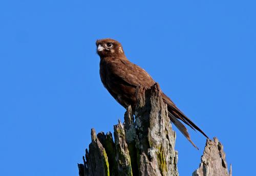
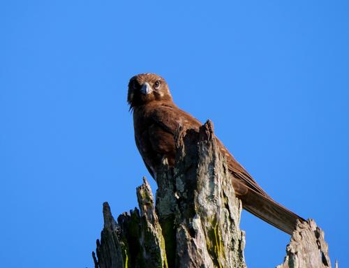
This Brown Falcon lets me get reasonably close now. The dead tree is about 7 or 8 metres high at a guess and I can move to a similar distance from the base.
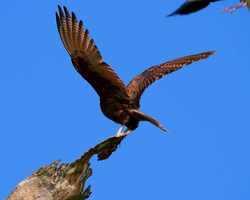
He flew over to another dead branch among a clump of trees. Just as I got over there I heard a plover squawking. I never realised it would get so close and didn't get the opportunity to zoom out a bit.
The Falcon was pretty agitated while the plover was still flying around...
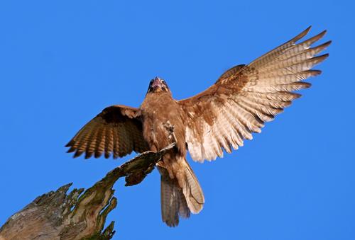
Kept a wary eye on it as it flew off
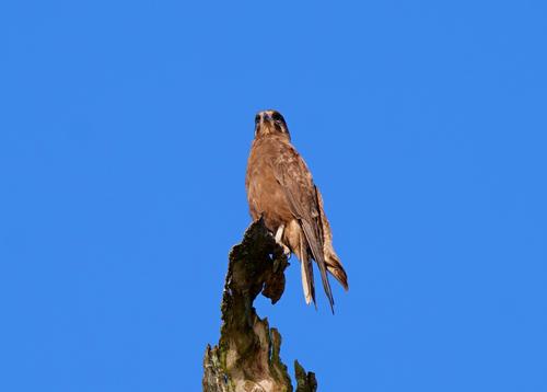
Another from a few days ago. It mostly ignores me but I waited till it was looking my way
Please don't edit without permission

That is a wonderful almost-abstract.
It may be my eyes deceiving me, but I have the impression that there is a slight lean to the right (top) (a few degrees max).
This makes the image "human", but it kinda diminishes the abstract quality.
A perfectly symmetrical image, split in half by a straight vertical, would be even more abstract.
And that would even enhance the surprise of discovering a human shape in the center.
And I liked your interpretation of the piece as a portrait. So it is. The lighting brings out the contours and surface details and textures. It shows the "character" of the piece. I think it would be a pleasing object to hold.
Somehow, the story of the aging of "art" pieces doesn't surprise me.
I agree with all that is said here.
The image does not need more saturation nor micro-contrast.
Let feathery be feathery.
One minor niggle: I would have loved to see the exact spot where the neck connects to the body (bottom left).
That would have made the curves even more graceful, because we would see the "origin" of the neck curve.
The structure and grate are uncompromisingly metal. Black. Shiny. Hard-edged. Much the same for the two dominant shadows. All the respect for life of a prison cell.
The leaves are fragile. There aren't many of them. They aren't held in place. The colours have faded. The couple of water drops are more like tears.
A statement about lost potential.
Perhaps a little could be removed from the left hand side without changing the feel of the image?
Yes. Topaz sometimes "over emphasises" the edits in some elements in a scene.
These are quick and easy to fix by either using a mask in Topaz and/or blending the Topaz output back into the original with a layer mask until it looks right.
it's a photo that has to be looked at in large view. There's no problem with the visibility of details. Two of the three umbrellas are furled. We can feel the cold of this day. Yes, the warm tones could be popped. Or they might not - very much the photographer's choice depending on how much they want to make the emphasis the people sitting outside on a cold day or whether the photographer wanted to make a statement suggesting something like - the summer will return.
It's your opinion and that's fine but you're not giving me any reason to change what I posted.
No-one is wearing hats, caps, beanies so although it's obviously not a hot day we don't get the impression it is very cold either.
No need to shout. I agree, I gave no reason for you to change your mind at all. I simply pointed out the difference in interpretation that the suggestions gave. Incidentally, I edited my response somewhat almost immediately after I posted and you responded to the unedited version.
Thanks Fireplace. I'll talk about the room when I reply to the last comment made (so far) about the image.
Thanks Rich. I'll talk about it more when I respond to the last comment(so far) on the image.
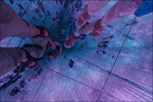
It wouldn't surprise me if verticals and horizontals are way out of kilter. This isn't a PP or constructed image. This is what I was seeing, which is another reason why I didn't want the original edited without knowing what the editor intended doing with it. The whole chamber is built to deceive and dazzle. Mirrors and lights everywhere and the patterns and colors kept changing. A most disorientating experience. Look in another direction and the world turned inside out.
Here's a self portrait. Different lighting and looking in a different direction. It stayed fixed for long enough for me to get a shot.

Great shot, like from a different epoch. B&w is a must in creating the atmosphere.
Just superb.l can't say anything else.
Amazing.