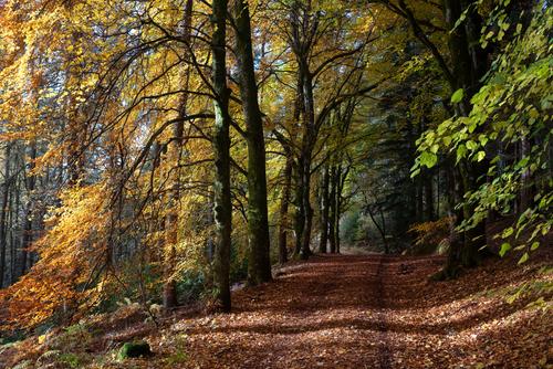
Agreed Xpat. It's the repetition of the lines in the branches by the shadows on the ground that makes this shot such a success and the left/right colour gradient is a further joy.The small patch of brighter leaves on the right balances the brighter golds on the left without distraction because both frame the vertical lines that take the viewer down the road.
A 5 star landscape.
-
-
@Andrew546 has written:
Actually got out of the house and took a couple of photos. Went to Blair Castle Estate to see the beech trees before Storm Ashley stripped the last leaves of the trees.
These two I liked. As before I have no issue with others editing and re-posting within this thread.
This photo has a certain depth and beautiful colors that really draws me in.
The other one is good too, but I like this one much better. -
@Kumsal has written:@Andrew546 has written:
Actually got out of the house and took a couple of photos. Went to Blair Castle Estate to see the beech trees before Storm Ashley stripped the last leaves of the trees.
These two I liked. As before I have no issue with others editing and re-posting within this thread.
This photo has a certain depth and beautiful colors that really draws me in.
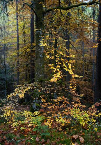
The other one is good too, but I like this one much better.Kumsal's comment got me looking at this shot further. While I still prefer 2, there's a lot to admire in 1. A completely different composition with a base of brighter leaves that extend upwards along with the verticals of the trunks. Beautifully exposed to maintain highlight and shadow details while creating depth.
-
@RoelHendrickx has written:@MikeFewster has written:@Kumsal has written:
Road Camp Motel
There is much that I like in this photo.
It's unsettling.
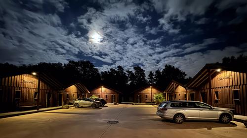
A clouded sky and veiled moon. The inverted cones of light that leave the dark areas and the black shapes of the tree. It feels remote. Not a person in sight.
The cars are a feature. The repetition of shape and colour gives foreground/backgound visual movement. There are people here - but not many.
Bates Motel comes to mind.Agree with all that.
And let me add that it reminds me a bit of "L'empire des lumières" by Magritte.
I checked out "L'empire des lumières." Yes, Kumsal's photo stirs up a very similar response.
-
@RoelHendrickx has written:@ChrisOly has written:@RoelHendrickx has written:
Albania
It's interesting that you have zeroed in on this individual...It's all about context.
I've explained why I was intrigued.
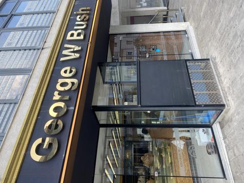
It just puzzled me why a bakery in a small town in Albania would be named after this US President.
Those are the kind of questions that really trigger me to go digging.And a nice dig. These sort of historical snippets often expand our understanding / perception of people / events / places, and the photos become much more than the rendition of a scene.
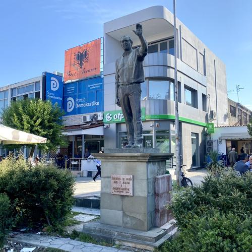
@minniev has written:Thanks for sharing this quirky Albanian tribute to George, an ex US president who receives few tributes even at home. I'd never have known! He's the only president I ever spent any significant time in conversation with, though I met a couple of others. Though I never voted for him and opposed most of his policies, I found him charming and relatable so I'm not entirely surprised that he made some friends when visiting there. Your pictures are nicely taken with good angles to show off the architecture as well as the subjects.
In later years he showed a human side not quite evident during his term in office. I am happy for that if only because my view became more positive.
-
@Sagittarius has written:
My perception here is that of a prepackaged tour where drinks are possibly included. I don't get the feeling that the "bartender's" income is dependent on sales - he appears too relaxed. Tropical paradise for some.
-
@minniev has written:@ChrisOly has written:
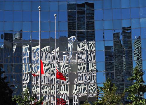
reflections
Fyi - convex glass in the background.
What a cool abstract architectural image! Kudos to you for spotting and capturing it. The colors grab my attention and push me to examine every line and square on this checkerboard. I love the twisted reflection of the windows, they make the image. Excellent!
Agree 100%. We could see 100s of glass building reflections without the impact of this one. I like the way the unknown black and white reflection continues in shadow.
-
@MikeFewster has written:@Kumsal has written:
Road Camp Motel
There is much that I like in this photo.
It's unsettling.
A clouded sky and veiled moon. The inverted cones of light that leave the dark areas and the black shapes of the tree. It feels remote. Not a person in sight.
The cars are a feature. The repetition of shape and colour gives foreground/backgound visual movement. There are people here - but not many.
Bates Motel comes to mind.I had to look up Bates Motel but I was pretty sure I already knew the psychological / horror / thriller genre. The colours in this fairly dark scene present well and there is a real sense of depth (both palette and 3D) to the image. The touch of blue in the sky contrasts well with the yellows of the artificially lit areas - and I think that's what makes this a really good photo.
-
@Andrew546 has written:
Actually got out of the house and took a couple of photos. Went to Blair Castle Estate to see the beech trees before Storm Ashley stripped the last leaves of the trees.
These two I liked. As before I have no issue with others editing and re-posting within this thread.
I went looking for the exif to see what format camera these were taken with, guessing FF (because I can't normally get scenes like this with my m43 but that is perhaps lens related). No info in the exif other than image size. Only 500 px on the long side for both!!! There is a lesson there that we don't need huge image size for good looking shots if all the other requirements are met. Of course it helps, but tick the other boxes and we can be on our way...
-
@RoelHendrickx has written:@MikeFewster has written:@Bryan has written:
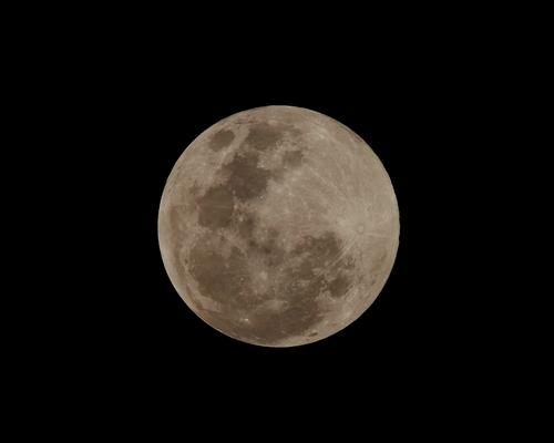
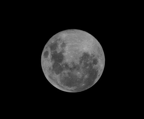
Full moon today
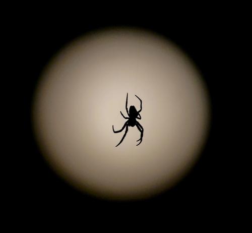
He wasn't crawling across a window. If you look closely you can see what he was doing
I was on the verandah, and he was suspended from the gutter...
Still not overly high above the horizon so some atmospherics at play.
There are light clouds now... Have parted...
Please don't edit without permission
A series with a difference. A puzzle is set up and then solved as we move down the images. That's one of the more original full moon shots I have seen. It must be tempting to cut the spider from the background in 1 and add it to one of the later shots- with a smidge of blur on the background...
Yes that would be far more interesting than as is in front of an indistinct blob that could be anything. The difficulty of obtaining the shot gave it more weight in my mind than what I see now - it was a touch breezy making getting him centred over the moon and in focus quite challenging.
Quoted message:"Spiders on the Moon".
That could be the pitch for a high-concept B-movie that combines horror and science fiction tropes.
(Like "Snakes on a Plane".)We have the set from Kumsal...
-
@Bryan has written:
I went looking for the exif to see what format camera these were taken with, guessing FF (because I can't normally get scenes like this with my m43 but that is perhaps lens related). No info in the exif other than image size. Only 500 px on the long side for both!!! There is a lesson there that we don't need huge image size for good looking shots if all the other requirements are met. Of course it helps, but tick the other boxes and we can be on our way...
Click on the file thumbnail at the bottom of the original post for the original image, they were about 2k x 3k in size. The viewer uses a thumbnail I think. Don't know what happened to the Exif, might be a setting I used the PS Export box, I'll look into it.
Nikon Z5, Zeiss Milvus 35/2.
Shot 1: f7.1 1/125 ISO800
Shot 2: f7.1 1/200 ISO800 -
@Andrew546 has written:
Click on the file thumbnail at the bottom of the original post for the original image, they were about 2k x 3k in size. The viewer uses a thumbnail I think. Don't know what happened to the Exif, might be a setting I used the PS Export box, I'll look into it.
Nikon Z5, Zeiss Milvus 35/2.
Shot 1: f7.1 1/125 ISO800
Shot 2: f7.1 1/200 ISO800Which is what I normally do... Somehow I have r clicked the displayed image not the full one - which I may have got into the habit of doing just to get the exif without loading the whole image and never noticed the change in size...
-
@Andrew546 has written:
Actually got out of the house and took a couple of photos. Went to Blair Castle Estate to see the beech trees before Storm Ashley stripped the last leaves of the trees.
These two I liked. As before I have no issue with others editing and re-posting within this thread.
These are both beautiful !
The first has incedible depth. Those bright warm coloured leaves trace a gentle curved path inside the foreground space and they lead your eye up to explore the rest of the image where the background is darker and bluer.The second gives you the impression of light coming from the left side and lighting up all the leaves on the left and leaving only the shade on the right hand side.
The bright green leaves in the near foreground on the right are also catching the light and stand out against that darker background, They seem to add in even more depth. Then the path leads you up and on to a bright space at the end of the tunnel.
Great stuff! -
@MikeFewster has written:
[quote="@MikeFewster"]
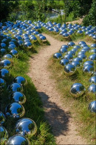
Such an interesting photo immediately catches my eye!
Very well done and I like it!The path leads the eye through the photo.
The blue balls along the path make it even more interesting.
This is what makes the composition and the photo so good! -
@Bryan has written:
Full moon today
He wasn't crawling across a window. If you look closely you can see what he was doing
I was on the verandah, and he was suspended from the gutter...
Still not overly high above the horizon so some atmospherics at play.
There are light clouds now... Have parted...
Please don't edit without permission
Nice moon images but the spider in front of the blurry moon is really a cool creative shot. A giant egg-sack for Halloween? Great details on Mrs Spider, and the sepia toning works well.
You could have some fun combining those images with blending modes...
-
@DanHasLeftForum has written:
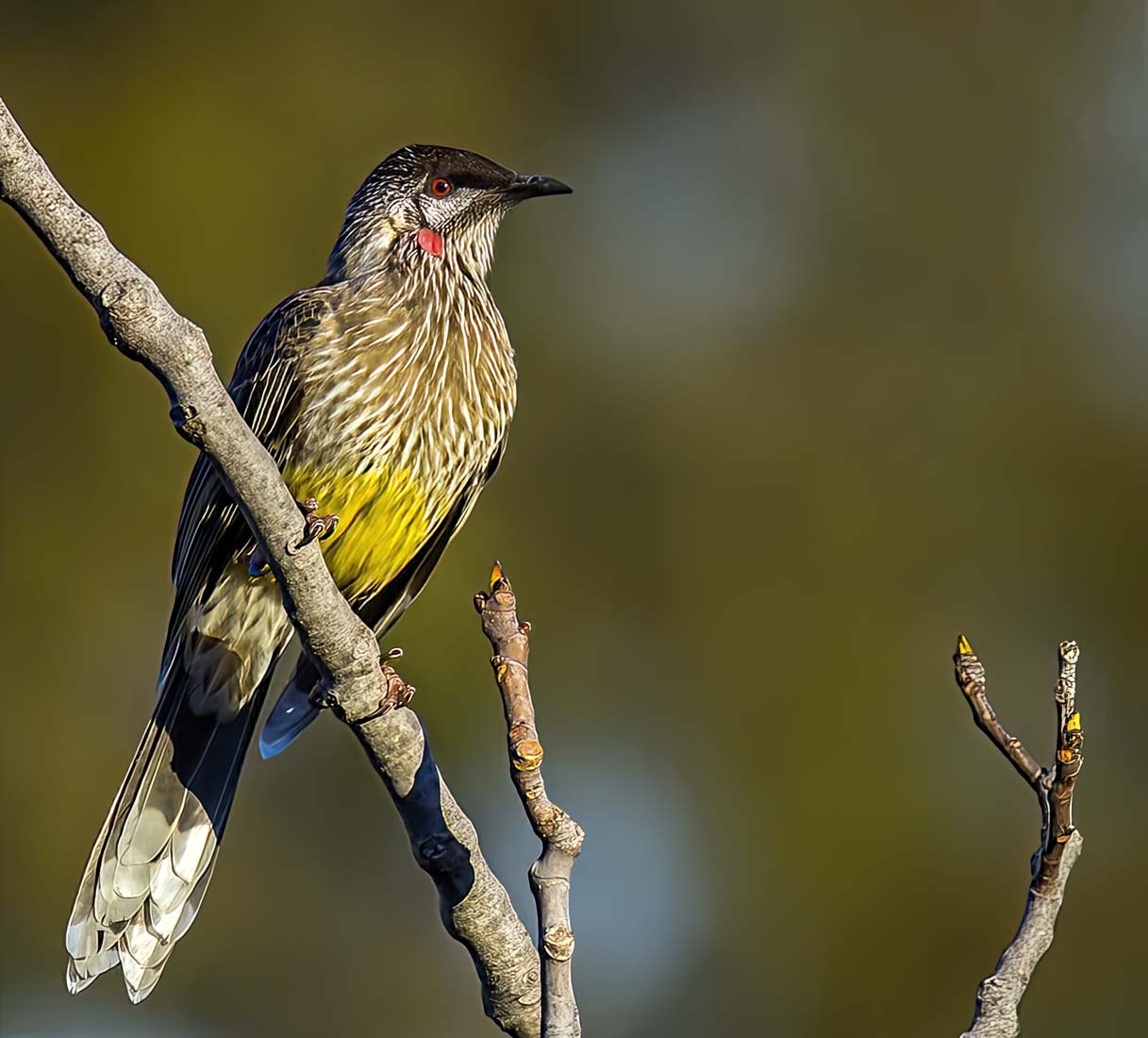
** RED WATTLE BIRD **
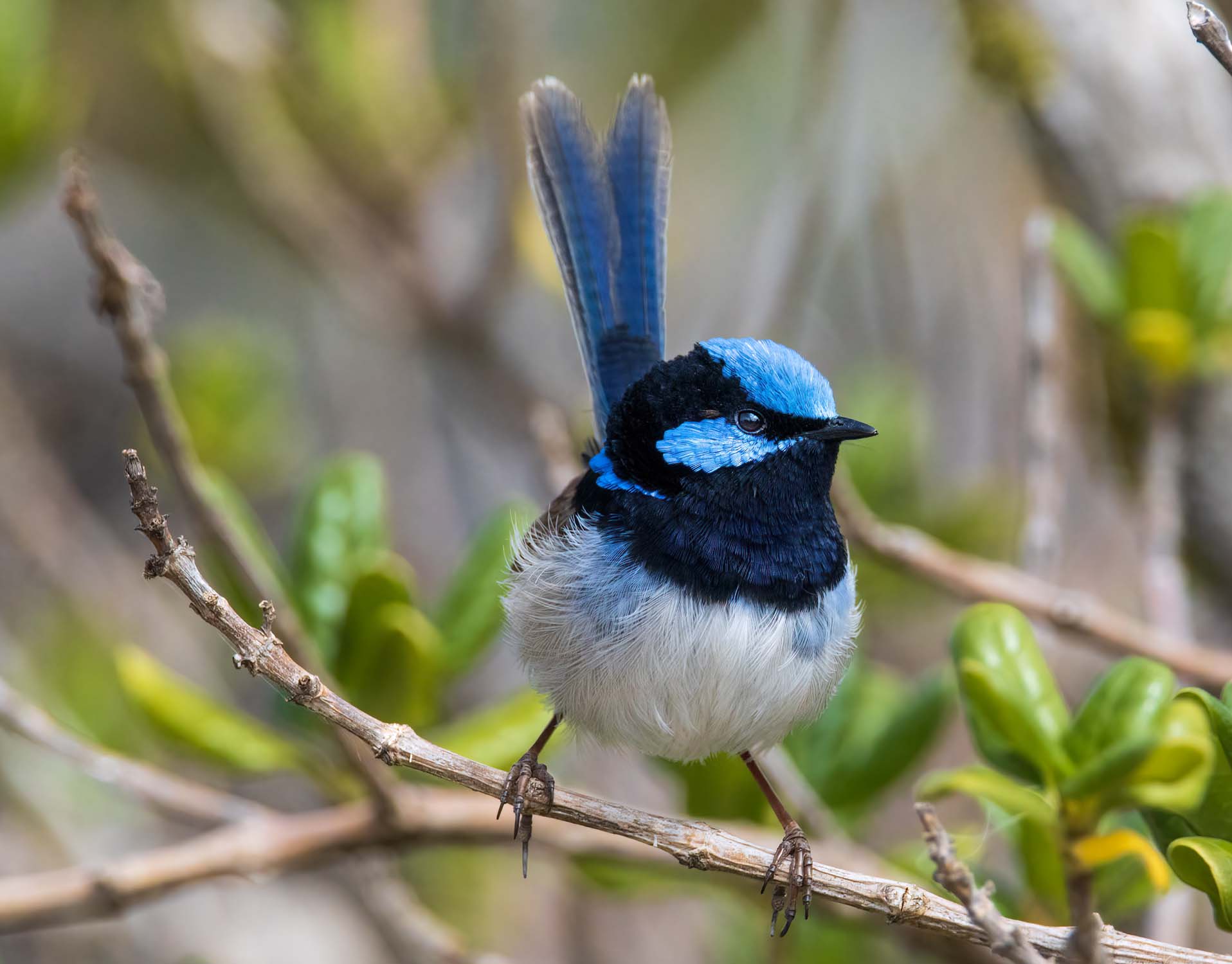
** SUPERB FAIRYWREN **
The wattle bird looks like he's an interesting bird and was well captured, but he seems over sharpened in post, giving him a bit of taxidermied look. There's some halos on the bird and the sticks.
The fairy wren is very pretty, well captured, in a great position, and doesn't seem as harshly sharpened as the other, more natural appearing. I really like her a lot. Well done.
-
@DanHasLeftForum has written:@minniev has written:
Out-Takes
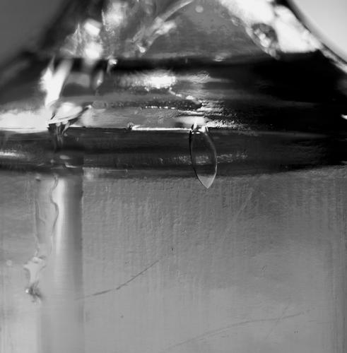
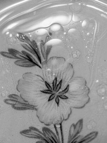
The 52 Project I belong to had a prompt this week I'd never heard of called Oil Abstract. You put oil and water in a vessel and take a picture of it. Not having much chemical sense, I had no idea how to pull this off or what was supposed to happen. So I rummaged in the sideboard for something to put it in. First I put the stuff in an ancient medicine bottle from the 1800s that I dug up on the farm. Then I tried dumping it in an antique china saucer. Finally I spotted a cracked crystal bowl and poured it in there, which gave it a zippy look and came up with one I wanted to use. Here's 3 of the out-takes.I like them all but I just wonder if color versions might add more impact to them.
Thanks. The color version of the one with the flower is kinda ok, but the other two were awful in color (think of olive oil mixed with water), so I just converted them all.
-
@Kumsal has written:
Road Camp Motel
An interesting and creative photo. I'm not usually a fan of perspective distortion but it works for this photo. The complementary colors of orange/blue enrich the image and cause me to examine all the details which are considerable. There is a clear compositional line from the moon through the vanishing point between the two middle structures and on to the back of the station wagon. The motel seems like a setting for a horror movie. It is a little quirky but it is an image that sticks to me. Well spotted and captured.
-
@Andrew546 has written:
Actually got out of the house and took a couple of photos. Went to Blair Castle Estate to see the beech trees before Storm Ashley stripped the last leaves of the trees.
These two I liked. As before I have no issue with others editing and re-posting within this thread.
These are quite beautiful. The depth of the images is striking with the lights brought forward and the darks receding, the way a forest would appear to one walking into it. The fall colors are rich. In the first, the leafy branches extend toward the viewer, enhancing the depth while allowing the viewer a space on the lower right to move through. The trees and their shadows in the second one form a receding set of nested L's, a very strong compositional device. Excellent forest photos. Forests are one of the hardest natural things to photograph well, and you've done it masterfully.
-
@minniev has written:
It looks like a spider with eyes. I just want to stare back.
-
@MikeFewster has written:@xpatUSA has written:@Andrew546 has written:
Actually got out of the house and took a couple of photos. Went to Blair Castle Estate to see the beech trees before Storm Ashley stripped the last leaves of the trees.
I like the well-captured synchronized "wave" effect in the branches, the foliage and the ground shadows/gradient.
An impressive composition!
Agreed Xpat. It's the repetition of the lines in the branches by the shadows on the ground that makes this shot such a success and the left/right colour gradient is a further joy.The small patch of brighter leaves on the right balances the brighter golds on the left without distraction because both frame the vertical lines that take the viewer down the road.
A 5 star landscape.I agree.
The horizontals are just diagonal enough to suck the viewer into the image, pulsating forward on that path.
Very effective!
(And the harmonious balance of bright and dark does the rest.) -
@RoelHendrickx has written:@MikeFewster has written:@xpatUSA has written:@Andrew546 has written:
Actually got out of the house and took a couple of photos. Went to Blair Castle Estate to see the beech trees before Storm Ashley stripped the last leaves of the trees.
I like the well-captured synchronized "wave" effect in the branches, the foliage and the ground shadows/gradient.
An impressive composition!
Agreed Xpat. It's the repetition of the lines in the branches by the shadows on the ground that makes this shot such a success and the left/right colour gradient is a further joy.The small patch of brighter leaves on the right balances the brighter golds on the left without distraction because both frame the vertical lines that take the viewer down the road.
A 5 star landscape.I agree.
The horizontals are just diagonal enough to suck the viewer into the image, pulsating forward on that path.
Very effective!
(And the harmonious balance of bright and dark does the rest.)Err, before you get too carried away with my "genius" and attributing everything as an absolute property of the image and it's composition... 😜
Composition and balance certainly, but also your memories, It's also reminding you of the familiar. You may imagine walking down the path because in similar views you have. Those shaded beech avenues as the sun shines through the golden autumn leaves is an iconic view, one that sticks in the memory.
@minniev has written:These are quite beautiful. The depth of the images is striking with the lights brought forward and the darks receding, the way a forest would appear to one walking into it.
@Fireplace33 has written:These are both beautiful !
The first has incedible depth. Those bright warm coloured leaves trace a gentle curved path inside the foreground space and they lead your eye up to explore the rest of the image where the background is darker and bluer.Thank you both.
What may not be apparent in the first image is that Glen Banvie is a small but quite deep ravine, so standing on the path you look through the closer ground detail and leaves straight through to the canopy behind. There is no forest floor, or sea of tree trunks, just this striking backdrop of autumn colour. I took a whole series at different spots, the one shown is by far the best.
-
@Andrew546 has written:
What may not be apparent in the first image is that Glen Banvie is a small but quite deep ravine, so standing on the path you look through the closer ground detail and leaves straight through to the canopy behind. There is no forest floor, or sea of tree trunks, just this striking backdrop of autumn colour. I took a whole series at different spots, the one shown is by far the best.
I understand what you're describing, now that you explain where you were, because strange as it might seem for an old lady from Mississippi, I've been there, though in August rather than October. It is the perception of an autumn forest path that becomes a reality for us, created by what's there and how you've caught and presented it. We aggregate your cues and draw our conclusions. Fine work.
