While I like the composition as shown, I think I would like it even better with just a bit more dark ground on the bottom, as a stronger baseline.
-
-
-
@RoelHendrickx has written:@MikeFewster has written:
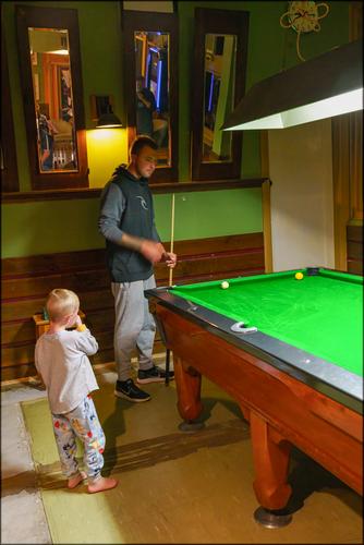
A Country Pub.
Following with keen interest.
There is a "Hustler" getting his education here.
I like how the diagonal of the pool table's edge leads to the hand in motion.Pleased to see the rectangles get noticed. The image is full of rectangles and part rectangles. I was very aware of them and their positioning when I took the shot.
-
@xpatUSA has written:@DanHasLeftForum has written:
I did read the posted exif data.
In that case, why did you say you were "really confused about why the sky looks so gloomy" - when the sky was so obviously under-exposed according to the displayed EXIF?
At the same or smaller equivalent exposure I have no difficulty in getting a natural looking sky.
Maybe Chris shot sooc jpeg and the camera picture style settings outputted a dark sky?
You can see Chris' exif data in his post at
dprevived.com/t/this-week-through-your-eyes-20241102/6399/post/87562/
This is a similar scene with a very similar exposure* that Chris used and the sky looks ok on my screen.
f/8, 1/2000s, ISO 100
* exposure - amount of light striking the sensor per unit area during a shutter actuation.
-
@Kumsal has written:@DanHasLeftForum has written:@Kumsal has written:
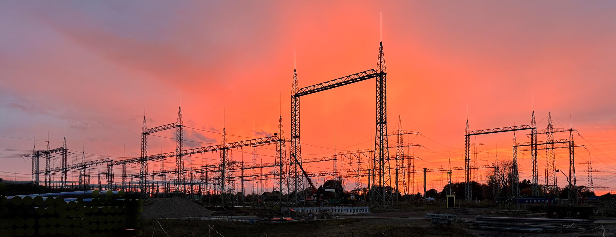
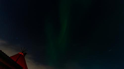
Overwhelming Sky
Only cut to 16:9 format, no other post-processing.
The sky is interesting but the foreground is uninspiring and detracts from the sky for me.
Electrical infrastructure has never really done anything for me.
But since your title suggests the sky is the most important part, a crop and edit something like this works better for me by highlighting the sky more.
Of course, you don't care what happens to the photo in the bottom left corner.
You hope that all viewers don't take the viewing too seriously.
That is your main dilemma, even with your photography.The foreground is uninspiring and doesn't interest me in any way.
If you like it that is fine.
Not everyone sees and interprets images the same way and that is the way it should be.
I'm running with the cropped version.
-
@MikeFewster has written:
It doesn't follow that the title tells us what the subject is and therefore the rest of the image is irrelevant. In looking at an image, the whole thing needs to be thought about. In this case, the foreground is very relevant.
That is basically a rinse and repeat of your initial opinions. That is fine.
I did look at and think about the whole image before forming my opinion of it.
I still disagree about the foreground for the reasons posted earlier.
-
@MikeFewster has written:
A Country Pub.
My instant reaction was to look for the dogs as in that iconic picture from a long time ago. I went looking for it to refresh my memory and all I could find were imitations...
-
@JSPhotoHobby has written:
It won't look like anything unless you make it big.
I have to ask what is the pretty coloured stick like object in the bottom right corner?
-
@minniev has written:
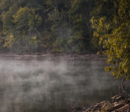
Transitions...
Summer to fall, night to morning, lake to forest, surprises included. Lake Barkley, KYA pleasant image that invokes a sense of serenity, calmness. The mist conveys the early part of the day with no breeze and little sun to burn it off. The deer seems aware of your presence.
I think there are times of the day, especially close to sun up / sun down where there are changes in the natural light that our mind may filter out but the camera catches.
-
@Sagittarius has written:
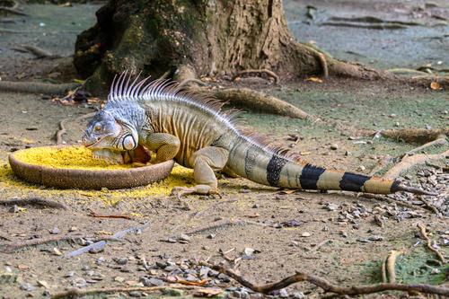
Wonderful specimen. Great detail shows off the colour variations and intricacies of his scales, skin folds and incredible head.
The tree roots and clutter on the ground show his environment. The food in and around the bowl, although integral to the image, is the outlier. -
@RoelHendrickx has written:
KORCE
One more from Albania.
And again one of my Iphone preview images (the ones I share while on the road, with "real camera" images, some of them very similar, still waiting to be processed)
I consider these Iphone images like the quick polaroids photographers used to make while on a shoot in order to visualize ideas... but something the temporary becomes permanent.This is the greek-orthodox cathedral in Korçë, a city in central Albania (and home to the brewery that makes the eponimous and widely available beer).
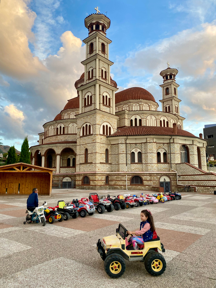
I adore that church. It is as if a mental image acquired from a story has come to life. I don't know if it is the phone processing or the architecture (brickwork, lines and colours) or both. Minnie mentioned a postcard. When I view it, it is as if I am looking at a real 3D scene. Not many photos convey that much depth. The colours of sky only add to it...
-
@Kumsal has written:
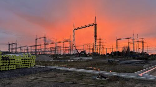
Overwhelming Sky
Only cut to 16:9 format, no other post-processing.
To catch a sky like that is one thing but to get the location and industrial aspects with it is another. Well done.
-
@Rich42 has written:
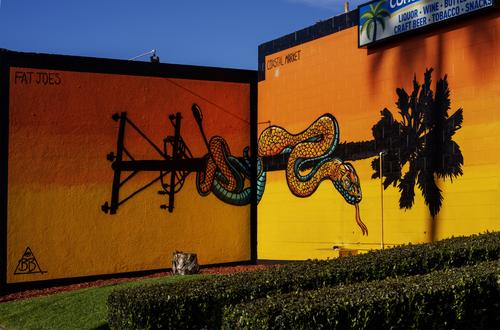
Oceanside can be a weird kinda place.
Rich
I like it, whether I may or may not be a customer of Fat Joes. The artwork stands out but there is also the bold oranges and yellows. I like the sometimes bold but mostly pastel colours of California.
-
@Bryan has written:@MikeFewster has written:
A Country Pub.
I see what you mean. Know them well.
My instant reaction was to look for the dogs as in that iconic picture from a long time ago. I went looking for it to refresh my memory and all I could find were imitations...
-
@ChrisOly has written:@Bryan has written:
There may well be some eggs in there...
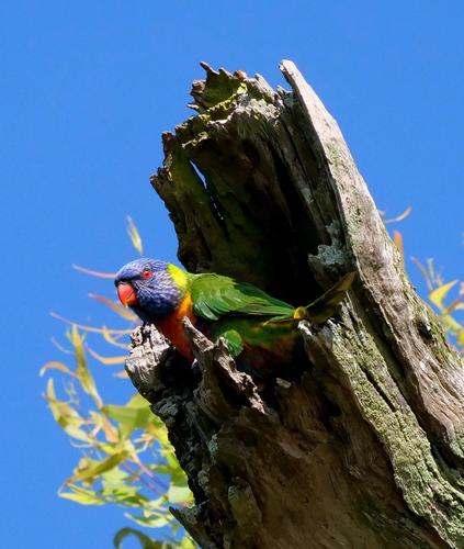
Excellent shot, fractionally blurred, but you know that. Love the colours and position.
Thanks Chris. I tried a touch of sharpening but the bright reflections on the feathers didn't like it. I was happy with the soft leaf blur.
@minniev has written:What a beautiful bird! Exotics such as this would only be found in a zoo or a pet shop here, never in the wild unless it escaped from a cage. Would it hold up to raising the shadows a bit in those darkest areas? If a crop (which my bird shots usually are), maybe not. Anyways, a lovely bird I wish I could spot in a broken tree.
Thanks minniev,
Soon I hope to have some pp up to the task of raising shadows and masking etc.
@MikeFewster has written:Well, if there aren't, there soon will be.
Disclaimer. I can't look at this image without seeing it along with a heap of my personal Australian baggage. It will look quite different to others.We have a Rainbow Lorikeet and a broken branch. The angle of the stump and the jagged points suggest the break was quite violent. The dark shadow (plenty of detail when viewed large) shows that a cavity has been formed. It's a matter of some significance in Australia. That's the way Eucalyptus trees break. The hollows are essential for breeding, especially for parrots and smaller marsupials. Re-afforested areas rarely get to develop nooks and crannies like these before they are harvested. In older timber areas, the timber industry claims it should be able to remove old dead/damaged trees, including in conservation areas.
What I see when I look at this image is a political statement.I never thought of the photo as a political statement but you are right about native forest versus re-forested areas. We don't even notice the hollows until we see the wildlife utilising them.
-
@RoelHendrickx has written:@ChrisOly has written:@DanHasLeftForum has written:
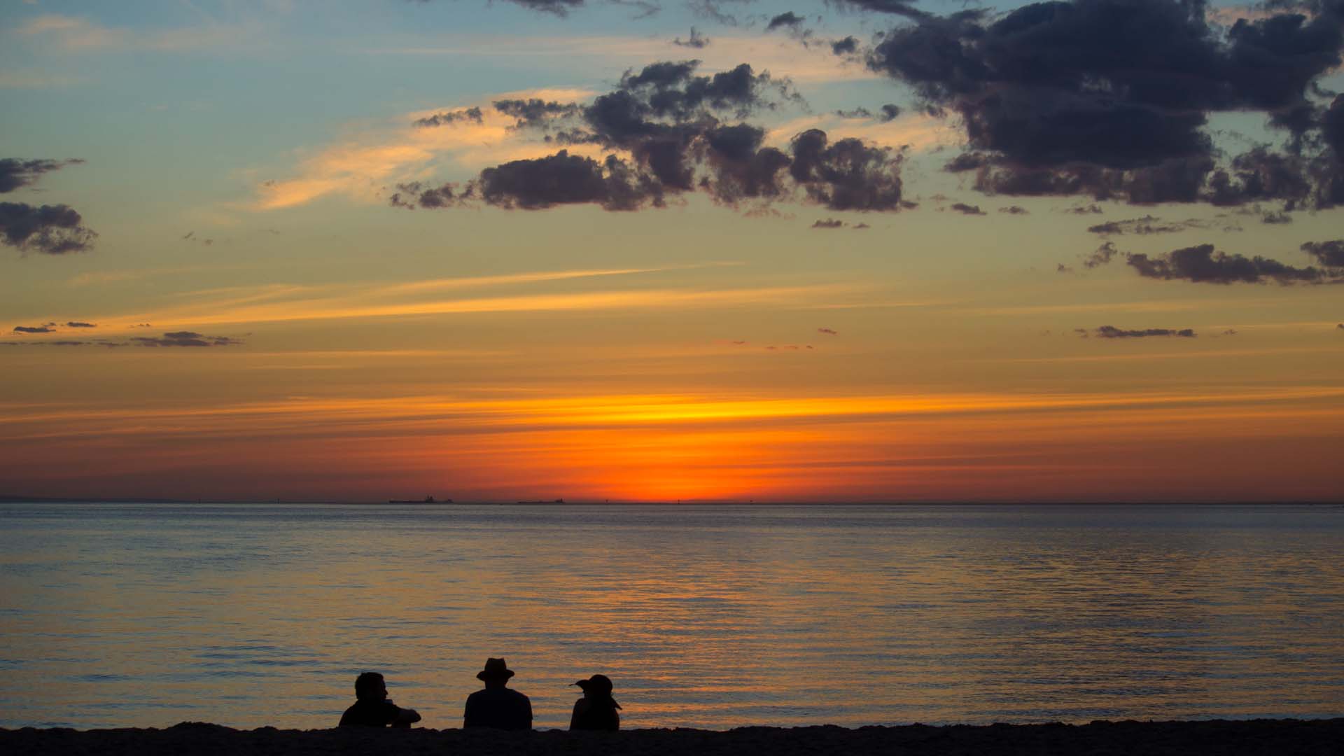
** END OF THE DAY **
Brilliant. Position of humans on the bottom is ideal. Gives us full idea what they are observing. Glorious sunset. Well done.
While I like the composition as shown, I think I would like it even better with just a bit more dark ground on the bottom, as a stronger baseline.
Thank you Roel,
Maybe a "smidge" more might help but it just comes down to personal taste.
-
<deleted> too confrontational
-
@xpatUSA has written:@DanHasLeftForum has written:@xpatUSA has written:@DanHasLeftForum has written:
I did read the posted exif data.
In that case, why did you say you were "really confused about why the sky looks so gloomy" - when the sky was so obviously under-exposed according to the displayed EXIF?
At the same or smaller equivalent exposure I have no difficulty in getting a natural looking sky.
Maybe Chris shot sooc jpeg and the camera picture style settings outputted a dark sky?
You can see Chris' exif data in his post at
dprevived.com/t/this-week-through-your-eyes-20241102/6399/post/87562/
This is a similar scene with a very similar exposure* that Chris used and the sky looks ok on my screen.
f/8, 1/2000s, ISO 100
* exposure - amount of light striking the sensor per unit area during a shutter actuation.
No need to tell me what exposure is and your example is not the one I was talking about.
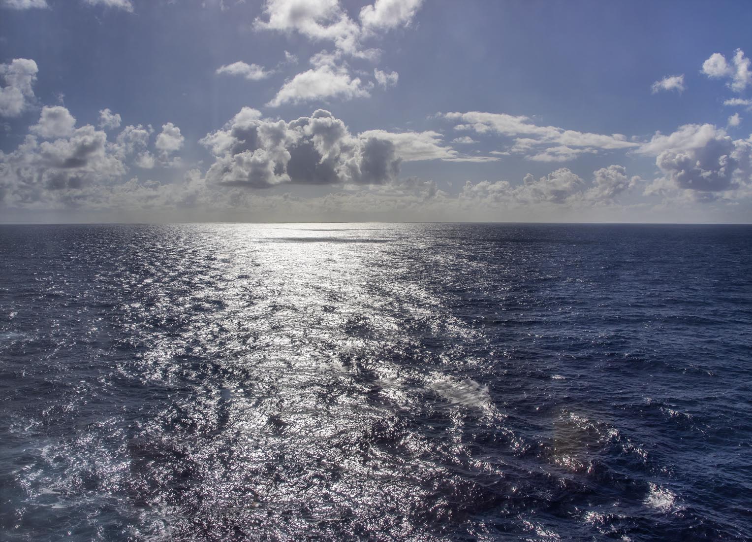
Here's the image I was talking about:
I just now downloaded and examined my example in the GIMP. My comment was based on the Exposure Value for the camera settings, f/4, 1/6400, 200 ISO which come to almost 18 Ev which is 2 EV more than bright sunlight, see here which explains why 2 EV more means under-exposed. However, the virtually zero-contrast sky is not explained by my previous comment, grump. Cranking up the sky contrast to the max brought out zero cloud detail.
I conclude that something untoward happened in post-processing but, in answer to your question, I have no idea what.
In Chris' photo the same exposure, as defined earlier, using f/8 as in my photo is f/8, 1/1600s.
I used a slightly smaller exposure of f/8, 1/2000s and the sky looks ok.
The point I was making is that the sky was not underexposed (according to the definition of exposure I use) as you claimed because the exposure I used in my example was the same or smaller than the exposures Chris used in his 3 photos and my sky is just fine.
I suggested the sky in Chris' photos might be due to post processing of the raw data.
Whether it was done in camera or manually I don't lnow.
