• Members 619 posts
    Nov. 1, 2024, 7:46 p.m.

    So if I send you a raw with nothing close to a neutral gray in it, you can magically produce an accurately color-balanced image!

    I believe you but thousands wouldn't ....

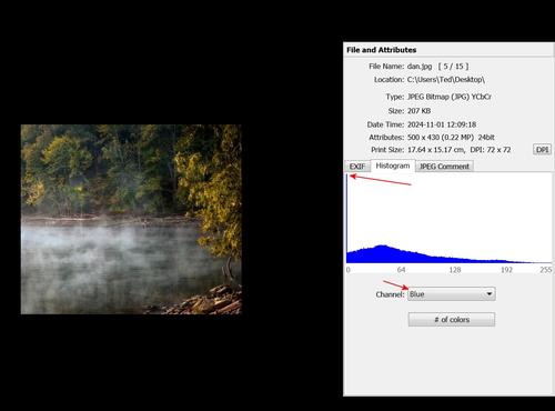
    The point I am making is that any edit that does this to image data is [poor]:

    blooz.jpg

    Therefore your edit is [poor] IMO, irrespective of how it looks on your screen.
    blooz.jpg

    JPG, 306.9 KB, uploaded by xpatUSA on Nov. 1, 2024.

  • Members 4254 posts
    Nov. 1, 2024, 8:02 p.m.

    That's fine. Your comment is just an opinion which obviously everyone is entitled to have and post.

    Some will agree with you and some won't 🙂

    I have posted several times in previous threads that the edits I do here using other people's 8 bit jpegs are not intended to be final images but simply examples supporting a point or suggestion I make in that post.

  • Members 4254 posts
    Nov. 1, 2024, 10:14 p.m.

    It depends on how close to a neutral grey is close enough for one's purpose for the final image.

    For example 220, 221, 219, or even a slightly wider variance, would be near enough as a starting point for my purposes most of the time.

  • Members 1517 posts
    Nov. 2, 2024, 12:37 a.m.

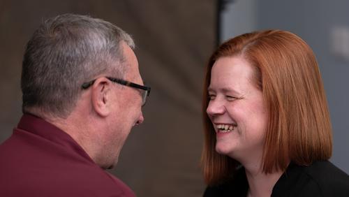
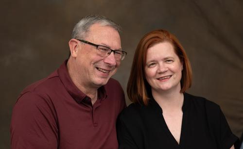
    As a formal portrait, I like 3. The light and shade gives 3d modeling without harsh shadows. The movement in brightness across the shoulders from right to left does the same. There's just enough detail on the left shoulder while it gives a transition to the dark background. The sharpness of the eyeglasses and eyebrows impresses and then moves to a more friendly softness. The splayed collar and zip suggest informality while framing the face in a traditional way.
    The whole image is gently managed. It is appropriate for the subject's pose. He isn't confronting the camera where a more direct pose might have suited a different treatment.
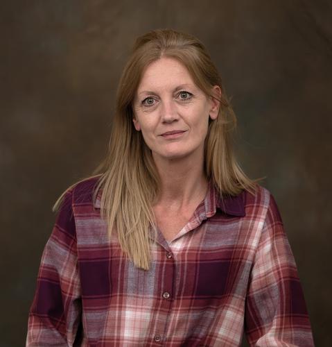
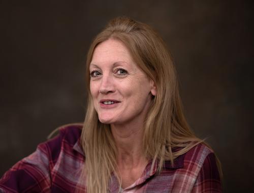
    Re the colours. image 3 doesn't seem to me to have a colour cast. I see the red tone more in the higher iso shots and those where there are large areas of red in the clothing. I also note the NR enhanced info. Are these reprocessed in Topaz which has an "enhanced " control? Alan, if you are going to explore the red tone further, it might be worth looking at those settings.

  • Members 4254 posts
    Nov. 2, 2024, 12:43 a.m.

    Not necessarily.

    In this one I used evaluative/matrix metering and kept clipped specular highlights to a minimum when I took the photo using the camera's histogram and blinkies as a guide.

    Then processed the raw file in ACR and PSE with the Elements+ plugin.

    It looks how I want on my screen. YMMV of course.


    dprevived.com/media/attachments/53/ea/y4VYsCq9zwvQjlHGZlnPf3ekqv9JWNkSWPPTb0G3sAMs56uHxv9SbROXsUYuDclo/waterhighlights.jpg

    waterHighlights.jpg

    JPG, 385.7 KB, uploaded by DanHasLeftForum on Nov. 2, 2024.

  • Members 4254 posts
    Nov. 2, 2024, 12:47 a.m.

    Yes, but assuming he was shooting raw the best starting point is to get the white balance, and hence skin tones, right when doing the raw conversion. Then look at any other relevant settings in the processing chain.

  • Members 619 posts
    Nov. 2, 2024, 12:57 a.m.

    Circling back, what if the raw has no neutral grays? Would you still need the raw for the purpose of white-balancing?

  • Members 1517 posts
    Nov. 2, 2024, 1:10 a.m.

    Well, if there aren't, there soon will be.
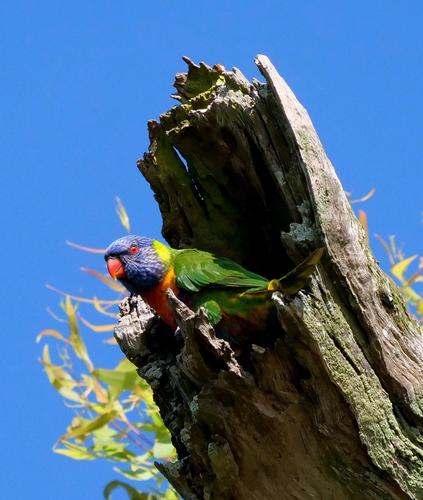
    Disclaimer. I can't look at this image without seeing it along with a heap of my personal Australian baggage. It will look quite different to others.

    We have a Rainbow Lorikeet and a broken branch. The angle of the stump and the jagged points suggest the break was quite violent. The dark shadow (plenty of detail when viewed large) shows that a cavity has been formed. It's a matter of some significance in Australia. That's the way Eucalyptus trees break. The hollows are essential for breeding, especially for parrots and smaller marsupials. Re-afforested areas rarely get to develop nooks and crannies like these before they are harvested. In older timber areas, the timber industry claims it should be able to remove old dead/damaged trees, including in conservation areas.
    What I see when I look at this image is a political statement.

  • Members 1517 posts
    Nov. 2, 2024, 2:15 a.m.

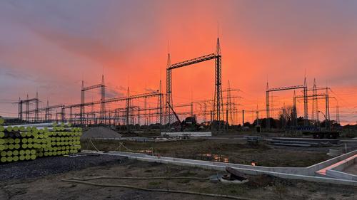
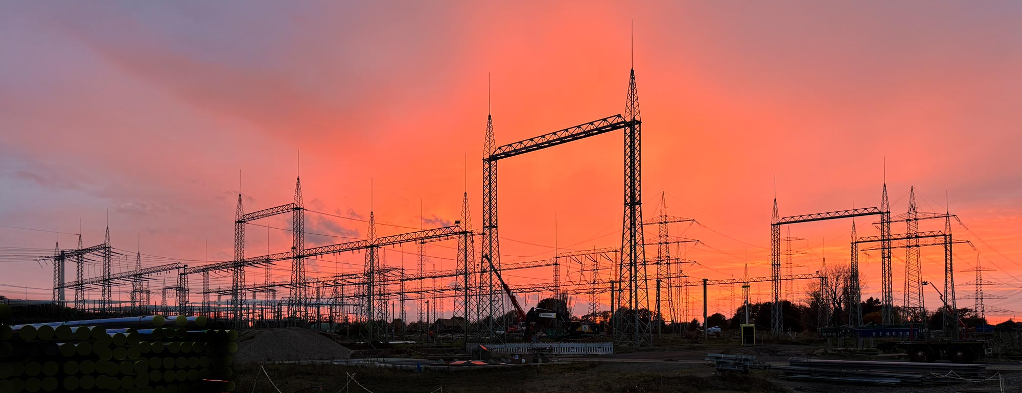
    I see why you used the 16:9 format.
    The highlight is the two central towers and your positioning of them against the pink/red sky. The shape of the sunset just right to pick up the vertical and horizontal spread of the towers. On the left, where the sunset fades, you have another element that keeps the balance - the stack of pipes with the green ends. I also think you got the space around the towers at the top and sides, just right. Less would have looked cramped, more would have taken some of the emphasis from the structures.
    I like the concrete channels and the foreground pipe as well. They give lines moving us into the image and opening up the panoramic format. If it had been a relatively featureless foreground or composed to miss these elements, the shot would have been nowhere near as satisfying.
    Great photo.

  • Members 4254 posts
    Nov. 2, 2024, 3:03 a.m.

    The sky is interesting but the foreground is uninspiring and detracts from the sky for me.

    Electrical infrastructure has never really done anything for me.

    But since your title suggests the sky is the most important part, a crop and edit something like this works better for me by highlighting the sky more.


    dprevived.com/media/attachments/29/f4/g2YpVzrgE9ttlqWYVzzK80fNqoaiPIirR5onaak9GCuHI9Z5WsARTCUYNZmAxeka/sky.jpg

    sky.jpg

    JPG, 209.3 KB, uploaded by DanHasLeftForum on Nov. 2, 2024.

  • Members 4254 posts
    Nov. 2, 2024, 4:24 a.m.

    Nice subject, scene and colours but is more compelling for me when cropped slightly, shadows lifted a bit and slightly sharpened especially the bird's head.

  • Members 4254 posts
    Nov. 2, 2024, 9:26 a.m.

    If you shoot only raw and there is no neutral grey in the scene you can simulate auto white balance to set white balance on the raw data in post with an Average Blur layer and the grey point picker in a Curves or Levels Adjustment layer.

    Pretty simple and straight forward.

    Or since white balance is not actually applied to the raw data in camera you can use the camera's chosen or user set white balance setting that is stored in a field in the raw's exif to set white balance on the initial rendering of the raw data in the raw converter.

  • Nov. 2, 2024, 10:18 a.m.

    They were processed in Photoshop. The red (magenta?) tone could be from the film simulation that PS tries to emulate. I know Provia in the camera has a red cast. Also, the shirts and hair in the other photos are red and this may have infuenced any NR.

    I will revisit them in time.

    Thanks for the feedback

    Alan

  • Members 619 posts
    Nov. 2, 2024, 3:56 p.m.

    In Adobe Photoshop Elements 24.0 (Windows)

    My computer is Adobe-free but but no doubt there is a way ...

    Gosh, I never knew that! 😉

  • Members 619 posts
    Nov. 2, 2024, 5:28 p.m.

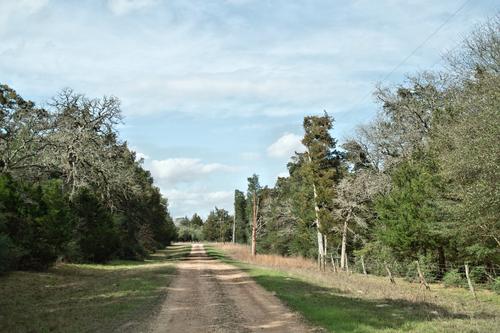
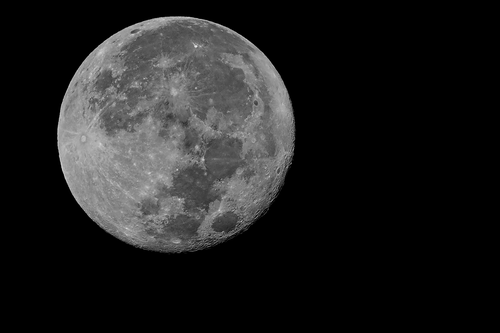
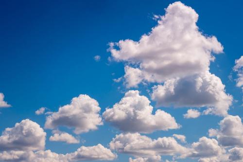
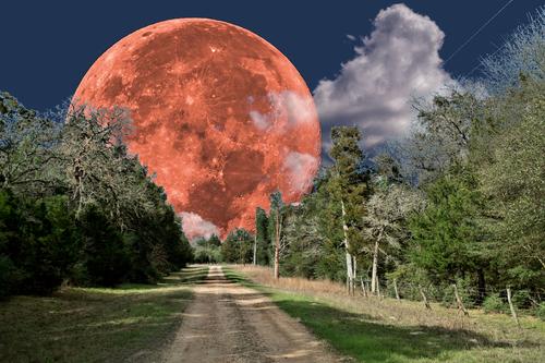
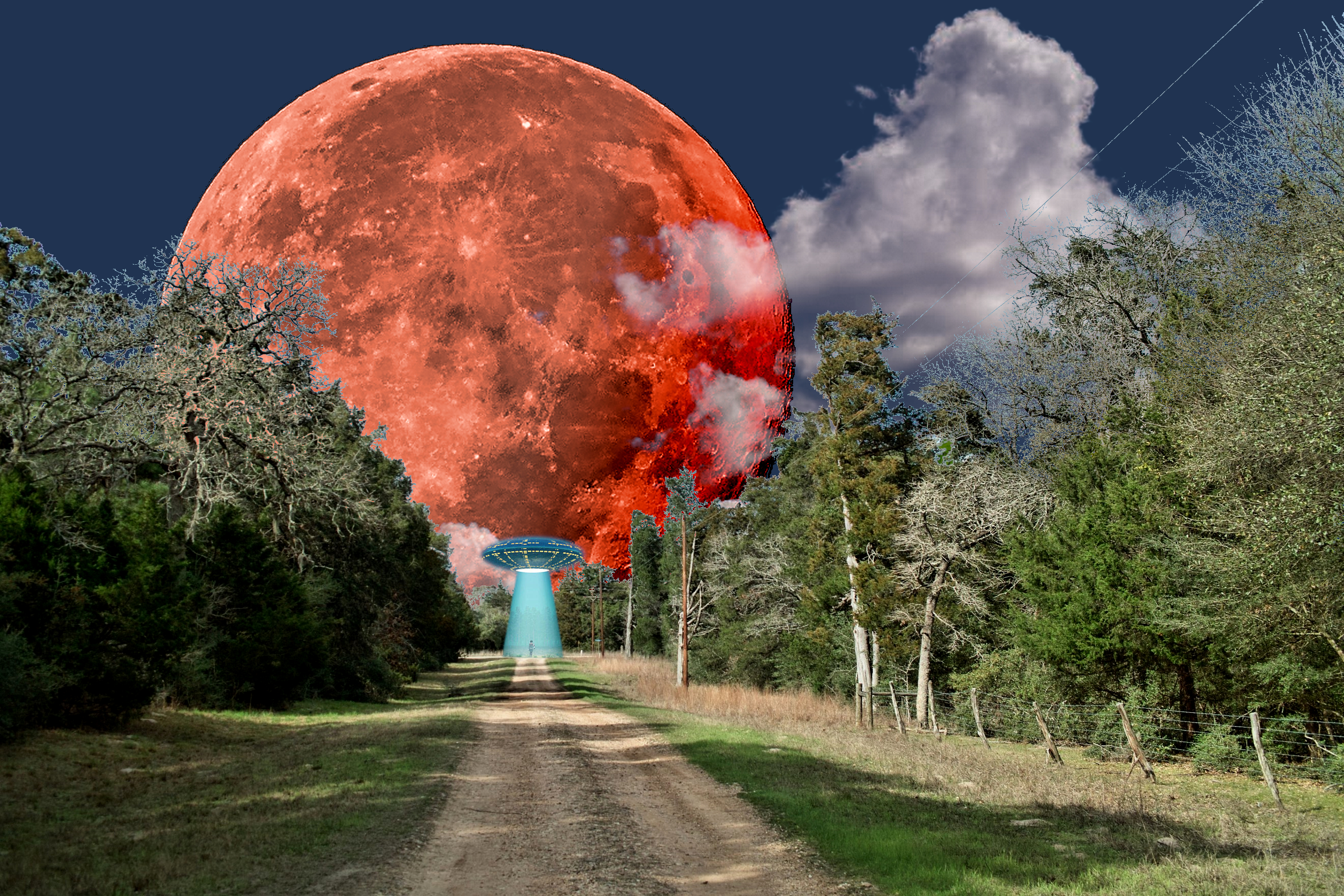
    Here's a composite involving the moon and my rural street

    The street:

    moon street.jpg

    A super-moon:

    supermoon.png

    Some clouds:

    moon clouds.jpg

    All brought into the GIMP as layers, added appropriate masks and changed the moon to blood and it's background to night, then all merged:

    moon clouds street.jpg

    Messing around with layers and masks is not real easy, see the tree twigs! Main point is that each shot by itself is pretty boring (just another moon shot, na-ni-na ...) but the composite is quite spectacular IMHO.

    Later, I added a UFO just for grins but I'm not sure whether it enhances the original or not ...

    kronometric.org/phot/manor/street/blood%20moon%20clouds%20street%20UFO.jpg

    moon clouds street.jpg

    JPG, 3.1 MB, uploaded by xpatUSA on Nov. 2, 2024.

    moon clouds.jpg

    JPG, 2.0 MB, uploaded by xpatUSA on Nov. 2, 2024.

    supermoon.png

    PNG, 1.2 MB, uploaded by xpatUSA on Nov. 2, 2024.

    moon street.jpg

    JPG, 1.1 MB, uploaded by xpatUSA on Nov. 2, 2024.

  • Members 4254 posts
    Nov. 2, 2024, 7:56 p.m.

    In earlier versions of PSE as well, Ps and some other apps as well.

    And now you do 🙂

  • Nov. 2, 2024, 10:47 p.m.

    Brilliant.

    Alan

  • Members 4254 posts
    Nov. 3, 2024, 1:48 a.m.

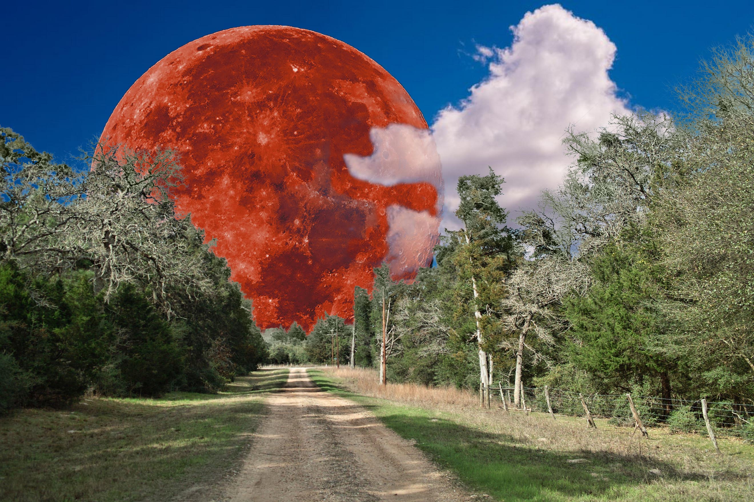
    Potentially a sensational composite but unfortunately the blue tinge all around the top of the trees spoils it a lot for me.

    I'm guessing it's a masking issue. If it is then tidying up your masking will help a lot to improve the composite.

    This is just a quick and basic re-composite to show what the composite would be similar to if you remove the bluish tinge. Imo it looks much better without it.

    I also wouldn't make the moon visible through the clouds but that's a personal choice. I reduced the opacity to show the moon only slightly through the clouds.

    I'd also clone out the power lines.

    The masking below still needs a little tidying up but it shows the gist of what I mean.

    Fwiw, just some food for thought.


    dprevived.com/media/attachments/0e/69/wSYxpPRf09ED7mVx1lgvxgDkuzZWrCjEDbeOotIMk0dyMXPFKheaKjWRKR8ZUzuZ/composite.jpg

    composite.jpg

    JPG, 895.8 KB, uploaded by DanHasLeftForum on Nov. 3, 2024.