Like b&w treatment. Well seen and captured.
-
-
Great series and colours .
-
Given choice I prefer this one, has more interest.
-
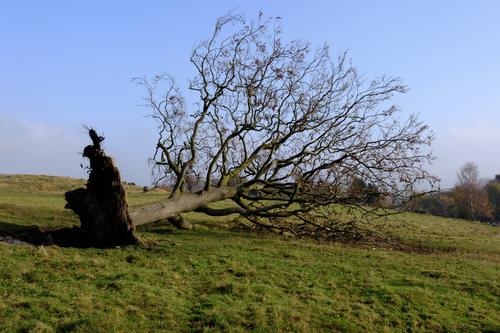
To paraphrase Crocodile Dundee ... this is an 'oops' ... albeit not so artistic, Alan ...
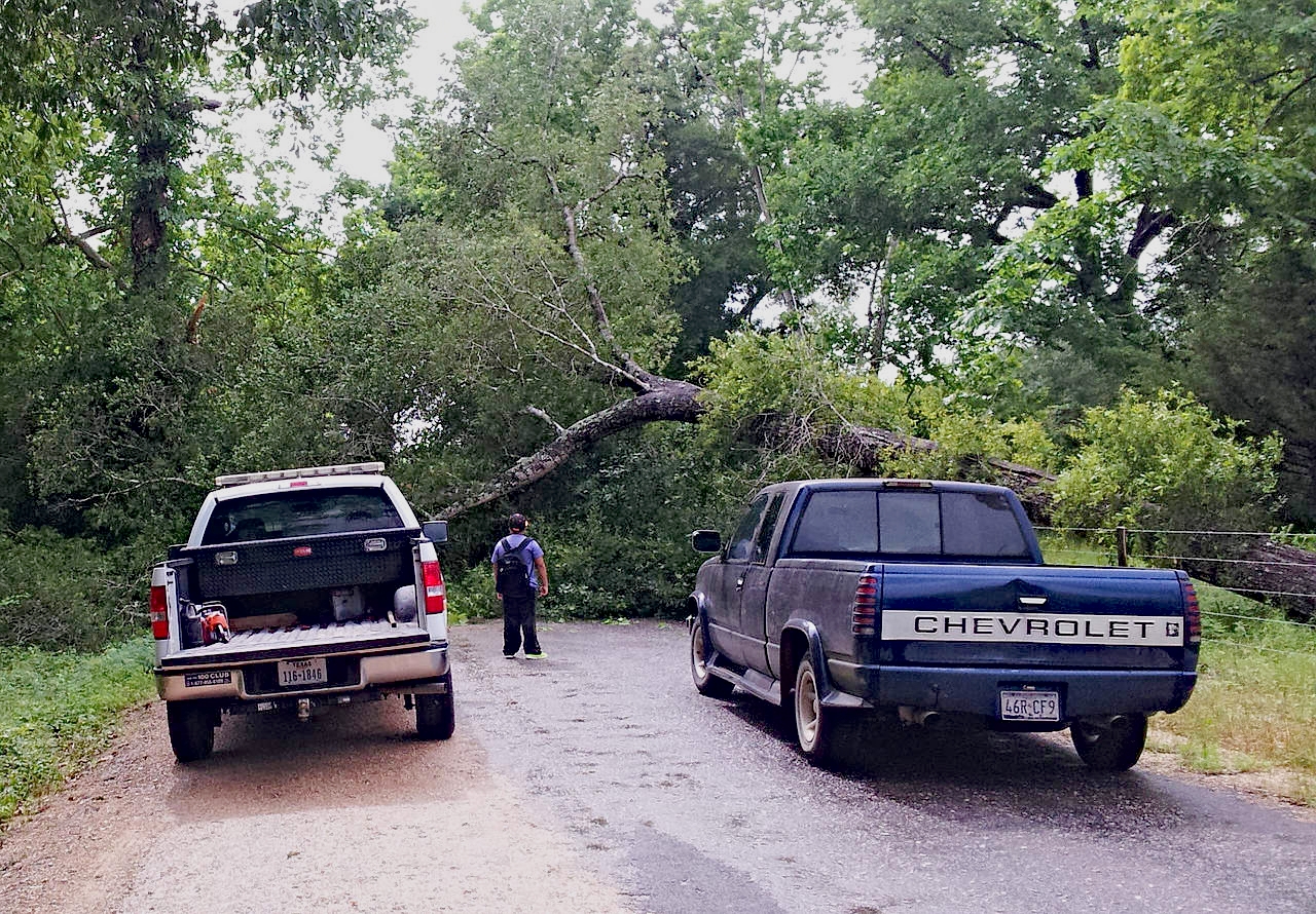
Encountered on the way back from town along the only road to the property, grump.
-
Rural Texas: dirt roads, 'bob wahr' fences and power poles:

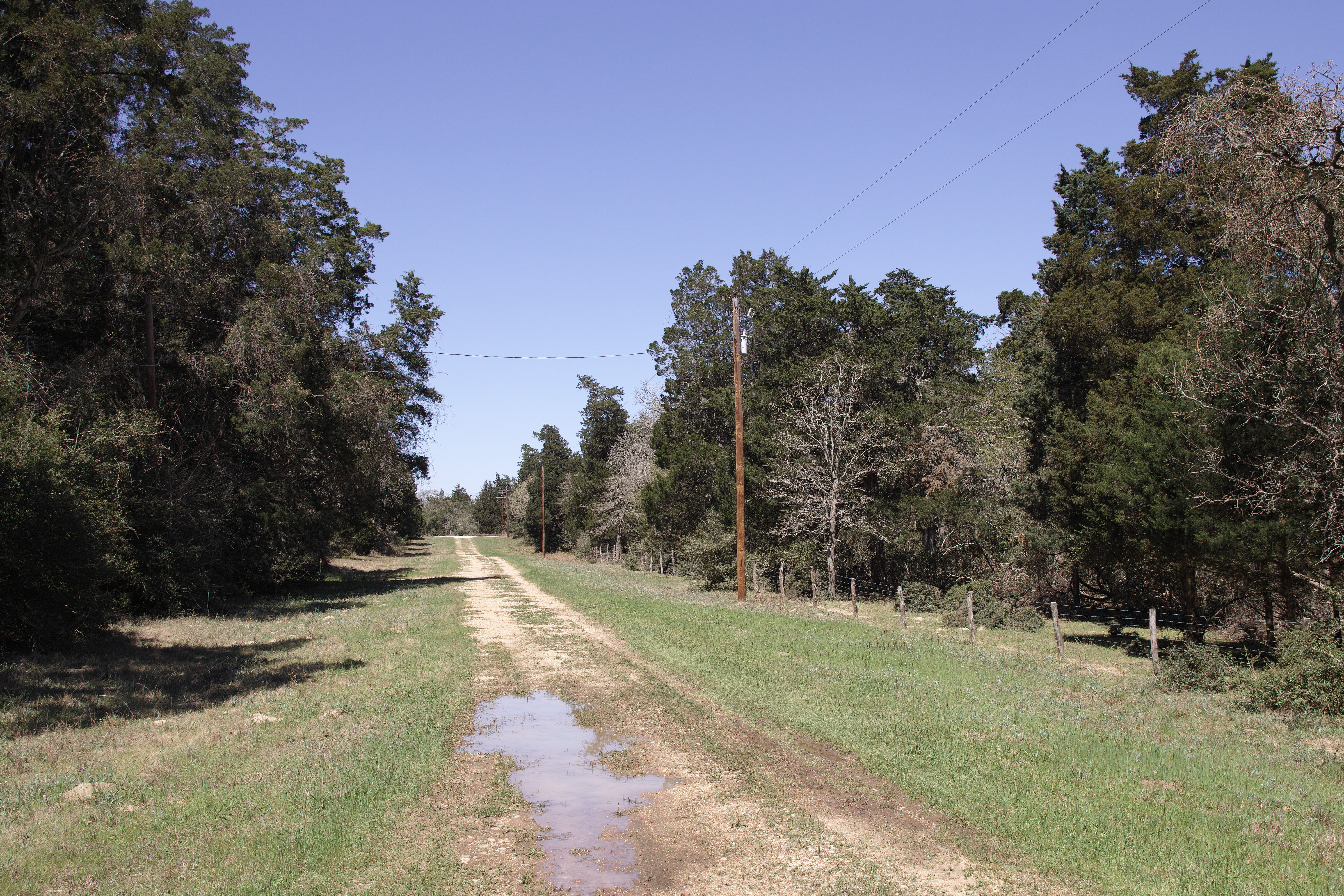
-
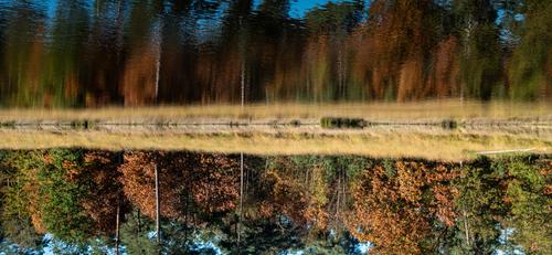
AUTUMN WALK - Taking on board some of the suggestions
I was curious for the effect of :
- Mike's suggestion to crop to exclude sky
- Minnie's suggestion to flip the image upside down.This version below uses those suggestions, but I did not go so far as to exclude ALL sky, because that would have yielded either a very small image (in 4:3 or even in 16:9) or otherwise a narrow horizontal strip of an image with ridiculous aspect ratio.
This (below) is what I felt I could get away with in terms of crop and remaining aspect ratio (still very panoramic of course) : -
Arvo and Mike have given such good analyses of the design possibilities in these images that I don't want to trouble you with repeating, and I have little new to add to their comments. There's so much rich detail hiding in the images, and some brightening and clarity applied overall and in specific areas (along the lines of what Dan has offered but his is overdone for my taste) could help bring out the details you would like to emphasize. I agree with Mike that the fellow leaving with the bag is not a great addition to the interest. I too have wasted much time waiting for the Right Person to enter a scene that really needs an interesting human, but we don't always get what we want. Those times when we do teach us the patience to keep waiting...
-
Is he headed home with a takeout for dinner? What is that under his belly?
-
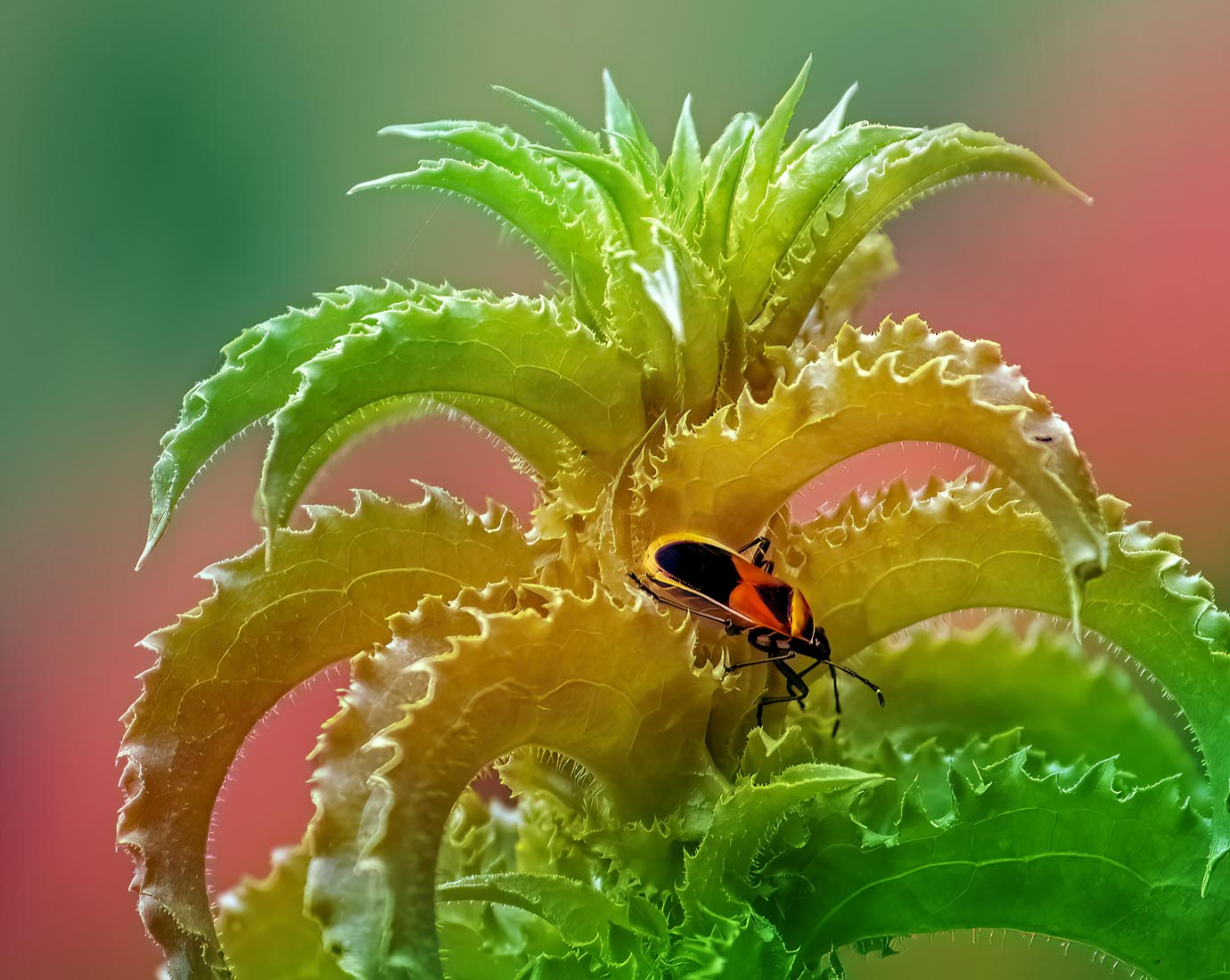
Thank you . I am still interested in this discussion because it doesn't seem to me that the colors you chose support the colors in the image, so I'd like to know why you chose them. The paint stripe's effect on the greens of the central leaves washes their color out to dull yellow and prevents the red and gold of the bug from benefitting from the color contrast with the rich greens. For me it calls more attention to the leaves (trying to figure out what's wrong with them) than the bug, who is pretty cute even if he is destructive, and in a great position to be eyecatching from a compositional point of view. It's your image and you are of course entitled to present it in any way you like but as a user of color overlays myself, I am still curious and hope you'll keep explaining.
-
@ChrisOly has written:@DanHasLeftForum has written:
I have no idea what type of bug/beetle this is.
Colours and sharpness are truly amazing.
Thank you Chris.
-
@minniev has written:
<snip>
There's so much rich detail hiding in the images, and some brightening and clarity applied overall and in specific areas (along the lines of what Dan has offered but his is overdone for my taste) could help bring out the details you would like to emphasize.
<snip>No problem minniev and they might not be overdone to some people, depending on how the images render on any particular screen.
The edits I do of other people's images in this thread are not intended to be final images but just visual representations showing what I mean in the post.
Anyone interested can then use my edits as a guide to do their own edits to their particular taste.
-
@RoelHendrickx has written:
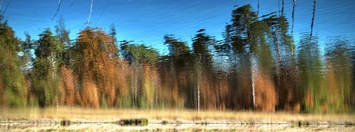
AUTUMN WALK - Taking on board some of the suggestions
I was curious for the effect of :
- Mike's suggestion to crop to exclude sky
- Minnie's suggestion to flip the image upside down.This version below uses those suggestions, but I did not go so far as to exclude ALL sky, because that would have yielded either a very small image (in 4:3 or even in 16:9) or otherwise a narrow horizontal strip of an image with ridiculous aspect ratio.
This (below) is what I felt I could get away with in terms of crop and remaining aspect ratio (still very panoramic of course) :OK. A longer thinner format wouldn't have bothered me, Looking at your crop, keeping in very small bits of the sky is better. The touches of blue lift the darker colours and also give an edge that wouldn't be there if the sky had gone completely. It's the right blue to complement the autumn tones.
With lots of sky, top and bottom, the shot became a conventional reflection and was easy to pass over. The ribbon crop changes everything. I'm undecided about the inversion. When I look at it I have a kind of "Oh yeah" moment while I decipher what has been done. To me, the new ribbon crop is strong enough not to need anything further to give it impact and have us feasting on the line and colours. The inversion feels a bit "tricksy," -
@RoelHendrickx has written:
AUTUMN WALK - Taking on board some of the suggestions
I was curious for the effect of :
- Mike's suggestion to crop to exclude sky
- Minnie's suggestion to flip the image upside down.This version below uses those suggestions, but I did not go so far as to exclude ALL sky, because that would have yielded either a very small image (in 4:3 or even in 16:9) or otherwise a narrow horizontal strip of an image with ridiculous aspect ratio.
This (below) is what I felt I could get away with in terms of crop and remaining aspect ratio (still very panoramic of course) :It needs some work to subdue the colors and tame the halo but I'm not near a computer and this is just a basic idea, shown from mobile.
-
@AlanSh has written:
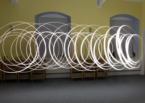
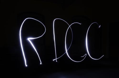
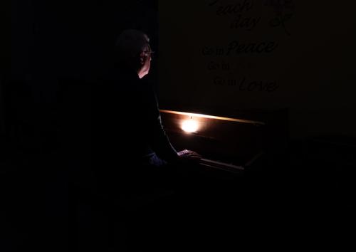
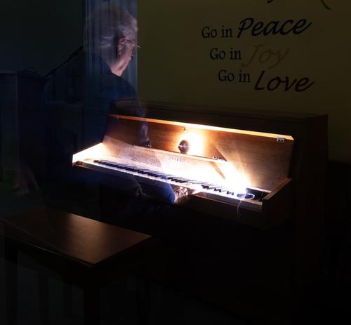
Last night, my club tried their hand at indoor light painting. For some of us, it was the first time. I found it a fun thing to do, but not something I'd ever put in an exhibition at the level we were playing (have a look here for some really good examples www.bbc.co.uk/news/articles/cyv7prndj0qo).
Anyway, here's some that I took. Feel free to comment - but not to edit please.
This was me (with remote shutter in hand) twirling a light around my head
Our Chairman wanted a new logo for our club
We then tried dark lighting around the piano
Finally, I tried to "ghost" a person.
Alan
Thanks for the heads up to the BBC. They convince me. It's a technique worth playing with. 1 and 2 are first steps on a path and I look forward to seeing where it takes you.
I like 4. A musical instrument and links to what an instrument can do. The ghosting means the instrument remains the subject while the person and music are associated with it. If they hadn't been ghosted, the player would have been assumed to be the subject. -
@minniev has written:
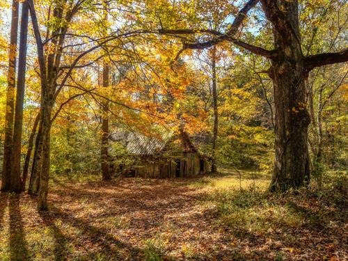
Cummins Falls State Park in TN - This old shed was once where products of the Cummins mill were stored in the 1800s. The mill is gone, but the shed remains, barely.
You live in such a beautiful part of the world!
It's too perfect. C&C here is too easy so I wont try to detail the following. Framing from the trees and the foreground shadows. Balance. Control of DOF with a special note for the path and the importance of the path. Exposure and colour (while getting some blue in the sky. Exposure has to be perfect to do that.)
Achingly beautiful. -
@MikeFewster has written:
Exposure and colour (while getting some blue in the sky. Exposure has to be perfect to do that.)
The exposure does not actually need to be perfect to get the blue sky in that scene. It can be less than perfect because what matters is that the sky is not clipped in the raw data.
The quickest and easiest way I know to keep blue skies in a single shot for that type of scene is to set manual mode with base iso.
Set the widest aperture that gives the DOF you want and then ignore the metering system because it can be easily fooled and clip the sky in this type of scene.
Set the slowest or near enough to the slowest shutter speed that avoids clipping of highlights according to the camera's histogram and/or blinkies.
You then set the final image lightness to taste in post.
As long as you don't clip the sky in the raw data (easy enough to do as described above) the sky will be blue.
An alternative is to take two exposures using ETTR and then blend them in post.
-
@RoelHendrickx has written:
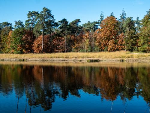
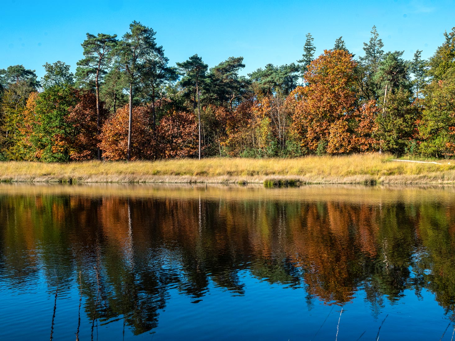
I'm a sucker for reflections in water. I like this scene very much. I like the few blades of grass in the foreground that help to give depth to the scene.
However I am not a fan of blue fringes in foliage as you have across the tops of the trees. They are easily removed in Ps or PSE by painting over them on a separate layer set to Color Blend Mode. You can use Select Color Range and the Magic Wand to quickly select those blue fringes for painting over.
Something like this looks better on my screen.
