Wonderful capture. I've never caught one hauling sticks. I've seen them but never when I had a camera in hand. Is this a courting stick or a building stick? If it's a courting stick, it isn't very impressive. He's beautiful, and I love his golden eye.
-
-
Minniev,
Thank you.
Thank you.
Thank you!
Rich
-
@Kumsal has written:
Close-ups
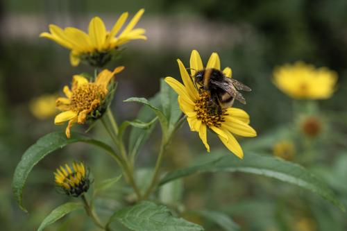
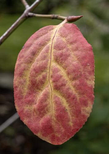
Both are quite nice, well taken images that could stand alone or be considered as a themed set. The bee photo has both plant a creature, with great detail and color. And the leaf is just lovely with its unusual color structure, flowing lines, and that tiny piece of spiderweb. Well done.
-
@Kumsal has written:
Close-ups
I like the bee shot too. Stacks of fine detail on the bee. The background flowers should be noted as well. They play a big part in the success of the image. Varying degrees of soft focus but all are recognizable and show the host flowers in different stages of opening. They add information without detracting from the main flower/bee. The soft focus., radiating leaves and stems do like wise and bring everything together.
The Autumn leaf is different. Nice colours and textures but the shape and positioning don't appeal to me in the way the first shot holds me. I like the fine strand of cobweb that minniev pointed out but it is overwhelmed by the rest of the leaf. To me. -
-
@JSPhotoHobby has written:
GoPro 7
Internal HDRCorrection: Not GoPro, Samsung S8 Phone
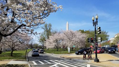
I like this a lot. I agree with Minnie that cutting off the red vehicle on the extreme right would be an improvement.. Also, the monument and the lamp post are not quite parallel or upright. But I am nit picking!
David
-
@MikeFewster has written:
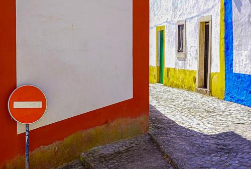
Lisbon Street. Version 2.
I straightened the left hand side a little and made further colour adjustment.
The lower orange angle is correct. The orange line follows steps that are sloping down a hill.
I prefer this version.I like this one much better. The colours round the house doors really complement the reds. My eye follows the red to the blue and yellow and makes me wonder what is further down the road. A picture that leaves you like that is always good.
Alan
Alan
-
@MikeFewster has written:
Lisbon Street. Version 2.
I straightened the left hand side a little and made further colour adjustment.
The lower orange angle is correct. The orange line follows steps that are sloping down a hill.
I prefer this version.Fairly dramatic improvement over the first edition, not even because we have more colours and shapes and sizes on the adjoining wall. I even like this truncated hockey stick of a shadow on the ground. All the elements play together now. Well done.
-
@Kumsal has written:
This simplicity of a lovely leaf image always wins.
-
@MikeFewster has written:@ChrisOly has written:@MikeFewster has written:@ChrisOly has written:
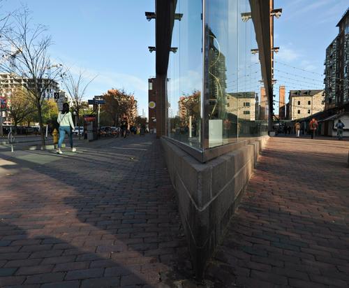
Two worlds
Two worlds indeed.
One shot taking in the old and the new of the city.
Well done. It's eye-catching and thought provoking. Thought provoking to me at least. I'm still undecided about how Chris brought the shot off.
Is it a wide angle lens and we are looking down the apex of a regular corner? Is this a corner where the streets converge on an unusually sharp angle with glass surfaces on both sides? I suspect the latter because of the angles of the shadows on the left hand side. They seem to be continuation of the same shadows we see on the right and the angle of both looks to be the same.
Something else? I can't figure it out.Thank you Mike for the comment. I believe the architect decided to maximize the space for the walkway towards the old section of town and created a pie shape to end the building like a point. That's it. I was attracted by this highly unusual architecual solution.
Thanks for the explanation. All my deductive work on the image suggested it was indeed a thin slice of pie shape. It was the shadows on the left that caused my head scratching. It seemed very unlikely that the construction would be that shape. Am I right in thinking that the V projection is not very high, which again makes it curious.
Whay city are we in?Toronto, Ontario, Canada
-
@Rich42 has written:
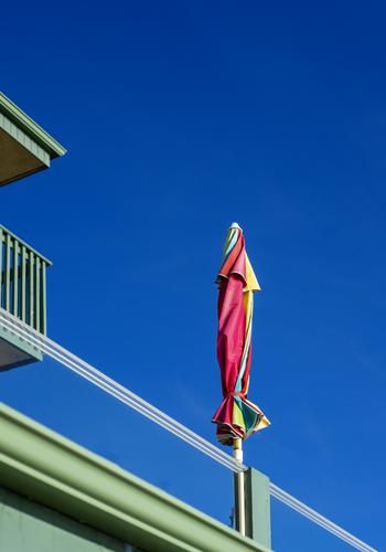
Attraction here is the variety of lines and colours all set against glorious blue sky. Well seen.
-
@ChrisOly has written:@MikeFewster has written:
Lisbon Street. Version 2.
I straightened the left hand side a little and made further colour adjustment.
The lower orange angle is correct. The orange line follows steps that are sloping down a hill.
I prefer this version.Fairly dramatic improvement over the first edition, not even because we have more colours and shapes and sizes on the adjoining wall. I even like this truncated hockey stick of a shadow on the ground. All the elements play together now. Well done.
.
Yep. I took the reposting as an opportunity to spend more time on the PP and reframe as well as reducing the brightness. -
@MikeFewster has written:
Lisbon Street. Version 2.
I straightened the left hand side a little and made further colour adjustment.
The lower orange angle is correct. The orange line follows steps that are sloping down a hill.
I prefer this version.This version looks much better and helps convey what the scene looked like.
And, I like this version.
But, I think you should invest in a better monitor.
Deeper shadows would do this photo much better.
Since you always comment on shadows that should be lightened, it must be something to do with your monitor.
Your photos are always slightly overexposed to my eye.
It can't be your camera or the exposure. -
@AlanSh has written:@Rich42 has written:
We had a photo competition last night and the judge talked about 'capturing your interest' as one of his criteria. This is a lovely picture with beautiful colours, but it just does not 'capture my interest'. Maybe if it were unfurled? Or if there was a bird perched on top - or something.
Alan
I agree with you Allan.
As for the colors, they are overexposed here, at least the ones that are supposed to make up the photo. -
@RoelHendrickx has written:
ALBANIA in LAYERS
Back to Albania. Back to an Iphone image.
One from a pretty strenuous hike through the hills just north of Përmet.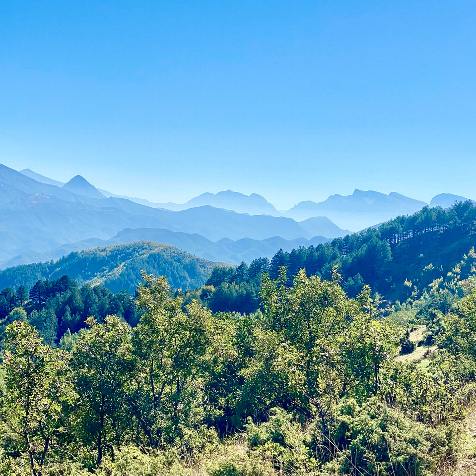
I hope you didn't just take this photo with your iPhone.
There's a lot more potential that can be achieved with a real camera.
Very good photo! -
@Kumsal has written:
But, I think you should invest in a better monitor.
Deeper shadows would do this photo much better.
Since you always comment on shadows that should be lightened, it must be something to do with your monitor.
Your photos are always slightly overexposed to my eye.
It can't be your camera or the exposure.It looks OK on my monitors. So, maybe just accept it is what it is.
Alan
-
@Kumsal has written:
I hope you didn't just take this photo with your iPhone.
Phones can take good pictures. Let's not disparage individual kit - or who knows where we will end up.
Alan
-
@minniev has written:
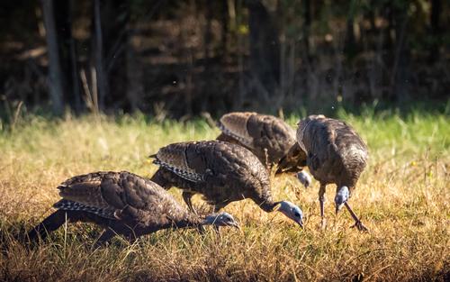
Ladies on the march (prairie wildlife sanctuary run by national park service, Golden Pond, KY).
I would like to see and photograph turkeys in the wild.
That's why they're very interesting for me.
