Alan, when it comes to nuances, we should talk about the quality of the screens.
The question is: do you really have a screen that can display your photos properly?
It obviously depends on the money you spend.
-
-
@AlanSh has written:@Kumsal has written:
I hope you didn't just take this photo with your iPhone.
Phones can take good pictures. Let's not disparage individual kit - or who knows where we will end up.
Alan
Sure, the phones can take good pictures.
But, there are still stark differences.
With so little sensor and glass, no computer can keep up. -
@ChrisOly has written:
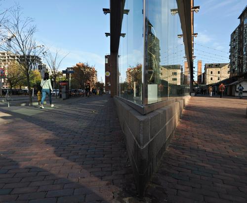
Two worlds
Very good!
The photo draws me in to take a closer look.
Well photographed. -
Guys, maybe we should not start argument along the lines "this looks better on my screen", sounds somewhat familiar, eh? :)
It is better to say simply "I suggest to make shadows deeper on this image", if you think so - often choosen 'lightness' may be other user intent or style.Sure screens are different, but unless you prepare for printing or are kind of perfectionist (well, we all are in some degree), then this does not matter much. Human eyes are highly adapting devices, we tend to compare all images to another images and if we see that some image is lighter or darker than majority of other images, then these images look different (lighter or darker) on almost any screen.
-
@Kumsal has written:@AlanSh has written:@Kumsal has written:
I hope you didn't just take this photo with your iPhone.
Phones can take good pictures. Let's not disparage individual kit - or who knows where we will end up.
Alan
Sure, the phones can take good pictures.
But, there are still stark differences.
With so little sensor and glass, no computer can keep up.Not even an iPhone, just an old 6MP Samsung SkyRocket shot being kept up very well by my old Dell on my old NEC Multisync:

Best viewed opened in new Tab.
So much for blanket statements ... 😉
-
@Kumsal has written:@MikeFewster has written:
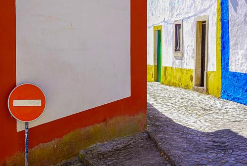
Lisbon Street. Version 2.
I straightened the left hand side a little and made further colour adjustment.
The lower orange angle is correct. The orange line follows steps that are sloping down a hill.
I prefer this version.This version looks much better and helps convey what the scene looked like.
And, I like this version.
But, I think you should invest in a better monitor.
Deeper shadows would do this photo much better.
Since you always comment on shadows that should be lightened, it must be something to do with your monitor.
Your photos are always slightly overexposed to my eye.
It can't be your camera or the exposure.Are you confusing me with someone else? I rarely say other people's images should have the shadows brightened. Usually I have been defending photos from others where Dan's edits, in my opinion, have over brightened shadows and in so doing often lost depth. Not this week's image from Dan though where I thought it was underexposed. How does the exposure on Dan's panorama this week look to you on your monitor?
I often find my initial posts to Dprev look too dark when I preview and only look at them at small size. Then later, after posting, when I look at images at full size, they look better. I find the same with other people's images as well as my own. This week, my image didn't look bright enough on preview so I boosted it a bit and reposted without doing a check. I agreed with those who said it was too bright and revisited it.
I note that you are making the same comment to a number of different images from different participants. Which raises the question of whose monitor is off?
Or it may be a matter of taste. If you like, we can begin a discussion on what the eye sees when it looks at a scene, what a camera sees when it looks at the same scene (they are quite different) and the decisions made when we turn what the camera has captured into an image. It is likely to be a lengthy chat so if you want to proceed, we might do it elsewhere rather than block up this week's C&C. -
@Bryan has written:
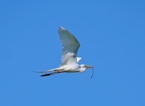
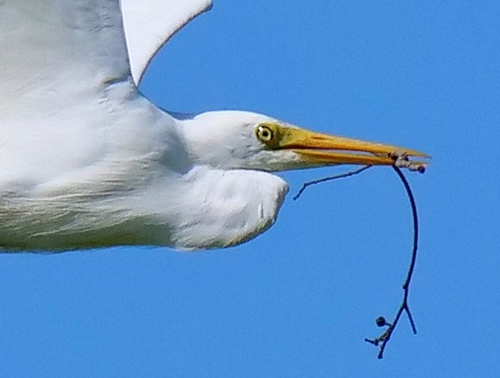
Eastern Great Egret
Late spring but still home building...
Despite the heavy cropping and blurriness, it's a good photo!
A photo doesn't always have to be technically very good. -
@MikeFewster has written:@Kumsal has written:@MikeFewster has written:
Lisbon Street. Version 2.
I straightened the left hand side a little and made further colour adjustment.
The lower orange angle is correct. The orange line follows steps that are sloping down a hill.
I prefer this version.This version looks much better and helps convey what the scene looked like.
And, I like this version.
But, I think you should invest in a better monitor.
Deeper shadows would do this photo much better.
Since you always comment on shadows that should be lightened, it must be something to do with your monitor.
Your photos are always slightly overexposed to my eye.
It can't be your camera or the exposure.Are you confusing me with someone else? I rarely say other people's images should have the shadows brightened. Usually I have been defending photos from others where Dan's edits, in my opinion, have over brightened shadows and in so doing often lost depth. Not this week's image from Dan though where I thought it was underexposed. How does the exposure on Dan's panorama this week look to you on your monitor?
I often find my initial posts to Dprev look too dark when I preview and only look at them at small size. Then later, after posting, when I look at images at full size, they look better. I find the same with other people's images as well as my own. This week, my image didn't look bright enough on preview so I boosted it a bit and reposted without doing a check. I agreed with those who said it was too bright and revisited it.
I note that you are making the same comment to a number of different images from different participants. Which raises the question of whose monitor is off?
Or it may be a matter of taste. If you like, we can begin a discussion on what the eye sees when it looks at a scene, what a camera sees when it looks at the same scene (they are quite different) and the decisions made when we turn what the camera has captured into an image. It is likely to be a lengthy chat so if you want to proceed, we might do it elsewhere rather than block up this week's C&C. -
-
@ArvoJ has written:
Guys, maybe we should not start argument along the lines "this looks better on my screen", sounds somewhat familiar, eh? :)
It is better to say simply "I suggest to make shadows deeper on this image", if you think so - often choosen 'lightness' may be other user intent or style.Sure screens are different, but unless you prepare for printing or are kind of perfectionist (well, we all are in some degree), then this does not matter much. Human eyes are highly adapting devices, we tend to compare all images to another images and if we see that some image is lighter or darker than majority of other images, then these images look different (lighter or darker) on almost any screen.
Agreed. You must have posted this while I was writing my response to Kumsal. If Kumsal wants to have the discussion, I'm happy to take it up and I'd be expanding on similar points to those you have made here. But I don't think this thread is the place to continue. If K wants to proceed, could you initiate a new thread in a more appropriate place. If so, let's do it quickly while the conversation can be conducted civilly in the absence of some potential participants.
-
@AlanSh has written:
What blurriness? This looks fine (snip of 100% view)
Thank you. This snip shows the sky through the slit of open beak that I commented on in my reply to Bryan.
-
@MikeFewster has written:@ArvoJ has written:
Guys, maybe we should not start argument along the lines "this looks better on my screen", sounds somewhat familiar, eh? :)
It is better to say simply "I suggest to make shadows deeper on this image", if you think so - often choosen 'lightness' may be other user intent or style.Sure screens are different, but unless you prepare for printing or are kind of perfectionist (well, we all are in some degree), then this does not matter much. Human eyes are highly adapting devices, we tend to compare all images to another images and if we see that some image is lighter or darker than majority of other images, then these images look different (lighter or darker) on almost any screen.
Agreed. You must have posted this while I was writing my response to Kumsal. If Kumsal wants to have the discussion, I'm happy to take it up and I'd be expanding on similar points to those you have made here. But I don't think this thread is the place to continue. If K wants to proceed, could you initiate a new thread in a more appropriate place. If so, let's do it quickly while the conversation can be conducted civilly in the absence of some potential participants.
Agreed.
But if the only criticism is that the shadows should be lightened, then I'll remember it.
No need to go any further, I'm always in favor of deep shadows because it makes every photo rich in contrast. -
@Kumsal has written:@MikeFewster has written:@Kumsal has written:@MikeFewster has written:
Lisbon Street. Version 2.
I straightened the left hand side a little and made further colour adjustment.
The lower orange angle is correct. The orange line follows steps that are sloping down a hill.
I prefer this version.This version looks much better and helps convey what the scene looked like.
And, I like this version.
But, I think you should invest in a better monitor.
Deeper shadows would do this photo much better.
Since you always comment on shadows that should be lightened, it must be something to do with your monitor.
Your photos are always slightly overexposed to my eye.
It can't be your camera or the exposure.Are you confusing me with someone else? I rarely say other people's images should have the shadows brightened. Usually I have been defending photos from others where Dan's edits, in my opinion, have over brightened shadows and in so doing often lost depth. Not this week's image from Dan though where I thought it was underexposed. How does the exposure on Dan's panorama this week look to you on your monitor?
I often find my initial posts to Dprev look too dark when I preview and only look at them at small size. Then later, after posting, when I look at images at full size, they look better. I find the same with other people's images as well as my own. This week, my image didn't look bright enough on preview so I boosted it a bit and reposted without doing a check. I agreed with those who said it was too bright and revisited it.
I note that you are making the same comment to a number of different images from different participants. Which raises the question of whose monitor is off?
Or it may be a matter of taste. If you like, we can begin a discussion on what the eye sees when it looks at a scene, what a camera sees when it looks at the same scene (they are quite different) and the decisions made when we turn what the camera has captured into an image. It is likely to be a lengthy chat so if you want to proceed, we might do it elsewhere rather than block up this week's C&C.In this case, I probably would have said the whole image needed brightening. What you have captured, at least as it looks on my monitor, isn't the way your eye would have seen this scene. If you want to proceed with this discussion, say so and we can look for an appropriate corner of Dprevived to continue. I think it is a discussion worth having.
-
@MikeFewster has written:@AlanSh has written:
What blurriness? This looks fine (snip of 100% view)
Thank you. This snip shows the sky through the slit of open beak that I commented on in my reply to Bryan.
Actually, the whole photo is blurry.
Where can you see the color blue between the beaks?
Am I colorblind? -
@Kumsal has written:
Actually, the whole photo is blurry.
Agreed :) Oversharpened and blurry are not mutually exclusive. This does not void image's appeal however.
Where can you see the color blue between the beaks?
Magnify image - there is stripe of bluish gray.
Am I colorblind?
Unlikely, usual colorblindness can't distinguish between green and red, blues are unaffected ;)
-
@MikeFewster has written:@Kumsal has written:@MikeFewster has written:@Kumsal has written:@MikeFewster has written:
Lisbon Street. Version 2.
I straightened the left hand side a little and made further colour adjustment.
The lower orange angle is correct. The orange line follows steps that are sloping down a hill.
I prefer this version.This version looks much better and helps convey what the scene looked like.
And, I like this version.
But, I think you should invest in a better monitor.
Deeper shadows would do this photo much better.
Since you always comment on shadows that should be lightened, it must be something to do with your monitor.
Your photos are always slightly overexposed to my eye.
It can't be your camera or the exposure.Are you confusing me with someone else? I rarely say other people's images should have the shadows brightened. Usually I have been defending photos from others where Dan's edits, in my opinion, have over brightened shadows and in so doing often lost depth. Not this week's image from Dan though where I thought it was underexposed. How does the exposure on Dan's panorama this week look to you on your monitor?
I often find my initial posts to Dprev look too dark when I preview and only look at them at small size. Then later, after posting, when I look at images at full size, they look better. I find the same with other people's images as well as my own. This week, my image didn't look bright enough on preview so I boosted it a bit and reposted without doing a check. I agreed with those who said it was too bright and revisited it.
I note that you are making the same comment to a number of different images from different participants. Which raises the question of whose monitor is off?
Or it may be a matter of taste. If you like, we can begin a discussion on what the eye sees when it looks at a scene, what a camera sees when it looks at the same scene (they are quite different) and the decisions made when we turn what the camera has captured into an image. It is likely to be a lengthy chat so if you want to proceed, we might do it elsewhere rather than block up this week's C&C.In this case, I probably would have said the whole image needed brightening. What you have captured, at least as it looks on my monitor, isn't the way your eye would have seen this scene. If you want to proceed with this discussion, say so and we can look for an appropriate corner of Dprevived to continue. I think it is a discussion worth having.
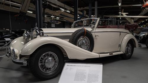
That's what I was talking about.
The car is perfectly exposed on both my systems, Apple and Microsoft.
I don't need any more details in the shadows, they are irrelevant. -
@MikeFewster has written:@Kumsal has written:@MikeFewster has written:
Lisbon Street. Version 2.
I straightened the left hand side a little and made further colour adjustment.
The lower orange angle is correct. The orange line follows steps that are sloping down a hill.
I prefer this version.This version looks much better and helps convey what the scene looked like.
And, I like this version.
But, I think you should invest in a better monitor.
Deeper shadows would do this photo much better.
Since you always comment on shadows that should be lightened, it must be something to do with your monitor.
Your photos are always slightly overexposed to my eye.
It can't be your camera or the exposure.Are you confusing me with someone else? I rarely say other people's images should have the shadows brightened. Usually I have been defending photos from others where Dan's edits, in my opinion, have over brightened shadows and in so doing often lost depth. Not this week's image from Dan though where I thought it was underexposed. How does the exposure on Dan's panorama this week look to you on your monitor?
I often find my initial posts to Dprev look too dark when I preview and only look at them at small size. Then later, after posting, when I look at images at full size, they look better. I find the same with other people's images as well as my own. This week, my image didn't look bright enough on preview so I boosted it a bit and reposted without doing a check. I agreed with those who said it was too bright and revisited it.<>As to Lisbon Street V.2. The camera settings indicate perhaps 1/3 EV overexposure for that scene, according to en.wikipedia.org/w/index.php?title=Exposure_value I make the Ev 14-2/3 reasonable enough if the aim was to show the shadows mo' better.
Drifting off a bit, it is bothersome when people confuse the brightness of a processed image with sensor exposure ...
-
@ArvoJ has written:@Kumsal has written:
Actually, the whole photo is blurry.
Agreed :) Oversharpened and blurry are not mutually exclusive. This does not void image's appeal however.
Where can you see the color blue between the beaks?
Magnify image - there is stripe of bluish gray.
Am I colorblind?
Unlikely, usual colorblindness can't distinguish between green and red, blues are unaffected ;)
I said:
Despite the heavy cropping and blurriness, it's a good photo!
A photo doesn't always have to be technically very good.I admit: technically it's a mediocre photo.
But good nonetheless.
