It's a cool image of an good artistic installation.
The colours are bright and work well together.
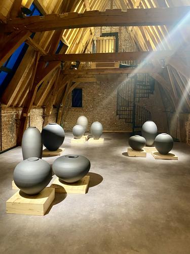
The light rays are impressive, what was in the air to make them shine out llike that? Was it dust or perhaps a smoke machine or somethng like that?
-
-
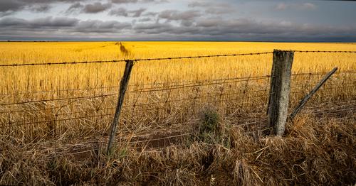
Those beautiful warm colours speak clearly of harvest time. So different to the cold blue snow scenes I'm seeing in Austria at the moment.
The fence and the dramatic looking sky make for an interesting frame.
Now it's time for the combine harvester to come and take all that barley to the brewery :-) -
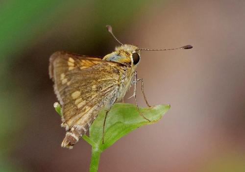
This is one of those images that looks better when you view it in full res.
I think it would also allow a crop to zoom in more on the nice details in the "skipper" -
Yep, the series does tell a story about the place. I think I like the resident governor standing on his raised platform and the "trash men" shots the best
-
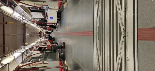
Interesting how you made this a long thin vertical shot, sort of emphasises the length of the carriage. I would have probably just cut off the bottom half of the image and missed that.
-
I like the way you find "everyday things", wait for the light to create some interesting shadows and then make that into an artistic looking image. A good eye!
-
This could become a series requiring a lot of serious immersion in the research.
I have added a note to the OP. The Barley shot was taken and processed to be viewed as large as possible. It doesn't work at smaller size. -
@ChrisOly has written:
Excellent shot, but.. I wish the main subject was more prominent to axencuate it's presence.
@Fireplace33 has written:This is one of those images that looks better when you view it in full res.
I think it would also allow a crop to zoom in more on the nice details in the "skipper"Yes you are both right.
-
@Rich42 has written:
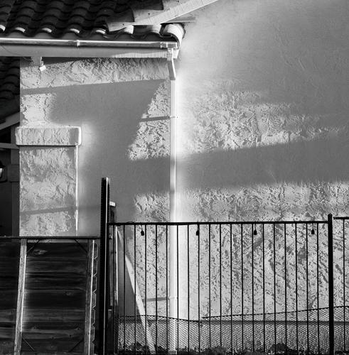
My neighbor's house under remodeling. Terrra cotta, a section of cedar fence, wrought iron, stucco in grazing sunlight.
Rich
To me, this doesn't work as well as your house detail series usually do. This shot feels too complex. There are many different lines. They vary in direction and weight. The same for the textures. Neither do I get a feel for an overall composition bringing things together.
I can imagine cropping several sections to make different images with each working with a smaller number of elements. -
@MikeFewster has written:@Rich42 has written:
My neighbor's house under remodeling. Terrra cotta, a section of cedar fence, wrought iron, stucco in grazing sunlight.
Rich
To me, this doesn't work as well as your house detail series usually do. This shot feels too complex. There are many different lines. They vary in direction and weight. The same for the textures. Neither do I get a feel for an overall composition bringing things together.
I can imagine cropping several sections to make different images with each working with a smaller number of elements.LOL!
Well, then, I guess it worked!
(It doesn't work well at all, viewed small)
I looked at this mess for several months while my neighbor's house was remodeled for selling. I walked past my window one day and that beautiful light was hitting the scene, and I thought it looked wonderful!
I did want to convey the chaos of the situation while repairs were under way, but I also think there is cohesive composition of the strong vertical (white) and horizontal (dark) lines.
When my new neighbor moved in he undertook a complete re-landscaping effort. He kept apologizing that his house created "an eyesore" while the landscaping was being done. (It was nothing - a plant here, some tree trimming, a bush there and new grass).
I told him, "Relax, you should have seen the construction phase! No one's complaining!"
Rich
-
@RoelHendrickx has written:
RUDIE DELANGHE in THE CLOUDS
Here's a snapshot (iphone image) of a exhibition of ceramics sculptures by artist Rudie Delanghe in gallery "The Clouds" in Mechelen.
click to enlarge. not linked from another website this time, but uploaded.
(The Clouds occupies the spaces above a restaurant in Mechelen, in the shadow of St Rombouts Cathedral: a few white painted rooms on the second floor and a quite spectacular attic space above that.
Rudie Delanghe is a master of large scale ceramics objects. My wife, also an artist who makes ceramics sculptures and paintings, says that his work is immaculately thrown.)The overall triangular composition gives stability to the urns, all balancing on narrow bases. Similarly, the repeating round forms agreeably counterpoint the straight lines that dominate the rest of the image. Much the same is happening with the cool colours of the urn and the warm wooden tones.
The light beams are intriguing. They are close to picking up lines from the angled wall. But why can we see them? I think something has to be in the air for the beams to show like that. Dust or water vapour or somesuch? Seems unlikely in a gallery.
If I was the potter, I'd be happy with this image on the front of the catologue. -
@Bryan has written:
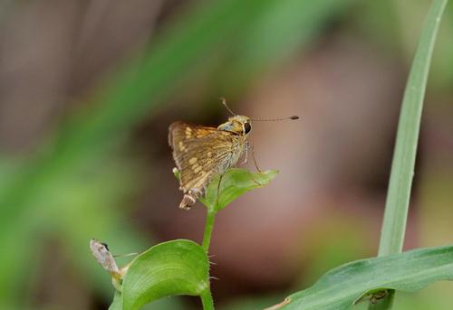
Closest match I could find is Brown Ochre Skipper but I am not confidant...
I can't make up my mind about this photo.
Plusses.
The green framing formed by the grasses and the out of focus area at the rear.
Colours that suggest life/nature
My area of doubt.
The dof on the butterfly with the largest area out of focus and closest to the viewer and the relatively small, sharper head area at the far end. It's unusual and feels odd but I might get to like it because of that. Not sure. -
@Rich42 has written:@MikeFewster has written:
Harvest.
Wheat
I see images like this, first as horizontal bands of abstract color, then for the more literal information.
Very nice.
It looks like Kansas or Nebraska to me.
The shots were taken a few years apart. The Barley shot, a couple of weeks ago. They are both in the Wimmera region near the South Australian/Victorian border. Harvesting is in full swing at the moment.
Rich
-
@Bryan has written:@ChrisOly has written:
Excellent shot, but.. I wish the main subject was more prominent to axencuate it's presence.
@Fireplace33 has written:This is one of those images that looks better when you view it in full res.
I think it would also allow a crop to zoom in more on the nice details in the "skipper"Yes you are both right.
I read the comments and Bryan's version two after I made my first response to the image. The close up fixes the problem I was having.
-
@Fireplace33 has written:@ChrisOly has written:
Tube
Interesting how you made this a long thin vertical shot, sort of emphasises the length of the carriage. I would have probably just cut off the bottom half of the image and missed that.
I think I'd have done the same as Fireplace. Chris has built with the tubular shape. The foreground grate is a surprise that we examine carefully. The tapering markings on the grate line it up with the pinkish stripes that run the length of the carriage. There's lots of visual movement from front to rear. There's a lot of "metal" as well. It conveys the title.
-
@minniev has written:
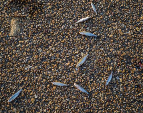
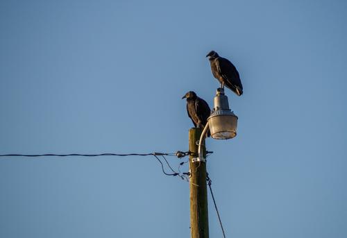
The Ever-Humble Pelahatchie Bay Fish Pier (on a recent morning). None of these are much to consider on their own but together they do make a little story about this ratty spot I visit often.
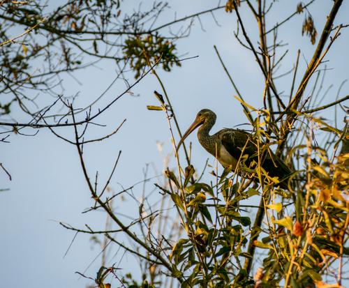
The surprise for the day was this ibis. Ibis don't live around here, but occasionally one will show up as seasons change and they migrate.
The moon and the leaf.
[]
(/a/yxLHATtQ5LguZpFWjUJSwCkaWbvym8I6YGBRW4Cig1AeYdicwbWN9rC8cESQSHSI/28561/?shva=1)The resident governor of the bay.
I'm going to disagree with minniev here and that doesn't happen very often. I don't see these as a series but I do see them as stand alone images.
There's no image or sequencing to the images, even with the text, that makes me feel I am exploring a specific place. As a series, I think it needs either an opening or concluding "locating" image that is explored in the rest of the series.
There are a couple here though that I'd argue for as stand alone, or maybe, images connected by an aesthetic. In another thread on Dprevived recently I suggested that how we looked at images can be culturally influenced, especially by Asian influences for those with Asian background.
One is an example. I'd have guessed it was taken by a Chinese or Japanese photographer. It has the vertical lines, thin branches, leaves, stork and use of a beak, limited colours, that can be found again and again in asian art. Asian photographers often pick up similar visual cues. Probably they would have used more of a portrait format.
Image 2. A moon reflecting in a pool, a fallen leaf, a hint of cloud. That's a haiku poem told through a photo.
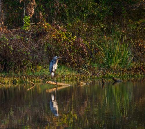
The same for 4. Matsuo Bashu would take one look and grabbed for his brush and scroll asap. -
@Fireplace33 has written:
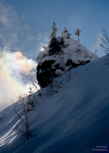
The Christmas Pudding
In the past , this rock formation has been dubbed "The Christmas Pudding" by a forum member here :-)
Everytime I visit it looks a bit different.
This time the sun was making a subtle diffraction pattern and rainbow effect in the clouds and a nice little sunstar just behind the rock.
Had to wait a while until the clouds came over just right to see those colours.
If you view in full res, you can see the tiny snowflakes floating in the air around that bright sunThe place is the Stegmoosalm, in the Hochkönig region, and this was my third trip in the space of two weeks. This time with snow shoes :-)
I know nuffink at all about photographing snow.
Looked at large I can pick out the snowflakes and I appreciate the timing needed by the photographer to get the light right.
"Christmas Pudding." complete with decorations for the season. -
@RoelHendrickx has written:
RUDIE DELANGHE in THE CLOUDS
Here's a snapshot (iphone image) of a exhibition of ceramics sculptures by artist Rudie Delanghe in gallery "The Clouds" in Mechelen.
click to enlarge. not linked from another website this time, but uploaded.
(The Clouds occupies the spaces above a restaurant in Mechelen, in the shadow of St Rombouts Cathedral: a few white painted rooms on the second floor and a quite spectacular attic space above that.
Rudie Delanghe is a master of large scale ceramics objects. My wife, also an artist who makes ceramics sculptures and paintings, says that his work is immaculately thrown.)Rather spectacular image. The round objects of different shapes and sizes are perfectly showcased by the fierce light beams from the upper right, forcing us to read from that unusual starting point. We explore the variety of the objects then wander up the variety of vertical and diagonal lines into the triangular shaped enclosure above, with its warmer lighting. The mix of warm and cool colors and light is appealing. The objects themselves have such smooth surfaces and such geometric forms that they almost appear to be AI generated at first glance, then reveal themselves as real art objects at second look. Fascinating.
