• Members 28 posts
    Dec. 20, 2024, 1:09 a.m.

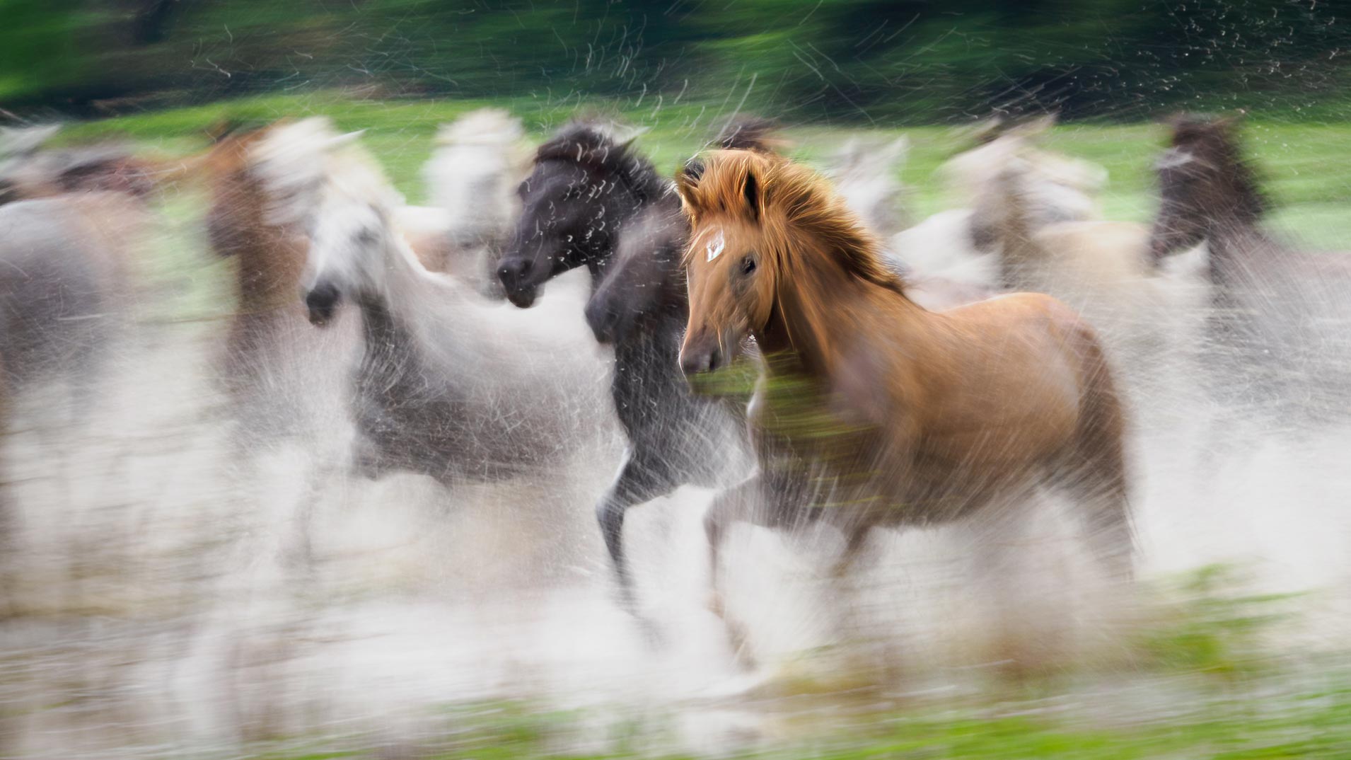
    This is a sensational photograph but with our yes naturally tending to focus on the sharpest parts of a photo they are left to wander uncomfortably around the image because nothing is sharp. I get the effect you were trying to achieve and you mostly have imho but I need something to "hang" my eyes on in the scene. I think if the leading horse's head was reasonably sharp with the rest as is, the photo would have even more of an impact than it does already.

    Anyway, see what you think since you can adjust the sharpness to whatever suits.
    dprevived.com/media/attachments/49/7e/DrNLAQFJuEVpKyZDJlHTjU2DsyBlhBhjHBeBeveDMrepbs266rDiJq0VXRoRM7pb/running-horses-e.jpg

    running-horses_edited.jpg

    JPG, 182.9 KB, uploaded by caspar on Dec. 20, 2024.

  • Members 760 posts
    Dec. 20, 2024, 6:06 a.m.

    Caspar,

    I understand the point you are making. But . . .

    I find the original preferable. I have posted my own images here in which there was nothing in the frame in sharp focus. Such images are most definitely in the minority, and the circumstances under which they are effective are limited, but they can be very beautiful. As is this one.

    Rich

  • Members 28 posts
    Dec. 20, 2024, 6:12 a.m.

    That's fine. I'm sure there are viewers who will like it as is and I do as well to a large extent, as I said, but having nothing at all reasonably sharp is a little uncomfortable for me. I'm sure there will also be viewers who feel the same way. I just pointed out what would have even more impact on me than it already does, again as I said earlier. Let's see if MikePDX has any thoughts and replies.

  • Members 1646 posts
    Dec. 20, 2024, 3:44 p.m.

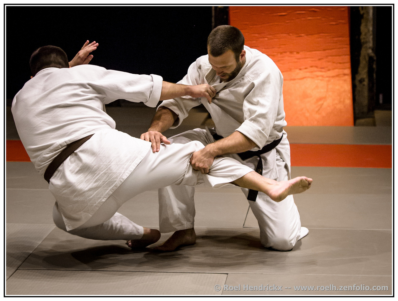
    Nicely caught action shot that puts a viewer right into the action. Love the tension especially in the hands and fabrics. The background is a bonus - interesting planes of color, no distractions (I just finished editing some soccer photos for someone to get blown up into poster size, and oh the distractions - fans, coaches, bags, bottles, portapotties, light poles) - so I especially appreciate the background!

  • Members 1646 posts
    Dec. 20, 2024, 3:46 p.m.

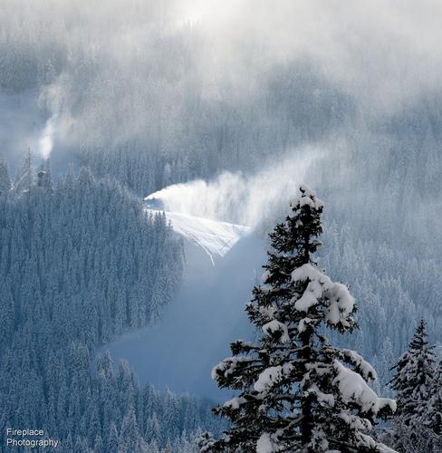
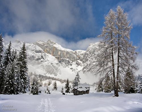
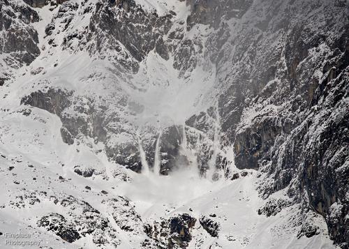
    Lovely set to study and dream on. The second is a frame-able or a calendar page. Exquisite winter beauty in a perfect composition.

  • Members 1646 posts
    Dec. 20, 2024, 3:48 p.m.

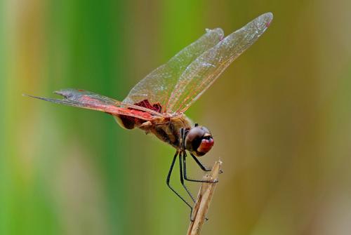
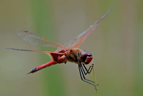
    Another nice pair of dragons in Christmas colors. I like the second better because his tail is in view, and his arms and legs (?) are in such lovely parallel balance, like he's dancing.

  • Members 1646 posts
    Dec. 20, 2024, 3:50 p.m.

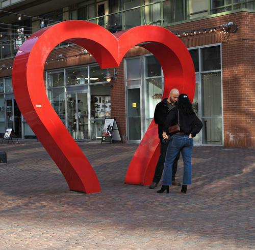
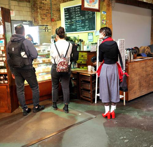
    Nice pair, well exposed and framed. The first could be on a "Welcome To Toronto" brochure. I like the second because Ruby Slippers lady looks like such an interesting character.

  • Members 1646 posts
    Dec. 20, 2024, 3:57 p.m.

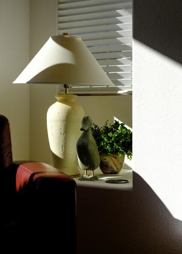
    Thanks for including your own thought process in formulating the image. I think taking the time to do that helps us all. This image is both simple and complicated. It has too much in it, not enough in it, and just the right amount in it, depending on what a viewer is motivated by and looking for. Love the rich muted colors and the effect of light and shadows at a slope. I see the non-scene area as a sort of half frame and I like the effect.

  • Members 1646 posts
    Dec. 20, 2024, 4:02 p.m.

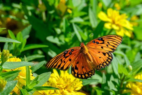
    A lovely butterfly (fritillary?) in rich colors. It is no easy task to catch one with fully outspread wings in such a position that you can capture them with every wingtip in view and in focus, but you've managed! Nicely done.

  • Members 1646 posts
    Dec. 20, 2024, 4:09 p.m.

    Beautiful. I love this effect, which conveys the emotion of the scene and the power of the herd in motion. The contrasting colors of the lead horses in the frame makes the image stronger. So well done. I see an edit down the thread which offers a sharper version of the lead horse, but I prefer this version with more motion blur and a more muted, magical feeling.

  • Members 1646 posts
    Dec. 20, 2024, 4:12 p.m.

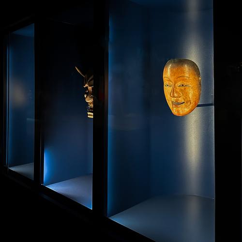
    The complementary colors of blue/orange are always a success in my book. Here you also have the contrast between the small oval shape and the large rectangular frames. The direct controlled lighting adds to the effect, causing the artwork to leap out at us, larger and more intense than it really is. Nicely spotted.

  • Members 62 posts
    Dec. 20, 2024, 6:01 p.m.

    I appreciate this discussion, as it helps me clarify my own feelings about this image. I fully understand the point Caspar made about wanting something in focus within the frame to give an anchor point. Other comments in another forum were similar.

    For me however, and I would emphasize that this is a personal preference, that in-focus area takes away from the sense of motion and action I was trying to achieve. My sense is that the "primary" horse is in focus enough for us to understand that he is the main subject while still giving that overall sense of speed.

  • Members 28 posts
    Dec. 20, 2024, 8:03 p.m.

    Thank you for replying Mile. You hit the nail on the head with your comment about personal preferences. There is no right or wrong in cases like this. We edit images according to our own personal preferences and tastes and viewers enjoy them or not according to their personal tastes. It goes without saying that personal tastes and preferences between creators and viewers do not always match exactly.

    In this case sharpening the horse's head and neck a little does not take away any sense of motion or speed for me. It actually enhances it overall with the more in focus raised hair on the horse's neck giving a stronger sense of motion and speed overall.

  • Members 1517 posts
    Dec. 20, 2024, 9 p.m.

    This is another of those visual literacy discussions. The added sharpening to the closest horse, especially along the mane, looks weird. The out of focus in the image isn't caused by lens blur, it is clearly motion blur right across the shot. If anything, the closest horse ought to be the most blurred. Focus sharpness is appropriate in some images to take the eye to a subject. but usually this is in images that have an eveness of colour tone and so we need the relative sharpness to do the work. Here, the horse selected for sharpening, using Topaz I presume, is the closest horse and stands out from the the rest of the horses a little because of the tone. There is no need for any sharpening of that horse. The movement is clearly the point of the image. Freezing the movement of that horse makes it the subject in a very unnatural way and is counter to the whole point of the image. The result jars in a way.
    Incidentally, Hello David/Dan again. Even moderate text profiling shows these posts as being the same person as Dan and this is a very Dan like edit. Would you like to share with us the Caspar/Dan transformation?
    And another reminder. The whole point of this thread is to post as well as critique others. You need to post an image each week to participate.

  • Members 1517 posts
    Dec. 20, 2024, 9:41 p.m.

    Yes, the point re posting images was made last week and you eventually posted. The other two haven't posted this week. We await your post.
    Any childish game is in your continued shape shifting. No body who has followed your adventures over recent years will be in any doubt that Dan and Caspar are the same person and come from a long line of identity swaps. I note that you haven't exactly denied the change of name and I'm not surprised that your answer only says that you are "not intested" in any discussion of the subject.
    Re the image. Mike PDX went on to say a little more. I built on that with a more detailed analysis of how the edit affects the image. That's what C&C is all about. It's the consideration of the why and how an image works as it does.

  • Members 28 posts
    Dec. 20, 2024, 10:03 p.m.

    They did not post a photo last week either before commenting so it's allowed. I will try to find a suitable photo if I have time before Christmas.

  • Members 760 posts
    Dec. 20, 2024, 10:32 p.m.

    And the childish "What-about-ism" and argumentative posts, strictly for the childish insistence on arguing, continue.

    Rich

  • Members 28 posts
    Dec. 21, 2024, midnight

    What's going on here? Are a few in a select group exempt from the rules or do the rules apply to everyone? I said I will try to post a photo by Christmas.

  • Members 28 posts
    Dec. 21, 2024, 12:25 a.m.

    I like it because it looks fairly natural but as I said, the sharpness can be adjusted very finely to suit by painting on a layer mask with the shade of grey to give the level of sharpness that looks good to whoever is editing the photo.

  • Members 28 posts
    Dec. 21, 2024, 5:37 a.m.

    C&C is about how an image works or does not work and to what extent for individuals. It is slso about how an image that works to some extent, as in MikePDX's image, can be made to work even better. Your thoughts, like everyone else's, are not definitive and one's that everyone must agree with. As Mike stated, he created the image according to his personal preferences and so everyone then gets to like or dislike it or any parts of it according to their personal preferences. The sooner you accept that the more at peace you will be with people who do not agree with all your opinions.

  • Members 219 posts
    Dec. 21, 2024, 9:52 a.m.

    I understand the conversation here but...

    You both seem to be treating the image as an absolute and therefore the levels of blur/sharpening are also absolute and are seen as absolute. And so by adjusting their levels you cater for preference.

    But this misunderstands the nature of an image and is little more than photographers trying to define and quantify the image by their own technical understanding and metrics.

    But this is a highly abstracted image. It relies on memory to recognise the subject and as such personal memory and expectation play a large part in in determining what and how you see this. Further to this, and in exactly the same way you both try to define the image by the level of sharpening/blur, the viewer tries to define/attach a meaning to the way the image is abstracted simply because we need an exact answer. It is not the exact level of sharpening/blur that controls this process but our own memories and how far we find the level of abstraction believable and how easily we can attribute an absolute meaning to the way the image is abstracted. And so we "see through" the abstraction by adding that recognition, it is not and does not need to be in the image, it needs to stay in the viewers imagination. By thinking and trying to add an "exact level of blur that defines" you try to make the image absolute, make the image fit your individual imaginations. And by doing so you make it relevant to one preference rather than understanding that it's the ambiguity that allows the many different interpretations.

    It's not the image that's absolute but the viewpoint, the image itself is quite plastic.

    I'm sorry, but I haven't actually taken any photos this week except a reference photo of the wiring on the extractor fan when I replaced it, which looks a little like a roundabout and as a ticket in to this discussion is a little thin, but...

    Personally, I find the blur a little too much and abstracts past real believably. Though the image should work really well smaller on a smart phone, it should go down a storm. The colours are great, but the balance needs a little off the left which gives a coherent group, and I would brighten/reduce contrast of the background to bring the horses forward (I include the foreground as well as it is "background tho the centre of the image). Please accept a humble, and subtle edit on the promise that I'll post another image in this series of threads as soon as I take one.

    Best viewed as the thumbnail below:

    running-horses2.jpg

    P.S. Broadband borken, replies will be sporadic...

    running-horses2.jpg

    JPG, 339.2 KB, uploaded by Andrew546 on Dec. 21, 2024.

  • Members 62 posts
    Dec. 22, 2024, 1:46 a.m.

    Andrew's reply is very interesting, and his definition of the viewer's response to an abstract image is consistent with my own. I would only comment that, as a trained engineer, my first response to any image tends to be a literal one. That is something that I've been trying to overcome in my journey down the abstract rabbit hole. And I might add it's quite a challenge. 😄