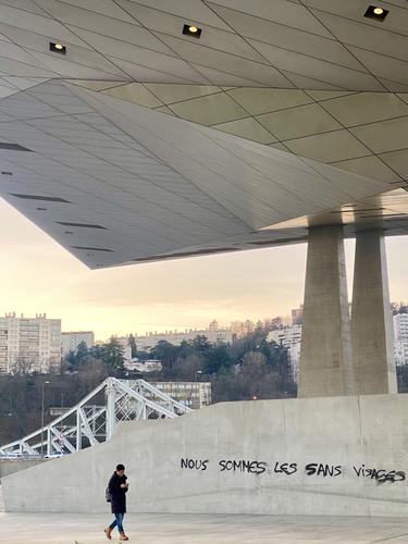
The architecture of the Musée des Confluences is fascinating, and you have some great light to bathe the whole scene in pale yellow. The rough, spontaneous graffiti contrasts well with the deliberately planned and formed building. The real gem as far as I am concerned is the graffiti declaring they are the unseen, faceless ones, and the pedestrian walks past without paying it any attention, proving that they are indeed unseen and faceless!
-
-
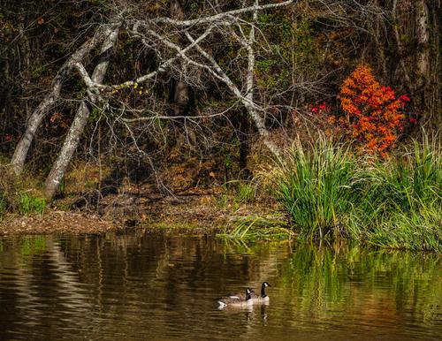
This is a lovely tranquil scene, which is strange because there is a lot going on on the frame, especially on the wooded shore. There are three things, which catch my attention - The bright trees, the ducks (on second thoughts they look more like geese?) and the red bush. They form a triangle to lead the eye around the image, and the trees themselves form a triangle, so maybe these stable triangles have a calming influence? The geese gliding on the smooth water are also the very symbol of tranquility.
In any case it is a lovely peaceful and soothing image. -
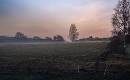
Yes, 1 is my favourite too. I think the tree also helps to visually link the bank and fence in the foreground with the horizon and the sky.
There is a lovely soft atmosphere to the scene, and the colour and contrast transitions are gentle. It would be easy to fall into the temptation of ramping up the saturation and contrast for effect and impact, but the attention would be short-lived and I appreciate your subtle approach. -
@Rich42 has written:
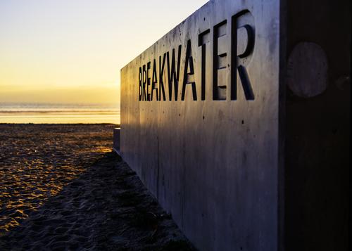
It was thoughtful of the builders to write on the side to save me asking what the concrete structure is! The letters also bring some interest to what is otherwise a fairly boring surface. That said, its surface does reflect the evening(?) sun nicely, and its smoothness contrasts well with the roughly textered and well-trodden sand. I also like the transition from a very bright top-left corner to a very shadowy bottom-right corner.
Nice one. -
@Daneland has written:@AlanSh has written:
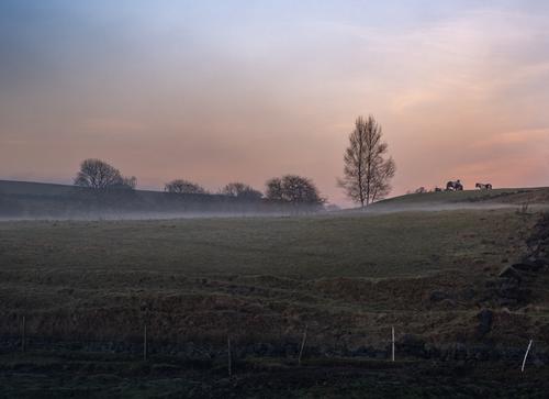
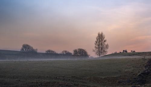
Two pictures here - both of the same image - one cropped more than the other. Which do you prefer and why?
I took these just now as the sun was going down and the mist rising.
The second one: the foreground tree does not contribute to the composition. But I agree with David, more panoramic-ish crop will more effective. It is a very nice capture.
Like this?
-
@Daneland has written:@ChrisOly has written:
Light dusting
Great White Frozen North is not getting much snow...(so far, that is)
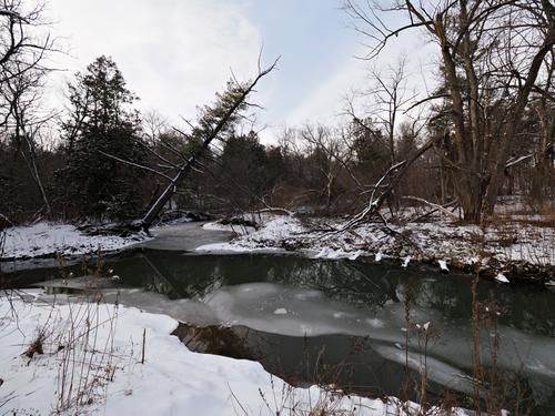
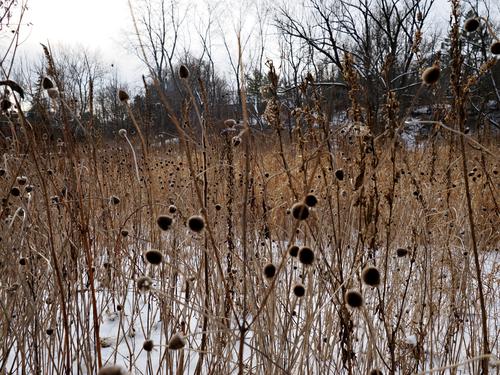
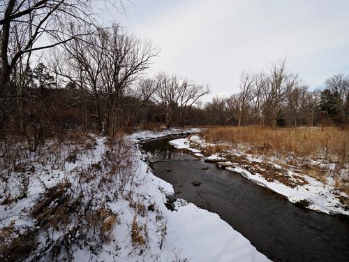
The tilted tree reminds me of a vessel about to sink. I find the plant shoot the most interesting but I believe it will suit better BW conversion.
I like Daneland's comment about the sinking ship! I also like the pale curved shapes of the semi-submerged ice, which contrast well with the spiky dark trees and branches.
The curtain of teasel(?) or reeds in the second let just enough detail of the landscape through for it to be interesting and not just obscure the view. There is plenty of graphic interest that a B&W might work, but I think the barely visible greens and the yellows in the background may be necessary to help the viewer distinguish it from the foreground and it may congeal into one mass in B&W?
The stream in the third curves nicely into the image and provides a fine leading line, but then there is not much for it to lead to, as the line of bushes and trees through the middle are just too dark to give the eye anything to focus on, so this one doesn't work for me, I'm afraid. -
@AlanSh has written:@Daneland has written:@AlanSh has written:
Two pictures here - both of the same image - one cropped more than the other. Which do you prefer and why?
I took these just now as the sun was going down and the mist rising.
The second one: the foreground tree does not contribute to the composition. But I agree with David, more panoramic-ish crop will more effective. It is a very nice capture.
Like this?
That was a good shout from Daneland, and improves the image no end. Do I prefer it over the first one now? Hmm, maybe I do.
-
I like the third one the best. I think that will go into my club comeptition.
Alan
-
-
@AlanSh has written:
Two pictures here - both of the same image - one cropped more than the other. Which do you prefer and why?
I took these just now as the sun was going down and the mist rising.
I would definitely prefer the second photo.
I would also greatly reduce the brightness of the two posts in the foreground. -
@minniev has written:
Two
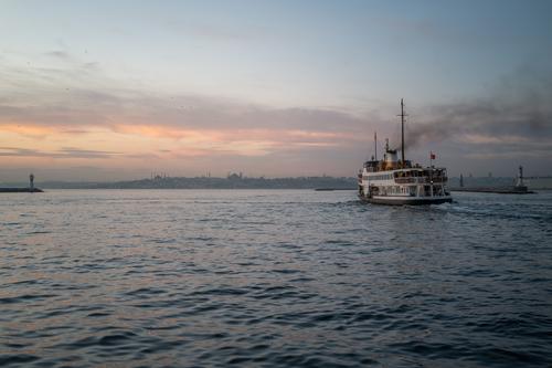
Pelahatchie Bay Fish Pier
I had to download the photo and view it on my full screen to form an opinion.
It looks good.
I especially like the colors, which contrast well with each other. -
@ChrisOly has written:
Light dusting
Great White Frozen North is not getting much snow...(so far, that is)
The first photo really shows what ice and snow looks like and what the forces of nature do to the trees.
Very good. -
@PeteS has written:
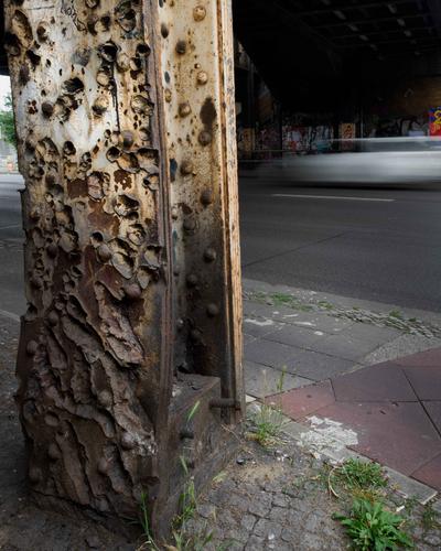
Violent Sculpture
This was taken in Yorckstrasse, Berlin, where, in the space of about 100 yards, about a dozen railway bridges carry railway tracks across the road - almost forming a tunnel. Some of the tracks are still used heavily today by the local trains and the main lines from Berlin to the South.
Almost exactly 80 years ago, in late April 1945, Yorckstrasse was the scene of a savage battle as the Red Army tanks and infantry fought hard to dislodge German defenders, who were using the bridges and pillars as cover in a major defensive position. Today the steel pillar in the photo bears witness to the heat and violence of that battle, but still does its job of holding up the bridge, albeit for one of the disused tracks.
The fading white paint is also a silent witness of the war. Headlights for vehicles were banned, or at least reduced to thin strips of light, by the Black-Out laws of the time to make it harder for enemy bombers to locate cities and targets. (This was the case in Britain too, not just Germany.) The pillars were painted white to help drivers see them in the darkness.I like the photo and the explanatory text.
But the title is misleading, I think. -
-
@MikeFewster has written:
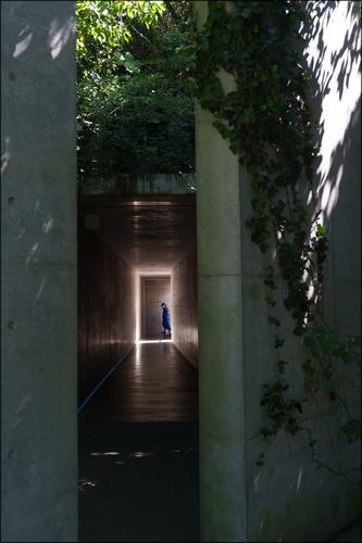
Down the Passage.
Needs to be looked at large.
I'm a bit too busy now but I'll repost the image later. What is showing here is considerably darker than the original I thought I was posting. It has happened before. Don't know why.I see your intention, Mike.
But if you want to draw attention to the person in the light frame, you should crop the very bright parts at the top and right.
At least at the top, because the strong green distracts from it. -
@RoelHendrickx has written:
THE FACELESS
Those who are "sans visages" are faceless only because their fellow citizens don't see them.
An image from a sunset visit to Musée des Confluences in Lyon.
It's another blurry one from your iPhone. And the other forum members have to look for ways to praise your photo. I'm not going to join in.
-
@Kumsal has written:@RoelHendrickx has written:
THE FACELESS
Those who are "sans visages" are faceless only because their fellow citizens don't see them.
An image from a sunset visit to Musée des Confluences in Lyon.
It's another blurry one from your iPhone. And the other forum members have to look for ways to praise your photo. I'm not going to join in.
hmmm
-
@PeteS has written:@davidwien has written:@AlanSh has written:
Two pictures here - both of the same image - one cropped more than the other. Which do you prefer and why?
I took these just now as the sun was going down and the mist rising.
I find No.1 better balanced horizontally.
Yes, 1 is my favourite too. I think the tree also helps to visually link the bank and fence in the foreground with the horizon and the sky.
There is a lovely soft atmosphere to the scene, and the colour and contrast transitions are gentle. It would be easy to fall into the temptation of ramping up the saturation and contrast for effect and impact, but the attention would be short-lived and I appreciate your subtle approach.I on the other hand prefer #2 because the mid-ground tree is not in the middle horizontally. I would also crop the top in order to a) reduce the pulling effect of the blue part of the sky and to b) raise the horizon upward from the middle.
