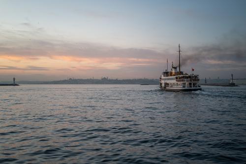
Pleasing environmental image with beautifully subdued sunset colors and great lighting.Catching the ferry entering the channel with both channel lights visible is a bonus.
-
-
This is an intriguing image. The lighting has created the impression of a neon-outlined doorway, though which a mysterious woman in a blue dress is hurrying. The slanted and somewhat distorted bright light from the right side is like a lightning bolt that's lit up the portal. Different shades of green both vegetation and structure mix to give the impression that the portal is constructed from living stuff. It is an abstract, a street photo, a conceptual photo, a people photo, a travel photo all at once. There are several interesting crops that are possible here, but the image as shown is interesting enough just as it is.
-
Nice bird image with great details and excellent separation from the background.
-
-
I hope you don’t mind me being critical. I believe your intent is right—to provide context with a broader point of view, completing the story of a single piece by showing where it actually belongs. However, I’m struggling to see the piece as part of the bridge; to me, it just seems to be sticking out of the ground.
Other elements (motion blur, white car, etc.) are fine, they serve well the purpose you intended.
-
@davidwien has written:
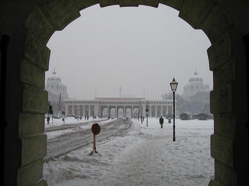
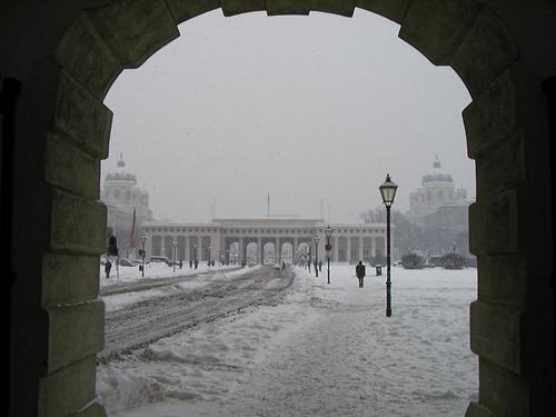
There hasnt been anything worth photographing in Vienna this month: the hours of daylight are short and the skies are cloudy. So here is one I took here in January 2004 with my Olympus D510Z (all of 2 MP!)
Due to global warming, it doesnt snow like that here any more...
One can see the Burgtor, and beyond it the Ringstrasse and the Art History (Kunst Historisches) Museum (left) and Natural History Museum (right).
David
I enjoy seeing older images, they remind me to look at my own and I'm sometimes surprised as what I find hiding there.
Portal images like this are always appealing because they are an open invitation to step through an opening into another world. This particular world is not one I've seen but is how I might have imagined an Austrian winter in the city to be. It is almost monochrome, just the barest hint of color gives away that it's not, and it would look good as a fully converted monochrome, too. The distant buildings look impressively ornate, and the dark figures give Scale but also a sense of purpose and a sense of isolation. I might be tempted to remove the nearest round sign (?) which interrupts the road from serving as a clear leading line, and thus feels like a blockage.
-
@AlanSh has written:@Daneland has written:@AlanSh has written:
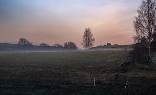
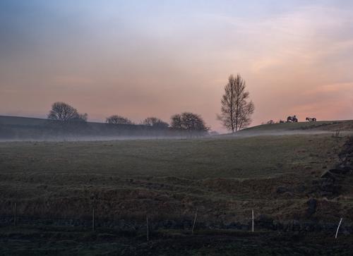
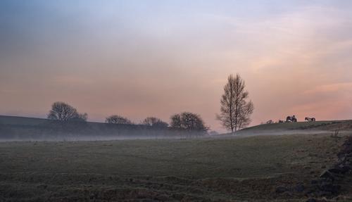
Two pictures here - both of the same image - one cropped more than the other. Which do you prefer and why?
I took these just now as the sun was going down and the mist rising.
The second one: the foreground tree does not contribute to the composition. But I agree with David, more panoramic-ish crop will more effective. It is a very nice capture.
Like this?
This is better, I read @Kumsal 's comment about reducing the brightness of the foreground and I do agree.
-
@Kumsal has written:
Ferry at sunset
That’s a beautiful photo—I loved it. The colour rendition of the APO lens is truly sublime. Your composition is strong, with space in the direction of the passenger ferry’s travel, the coastline dividing the scene through its middle, and a good balance between the upper and lower parts of the image.
-
@ArvoJ has written:
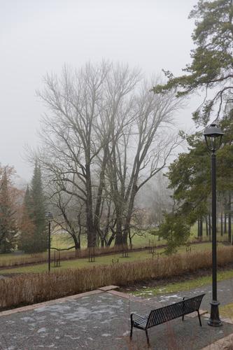
Processing some foggy images, decided to upload one here. It could go into 'Lonely benches' thread - but here it can receive some C&C :)
End of december, near Lohja, Finland. No snow, no Santas, sorry. Best seen in full screen.I do love fog, and will get out before dawn to chase it when we have it, but it's become a rare occurrence. So I'm predisposed to like this image! I like the angle you've photographed from, showing the "lonely bench" but also the tiered garden beneath it from a similar angle as it would look from that bench. The colors are quite nice even though the atmospheric conditions are conspiring against you. There's plenty of detail, and the diagonal lines give the eye something to follow to weave a path back and forth through the image. Peaceful and visually pleasing.
-
@minniev has written:@davidwien has written:
There hasnt been anything worth photographing in Vienna this month: the hours of daylight are short and the skies are cloudy. So here is one I took here in January 2004 with my Olympus D510Z (all of 2 MP!)
Due to global warming, it doesnt snow like that here any more...
One can see the Burgtor, and beyond it the Ringstrasse and the Art History (Kunst Historisches) Museum (left) and Natural History Museum (right).
David
I might be tempted to remove the nearest round sign (?) which interrupts the road from serving as a clear leading line, and thus feels like a blockage.
How about this:
Not perfect; but it's late here. I will have another go tomorrow. (And I am now worried that the lamp post is a distraction...)
David
-
@davidwien has written:@minniev has written:@davidwien has written:
There hasnt been anything worth photographing in Vienna this month: the hours of daylight are short and the skies are cloudy. So here is one I took here in January 2004 with my Olympus D510Z (all of 2 MP!)
Due to global warming, it doesnt snow like that here any more...
One can see the Burgtor, and beyond it the Ringstrasse and the Art History (Kunst Historisches) Museum (left) and Natural History Museum (right).
David
I might be tempted to remove the nearest round sign (?) which interrupts the road from serving as a clear leading line, and thus feels like a blockage.
How about this:
Not perfect; but it's late here. I will have another go tomorrow. (And I am now worried that the lamp post is a distraction...)
David
I think it is a better image without the sign or whatever it was, allowing the road to be unimpeded. The remnants should clean up easily. I like the lamp. It contributes. It looks like a lamp in Austria ought to look. A Narnia type affair...
-
@Kumsal has written:@RoelHendrickx has written:
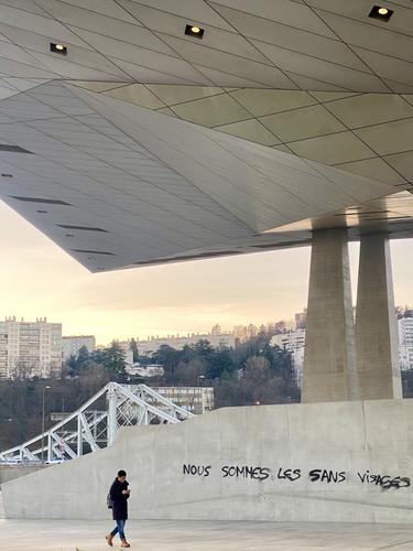
THE FACELESS
Those who are "sans visages" are faceless only because their fellow citizens don't see them.
An image from a sunset visit to Musée des Confluences in Lyon.
It's another blurry one from your iPhone. And the other forum members have to look for ways to praise your photo. I'm not going to join in.
I'll try to explain what I see in the shot and why I like it. It's one of those that makes its point because of the perfection of the moment it was taken.
The corner point of the ceiling roof, the verticals of the bridge and the vertical of the figure are all beautifully aligned. It's like an arrow in the image establishing the relatively small figure as the subject while linking it to the much larger structure.
Then there's the cryptic message that reads left to right from the person's head. In doing so it also establishes a link with the person - either a thought or a comment applicable to them. Take your pick, either the human is insignificant and overshadowed within the huge concrete structure or the phone has isolated them to something cut off from the world around, or both.For this kind of shot, I don't expect the kind of IQ perfection that I expect of a landscape image taken with the intention of making a large print (even so, I don't think it is blurred.) The image is still the image with all the elements that make up the image.
Sometimes some of us get lucky when we take shots and find the composition has fallen into shape for us. It isn't the case with Roel. I've seen thousands of his photos and watched him working. He really looks for lines and situations like this when he shoots and he finds them over and over. -
@AlanSh has written:
Two pictures here - both of the same image - one cropped more than the other. Which do you prefer and why?
I took these just now as the sun was going down and the mist rising.
Not an easy one but I prefer 2. It is the uninterrupted band of fog right across the image that seals the choice for me. The fog line repeats the pink sky line and the dark horizon line.There are similar but more muted east west lines including what I think are furrows and the white posts, along the bottom.
I can see why some viewers might like the tree on the right but I prefer the repeating unbroken lines.I'm editing my post and this is the edit. Since writing the above, I've seen the posts that have cropped off the bottom of 2. The crop strengthens the horizontal lines lines admired in 2 and I agree that the cropped 2 is the best of all.
-
@Rich42 has written:@minniev has written:@Rich42 has written:
Well taken image with good rendering of a vanishing point perspective, nice complex color palette, and good use of natural light. Could be on their brochure!
Thanks everyone for the comments.
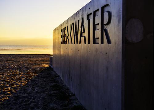
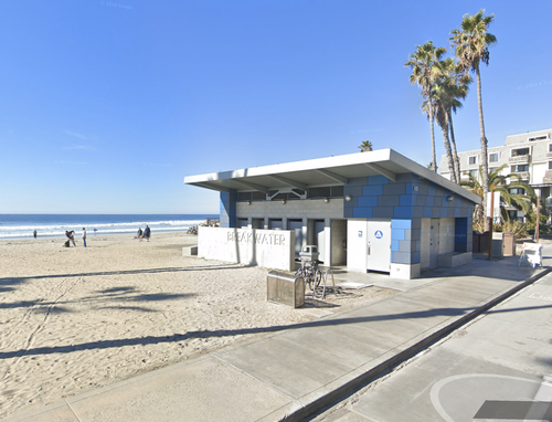
A few years ago the city of Oceanside, CA renovated the area north and south of the pier and the beaches there. They built a number of public restrooms, including two on the beach. One at "Breakwater Way" and the Strand (the road along the beach) and the other at "Sportfisher" St.
This "Monolith" is a short "modesty wall" on one side of the restroom building at Breakwater Way.
The building at Sportfisher has a similar treatment with that name embossed there.
I'm impressed that the city planners had the inspiration to place the (otherwise) mundane identification of these municipal structures in such an artistic way and to commission the lettering treatment as embossing during the concrete pour, turning perfunctory concrete slabs into eye-catching objects.
Rich
Excellent and even more so because we have the second image. The second image reveals the creativity that went into image one. It's one of the things I like best in photography. The photographer sees what everyone sees but didn't "see." If you see what I mean.
Shot 1 is carefully composed along with the shadow to make an arrowpoint that slices into the sea and sunset. Breakwater indeed. In setting it up, Rich has tucked the very edge of the sun behind the monolith and so avoided burn out. Shot 2 shows the wall in direct day sun is white. Shadow and reflectiondue to the time of day in 1 gives complementary bluegreys along with the gold.
I'd have cropped off the black wall edge on the right and I'd have been wrong. The black strip adds some very satisfying solidity to the block and the "Breakwater" text. -
@PeteS has written:@minniev has written:
Two
Pelahatchie Bay Fish Pier
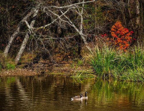
This is a lovely tranquil scene, which is strange because there is a lot going on on the frame, especially on the wooded shore. There are three things, which catch my attention - The bright trees, the ducks (on second thoughts they look more like geese?) and the red bush. They form a triangle to lead the eye around the image, and the trees themselves form a triangle, so maybe these stable triangles have a calming influence? The geese gliding on the smooth water are also the very symbol of tranquility.
In any case it is a lovely peaceful and soothing image.Amen to Pete's analysis.
When I looked at minniev's photo it reminded me of something. It took a while for my neurons to link up. I went back to look at the photo again.
John Everett Millais' Ophelia. Ok, minniev's lacks Ophelia, but otherwise.... -
@Daneland has written:@Kumsal has written:
Ferry at sunset
That’s a beautiful photo—I loved it. The colour rendition of the APO lens is truly sublime. Your composition is strong, with space in the direction of the passenger ferry’s travel, the coastline dividing the scene through its middle, and a good balance between the upper and lower parts of the image.
It is interesting to compare Kumsal's photo with Alan's second image this week. Looking at them as abstract shapes and blocks of colour, they are almost the same shot. I agree with Daneland but I'd take a little off the bottom for the same reason David and Daneland have suggested a crop off the bottom of Alan's image 2.
-
@Daneland has written:@ChrisOly has written:
Light dusting
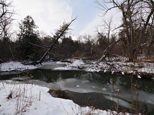
Great White Frozen North is not getting much snow...(so far, that is)
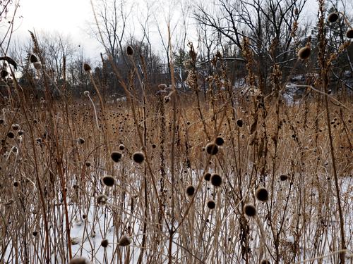
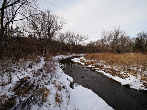
The tilted tree reminds me of a vessel about to sink. I find the plant shoot the most interesting but I believe it will suit better BW conversion.
The tilted tree simile from Daneland is spot on. It's a simile?
I like the three of them. The merest of washed out blues along with all the B&W in 1 and 2 adds cold my skin feels. There's an untidiness in the masses of fine detail in the three of them that makes them all feel bleaker. The river in 1 and 3 beckons deeper into the leafless arms of the trees. It's a black river. These aren't the grand scale winter landscapes that Fireplace shares, this is a landscape that's more intimate so I feel cold here rather than awe.
Much as I like B&W, I think I prefer 2 in colour. The brown reeds I think might get lost in B&W, There's no point of subject here. It is a study with four horizontal bands . In the middle two bands, I think B&W would lose definition whereas the faded brown still emerges. A really good B&W conversion, with careful control to distinguish the tones and then made into a large print, might be able to bring this off. -
@davidwien has written:@minniev has written:@davidwien has written:
There hasnt been anything worth photographing in Vienna this month: the hours of daylight are short and the skies are cloudy. So here is one I took here in January 2004 with my Olympus D510Z (all of 2 MP!)
Due to global warming, it doesnt snow like that here any more...
One can see the Burgtor, and beyond it the Ringstrasse and the Art History (Kunst Historisches) Museum (left) and Natural History Museum (right).
David
I might be tempted to remove the nearest round sign (?) which interrupts the road from serving as a clear leading line, and thus feels like a blockage.
How about this:
Not perfect; but it's late here. I will have another go tomorrow. (And I am now worried that the lamp post is a distraction...)
David
Nope, leave the lampost. There are lots of them on both sides of the road for it to visually link up with and besides, the housing on the top is talking happily with tops of the domes. But remove the sign. It doesn't link with anything and has become a visual blot.
If it was available, a touch more height would be nice. The sliver of arch at the top feels too thin. Or maybe if no more is available at the top, crop the sides in a bit more.
I'm halfway through Graham Greene's The Third Man so an older Black and White photo of Vienna is very appealing to me. I look at the shot and hear Harry Lime whistling. Along with the reducing lamps, The tonal progression from the solid blacks of the arch to the light greys of the domes is atmospheric. The progression down the slushy road does the same.
The kind of shot that will have growing historical relevance.
