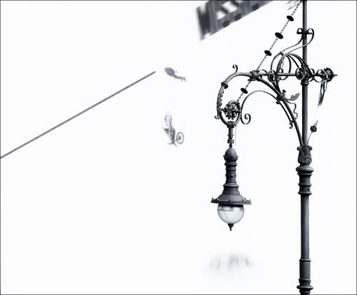
This one really grabbed me. I guess it's because of all those fairy tales I remember from my childhood. Where is the big bad wolf? Just off stage to the camera's left, I suspect.
Jan. 29, 2025
67
-

-

It’s not a matter of memory (god knows that would not work…). I have been keeping (for 15 years now) a dedicated gallery of all my submitted images to the Weekly Wed C&C, to which I add a copy of every week’s new image, with attached the link to the forum thread.
-

A nice series showing how these kids are reacting to the antique devices. Certainly having fun!
Looks like a good hands-on type of museum.
Not sure most would laugh at everthing, maybe they just had the giggles that day :-) -
A nice series showing how these kids are reacting to the antique devices. Certainly having fun!
Looks like a good hands-on type of museum.
Not sure most would laugh at everthing, maybe they just had the giggles that day :-) -
At least the light is warm here when everything else is at -20°C :-)
The image could handle a bit of straightening. -
You've captured the atmosphere well. It certainly looks foggy, and very cold too.
-
Well you found some good light here!
Nice and bright and colourful too, with some good cloud patterns as a bonus -
HaHa! I know that feeling too, and the time in the "marinade" really does help :-)
I'm glad you came back to this one.
The panning effect shows the speed with the big "movement blur" in the background.
It doesn't matter that some parts of the powerful animal are also a bit blurred, in fact it just adds to the feeling of its fluid running movement; his shoulder is moving faster than the rest of the body and its head. Nice that the whiskers are in good focus.I just noticed that there is sort of optical illusion effect going on (at least for me).
It's coming from the pattern of the fur. The still image seems to be moving very slightly, almost like it's breathing -

It's your real Berlin
-
I agree with both points!
I could see this displayed near the triptych you showed last week, offering a total contrast between those resting animals and this high-energy version. So long as the print was not too big and the viewers not too close, then the lack of sharpness would not be noticed, and even if it was, I think it would be accepted as part of the high-energy package. If it still disturbs you, you could try Topaz on the jaguar's face to remove some of the motion blur and dial it back so that the sharper bits did not clash too much with the original blurry parts.
In any case it is a great image.As to the marinade, I find exactly the same thing. It is often caused by getting excited by one or two images at the time of taking and the camera screen seems to support the enthusiasm, but then at home the big screen of truth casts the cold water of disappointment, showing that maybe the image is not so great. Sometimes the marinade reconciles me to the image and sometimes it allows other images to shine.
-
Indeed!
I think subjects we see all the time lose their originality and fail to excite and inspire us, but, as you prove here, will still interest and excite others. -

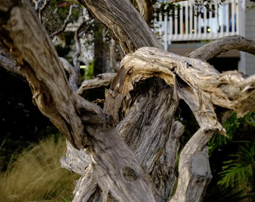
Gnarled TreeSorry for being late to the party this week. Got involved in emergency replacement of water supply pipe and various valves coming into our house. Always a treat to be sloshing around with a propane torch in hand, un-soldering and soldering cold copper metal, praying to be able to accomplish the job before the sun goes down and being without water another night. Absolutely backbreaking work.
This gnarled tree, photographed in the "dead of winter," despite its looks is not at all dead. It's one of many ornamental trees on the grounds of a sea-side resort in Oceanside, CA. Actually quite attractive when seen against the greenery.
Rich
-
I agree, but I can't help wondering if you increased the brightness to make the fog nearer white, whether it would look even better? The camera's metering system tends to make so much white fog a neutral grey, which I think is what happened here. That makes it look gloomy and cold, which is probably the perfect effect for this image, but still, I wonder?
-
I am surprised to hear that the tree is still alive! It looks as if it has spent a long time residing in the ocean, not growing in Oceanside.
The detail and texture at the centre of the image contrasts well with the out of focus parts around the edge, and the effect it has works well for this image. The bright (wind-blown?) grasses in the bottom left do not distract, for some reason, and just add their weight to the out of focus section of the image. -
Well, the original was a good photo, but the reworked version is great. The tighter crop means the viewer is no longer looking at the scene, but actually seems to be sharing the camp fire with him. The brightest embers have been cropped out or subdued, and are no longer a distraction, and the man has been carefully brightened, making him more prominent, and his face and clothes now have attractive highlights from the fire, but are not unnaturally bright. The composition and focus were excellent in the original and are, of course, in the new version.
It is a wonderful illustration of the adventurous holiday you had with family and friends. -
That seems to be a fascinating museum, and your series shows the visitors think so too.
My favourites are the second, where I particulalry like the motion blur of the spinning reels, and the last one. The amusement shown in their faces is infectious! I also think the compostion in these two is particularly successful. -
This is another good series, but these two are my favourites.
I agree with you about the frosty tracks in the foreground, but also the different shades of the tres is very attractive. There are no end of trunks, but the relatively few dark ones right next to the track stand out and the fog has created varying shades for the others, seperating them into layers and stops, them becoming a messy mass of trees. It is a really nice effect.
The other is a real beauty, with a similar effect from the fog helping to sort an even denser group of trees and the path leading towards the light creates real depth. Then the very dark section on the left creates a sense of mystery and tension. Superb. -
The reflection in the building is excellent. The reflected sky is an attractive pattern of cloud and sunlight, and its yellow tones contrast nicely with the blue-grey sky behind the building. I like the reflecting puddle in the foreground too.
I agree with Fieplace, that if you can straighten the building without losing anything important (especially that puddle!) then I would do so.