Even though I know weather is just bubbles of air moving around, I always find it interesting when you can see one. A highly defined boundary between the Ice and the sunny area so clearly defined and here represented in layers. I like it.
The colors make it seem like the boundary between two seasons, fall and winter.
Feb. 5, 2025
53
-

-

I can't see a 320 card so I'm uncertain about where you mean to direct our eyes. I assume you meant the A321
The grouping of the cards isn't helping you, it's an uninteresting splodge of a shape.
Possibly shoot this shape from vertically above? Maybe arrange them into something with a bit more line and have the line somewhat more diagonal?
The background is dead boring and is not a good colour to team with the blues.
What about this, using your original image? I've cropped out most of the background and tried to crop around the cards to give a stronger diagonal line to the arrangement. I think the new version gives a better movement from out of focus to the A321 -
Like Kumsal, I have the same bias and I saw mine in Bali as well.
I think Roel has made a sneaky camera tilt here to arrange the white track within his frame, so it doesn't leave and then re-enter and that's fine with me. Keeping the white line curling across the base then advancing down the crest is far more effective.
The photographer has chosen lighting for maximum effectiveness. The low sun angle picks up the terrace walls to make the most of the repeating lines of the terraces. I like the tiny figure as well. I'd have missed him if not for the white path. A touch of scale without intruding. -
For mine, there is a bit too much of the image that's out of focus to the left of the Makers Mark label, until the yellow label on the left hand edge, the shapes are more than out of focus. It's a confusing mix of shapes and tones. The out of focus bottles to the right of Makers Mark are even more out of focus but they don't jar in the same way as they have repetition of shape.
But thanks for the sharp Makers Mark label. I've had my fair share of MM and didn't know it was a Kentucky bourbon. And a smile for the other little bit of text that can be found sharp and peeping through the gap in the blue. I've noted the message. -
Thanks Rich. The lack of scale and depth was entirely deliberate. One of my earliest digital camera shots from 2003. The tree trunks of the fork would be about 15cm diameter.
-
Ta minniev. I don't do square often. I can see what you are getting at in taking off some of the white trunk on the left. It immediately gives more weight vertical dark bark and creates a stronger visual link between the dark bark on the left trunk and the diagonal libe of dark stone running down the cliff. Now I don't know which version I prefer. I need help here. Anyone else have an opinion on minniev's suggestion?
-

Thanks Minnie.
I couldn't actually read the label at the time I took the picture. It felt right to focus at that point in the wall of bottles. When I saw it in post it was like "finding an Easter egg" in the image. Ive been to a few wineries, but never a distillery.
Rich
-
Thanks Mike.
The shot was on a 645 film camera. Color negative film. I think the lens was a 105/2.8 and I had to shoot wide open as this was at night. Near minimum focusing distance. So very shallow DOF. Images with blurry foregrounds are not for everyone.
Yes, the "other" readable text hiding back there is a bit of irony and humorous. None of that planned by the owner of the street fair booth nor by me as I had no idea it was there at all (or the Makers Mark text) when I took the shot.
Rich
-

Here's what I was visualizing, to introduce a mate to the triangular form top center, and allow the strong line to exit the frame in the upper right corner. It makes a more graphic image, which is not necessarily better but I think is an interesting variation.
-
I've recropped to what I thought was your first suggestion and I prefer to both my original and the alternative crop. It's the relationship between the dark vertical band on the tree trunk left and the diagonal dark band across the rocks that appeals to me.
-

You've been having a good conversation about this image that has a lot of abstract appeal AND potential for different ratios.
I think the square format works very well, because it allows the viewer more easily to spin this image 90° and 180° and 270° in any direction without feeling like he is betraying the photographer's intent... In abstract, that is one of the cool attractions of square format.My wife (the painter) has the opinion that a successful abstract painting does not necessarily have a top or bottom and you should be able to hang it in any direction. There is sometimes a psychological obstacle to such intervention, if the rectangular painting/image is presented in landscape or portrait orientation.
With square format, such inhibition seems to be less.
Just a side note here.What I might add to this conversation is the suggestion to keep the square crop, but move the "viewfinder" to the left, and see how it looks like if the diagonal that runs from top right to bottom left, originates in the top right corner. It may look contrived. It may work.
-
Sometimes in this thread of ours, although it is a "No Theme" thread, an accidental/coincidental theme emerges.
Like when multiple contributors all submit B&W images of a wintery landscape (from all over the world).And sometimes the similarities are not thematic but purely visual.
I've had that kind of feeling of a purely visual connection/similarity between my own image for this week, and this one by Alan.
The both include curved shapes with rib-like structures and in a range of green hues.
The images are worlds apart in what they actually depict as subjects, but still there is this resemblance.How odd, and interesting, is that?
Alan, you made the most of your angle to show this roof structure in a refreshing way.
-
The original POV (sideways, not head-on) and the limited DOF turn this ordinary installation of hanging whisky bottles into something that approximates an image of a kaleidoscope, or a stained glass window. Very cool.
-
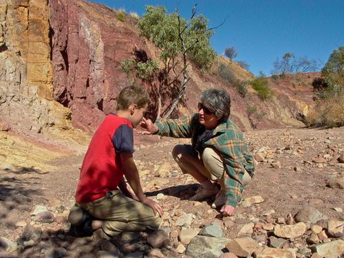
Thanks one and all. It is a photo I took over twenty years ago and had forgotten about it. It's being resurrected but I can't decide which version I like best.
Here's another I took on the same day with my much younger looking family experimenting with the pigments.
-
Wonderful to see Suzette and Callum so into the exploration.
-
A very interestingh comparison and one I didn't see until you mentioned it. But now I do.
Thanks
Alan
-
Thanks!
Rich
-

What a fantastic shot !