TAJ MAHAL
In December 2016 and January 2017 we spent a few weeks in India, visiting a number of cities and sites in Tamil Nadu and Kerala.
New Year's Eve was spent rather sadly in the bubble of the ballroom of our hotel, where we were mostly among other tourists, eating from a buffet, watching "traditional dances" and listening to a hysterical DJ's countdown. We drank a glass at midnight, toasted to new adventures in the coming year and called it a day.
I was up early on January 1 and went for a stroll through the sleeping city.
On this early morning walk I came to a place that looked like fun: a fairground and carnival.
Inactive at that hour, I saw that it was filled with the kind of mechanical rides and ferris wheels that have been banned in our western countries for decades, because of safety hazards. A smell of Indian food and sweets being prepared for the day invited me in and I talked to some of the carnival people.
Then I went back to the hotel and told Els that we would go for the planned cultural visits before noon and that we then would take a nap, but that I would take her to a surprise in late afternoon and evening. And so we did.
I guided her back to that fairground and we spent a few hours and had a ridiculous amount of fun at that carnival on that first of January. We were the only non-Indians there, so we quickly became an additional attraction, with lots of people wanting to get a selfie with us. We ate and drank and chatted and rode the rides. For sure one of the best nights of our whole trip and so much better than the sterile night before.
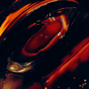
One of the attractions was a quite large replica of the Taj Mahal, made of cardboard and styrofoam, intended as a backdrop for photography.
There was a queue of couples and families lining up on the fake grass to get their photo taken by an "official photographer" in front of that Taj Mahal, famed landmark of their own country but so far north that many of them would never get to visit it in reality.
I looked for another angle and found this (Taj Mahal viewed from the side or the back, I don't recall exactly):