I agree with the reasons for the crop. Look at all the horizontal lines in the top half. clouds, tanker, suggested line from the rocks, pier.
However, I'd suggest taking even more off the bottom - 1/3 to 1/2 of the ocean below the pier legs.
March 5, 2025
83
-

-

I hope so also. I pray so.
But it will only happen with the greatest of effort. Passivity and resignation will doom us. It can and must be done. Don’t let your voice or those of anyone you know be silent. And we will prevail.
Have faith, but have courage.
Rich
-

Good !
These look intriguing. That spiral slide looks fast and furious 😉
The first reminds me a bit of the opening sequence of a James Bond movie; looking down a barrel,.
I’m sort of expecting 007 to appear at the end, shooting back at us. -
A wander around town with photo club friends sounds like good fun. The results from this trip are good too.
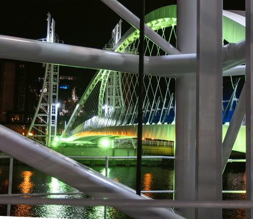
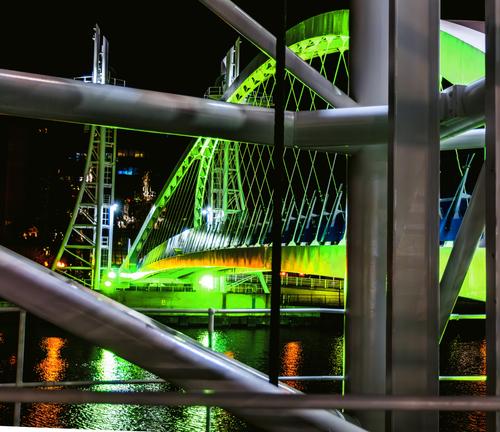
My favourites above , the bridge is impressive! -
Thanks for the edit. Looks good:-)
Please feel free to post edited versions.
Just before I posting this, I did some cropping of the original 4 x 3 format image in just the sort of direction you suggested, you've taken it even a bit further with the more pano crop. The half cut off post on the left was an oversight ;-) -

Repetition and colours and shapes win.
-
Word serenity comes to mind. Fab shot.
-
Now I'm guessing and dreaming myself back to 2012 or so when I visited Barcelona and rented an apartment there. So, I guess you did the same and that we are looking at an inner courtyard with the warm yellow on the buildings, balconys where the laundry hang to die and old men in underwear only sit reading the newspaper. There is a small from fresh bread and the muffled sounds from an alarming city somewhere in Eixample not far from La Sagrada Familia.
It's an excellent "remember the vacation" image with the tiles to the right, the cool reiling details and then further away the rest of the courtyard with a lot of details and daily life as it goes on hidden from pedestrians down on the sidewalk.
For a beholder not having seen the exact same courtyard one can wish for less tiles and more of the courtyard. Perhaps that is another image*. So, OK, I'm seduced by the colors!*Now imagine a pano where the image above is the third or fourth image ending an overview of the courtyard.
EDIT: Also, Thank you for the comments last week!
-
I took a couple of my images and tried to make them more "punchy". What do you think?
Before
After
Before
After
-
Road markings
Today's image is an unplanned capture taken while out walking. One of many images as i for periods shoot anything remotely interesting.
EDIT: Removed part of the text. -
If I get this right this is an impressive and large kind of viewing tower. last week i thought i would like to see the tower. These images does that as well, only more so. I love this kind of constructions and a tower this size made for nothing else but amuse us poor humans is great!
The idea showing the tower from the top and down and then vice verse is great and made me study the details and wish for a ride down the slide.Unfortunately the presentation is not success only. From the bottom, looking up:
I like the centered composition. The interesting tower is depicted and the picture is saved by the slide making it interesting.
The camera hasn't been up to the work. There is a lot of CA. I think it is causing discoloration when looking up at the magenta half way up (and about everywhere).From the top, looking down:
Now we have a dark image which has lost the great contrast we had in the first image. It's not as exciting and make me wonder about the color and lack of light instead of enjoying the image itself.
EDIT: I refuse to accept the color. The woodwork can't purple?! I think this is about a bad white balance combined with the blue (?) sky coloring everything. The iron things holding the slide probably shows this. Were they black?I suggest making the images more matching with regards to color and light. or make them completely B&W. The second image unfortunately leaves me with an impression of having been chopped off at the bottom. Is it deliberately cropped that way making me an ungrateful spectator whining while not understanding or has something forced you to do it that way?
I try to show what I mean:
and
OK, I am smacking on some AI-generated extras here. It's not nice but Without a complete slide the image is missing.
Anyway, with not much work I think you can save it all making the presentation cleaner and nicer for us admiring the tower and images. The second image... perhaps you have more exposures and can stitch it making the slide complete?
Austria next! -
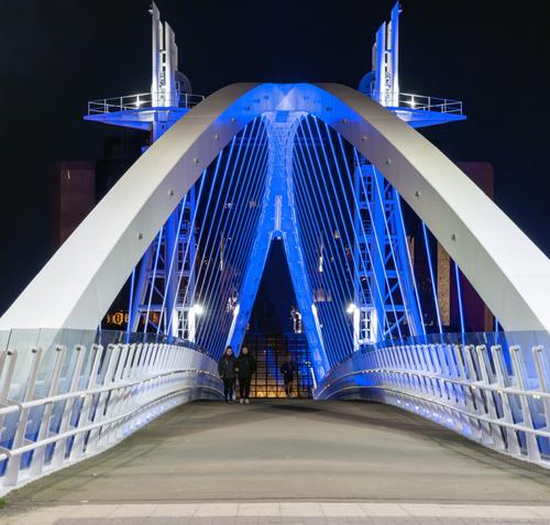
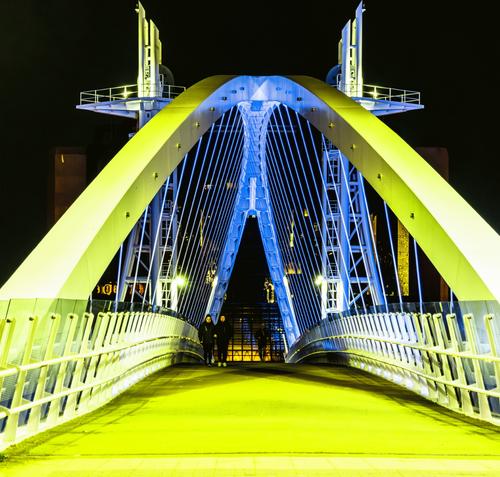
I think the first image is way better as it was. The added yellow color is, to me, un-natural and strange.
The second pair, well, here the adjustment is more subtle. If you had done that in the first place I don't think many would have any objections. Maybe toning it down just half a notch? -
Thanks for the feedback.
-
The original is much better!
The reduction of overcooked highlights is an improvement.
I dont think I‘ve been in Manchester since 1960, and it certainly was not that colourful then!
David
-
I agree with Jonas. If colour was to be added to shot 1, I think you have used the wrong yellow. Blue/yellow are strong complementary colours but the yellow used here is too green. I still think I'd prefer the simplicity of 1 but for the fun of it, you could try adjusting the yellow.
-
Here I agree with David. This time the stronger colour works because the range of additional colour is simpler. The orange area is oK because it is quite small. If considerably bigger area had become orange, it wouldn't have worked.
-
Thanks all, I'll have a play with the first one tomorrow.
Alan
-
Playful, different, east, west, south.
White on black have impact. Central triangle is a key anchor. Well seen.

![i528_roadmarkings_for_bikers[1].jpg](/a/thumb/8mRJL1DtWkbMdtDHjimr1e8G21vYVPSpI4NOAjsBmhfSINPeBT91v23m1fVs8JI7/31310/?shva=1)
![upwards_img-20241003-125_streamdream_PP[1].jpg](/a/thumb/4a1koPm27pCQ8Pd9AsbtwvH4Srp5EwWls5jH5nD464gSKBwgYnkDzpp5rLH5tpol/31318/?shva=1)
![downwards_img-20241003-131-_streamdream_generative_PP[1].jpg](/a/thumb/qD5B6A7b7irnaPkYPVPsOGeJnVhKMNs7prlx5veObDkbzP7GDrxoWgx4hRIgCNek/31320/?shva=1)