The English Patient never crossed my mind. It should have.
I've never printed this shot for the Gallery. Thanks, I'll try it.
-
-
@minniev has written:@Rich42 has written:
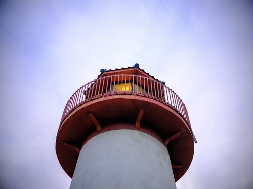
From a series, So Cal Rainy Day.
The lobster bisque dinner at Luis' Lighthouse Restaurant was great, as usual.
The creaky wooden stairs from the second floor bistro wind down around the Oceanside light, under the top.
Fog hadn't rolled in yet but heavy clouds weren't more than a few hundred feet above.
I like how quiet the harbor gets before it rains, which it did for the next 24 hours.
I photographed for most of that time.
Rich
Creative angle for photographing a lighthouse. (Though lighthouses have been done to death by painters and photographers, I still love them and seek them out whenever I'm near a coast). The geometry is more evident than with a traditional composition - the circles, cylinders, the octagon (I think) on top. The light itself, which we seldom see in daytime photos, is an added attraction. Great colors, simply composed, very nice.
I agree on most points but feel the photographer might have taken a couple of steps to the right. The peak of the tiled roof is a little offset. I'm by no means certain about this but I'd like to have seen peak of the roof a little more centred so we only saw the A of the roofshape perched on the hand rail.
-
@PeteS has written:
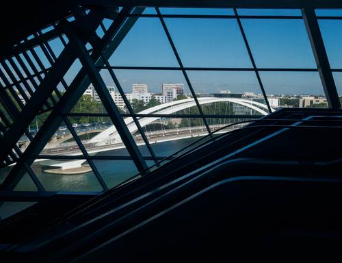
Lyon Lines
A few weeks ago, Roel posted images of the Musée des Confluences in Lyon (see here ) which is architecture from a photographer's dream. This photo is also taken there, but from the inside looking out. I was fascinated by the interplay of different lines, which are mainly straight, but including the elegant white curves of a bridge. By exposing for the outside, the interior is almost black, but the lines of the escalators, shining faintly, break up the block of darkness at the bottom.
It is really a portrait of the bridge, but I wanted to do it in a more interesting way than just a straight forward shot from outside. I think having to disentangle the bridge actually makes the viewer think more about its shape and elegance.
I really like the interplay of all those lines, but am interested to know what you think. Do you think the bridge is just lost? Does it hold your attention too? Or is it just a mess of lines?I can see the attraction of the idea but I don't think it quite comes off. There are too many lines going in too many directions. How about cropping it hard and then working with the bridge and more curved elevator lines? Attached is a rough crop of the area I'm talking about. Esit note. Having seen my crop on screen I think the crop should be portrait shaped with more of the dark area below the lowes elevator rail included and more of the left edge removed .
-
@MikeFewster has written:@minniev has written:@Rich42 has written:
From a series, So Cal Rainy Day.
The lobster bisque dinner at Luis' Lighthouse Restaurant was great, as usual.
The creaky wooden stairs from the second floor bistro wind down around the Oceanside light, under the top.
Fog hadn't rolled in yet but heavy clouds weren't more than a few hundred feet above.
I like how quiet the harbor gets before it rains, which it did for the next 24 hours.
I photographed for most of that time.
Rich
Creative angle for photographing a lighthouse. (Though lighthouses have been done to death by painters and photographers, I still love them and seek them out whenever I'm near a coast). The geometry is more evident than with a traditional composition - the circles, cylinders, the octagon (I think) on top. The light itself, which we seldom see in daytime photos, is an added attraction. Great colors, simply composed, very nice.
I agree on most points but feel the photographer might have taken a couple of steps to the right. The peak of the tiled roof is a little offset. I'm by no means certain about this but I'd like to have seen peak of the roof a little more centred so we only saw the A of the roofshape perched on the hand rail.
Thanks, Mike.
But as I explained I was perched on some creaky wooden stairs winding down around the lighthouse. "A couple steps to the right" was thin air!
🙄
Rich
-
@LouPhoto has written:
Interesting architecture. Interesting, but disturbing (to me!) I don't do well at all with heights. Images like this trigger my sense of vertigo.
Nice capture.
Rich
-
@Rich42 has written:@MikeFewster has written:@minniev has written:@Rich42 has written:
From a series, So Cal Rainy Day.
The lobster bisque dinner at Luis' Lighthouse Restaurant was great, as usual.
The creaky wooden stairs from the second floor bistro wind down around the Oceanside light, under the top.
Fog hadn't rolled in yet but heavy clouds weren't more than a few hundred feet above.
I like how quiet the harbor gets before it rains, which it did for the next 24 hours.
I photographed for most of that time.
Rich
Creative angle for photographing a lighthouse. (Though lighthouses have been done to death by painters and photographers, I still love them and seek them out whenever I'm near a coast). The geometry is more evident than with a traditional composition - the circles, cylinders, the octagon (I think) on top. The light itself, which we seldom see in daytime photos, is an added attraction. Great colors, simply composed, very nice.
I agree on most points but feel the photographer might have taken a couple of steps to the right. The peak of the tiled roof is a little offset. I'm by no means certain about this but I'd like to have seen peak of the roof a little more centred so we only saw the A of the roofshape perched on the hand rail.
Thanks, Mike.
But as I explained I was perched on some creaky wooden stairs winding down around the lighthouse. "A couple steps to the right" was thin air!
🙄
Rich
Aw, C'mon. Where's that dedicated photographer spirit?
-
@RoelHendrickx has written:
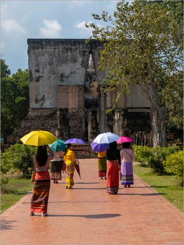
SUKHOTHAI
A photo from December 2022, on a visit to the ancient royal city of Sukhothai in Thailand.
We were there for two nights. On the morning after our first night, I was up very early (before sunrise) and took a bicycle for a trip to the ancient city center ruins and a bit beyond, because some of the most remarkable temples and shrines are scattered around the walled center.
At one of the Buddha shrines with a spectacularly large statue I had encountered a tourist group that was also up early, all in matching blue hawaiian shirts.
Obviously, I had made some images of them, taking photos and selfies in their sky blue garb against the browns and ochres of the ancient walls.I was convinced that I had bagged my "best image" for the day even before our own (mine and Els') exploration of the city would being in earnest.
Later that day, Els and I returned, again on the rickety bicycles that our lodging provided, to the same shrine.
And I found out that even if you have a good photo under your belt, there is always still room for improvement.
These elegant ladies topped the hawaiian shirts by a fair margin.(straight upload, not from Zenfolio - click to enlarge for details of the buddha and everything else)
If this place is where I think we are, I can tell you a little more about what they are wearing. Sukhothai is recognized by Thais as a very important birthplace of Thai culture. Many Thai tourists make a special effort to wear more traditional clothes when they visit. In the nearby streets are shops that hire traditional clothes for men and women, usually for walking around the precinct in the evening.
Umbrellas though need to be modern. Torrential Thai rain, searing sun. A modern umbrella is a necessity in Thailand and far more practical than the traditional model. But have a close look at the young lady in yellow. She has another, larger umbrella hooked over her arm as well as the blue one protecting her from the sun. I think the one over her arm is a traditional brolly that has been hired with the dress.
So for me, the photo is all about Thai nostalgia.
Coincidentally Roel, have you seen my photo this week in Street? I was thinking umbrellas as well and the colours are very similar - but mine was taken in Italy. -
@LouPhoto has written:
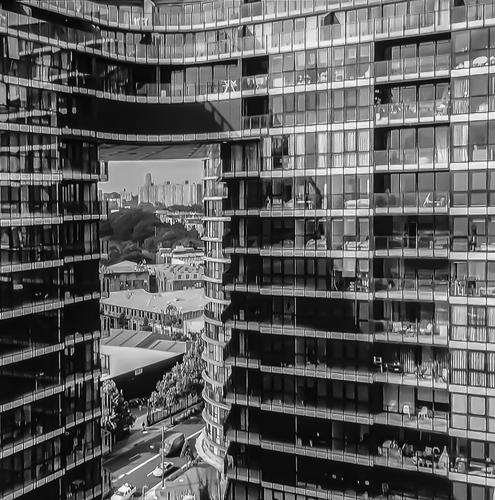
I like the edge to edge wall of glass and horizontal lines combined with a vertical slit giving a quite different view of the city. It's an interesting reversal of the usual composition that gives more space to the big setting against which something is set. Looking at it large, I think some form of posterization has been applied PP. At first I didn't like the PP but it grew on me. Seen large, the section through the slit looks more PP than the closer building. It seems to suggest the background is less real than the foreground and I began to feel this is appropriate.
-
@minniev has written:
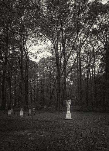
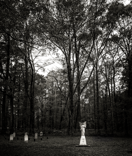
Yesterday, between rain showers, I took a different route home from the dentist's office, and got a glimpse of this angel through the trees behind a church, so I stopped to explore. Right in the middle of a strip of medical offices was this little patch of forest, and a small cemetery, with a marker that explained the current brick church building was constructed around an old log church, and the cemetery contains church members, a local family who owned the surrounding land, and a mix of marked and unknown confederate and union soldiers who died here during a civil war battle.
Portrait format with lots of long repeating vetical lines always invokes solemnity. The trees are creating the right mood. The lighter stone edges the memorials out from the background. The distance between the angel and the tombstones hints at a story.
It would have been a quite different image if the trees/bushes blocked out the central area of sky. But they don't. There is life and hope in the photo rather than unrelieved solemnity. -
@MikeFewster has written:@minniev has written:
Yesterday, between rain showers, I took a different route home from the dentist's office, and got a glimpse of this angel through the trees behind a church, so I stopped to explore. Right in the middle of a strip of medical offices was this little patch of forest, and a small cemetery, with a marker that explained the current brick church building was constructed around an old log church, and the cemetery contains church members, a local family who owned the surrounding land, and a mix of marked and unknown confederate and union soldiers who died here during a civil war battle.
Portrait format with lots of long repeating vetical lines always invokes solemnity. The trees are creating the right mood. The lighter stone edges the memorials out from the background. The distance between the angel and the tombstones hints at a story.
It would have been a quite different image if the trees/bushes blocked out the central area of sky. But they don't. There is life and hope in the photo rather than unrelieved solemnity.Edit addition. After reading Rich 42 seeing his edit. I like the edit, providing the intention is as I suggested above. Of course, that might not have been the intention.
-
@MikeFewster has written:
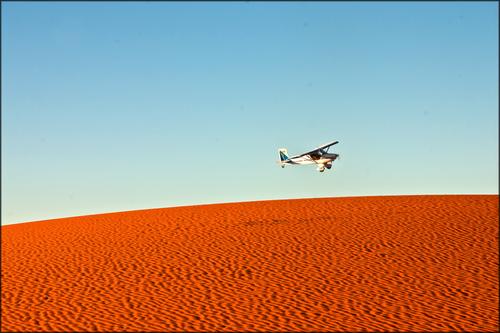
Pre breakfast on the Dunes.
I was up early photographing the early dawn light on sand dunes on South Australia.
The plane appeared and skimmed the dunes and circled me. It landed on a flat area near our vehicle. They joined us for breakfast.
Turns out, the two young men inside make a living photographing cattle stations and mining sites from the air, then selling the shots to the companies. They saw me, and saw a close by spot where they could land.That's excellent minimalism.
It seems to be a Mondrian of just two colour and then one intervention, but actually I really like the subtle gradiants in both colour blocks: the gradual lightening of the blues towards the horizon, and the subtle variation in earth-red caused by ripples and mini-dunes on top of the big one.
The plane could hardly be placed better. -
@streamdream has written:
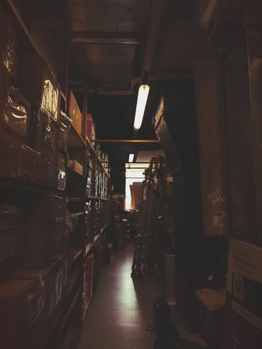
storage
So a while ago, I did a gig-job in a shoe shop. The shop didn't get that many customers and I was stationed in the men's section upstairs, so I got even less. Subsequently, I was very very bored after finishing all my tasks. The next step was naturally to take atmospheric photos of the storage room.
Who would ever have thought that shoe store storage could look like the final scene in "Raiders of the Lost Ark"?
-
@Fireplace33 has written:
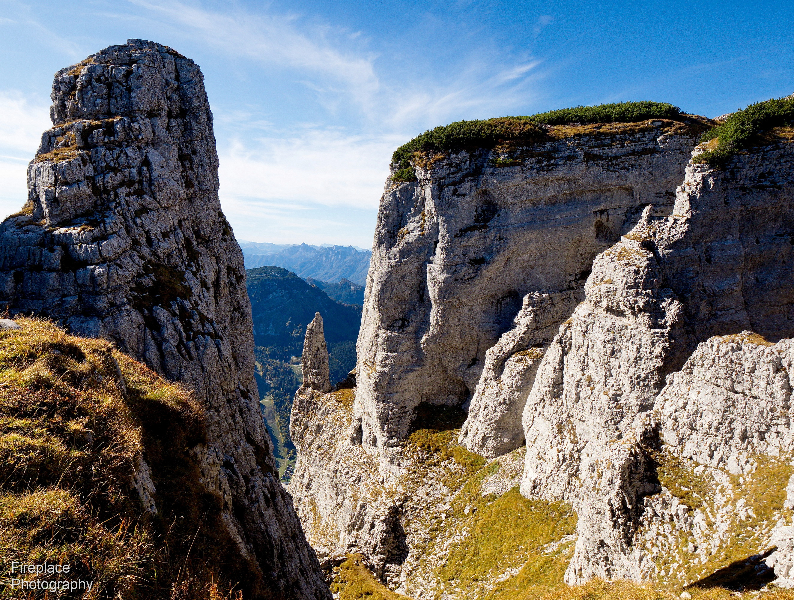
Loser!
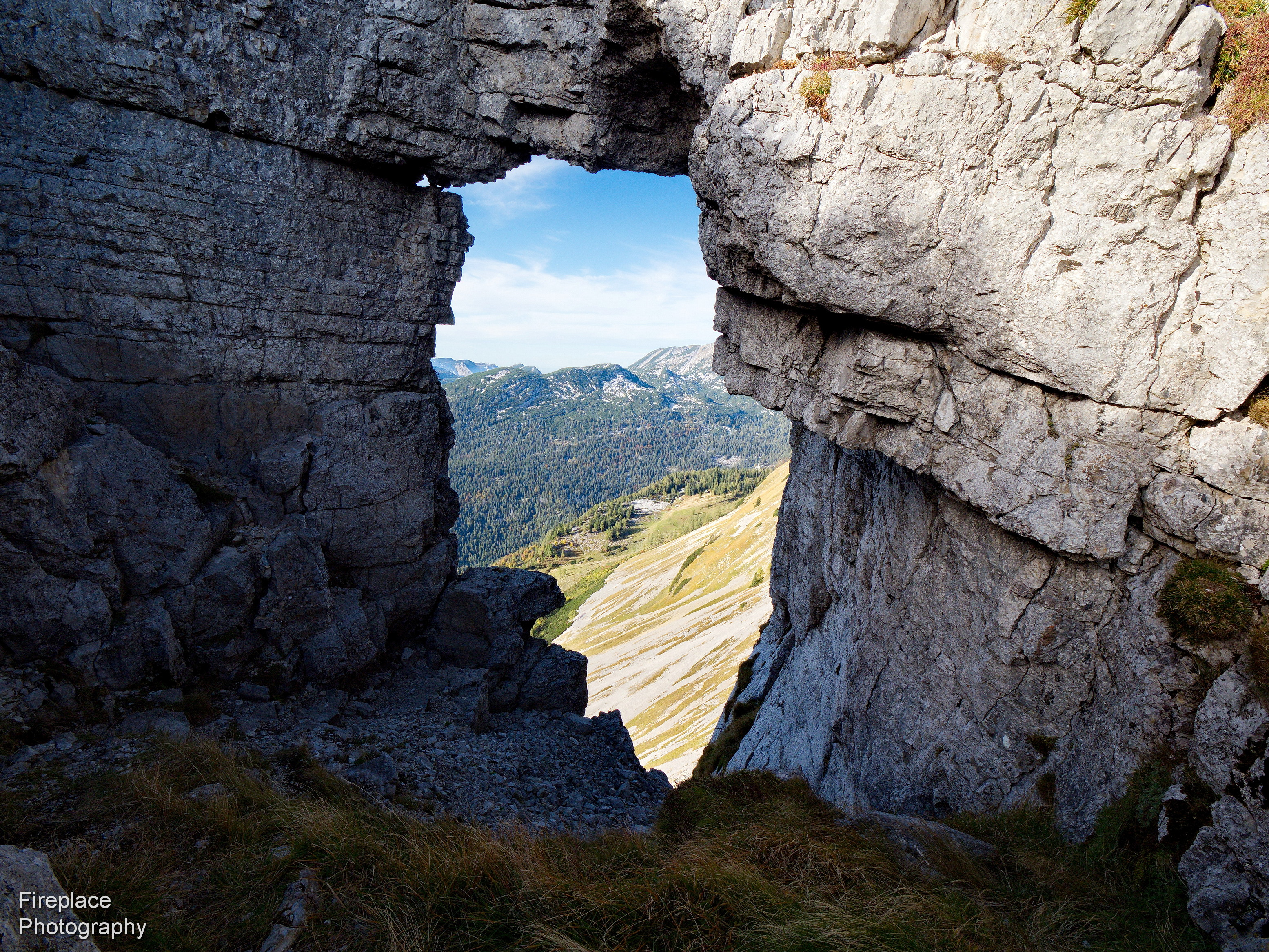
Well the title sounds like an accusation or an insult, but that really is the name of this mountain :-)
I haven't been out on photo trips for a while now, so, once again, here's something from my archives
We were near the summit (1830m high) for these two photos taken in 2019
It's a lovely area with a 10km long and winding toll road to drive up fairly high to the starting point for the hike, there's also a small skiing area and a quaint hotel where we've stayed overnight before. There weren't that many people that made the effort to get there :-) It was great.But now, at the end of last year, it has all been modernised, with a brand new cable car and building complex, with a high capacity to transport many people close to the top.
We haven't visited Loser and the new panorama cable car since it was opened, but I suspect it has completely changed the character of the place, and maybe not only for the better ?That is a wonderful spot. My feet are itching to go hike there.
The second image has the benefit of that great natural tearshaped frame. A real photographer's image.
But I actually prefer the first because of the general composition of the whole image: a pillared frame of big mountains that surrounds a natural landmark in the form of a lonely free standing rock, and that one then against a backdrop of layers of distant mountains with receding blue hues. The kind of photo I would be happy about for days if I had made it. -
@minniev has written:
Yesterday, between rain showers, I took a different route home from the dentist's office, and got a glimpse of this angel through the trees behind a church, so I stopped to explore. Right in the middle of a strip of medical offices was this little patch of forest, and a small cemetery, with a marker that explained the current brick church building was constructed around an old log church, and the cemetery contains church members, a local family who owned the surrounding land, and a mix of marked and unknown confederate and union soldiers who died here during a civil war battle.
My initial impression was that I wanted to see this cropped for more emphasis on the angel.
But that initial feeling was quickly discarded when I started exploring the whole image, realizing that all the elements have their place here.
A bit of empty foreground to create a sense of distance and separation between the natural and the spiritual worlds.
The tombstones, anonymous to the side.
The angel placed at 2/3s of the horizontal frame but with another ratio than 2/3 in the vertical plane, suggesting that there is more in the sky than just sky.
The skeletal trees creating a laced veil, but with an opening towards clear sky, placed nicely diagonally from the angel.
So don't change a thing, please. -
@Rich42 has written:@minniev has written:
Yesterday, between rain showers, I took a different route home from the dentist's office, and got a glimpse of this angel through the trees behind a church, so I stopped to explore. Right in the middle of a strip of medical offices was this little patch of forest, and a small cemetery, with a marker that explained the current brick church building was constructed around an old log church, and the cemetery contains church members, a local family who owned the surrounding land, and a mix of marked and unknown confederate and union soldiers who died here during a civil war battle.
A beautiful, serene image.
I re-worked the tones a bit to give more drama to the light falling on the white figures and the deep blacks of the woods.
Hope you don't mind.
Rich
I posted my comments before I saw this rework.
I appreciate the effort and I understand the intention, but a large degree of subtlety gets lost . -
@PeteS has written:
Lyon Lines
A few weeks ago, Roel posted images of the Musée des Confluences in Lyon (see here ) which is architecture from a photographer's dream. This photo is also taken there, but from the inside looking out. I was fascinated by the interplay of different lines, which are mainly straight, but including the elegant white curves of a bridge. By exposing for the outside, the interior is almost black, but the lines of the escalators, shining faintly, break up the block of darkness at the bottom.
It is really a portrait of the bridge, but I wanted to do it in a more interesting way than just a straight forward shot from outside. I think having to disentangle the bridge actually makes the viewer think more about its shape and elegance.
I really like the interplay of all those lines, but am interested to know what you think. Do you think the bridge is just lost? Does it hold your attention too? Or is it just a mess of lines?When we were in Lyon, I did not go inside the Musée des Confluences. On the first day, we were on our way to another place (Le Grand Loco, for the Biennale).
On the second day, I raced the evening sun to the spot, and frankly, the weather and light was just too nice to consider stepping inside.
Your image tells me that we need to revisit Lyon someday and give the interior a chance.
I do like the lines in your image and can see what you were going for, but unfortunately I am not 100% convinced.
I still feel like the exterior is the more interesting part of the architecture. -
@LouPhoto has written:
This view feels like something out of The Matrix: through a small window in a uniform and rigid reality of steel, concrete and glass, we get a glimpse of another dimension that is more organic. (Still a lot of buildings, but some plants too - I am imagining this same image, but then with a view towards a lush forest through the gap - how cool would that be...?)
The funny thing is that even that rigid uniformity of the building façade is not all that uniform at all, upon further scrutiny.
Individual inhabitants are customizing their space with terrace furniture etc.(I always think that architects of this kind of modernist buildings imagine their creation as pristine and flawless, shiny and anonymous.
And then a troupe of neanderthal cave dwellers descends upon it and make their little cozy homes and out goes the formalism.) -
@MikeFewster has written:@RoelHendrickx has written:
SUKHOTHAI
A photo from December 2022, on a visit to the ancient royal city of Sukhothai in Thailand.
We were there for two nights. On the morning after our first night, I was up very early (before sunrise) and took a bicycle for a trip to the ancient city center ruins and a bit beyond, because some of the most remarkable temples and shrines are scattered around the walled center.
At one of the Buddha shrines with a spectacularly large statue I had encountered a tourist group that was also up early, all in matching blue hawaiian shirts.
Obviously, I had made some images of them, taking photos and selfies in their sky blue garb against the browns and ochres of the ancient walls.I was convinced that I had bagged my "best image" for the day even before our own (mine and Els') exploration of the city would being in earnest.
Later that day, Els and I returned, again on the rickety bicycles that our lodging provided, to the same shrine.
And I found out that even if you have a good photo under your belt, there is always still room for improvement.
These elegant ladies topped the hawaiian shirts by a fair margin.(straight upload, not from Zenfolio - click to enlarge for details of the buddha and everything else)
If this place is where I think we are, I can tell you a little more about what they are wearing. Sukhothai is recognized by Thais as a very important birthplace of Thai culture. Many Thai tourists make a special effort to wear more traditional clothes when they visit. In the nearby streets are shops that hire traditional clothes for men and women, usually for walking around the precinct in the evening.
Umbrellas though need to be modern. Torrential Thai rain, searing sun. A modern umbrella is a necessity in Thailand and far more practical than the traditional model. But have a close look at the young lady in yellow. She has another, larger umbrella hooked over her arm as well as the blue one protecting her from the sun. I think the one over her arm is a traditional brolly that has been hired with the dress.
So for me, the photo is all about Thai nostalgia.
Coincidentally Roel, have you seen my photo this week in Street? I was thinking umbrellas as well and the colours are very similar - but mine was taken in Italy.No, I haven't seen your photo in Street because I have not (yet) looked at that forum.
We've seen this phenomenon of "traditional dress for hire" in many places in Asia.
It adds to the atmosphere.And at one occasion, we have seen the hilarious effect of European tourism discovering that trend and catering to Asian tourists.
In Cesky Krumlow, an achingly picturesque medieval town in the Czech Republic, with an imposing castle dominating cobblestoned streets and crooked houses, all with the embrace of a meander of a river, we encountered a few groups of Chinese selfie-makers in European medieval dress. Hard to keep a straight face.
