Pleasing travel image. An amazingly detailed and colorful building.
-
-
The rich color and design of the buildings is showcased against the gray featureless sky. Though you could probably bring out more detail in that sky with processing, I am not sure I would do that. The buildings have a stark beauty that could be diminished by having them compete with a lovely sky. The first is my favorite of the set, for its soaring ornate tower.
-
Well, it looks like Spring is treading lightly there anyway, and as it has here, is quick to retreat when winter pushes back. We are celebrating the beauty of old cities here this week!
-
Pete,
I really like this series. Especially the last image - warm refuge against the chill outside. I would have warmed up the color of the lighting a little and included a cup of coffee in the foreground, steam rising! (Just kidding - very nice images).
Rich
-
You read my mind, once again.
Rich
-
@minniev has written:
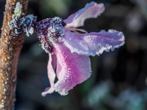
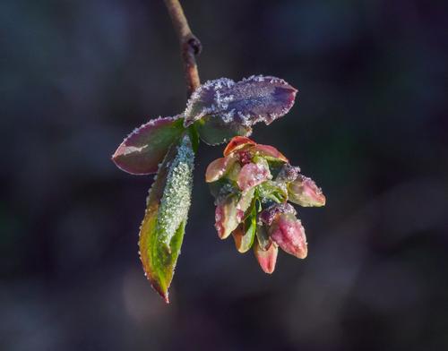
Last frost
Interesting series. Winter is still around and not giving up. Plants are really at the mercy of the weather. That frost is adding and taking away, all at the same time.
-
@Sagittarius has written:
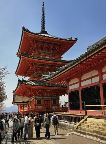
Kiyomizu - Dera
Great structure from foreign land.
-
@Rich42 has written:
Rich
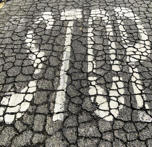
Parched, old and very symbolic.
-
@streamdream has written:
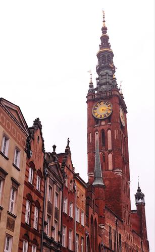
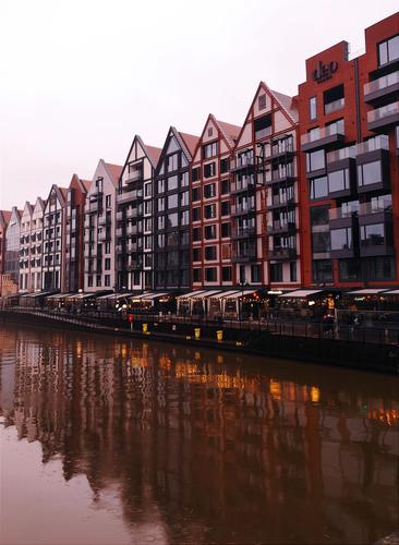
Gdansk
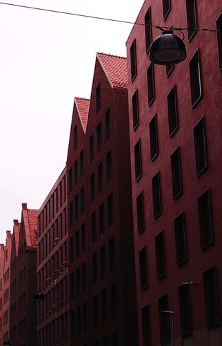
I really love this city. I was there twice and ne'er I did I witness even a single ray of sunlight. T'was cold and wet and I froze to my bones. 'Tis a testiment to the city that I adored it anyhow.
Eventhough there is a red tinge to the series all the shots certainly reflect the atmosphere.
-
@PeteS has written:
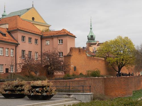
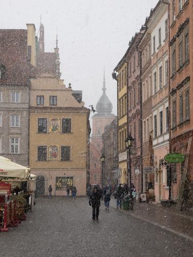
Two Seasons Warsaw
Yesterday we experienced Warsaw in the Spring…
Poland is on a map. All captures reflect both history and prevailing weather. Like the last shot showing old city from inside the apartment.
-
@Sagittarius has written:
Kiyomizu - Dera
It's an amazing building with stunning colour that looks great against the pure blue sky.
As a photo however I feel it has a problem. Are we looking at the building or the tourists? The tourists seem more interested in the photographer than the building.
If this was the point you wanted to make (and it might be. If so, there's plenty of irony) then I think the tourists need to be larger.
If a study of the building is what you want, I'd suggests a portrait format crop with the lower edge a little above the tourist's heads, taking in about half of the roof on the right and cutting out the tree on the left. -
@RoelHendrickx has written:
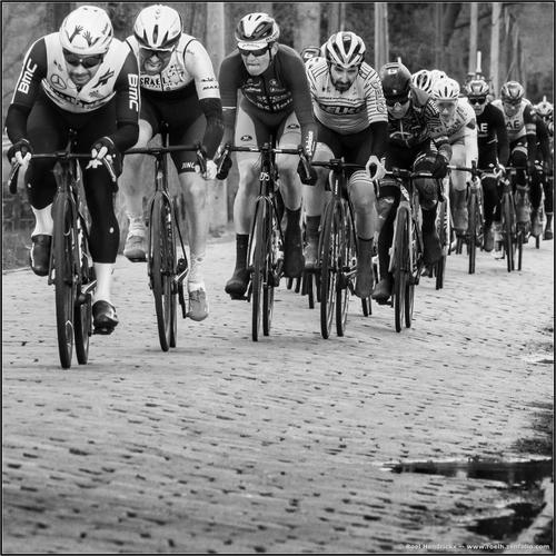
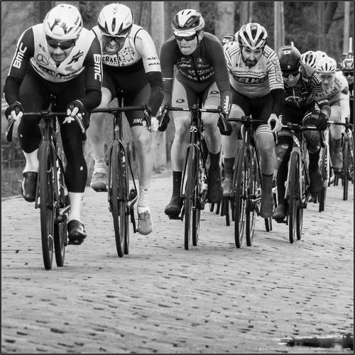
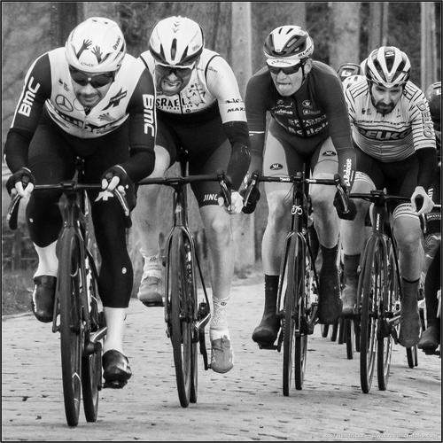
SCHELDEPRIJS (2021)
Today is racing day in my hometown Schoten (near Antwerp).
Traditionally on the Wednesday between the two monuments "Tour of Flanders" and "Paris-Roubaix", a peloton centered around sprinters, makes Schoten their goal for the annual (and this year 99th edition of) the "Scheldeprijs" (aka "Grand Prix de l'Escaut).
All UCI pro teams (male and since 2021 also female) are well represented.
No Pogacar, Van der Poel or other top tier candidates for victory in Roubaix (they will not risk getting hurt in the hectic and high speed sprint that is most often the finale of our race), but all the big sprinters and their lead out trains are present.Although it is traditionally a race without much elevation (riding through Zeeland and then the "Kempen", with local rounds as icing on the cake, there are still a few cobblestones to be conquered (compared to the sections in Paris-Roubaix, our sections are very "civilized", hardly more difficult than asphalt).
This sequence is from the 2021 edition:
(I have shown the middle one of this sequence before, in edition 677 of April 14, 2021.
In that edition, it was accompanied by different colorization versions of the identical image
(one natural colour, one desaturated with a greenish cast).
In today's edition, the idea is to explore what a rapid succession of shots can represent.)This is an interesting study of different crops, which, as a series, gives the same mpression of motion.
As a single image, I think the third has the most impact and says it all.
I have just played about with the limited editing possibilities on my phone and have two more suggestions
Ok, Wi-Fi issues, I’ll try to post them later. -
@Rich42 has written:
Rich
Very graphic. The image is very simple but then so is the message on the road. Just do it. We don't know what we are stopping for but the cracked surface gives a feeling of unease suggesting it is a sign that should be obeyed.
Up in the top left is a small detail that distracts from the simplicity. Perhaps remove it?
Viewed large, another possibilty emerges. The leaf. I'm not sure whether this is a monochrome or whether the leaf has a hint of colour? If the leaf was given a little more green, whole new interpretations of the photo become possible. -
Spoiler text
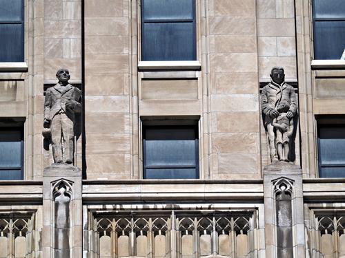
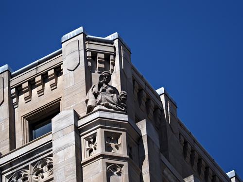
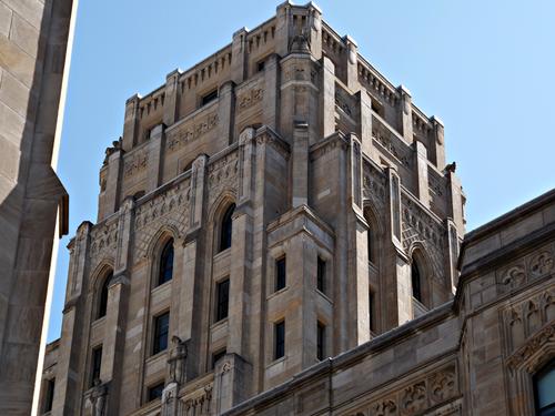
@ChrisOly has written:Figures
Whitney Block is a Government building in Toronto, Ontario, Canada
The Modern Gothic-Art Deco structure was built in 1926 by architect F. R. Heakes .The facade is ornamented by repeated sequences of quatrefoils, and figures designed by Charles Adamson, which represent abstract ideals like justice, tolerance, wisdom and power, as well as more ordinary pursuits such a mining, forestry, labour, law, education and farming.Spoiler text
Right around the world, government buildings of the mid 20s to early 30s use similar figures with similar symbolism. I guess it was a reaction to events in Russia and governments of all persuasions deciding it would be prudent to make a gesture. There's a book to be put together on this.
A suggestion. Arrange them more as a series. The last photo gives something of the whole building. Perhaps start with the complete building and then zoom in on the individual figures. I found each figure a lot more interesting when seen large on its own. -
@ChrisOly has written:@PeteS has written:
Two Seasons Warsaw
Yesterday we experienced Warsaw in the Spring…
Poland is on a map. All captures reflect both history and prevailing weather. Like the last shot showing old city from inside the apartment.
As Chris says. The progression works well. In 2. the old brick walls and black clothing give a backdrop making the snowflakes stand out. The last shot with its warm domesticity and view out onto the street is all the better because we have been out on the street.
-
@MikeFewster has written:@Rich42 has written:
Rich
Very graphic. The image is very simple but then so is the message on the road. Just do it. We don't know what we are stopping for but the cracked surface gives a feeling of unease suggesting it is a sign that should be obeyed.
Up in the top left is a small detail that distracts from the simplicity. Perhaps remove it?
Viewed large, another possibilty emerges. The leaf. I'm not sure whether this is a monochrome or whether the leaf has a hint of colour? If the leaf was given a little more green, whole new interpretations of the photo become possible.Thanks, Mike.
It's a color image. I deliberately did not crop out the yellow dividing stripe in the street. Other "real" objects are simply where they were when the shot was taken. Everything about the image is real, especially its imperative.
Rich
-
@RoelHendrickx has written:
SCHELDEPRIJS (2021)
Today is racing day in my hometown Schoten (near Antwerp).
Traditionally on the Wednesday between the two monuments "Tour of Flanders" and "Paris-Roubaix", a peloton centered around sprinters, makes Schoten their goal for the annual (and this year 99th edition of) the "Scheldeprijs" (aka "Grand Prix de l'Escaut).
All UCI pro teams (male and since 2021 also female) are well represented.
No Pogacar, Van der Poel or other top tier candidates for victory in Roubaix (they will not risk getting hurt in the hectic and high speed sprint that is most often the finale of our race), but all the big sprinters and their lead out trains are present.Although it is traditionally a race without much elevation (riding through Zeeland and then the "Kempen", with local rounds as icing on the cake, there are still a few cobblestones to be conquered (compared to the sections in Paris-Roubaix, our sections are very "civilized", hardly more difficult than asphalt).
This sequence is from the 2021 edition:
(I have shown the middle one of this sequence before, in edition 677 of April 14, 2021.
In that edition, it was accompanied by different colorization versions of the identical image
(one natural colour, one desaturated with a greenish cast).
In today's edition, the idea is to explore what a rapid succession of shots can represent.)A good series. I think I prefer the last one best, where you can see the expressions on their faces better. The guy with his tongue sticking out shows just how hard they were working :-)
The middle crop shows better just how many riders there are and is also very good. -
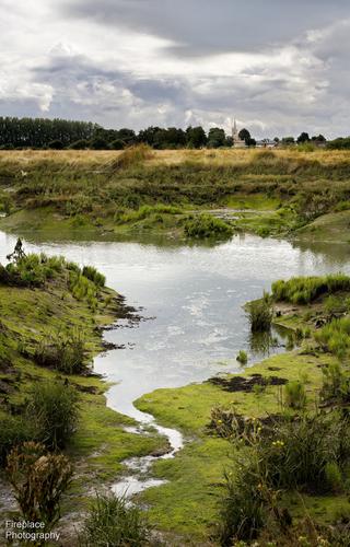
@Fireplace33 has written:
Same story as last week, no time for any photo tours again this week :-(
Very busy with some garden renovations and a full time job,...So one from the archives.
This is a view, with Wakering Church (Essex) in the distance. Taken from a walk along the sea wall in Wakering, looking down and across the marshy estuary water. At the bottom there's just one of the many little tributaries leading into the main channel. It's very muddy here and has that familiar characteristic smell of the estuary marshes with all the local flora and fauna. Quite nostalgic for me :-)You just gotta love the leading line here, because it does not lead our eye in a straight vertical or diagonal, but rather allows the eye to meander through the whole image towards the reward on the horizon.
Only a minority of landscape photographers use vertical orientation regularly in their images. (I am one of them, maybe because I am not really a landscape photographer...) I think it is a underrated technique to bring enormous depth into an image that would look flat and borderline boring in a horizontal orientation.
This is a prime example of how effective the orientation can be to create depth and tension and (yes) a narrative.
Your description is another good factor here. Without it, I could have thought this view was from any small stream leading into a bigger one. The description makes me smell the jodium-infused, seaside salty smell.
-
@ChrisOly has written:
Figures
Whitney Block is a Government building in Toronto, Ontario, Canada
The Modern Gothic-Art Deco structure was built in 1926 by architect F. R. Heakes .The facade is ornamented by repeated sequences of quatrefoils, and figures designed by Charles Adamson, which represent abstract ideals like justice, tolerance, wisdom and power, as well as more ordinary pursuits such a mining, forestry, labour, law, education and farming.Your use of light and shadows brings out the neo-gothic features expertly.
-
@Rich42 has written:
Rich
A stop sign painted onto heat-cracked tarmac, that could easily be mistaken for the dried-up and cracked mud of a river bed.
There is a big ecological message hidden beneath the surface here, about pollution and the wasting of natural resources (especially water). -
@minniev has written:
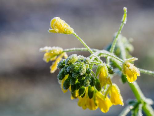
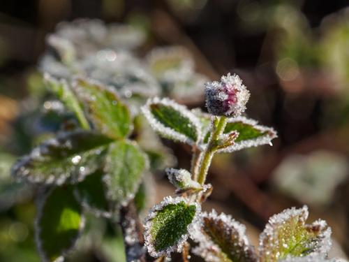
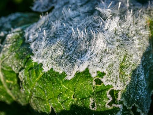
Last frost (I hope). I'm not very good at closeups, but the patterns and shapes in the frost, and the sweet morning light, persuaded me to try a series.
The blueberries didn't sustain as much damage as I suspected they would.
The dewberries seem to have taken a hit.
Turnips are tough to kill, just shake the frost off.
The peaches did OK because we covered them, except for this one branch, and it's pretty much done.You may consider yourself a person not good at closeups, but you manage to hide that defect very convincingly here.
I think some of the compositions could use just a bit more tension (maybe by daring to use dutch angles a bit more).
But the macro-capabilities are quite good (focus could be a tad deeper on some of them, but at least focus is where you wanted it).
Looking individually, my favourite are the glass-splinter icicles on the turnips and the mustard.
My least favourite is the dewberry, because I feel that you could have separated that better from the background with a slightly different POV. -
@streamdream has written:
Gdansk
I really love this city. I was there twice and ne'er I did I witness even a single ray of sunlight. T'was cold and wet and I froze to my bones. 'Tis a testiment to the city that I adored it anyhow.
You've created quite a uniformity of style and processing here, and it elevates all three images to form a higher ideal together. Like 1+1+1=4.
If you had not told me that this is Gdansk (where I have never been, so far), I would have guessed at Hamburg (Speicherstadt specifically).
The warehouses (Speicher) are very similar.
Goes to show that commerce does not end at borders (and in fact, there was not a border for long periods of time between Hamburg and Gdansk/Danzig).
Thanks for giving me another reason to put Gdansk on our wishlist. -
@PeteS has written:
Two Seasons Warsaw
Yesterday we experienced Warsaw in the Spring…
I sense a conspiracy here to lure me to Poland again.
On our single visit, we visited only the area around Krakow.
Gdansk and Warsowa are on the list.
I like how you illustrated how quickly the weather can turn in a continental climate.
