Great shot. You have certainly captured delightful selection of dwellings in various colours and those tree shadows. Wonderful.
-
-
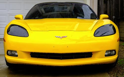
Sunglasses were invented for looking at this car.
So yes, you’ve had enough sun now. Come into the shade of the garage and park next to the rusty Ford pickup. -
Thank you for posting this, Minnie. When I first saw it, I was reminded that I had forgotten to buy an onion to go in our evening meal!
The patterns and textures and especially the colours make an attractive series. -
There is lots of scope for making this into other objects. A face or an owl, for instance.
-
Those houses are lovely. They remind me of Istanbul, and with the hills and, since the red in the centre could be the Turkish flag, I’ll stick with that guess.
The houses are in the shade, but since the sunlight is creating a dappled shadow across the road, the brighter area does not distract from the main subject, and even makes the photo more interesting. -
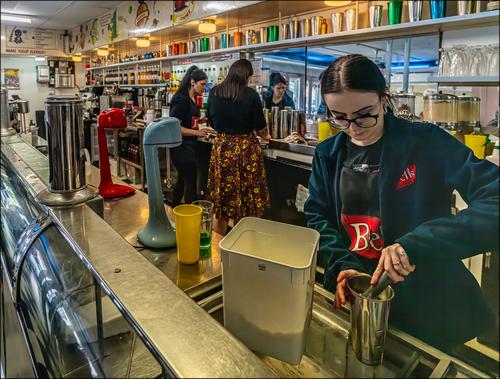
There is an object in the photo that I'm curious about- curious to see if it is recognized by anyone other than an Australian of older years. Above the closest shoulder of the girl adding icecream into the milk shake container, is a largish glass container. When I took this shot I was careful to ensure this object could be seen and I was happy to get it with the reflection. It may be that these things are /were universal or they may be an Australian speciality. I don't know. Does anyone recognize it? The associated brand is a famous British name but I don't believe the product is used in the same way in Britain. I may be wrong.
-
@Kumsal has written:@MikeFewster has written:
The Bell's MilkBar. Again. Broken Hill. NSW.
Congratulations, Mike.
You had the woman in the foreground created by artificial intelligence without anyone noticing until now.
AI is very bad when it comes to fingers.
In this case, it failed again.
Why do people look at the posted photos so superficially?Nope, the figure wasn't created by A1, although there is some AI involved and I had noted the fingers before I posted.
Look at the camera settings and the lighting. -
@PeteS has written:@Rich42 has written:
From a series, SoCal Rainy Day.
Rich
Sunglasses were invented for looking at this car.
So yes, you’ve had enough sun now. Come into the shade of the garage and park next to the rusty Ford pickup.Thanks Pete.
But this was taken on a dark, rainy day! The poor thing is dripping with rain and is just asking to come in where it's warm and dry.
And he has such a nice smile!
😎
Rich
-
@Rich42 has written:
But this was taken on a dark, rainy day! The poor thing is dripping with rain and is just asking to come in where it's warm and dry.
That’s what comes from viewing the images on a small phone whilst travelling by train. It was lovely and sunny outside my window. 🤣
-
@Kumsal has written:@MikeFewster has written:
The Bell's MilkBar. Again. Broken Hill. NSW.
Congratulations, Mike.
You had the woman in the foreground created by artificial intelligence without anyone noticing until now.
AI is very bad when it comes to fingers.
In this case, it failed again.
Why do people look at the posted photos so superficially?I looked at this image pretty closely and I see nothing to suggest the figure in the foreground is an AI construct. I've never seen an AI construct that could emulate lens distortion and angle distortion simultaneously in a convincing way. There's nothing about her hands that suggests the usual AI problems with hands. AI people often have too many or too few fingers, but this woman has the right number in the right angle for the position she's in and the task she's doing. AI would likely have made a mess of the lettering on her clothing. The reflections in the metal cup would have been less convincing. I would suspect an AI-based noise remover/sharpener such as Topaz was utilized here, and would account for the mild oddities we see (the weird distortion of a vein in her left hand, some textural anomalies in some reflective surfaces like her glasses and the edge of the ice chest, and the unnatural smoothness of her skin). I use Topaz products sometimes and see this behavior in Topaz AI, a program which I consider equal parts blessing and curse.
-
@MikeFewster has written:@minniev has written:@MikeFewster has written:
The Bell's MilkBar. Again. Broken Hill. NSW.
Looks like the service end of the milk bar is as interesting as the customer end.The sprinkling of primary colors along those leading lines is a visual treat and the mirrors double it. Fun image.
There is an object in the photo that I'm curious about- curious to see if it is recognized by anyone other than an Australian of older years. Above the closest shoulder of the girl adding icecream into the milk shake container, is a largish glass container. When I took this shot I was careful to ensure this object could be seen and I was happy to get it with the reflection. It may be that these things are /were universal or they may be an Australian speciality. I don't know. Does anyone recognize it? The associated brand is a famous British name but I don't believe the product is used in the same way in Britain. I may be wrong.
Though the container is unfamiliar, the stuff in it looks like malt powder.
-
@Kumsal has written:
Very good.
I would reduce the saturation in the background quite a bit.Thank you for looking and suggestion.
-
@minniev has written:@MikeFewster has written:@minniev has written:@MikeFewster has written:
The Bell's MilkBar. Again. Broken Hill. NSW.
Looks like the service end of the milk bar is as interesting as the customer end.The sprinkling of primary colors along those leading lines is a visual treat and the mirrors double it. Fun image.
There is an object in the photo that I'm curious about- curious to see if it is recognized by anyone other than an Australian of older years. Above the closest shoulder of the girl adding icecream into the milk shake container, is a largish glass container. When I took this shot I was careful to ensure this object could be seen and I was happy to get it with the reflection. It may be that these things are /were universal or they may be an Australian speciality. I don't know. Does anyone recognize it? The associated brand is a famous British name but I don't believe the product is used in the same way in Britain. I may be wrong.
Though the container is unfamiliar, the stuff in it looks like malt powder.
You got it. It's a Horlicks malt dispenser. Once malt added from one of these and at least one scoop of real icecream, were essential components of a good milk shake. Shakes made with soft serve "ice creams" don't have the same flavour and texture.
-
@minniev has written:@Kumsal has written:@MikeFewster has written:
The Bell's MilkBar. Again. Broken Hill. NSW.
Congratulations, Mike.
You had the woman in the foreground created by artificial intelligence without anyone noticing until now.
AI is very bad when it comes to fingers.
In this case, it failed again.
Why do people look at the posted photos so superficially?I looked at this image pretty closely and I see nothing to suggest the figure in the foreground is an AI construct. I've never seen an AI construct that could emulate lens distortion and angle distortion simultaneously in a convincing way. There's nothing about her hands that suggests the usual AI problems with hands. AI people often have too many or too few fingers, but this woman has the right number in the right angle for the position she's in and the task she's doing. AI would likely have made a mess of the lettering on her clothing. The reflections in the metal cup would have been less convincing. I would suspect an AI-based noise remover/sharpener such as Topaz was utilized here, and would account for the mild oddities we see (the weird distortion of a vein in her left hand, some textural anomalies in some reflective surfaces like her glasses and the edge of the ice chest, and the unnatural smoothness of her skin). I use Topaz products sometimes and see this behavior in Topaz AI, a program which I consider equal parts blessing and curse.
Yes, this is Noise reduction. The light levels over the serve area were low, atmospheric and amber coloured. I wanted plenty of dof to get the length of the counter and the reflections and the close up of the icecream being added. I needed the shutter speed, knew the image would be dark but figured Topaz would come to the rescue.
As you say- part blessing, part curse. -
@RoelHendrickx has written:
LAYERCAKE
[text removed]

Ah, this weeks opening image hits the eye instantly and is then hard to shake off. Great stuff. The colored areas with their lines of different trees are like eye candy.
Then, at a second look I wondered if it is a little to much? I tried another version:

What do you think? A layer or two are shaved off but it's easier for me this way. On the other hand... I'm not sure.
Use of image: Maybe on the front cover of a photo-book about traveling the Manderscheid area?
(I would recommend f/4 or f/5.6 if the lens is OK. f/10 is a recipe for fuzziness.) -
@MikeFewster has written:
The Bell's MilkBar. Again. Broken Hill. NSW.
it's an interesting image with a lot going on in it. It took a few seconds for me to understand the room layout. EDIT: I forgot to mention I really like this kind of images showing people at every day activities. This image is basically good and I gave it a long look. /EDIT
Then my eye landed, of course, on the foremost lady and her left hand. Hmm.
This is strange. The woman does partly look AI generated but the light and her place suggest she is a normal human. Than again there are so many shady details and scrolling around I was fascinated by a some of them:
The rim of the glasses maybe goes straight into the ear canal.
The eyebrows are otherworldly.
The eyelashes have become one long black thing made of something not looking like hair.
The first joint of the left little finger is further out from the hand than the first joint of the ring finger.
On her right index finger, she has a ring that sits between the first and second joints instead of before the first joint.
The left index finger is deformed.
All fingertips of the right hand are strange.Then I also started to wonder why she works that steel cup upon a surface of glass and also without holding the cup. At that point I felt I was getting paranoid.
All that happened yesterday. Today I read this is a result from noise treatment.
May I suggest letting ISO1600 images be a bit noisy, it can't be that bad in reasonably sized images. At least not as frightening as the poor young woman.0


-
@Fireplace33 has written:
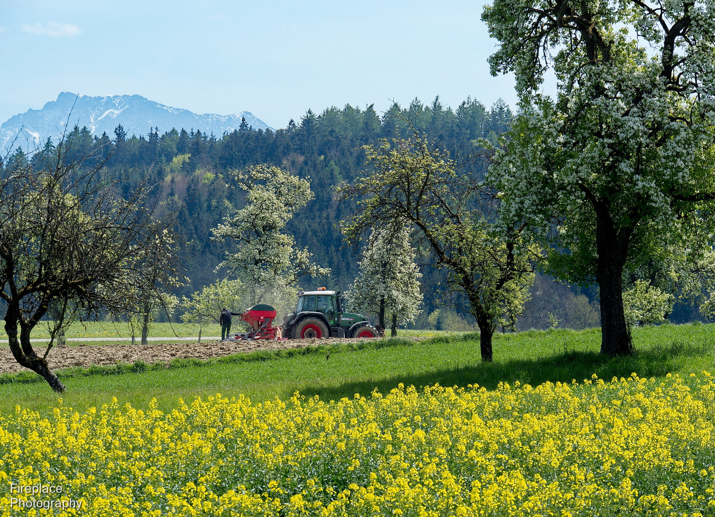
Pictures along the path
Wow! Even a double wow!
What a great idea and how well executed all the way from the signs to the website. The story is well written and illustrated and the net result is that I start to think about visiting the area next time I'm in Munich. It cant be that far? If the goal was to lure people to visit the goal is achieved.
The second wow is about the image of the two guys in a rowingboat. Märchenhaften indeed!
Perhaps i could wish for the images showing the images on display to show a little more of the area around the great images. OK, by then you understand you got me curious.
Great work! -
@Rich42 has written:
The first impression of an image you get here is always from a very small preview. If there hadn't been the text telling me it was taken a rainy day I would have scrolled by and forgotten the image quickly enough. In the small preview version it doesn't work.
The small format amplifies the negative sides of the image.
Looking at the image larger changes things for me. Now you can see the water drops and the focus is moved from nowhere to the air intake at the lower front. It turned more interesting at the same time as the disturbing background gets less disturbing. I hope you get what I mean:
In the small format it's just a car. A nice car but just a car. An image of "just an car" needs a better background. Now the right side (which is looking better together with the yellow car than the left side) become the strange part of the image. That is weird. In the small format it also doesn't help that the image is taken with the camera at the dead center of the car. Larger it doesn't matter that much as the background gets less interesting and the eye stays on the car.
Ah, something like that.


