I cannot unsee what I was first seeing here, and that is a view straight up the nostrils of a wild boar or maybe the tip of an elephant's trunk.
May 7, 2025
102
-

-
Please can you and/or Arvo send me those settings and I will see if someone can do it.
Alan
-
No apologies needed, in fact quite the contrary.
Such a fun post to look through and read.Your images are good and the explanation adds useful context.
Balance between words (text, captions) and images is just right.
The essay contains a good mix of pictures: some focus on the dwarves themselves, others on their political or social meaning, others still show humans in interaction with the bronze little fellas. Like I said: a really good mix of views to get across that these little statues are all over the place and have meaning and yield interaction.When we were in Wroclaw years ago, we also encountered quite a number of these dwarves.
I remember distinctly a dwarf mounted on horseback, near the site of an artificial hill with spiralling path that commemorated the deeds of some polish military hero who had also been active in the American war of Independance (against the Brits). Can't remember his name without using google. I will try to flex my brain muscles some more, before I resort to assistance...
But there were many others, and you have shown an interesting selection here. -
These must be wooden houses in a particular neighbourhood of Istanbul, right?
I like the view and would enjoy some more. -
Interesting discussion.
I had not noticed anything strange.
I am so conditioned to look at images and accept them for real because of my own documentary credo. -
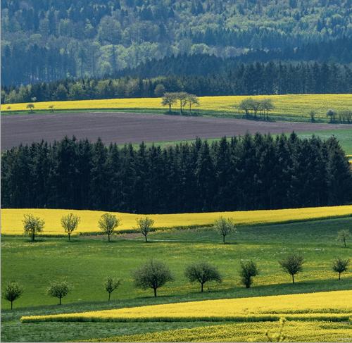
I can see the connection with the Palouse.
But that region (that I have not visited) seems to be filled to the brim with these undulating hills.
(I would love to visit it someday).
The Vulkaneifel is certainly nice, but not as spectacular.
You really have to stumble upon a view with that many layers, there. -
I don't know what you are hinting at.
Some kind of mixer? Or a precursor of the Slush Puppy craze?
I am probably not old enough, or not british enough or not australian enough (or any combination of the above). -
I get your point, but for me this image was most effective in square format and I did not want to lose any of the width.
-
I appreciate your feedback and the proposed crop, but I think I prefer my square format still.
The point of the image is (partly) in the number of layers so I think I want to keep as many as possible.(In layers for landscapes - as in cake - there is no such thing as "too much"...) 😃
As for settings: I was actually just using P mode
(I often do, not trying ot outsmart the camera, * unless I want a very specific shutter speed (either very slow or very fast, depending on subject, motion or desired effect) * or unless I want a very specific aperture (mostly wide open for background blur or very small for maximal DOF).
Since this was a static subject with little relevance of how deep DOF would be, I did not use A, S or M mode.
I do take your point on board though: if a wider aperture can be better, I might as well use it if I notice that the camera is closing down the aperture a lot, in order to up my shutter speed for telephoto.
Mind you, though, that with this cheap kit lens, F5.6 might be the wide open aperture value for fully extended telephoto - I think the lens is F4-F5.6.
That may be the reason for the camera stopping down a bit.) -

That would be Thaddeus Kosciusko (in the Americanized spelling without the "z"), for whom my hometown in Attala county, MS was named. Population 7000, also hometown of Oprah Winfrey, James Meredith (famous civil rights activist), and Jack Spencer, (one of my favorite photographers - and one whose prints sell for astronomical amounts even though he isn't widely known. )
-
I didn't know that rule about layers in landscape photography... :-) Fair enough!
If the camera in P mode draws you deep into diffraction territory at the same time as you start to risk movement blur - well, then the camera doesn't do it right.
Your point about the light weight but slow zoom I fully understand. I guess the lens performs at its best around f/5.6-6.3-7.1 somewhere. You'll take advantage from running a simple test some day finding how much (=how little) you need to stop down. -

Nice use of triptych to tell a story, almost like a little film strip presentation with very nice movement from left to right. Beautiful little girl, as are all little granddaughters.
I'm not a fan of the black border. It's too heavy in any case. Maybe if used very fine, ok, but, it takes away from the delicacy of white space around an image. Especially on a site such as this in which graphic control is . . . um . . . challenging.
We're 25 years into the Twenty First Century. If there are still devices or Web sites without color management, shame on them. Until recently my images had the largest color space Adobe Camera Raw permitted me to use when processing my Raw images, Pro Photo RGB. Adobe upped the game recently and replaced that with a slightly larger space, Rec 2020.
I would not allow any program to wring my images out to sRGB space. Not knowingly, anyway. sRGB is not a real color space.
I only recently became aware that my aging copy of Topaz Sharpen does just that, before it saves out the sharpened file, without any way to turn off the "feature." I have no idea why such a conversion is done in a "sharpening" program. So I've generally stopped using it at all. Which is just fine with my GFX images.
Looking forward to seeing more of your images.
Rich
-
That's the one.
(My brain had not retrieved the name.) -
Good to see you again Jonas! A nice little triptych, a trio of photos with a logical and artistic sequence to describe a personable and very cute little girl emphasizing her most immediately noticeable feature: that wild and amazing curly hair. Though I don't have Rich's extensive experience, my impression is that more white space between and around the images would be a good thing. Agree with Rich about the black border. There are areas where the bright sun has leached color from her shoulder and her hair. That looks like it works great for the hair, less great for the clothing. Looking at it online, all of it processes visually as a set of lovely images but getting it to render the way you want in ink and paper may give you some challenges. I would be very careful how and on what I printed it.
-
Because I really liked Jonas's removal of the sky section, and Roel didn't really like switching switching from the square format, I tried a crop that does both.
I really love that little kit 40-150, which is better than it has any right to be. Weighs nothing. Mine (free with my first Oly m43 camera) finally fell apart after a decade of hard use, and I got another one used for about $30.
Again, a great image, no matter how you "slice" it!
-
Nice use of triptych to tell a story, almost like a little film strip presentation with very nice movement from left to right. Beautiful little girl, as are all little granddaughters.
I'm not a fan of the black border. [...]
I would not allow any program to wring my images out to sRGB space. Not knowingly, anyway. sRGB is not a real color space. [...]
[/quote]Thank you for looking and commenting Rich, and for the nice "film strip" comment!
Yes, granddaughters all have some universal trick when charming the previous generations.
I get it, no black borders. I still wonder if there should be more white space between the images and also a little more at the top and bottom of the frame.When it comes to color spaces, we seem to think in diametrically opposite ways. I like the idea of knowing everybody get the colors reasonably "right". So, sRGB it is for anything i do on-line. For prints I use aRGB. I understand your approach as well but have given up to reality. There are however small signs giving me hope most screens will handle aRGB in a few years. Applications automatically doing things, including convert from a color space to another (something I never heard of earlier) should be banned.
See you! -
Hi minniev,
The little girl is 2,5 y.o. and her greatest feature can't be seen but really is that she recently started to speak properly. Until a couple of weeks ago i have understood in total three or maybe four words only. From frustration to fun!Thank you for your comments and ideas.
I now totally get it: no black borders. Bigger white areas I agree about. I'll have to redo this one.
Sometimes I think I get this with triptychs but in reality I have to think and try a couple of ideas before getting satisfied.About the colors: They are kind of wild. For a change I tried some of all these "filmistic presets" you can find everywhere. This one is supposed to make the images look more like some brand of negative color film. From time to time I can't help myself and revert to stupid experiments. I think that is an illness since the I got to try an old Rank Xerox color copier for the first time. It was possible to project images to it using a slide projector and a mirror. Crazy stuff, and fun.
If the poor childs mother would like the triptych printed I think I can make something decent from the raws. Without borders. For now it goes on-line only, in line with your thoughts. Thanks again!
-
Just to be clear, I really like the color palette. I too am an inveterate fiddler and experimenter, and old film emulation is one of the many toys I like to play with. I was just warning you about the patches of bright reflected light on her jacket, especially the shoulder, and the very top of her head that may not be easy to render in print.
Aren't grandchildren the most fun there is in this world? I adore my 3, but miss the magical stage your little one is in.