Very symbolic and timely.
May 14, 2025
49
-

-
Roel, any meaning behind thread #111?Happy numbers?!
-

Sorry, I've been ultra busy with domestic matters and I haven't been able to do much posting over the last week. I accidently posted this to last week's thread so I'll repost it here. Then I'll go back and comment on the discussion of last week's milkbar post.
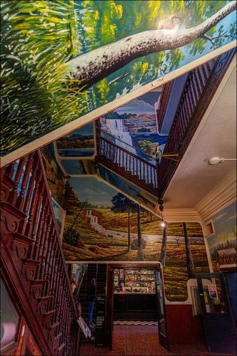
Mario's Palace Hotel. Broken Hill.
The Palace was a temperance hotel in the heart of one of Australia's hardest drinking mining towns.
You will find what happened next here.
www.weekendnotes.com/marios-palace-hotel-broken-hill/
The hotel has been used as a set in many films. -

No special symbolism of the number. it's just the sequence.
The thread's tradition was started MANY years ago on DP Review, and so we are at edition 891 in the large sense.
After DP Review's big changes two years ago we migrated to DP Revived (now renamed to The Photo) and so we are at the 111th edition in the new venue. -

After I take an image of almost any building, I have to spend time in post straightening up lines and correcting perspective distortion.
This one would drive me crazy!
I'm trying to figure out how there are two flag reflections when only one flag is visible in the foreground.
Rich
-
Aim into the "croud" and shoot. Something will be in focus!
Fantastical.
Rich
-
M. C. Escher - like.
Complex and fascinating interior. It's hard to decide where to look.
Good job controlling the perspective.
Rich
-
I think it is two flags with one reflection. So I am trying to figure out where is the other reflection..?
[Edit] we have been tricked - how about 3 flags no reflections?
-

-
-

Enjoyed more views of the castle, it's a beauty. Love the overlapping mountains behind. The last is my favorite, with the framing of the tree limbs.
-
Nice reflection for your reflection series (have you thought of making your own coffee table book of these type photos?). It could bear a little brightening in the darker areas. This is definitely one where I would NOT try to correct the effects of the wide angle. The converging verticals add to the artistic merit.
-
Nice composition with the overlapping hills and the almost-hidden red temple in the distance and placed in just the right spot. Bright sun robbed you of some richness in color. I have so many photos that suffer from this, usually when I forgot or lost my polarizer (I may hold a world record for dropping them off bridges). It may be challenging but I bet careful editing of individual areas/colors could give you a richer palette and fight off some of the reflected light. It's a picture worth working with some more.
-
Photo of the week or month. Fabulous photo using your special brand of creative composition and available lighting and atmospheric conditions to construct an image that is more than the sum of its parts. The ghost of the late pope emerges from the darkness of the digital "balcony" to bless the symbols of the newly chosen one. A real Pete Smith original. Remarkable.
-
An exercise in focus and detail. I especially like the tiny spider web. I don't think the leftward lean is adding anything, and it's enough of a distraction to bother me so I would straighten it if it were mine.
-
The confusion is the attraction. Lines and shapes and forms and colors abound. It reminds me of a marble run game, but designed by Escher. Visual exploration is rewarding, even in the tiny areas towards the rear of the scene. Very nice and very fun.
-
I am always attracted to images that show a scene through a portal: whether window, drainpipe, mirror, or whatever. You have offered us two separate ones, and I'll try to respond to them separately rather than as a set, but they could have been presented equally effectively in either way.
This one is my favorite of the two because it is the most confusing and thus the most engaging: I want to figure out what the portal is, whether it's a reflective surface showing a scene behind (the slight skew could conceivably eliminate the photographer or camera), or a clear window of some aging industrial complex or equipment. The scene it looks out on is less interesting than the portal, but the contrast between the modern and warmly colorful apartment building and the shaded worn machinery through which we view it is striking. Very nice image.
-
Here we have a quite different portal though with some similarities (dark, worn, man made interior looking out on a bright open scene). I'm pretty sure this one is open air viewing but that could be a trick. It reminds me of an old log cabin I have come upon a couple of times in Grand Teton with a view to the river and mountains.
Nice concepts, executed well, with engaging stories hidden inside and out.