Thank you kindly for your comments.
-
-
Classic cameo framing with a vertical tower/reflection centrepiece.
-
Lots of youth and energy. Goths maybe but they are happy Goths. The strong changes of colour in the series adds more energy.
I like the inclusion of the last shot. It broadens the subject matter of the series from the performance to the young people themselves.
The finishing touch is finding where the series was shot. It makes viewing the youth, joy and energy even more pleasurable. -
Minimalistic but surprisingly complex. There's a repetition of forms here that ties things together - the white posts, the palings plus the repeat of the plant shapes. Then there is an implied diagonal line between the plant shapes and branch directions and the fence intersection. It needed the square format for this to work.
I'd like a very fine black line border so the image doesn't bleed into the surrounds. Interestingly, you have included a broad white frame as part of the image. I like that frame and suggest that the fine black border should be around the outside of the white border. -
Looks like a postcard from an earlier era. Perfect centered composition with natural oval foliage framing the subject like an ornate Victorian frame. The mirrored reflection is appropriately vague. The colors are light and airy. Lovely image.
-
Quite a nice set of concert photos. You managed that tricky concert lighting quite well. The first is my favorite because of that lighting - the beam bearing down on her from behind and enveloping her with an aura that ranges from red to gold. Well done.
-
The stark geometry of the fence creates a frame for the red flowers and a base for the background trees and foliage while suggesting an (invisible) repetition framing of the same dimensions in the space above the fence. I see four quadrants, though only two are visibly marked. It makes for a well balanced composition.
-
Black and white is a good choice for these classic street images. Aligning the composition along the lines leading to a vanishing point near the upper thirds intersection gives the images a lot of visual power. The third is my favorite, because : you can see the face of the nearest man, you can make out the blurred people in the distance, and the dark figure in the center (with his shadow trailing behind him) adds an important element of mystery and story, perhaps even more important than the fellow in the foreground. I could envision a successful version without the man in the foreground at all.
-
I'd love to see that display since my own porch is the most important room in my house. Your image of the display is fulll of rectangles and triangles, a feast of geometry and design that appears to summarize some of the various functions and styles of American porches from the columned portico to the modern pool patio. Nice image to showcase a nice display.
-
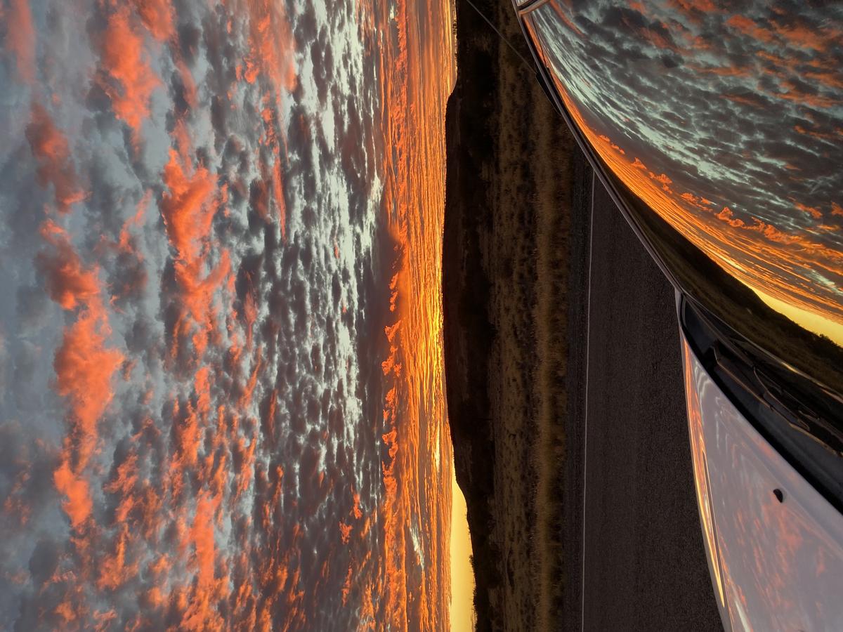
My compliments to the photographer. The scene was glorious, including the reflection of it in the car was genius, pairing the wonderful landscape photo with a quirky abstract of itself.
-
-
From the figure on the left, the lines radiate outwards. This suggests a vision as experienced by the man. His image builds to the ferris wheel on the right that takes in almost the entire top/bottom. It's the kind of technique a graphic novelist might use to convey an image as seen by a character. It's all the more effective because of the high contrast.
-
-
@RoelHendrickx has written:
PORCH
I know I’ve posted an image already but I could not resist one more this week.
I must confess that I was kinda surprised to find that one of my favourite pavillions of the Venice 2025 Biennale on Architecture was … the USA one.
While many countries (including Belgium) chose a conceptual approach and submission (Belgium about micro biospheres in buildings), the USA present a historic narrative on the importance of porches in architecture and social life.
There is a website and a book/catalogue will follow.
www.porchusavenice2025.orgHere’s my shot:
[![IMG_1472.jpeg]
Porches. What a good idea for a series! The interface between the private world of the house and the public. Reflecting on it, they are a feature of much of what I associate with America - from those of southern USA literature to the brownstone stoops of New York. Can I consider brownstone stoops as a porch?
Roel's photo plays with distinctive features of Greek buildings, the triangular pediment and the columns. He has picked up similar shapes in the surroundings and visually linked them to the porch. Very, very clever. -
@JonasB has written:
[quote="@ChrisOly"]
* Ride
Hi Chris,
I like this one, the first image.
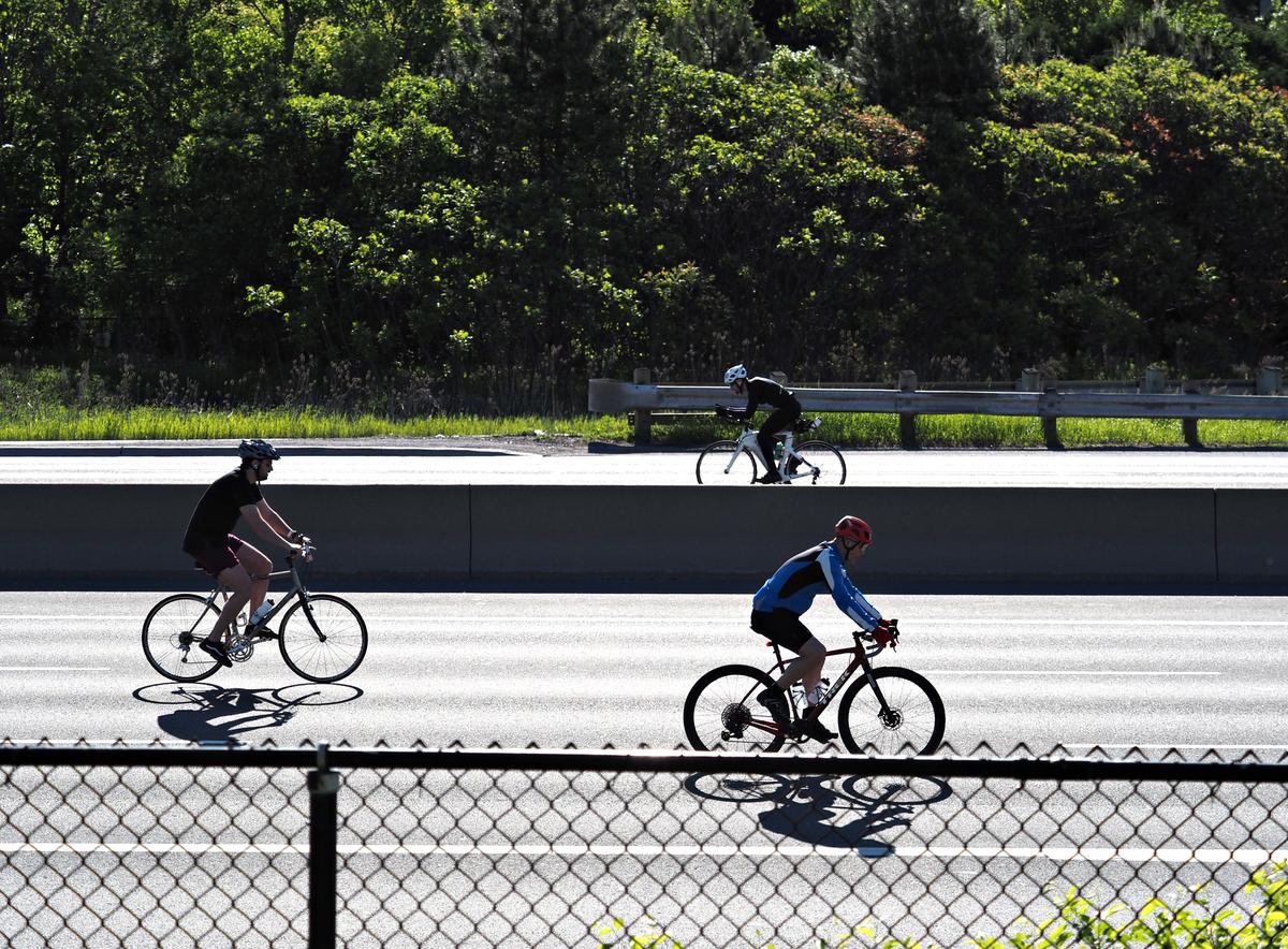
The three bikers make everything right. One is going to the left holding the upper part of his body in a high speed position, clearly on his way somewhere.The other two are more relaxed. They are going somewhere as well but confident they are traveling in the right direction. The highway barrier is in the way but at the left most biker has his head above the barrier he helps me understand the image.
Or maybe he isn't as in my mind it's an image from the future right here on the screen. The cars are gone having left their hard and gigantic infrastructure behind free for us to use for biking and traffic with vehicles we yet have to see.• Technically the high contrasts work well. If printing big I would desaturate the blue tones in the foreground shadow details (such is life when getting hooked on details). Shutter speed is fast and the wheels are shown nicely. The biker going to the left is a little blurred but getting everything perfect in a grab shot is not expected. Shot against the sun which works wonderfully.
• The foreground fence kind of ruins the whole thing. Maybe it was impossible to get higher or closer? It would have been a better image with less of that fence.
• Is it cropped to the right? A little, just a little, more of the highway at the right would have been right for me. Now the road ends and somehow slows the right-most biker down.The image can be used as promoting material for the next run and probably also by environmental activists in some way or another.
I love a good snapshot so thank you!
/JonasEDIT: The point list became italic, not my intention and now back to normal.
Yet again I'm finding the flat thread view makes exchanging views difficult.
If we look at these shots as coverage of an event, I don't think photo 1 gets the feel of the occasion. It needs the added information from further shots that show the freeway with bikes only. If we choose one photo as a stand alone image, then yes, I'd pick one also but I'd suggest some edits.
The horizontal lines are important here. They contribute to the east/west west/east movement of the cyclists. The bottom fence and the barrier are part of this pattern of lines. I suggest that some cropping would make them stronger. Crop for the bottom to just below the white painted line and the closest rider's shadow. Then take a tiny fraction off the right to eliminate the remaining small piece of green bush that will be at bottom right.
Then crop off about half the width of the trees at the top. The vertical lines from the bright areas of the trees are pulling our eyes away from the east/west movement that I feel is the strength of the image. This crop will leave another, largely dark band that complements the mid lane barrier and the other east west lines in the image.
What do y'all think? -
@MikeFewster has written:
Please tell my wife....
that I'm supposed to be the family photographer.
We are settled into Yulara for our annual working residency. She took this shot of dawn breaking over the desert as we drove up here.Thanks everyone for the comments on my wife's shot. I have passed them on.
She took this with her phone. Me -I was out there a little to the right with my fancy camera taking the obvious shot along the skyline. There's a message in this somewhere.

